Guide to Mockplus Cloud
Mockplus Cloud is a collaborative platform where product design teams can collaborate effectively and hand off prototypes, designs and other deliverables more efficiently. It keeps each product team member in the loop and simplifies your entire design-to-development process into a single link.
With Mockplus Cloud, your entire team, including designers, developers, product managers, marketers and more design stakeholders, can get together, and share, review, collect feedback and also handoff in just one platform, shipping high-converting products faster.
What can you do in Mockplus Cloud?
Mockplus Cloud helps you collaborate and handoff in significantly less time. How?
- Import designs and assets from Sketch, PS, Figma, Axure and Adobe XD in just clicks
- Share designs or prototypes within your whole team via a single link
- Invite team members via a single link
- Quickly review designs and also leave comments on screens
- Handoff designs to developers with auto-generated design specs, assets and code snippets, all via a single link.
- Create, assign and manage design tasks to ensure your project is completed on time.
- Write and share PRDs online
- Build and maintain your own design systems with your team
A quick Intro to the Project Homepage
Mockplus Cloud's project homepage is divided into different functional sections, gathering all the collaborative features that design teams may need for creating the best UI/UX and digital products together.
It provides entries for you to create and manage your projects, assign tasks and track the task process, build and manage your Design System, check all the activities within your team, manage your team and members, and even quickly go to our other tools, Mockplus RP and Mockplus DT.
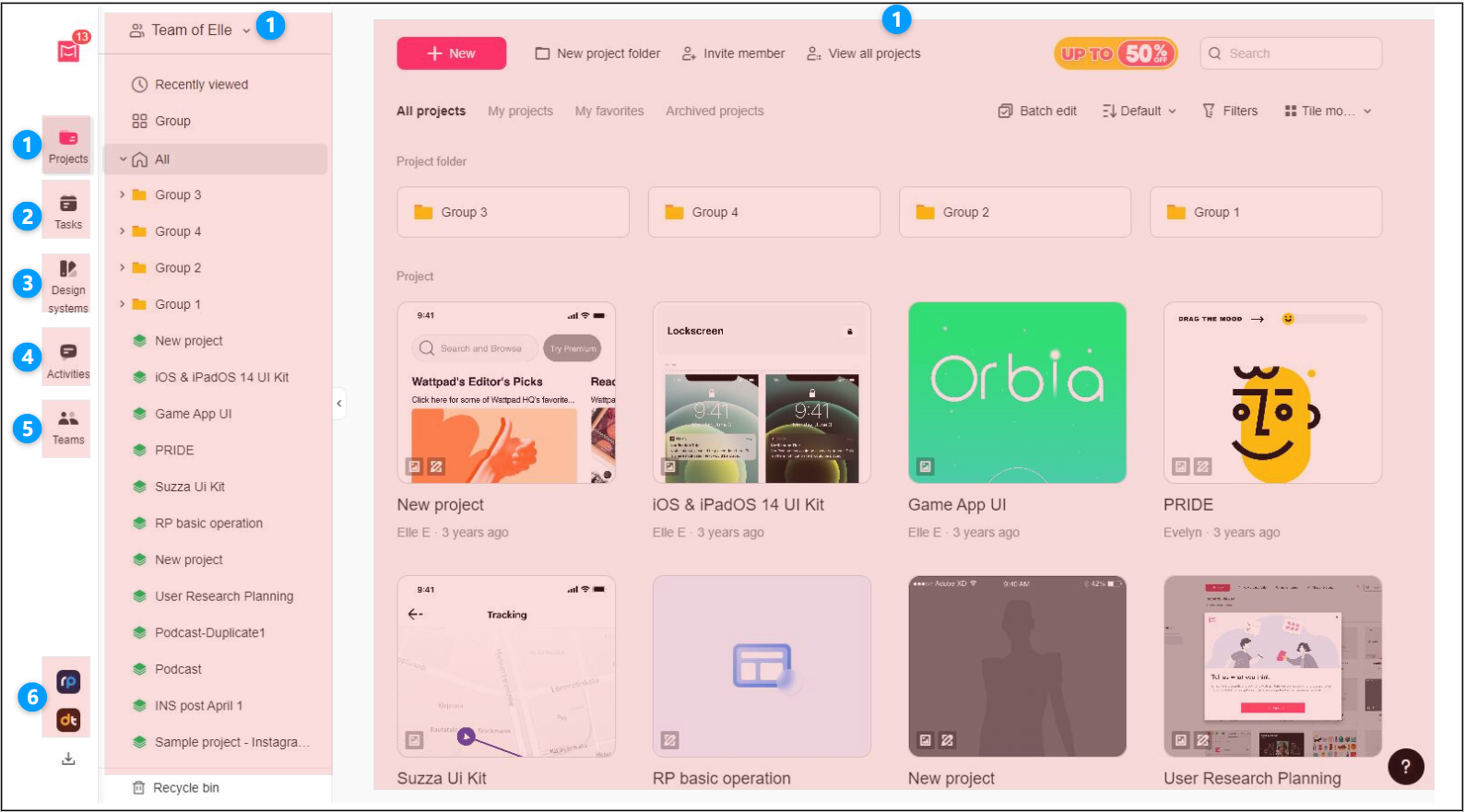
1.Project Management
Section No. 1 is where you can create, access, and manage projects by group.
It is divided into two parts:
- On the right, you can easily create projects or nested project folders and manage them in tile or list mode.
- On the left, you can assign projects to different groups for quick access and management.
2.Task Management
Section No.2 provides a clear insight into your project processes and ensures a smoother workflow. Here you can create, assign and manage your tasks.
And Super Admins also have the permissions to customize the task statuses and task review process.
3.Design System Management
Section No.3 provides an entry for you and your team to build, share and maintain your brand design systems together by creating Asset or Library design system projects.
Your design system projects can also be connected with your design projects so developers can easily view the related code snippets and components under the Development mode.
4.Activity Management
5.My Teams
6.Go to Mockplus RP or Mockplus DT
Mockplus Cloud offers features that allow you to quickly navigate to Mockplus RP or Mockplus DT. Simply click their logos in the bottom left corner to access them.
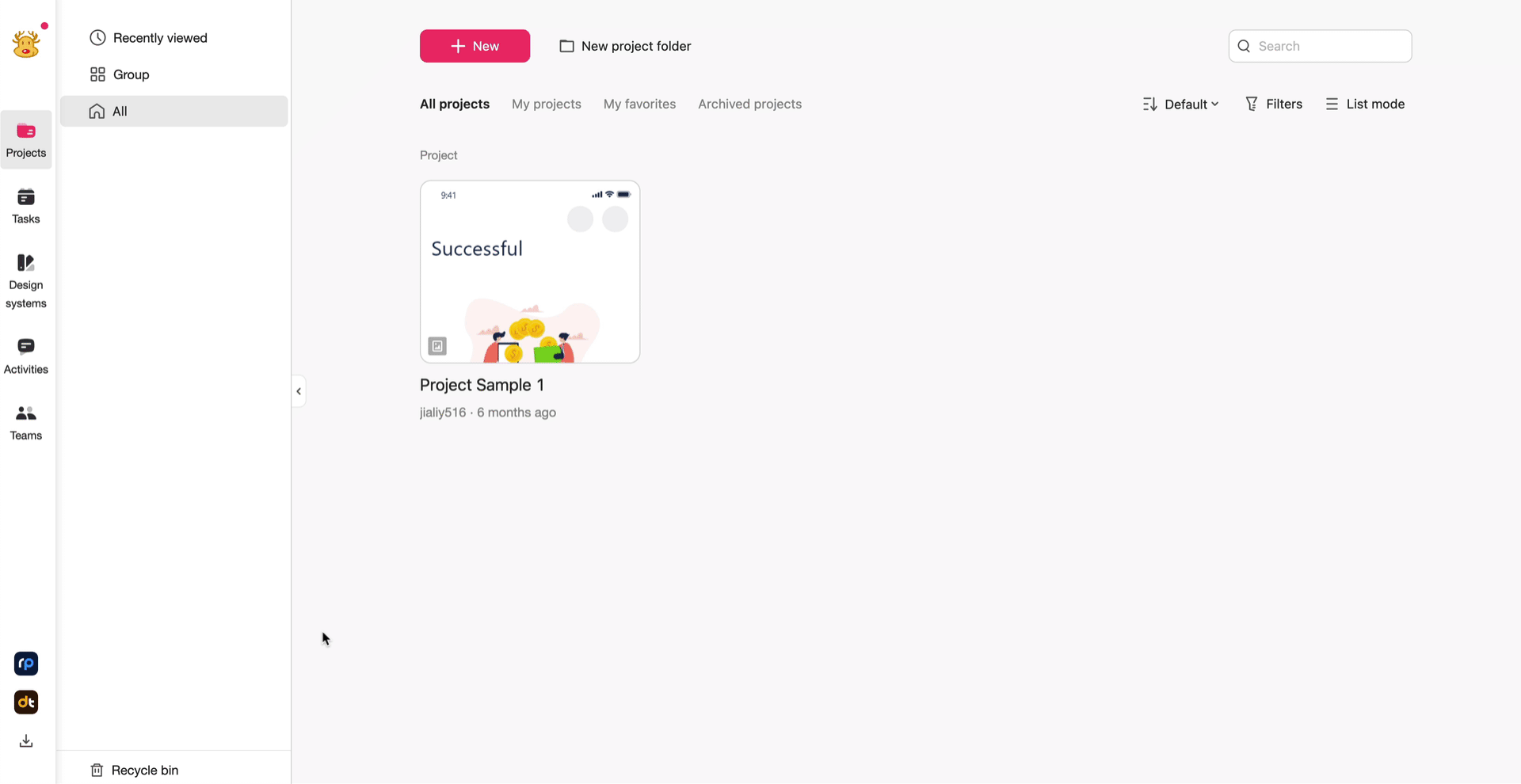
How to Create a Mockplus Cloud project?
To create a Cloud project, go to the project homepage and click “+ New”:
Two options would be given: Prototype handoff and Design handoff.
Here is how to choose:
If you want to start your project from Axure or Mockplus RP files, select "Prototype handoff".
If you need to start your review and handoff process from other design tools, like Sketch, Adobe PS, XD, or Figma, go choose "Design handoff".
And then, click OK to create your first project.
Explore the Mockplus Cloud User Interface
Now that your first project has been created, let's see what you can do with its user interfaces:
Top toolbar
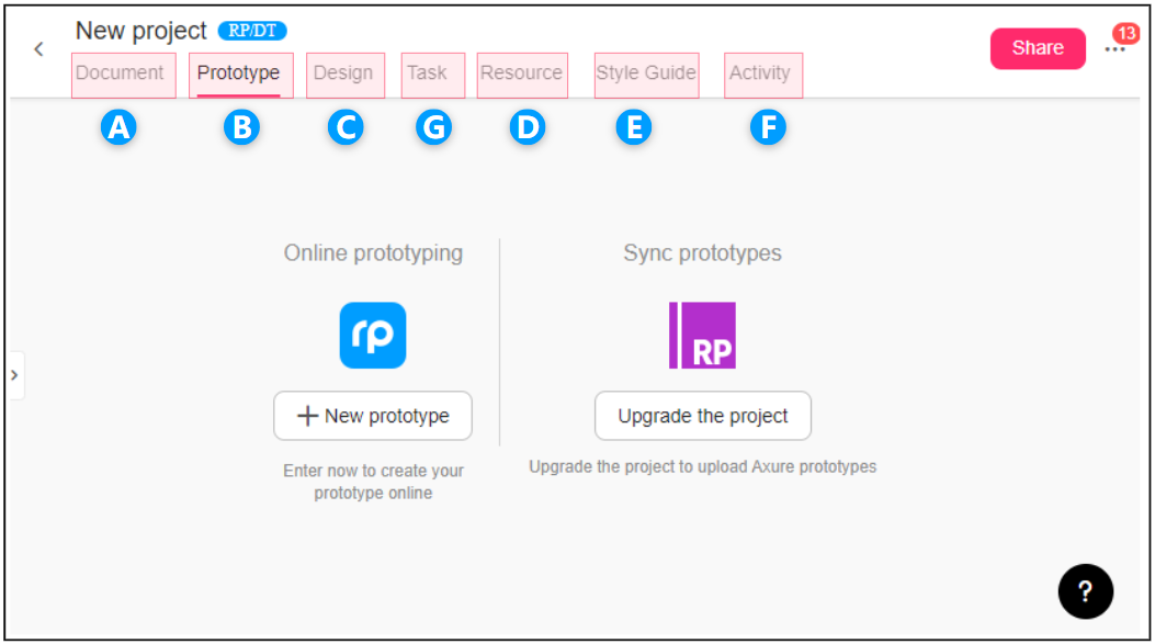
A. Document
Create and edit your PRD (Product Requirement Document) online here. You can also insert tables, designs, or prototypes into your PRD, helping to explain your product requirements further.
B. Prototype
Sync prototypes from Mockplus RP or Axure here to collaborate with your teammates.
C. Design
Sync designs from Sketch, Adobe PS, XD, or Figma with our plugin or directly drag and drop your designs to upload here.
D. Resource
Here you can upload multiple product documents and various attachment documents for previewing, downloading, and sharing.
E. Style Guide
Build your own style guide libraries here and export them all as CSS codes in one click, speeding up your designer-developer collaboration and handoff.
F. Activity
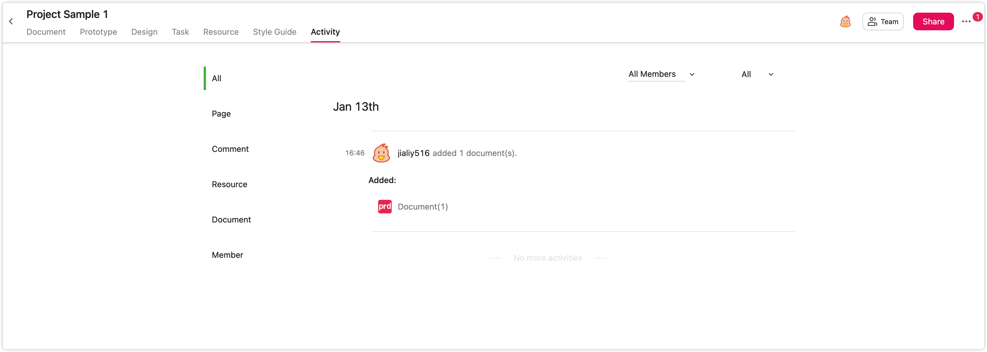
View all activities (including adding, deleting, and changing designs, etc.) within your team for each project and always keep all teammates on the same page.
G. Task
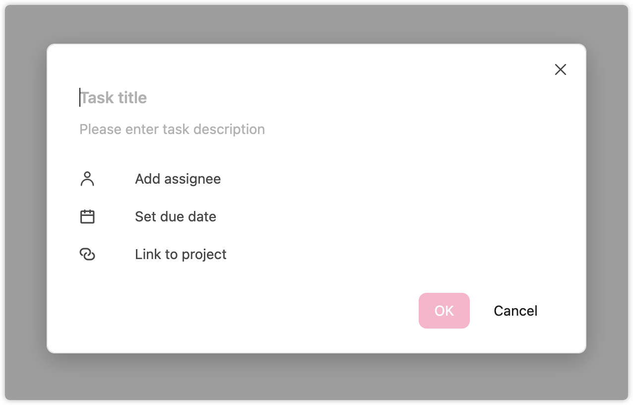
Assign a task to any of your team members and set a due date for the task. This ensures that all tasks are done on time, moving the project to the next phase.
How to collaborate with your team on Mockplus Cloud?
Storyboard
After your designs have been imported, all pages within a project will be displayed under one screen. This is where Storyboard comes in.
You can then overview all pages of this project under Storyboard, and also drag and drop lines to connect them together to create a simple screen flow for showing the jumping logic between pages.
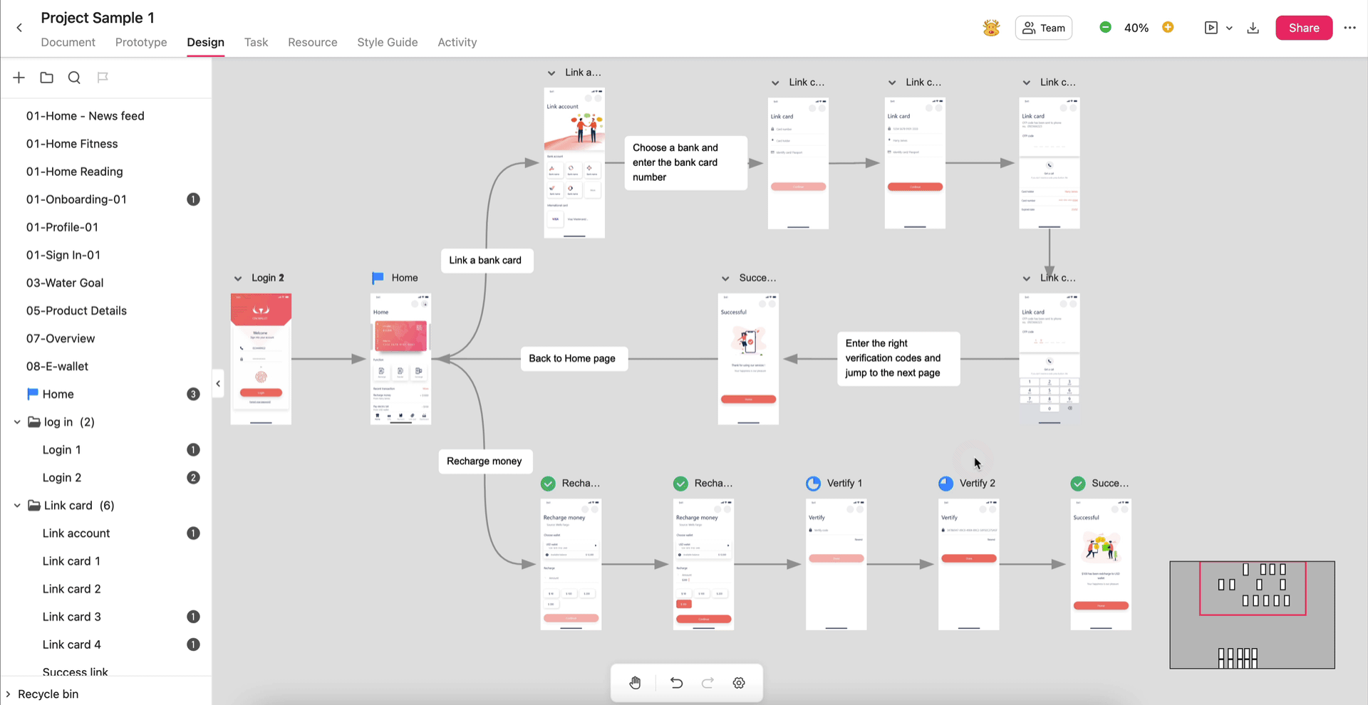
Under the Storyboard, you can add sticky note to add further design information there, and also use the Shape tools there to create flowcharts.
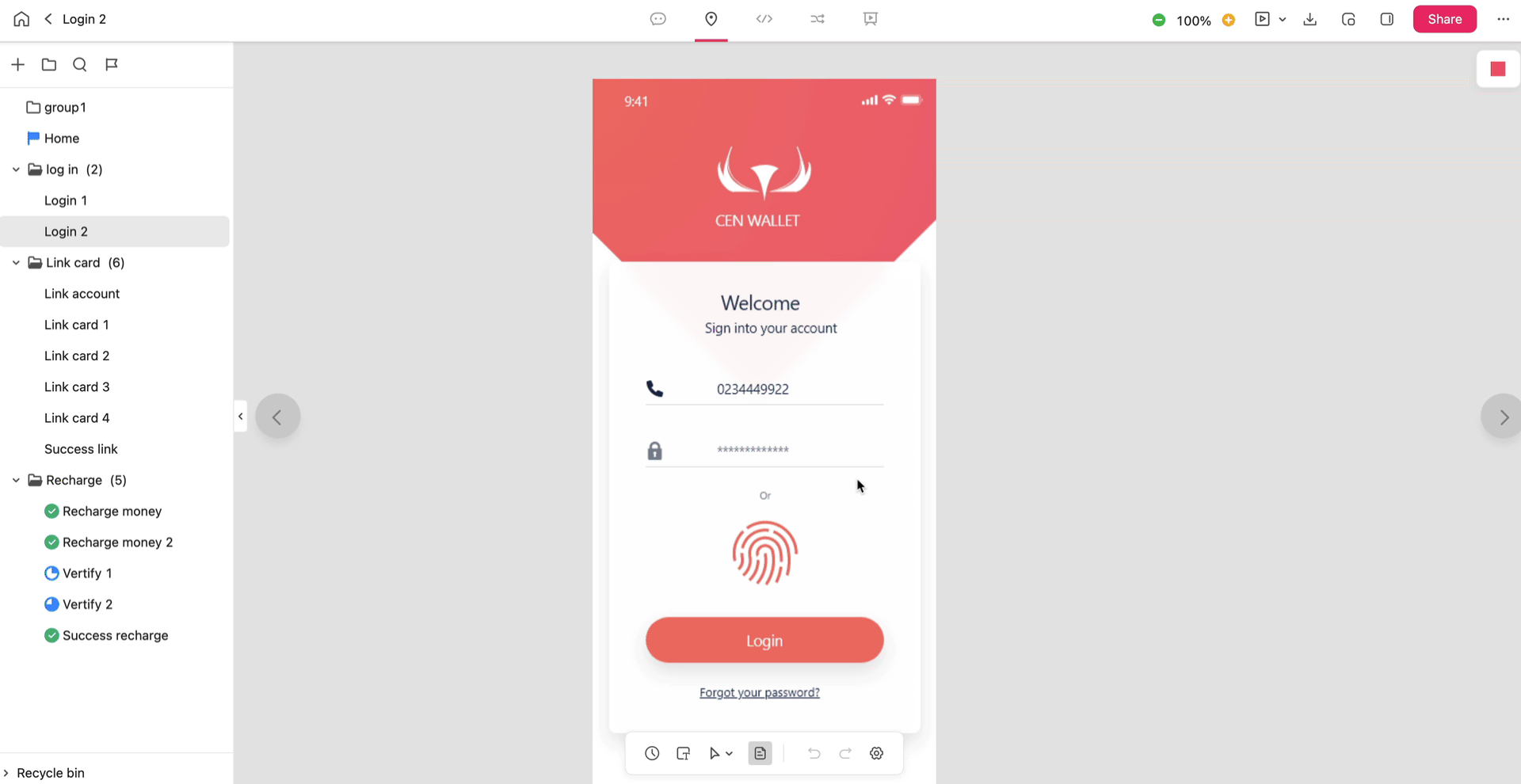
Single-Page Mode
Double click on any pages on the Storyboard and you are directed into the Single-page mode, which allows you to further view and collaborate on a single page in details with your team.
There are also five sections provided for your teammates, including designers, developers, product managers and more stakeholders, to do their own work with conflicts and distractions.
Comment Mode
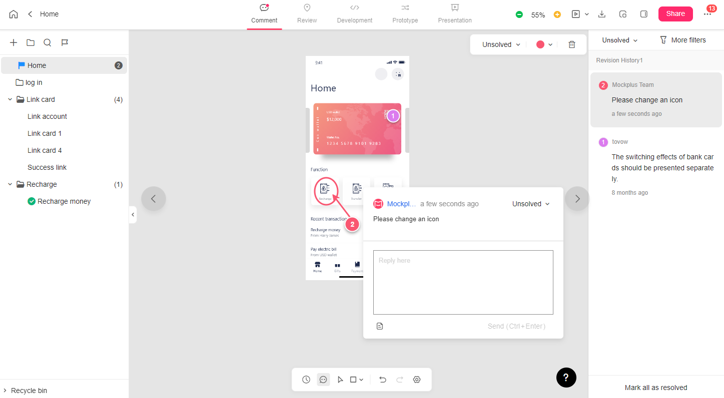
This section provides a place for designers or other stakeholders to freely view design details, and directly leave a comment on the screen using the comment tools. They can @mention someone in the teams to quickly notify them, and add a comment status to follow them up.
A. Comments tools
Five comment tools are available for you to point out any part or detail of your design files, and leave a comment there directly:
- Pin 
- Rectangle 
- Circle 
- Straight line 
- Arrow 
B. Project tree
A project tree panel on the left side helps to show all project pages in a tree-structure, and allows you to quickly navigate between different pages.
Expand the right-click menus, you may also have more options to organize and manage your design pages and projects.
For example, through the right-click menus, you can:
- Add pages
- Merge your pages into a group
- Search pages
- Mark progress
C. Revision history
Here you can check how your project has been modified, overwritten, or replaced. Any change to your project will be automatically saved to a revision version. You can quickly compare the differences between the two versions side by side.
Review Mode
The Review mode, as its name suggests, is a place where teammates can freely review all design files, and add annotations or custom specifications with the markup tools.
Plus, you can also add references to attach further documents, resources and links to further convey the design ideas.
A.Markup tools
Five markup tools are available to quickly add any custom design specifications:
- Text Markup  : Add text specs or explanations to any design element
- Coordinate Markup  : Click any position to show its coordinated information
- Spacing Markup  : Draw out a line around any element to add spacing specs
- Color Markup  : Click any element on the page to mark out the color value
- Region Markup  : Draw a rectangle to add height and width specs
B. Add design references
Click "Add references"  on the toolbar to:
- Add a relevant Document, Resource, or Link as references
- While adding a Document as a reference, you can add an anchor to refer it to specific paraphs, sentences or even phrases.
So, your teammates can directly click to preview any documents, resources or external content you want them to read to better understand the design concepts while reviewing design files.
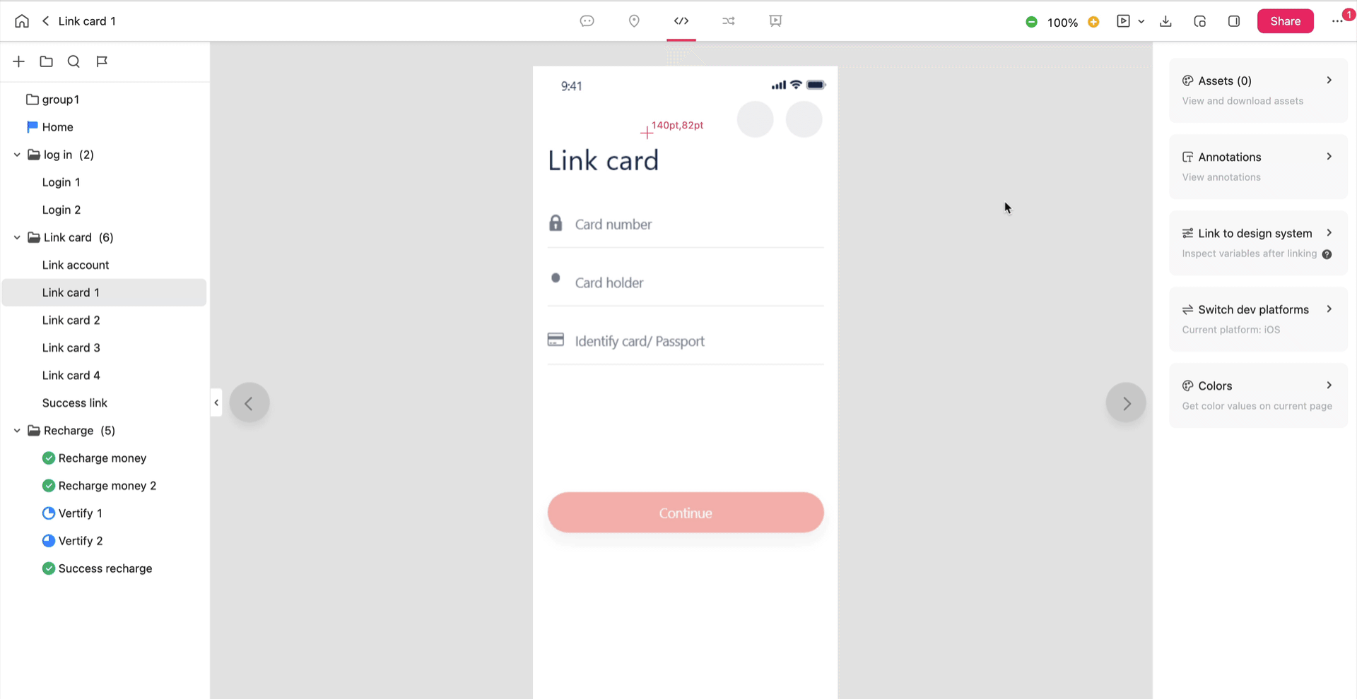
Development Mode
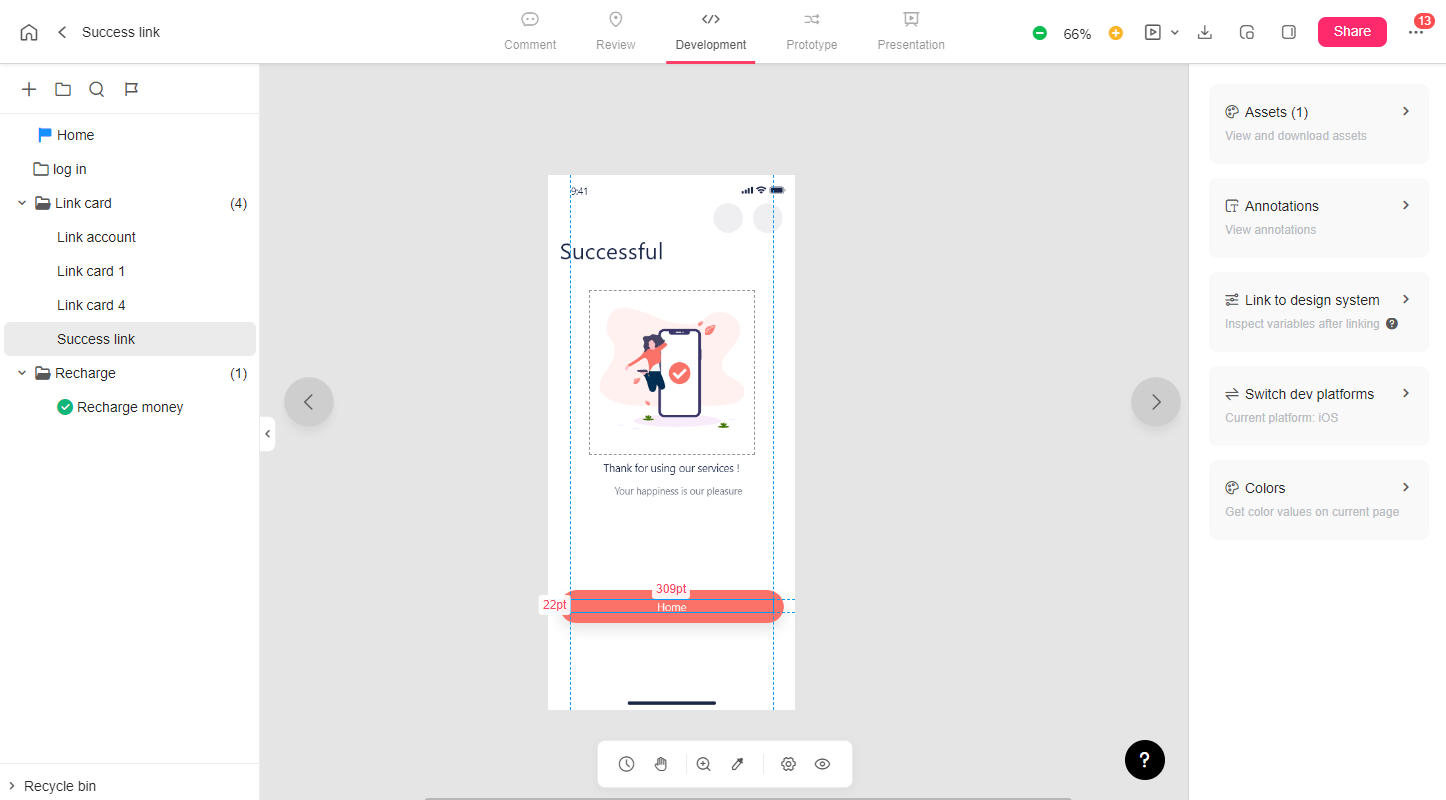
Development mode is especially made for developers to:
- Inspect design files and view design specs with simple clicks or hovers
- Download design assets in all formats or for all development platforms in clicks
- View and get CSS style codes
All design related specs, assets and code snippets are automatically generated once when your design files are imported under the Development mode.
Dev tools
- Magnifier  : Zoom in to check all specs on the page
- Color picker  : Get the color value of any design element
- Hand tool  : Move the canvas to check any detail you want
Right property panel
This panel contains all the details for specs, assets, and layers, helping front-end developers get what they need to quickly program apps/websites.
A. Switch development platform
Whether you are an iOS developer, Android developer, or Web/H5 developer, you can get the exact codes for your own development platform here. Simply click "Switch development platform" and check all the details for assets, colors, and layers.
B. Assets
If designers mark assets when importing designs from Sketch, Adobe PS, XD, or Figma, the associated assets will be recognized and shown up in this section. Developers can then easily inspect and download the assets in one click, quickly saving their time and effort.
C. Colors
Here developers can check all the colors and their color value on the design page. Developers can also switch color modes to copy the value they need for development directly.
D. Layers
Click the “Mark layer” icon in the upper right corner to view all marked layers. To further use the layer data for development, just select any layer you want, copy all related layer data and paste it where you like for faster product development.
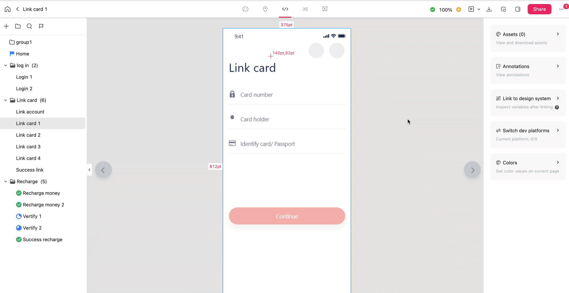
Prototype Mode (only for design handoff project)
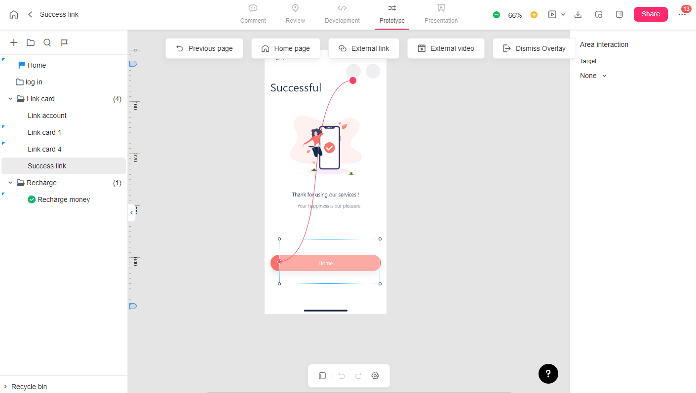
This section is made to turn your static design files into interactive ones. You may add page jumping interactions, hotspot interactions and even overlays with simple clicks or drag-and-drop actions, which is much better to show developers the design logics and flows for faster implementation.
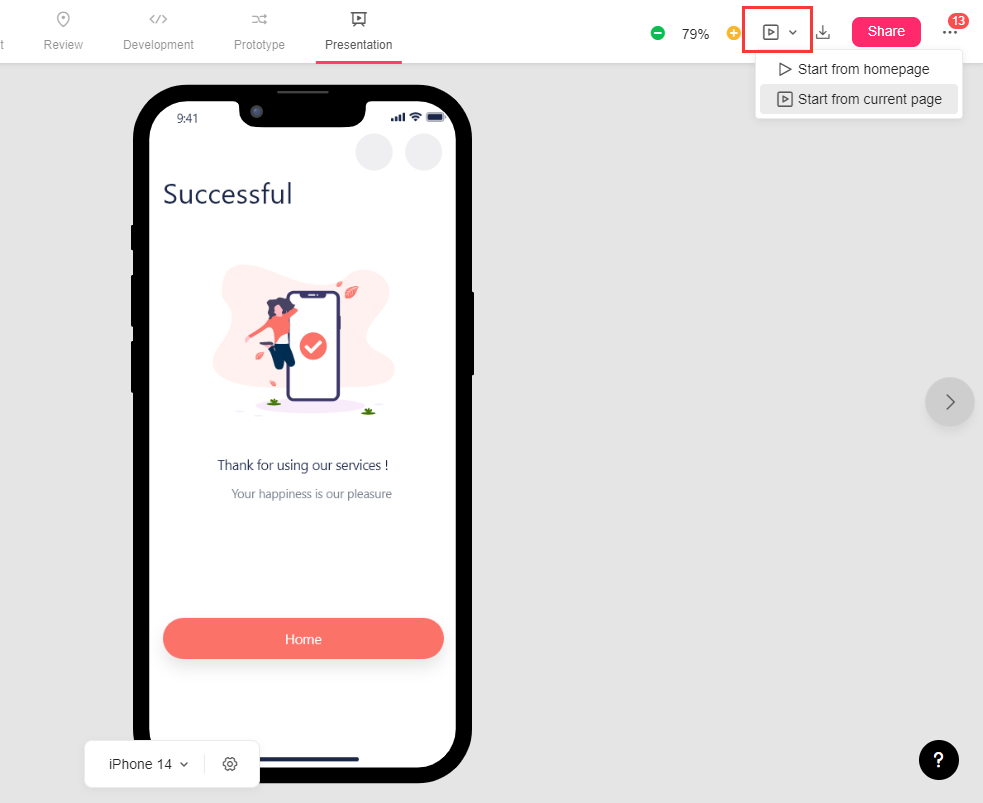
Presentation Mode
Here you can instantly preview and test out the interactions you've made in Prototype mode, all without jumping into elsewhere.
How to Share a Cloud project?
Preview
Click the Preview button in the upper right corner to preview the project from the home or current page. The preview link can also be shared with others to check and test your project.
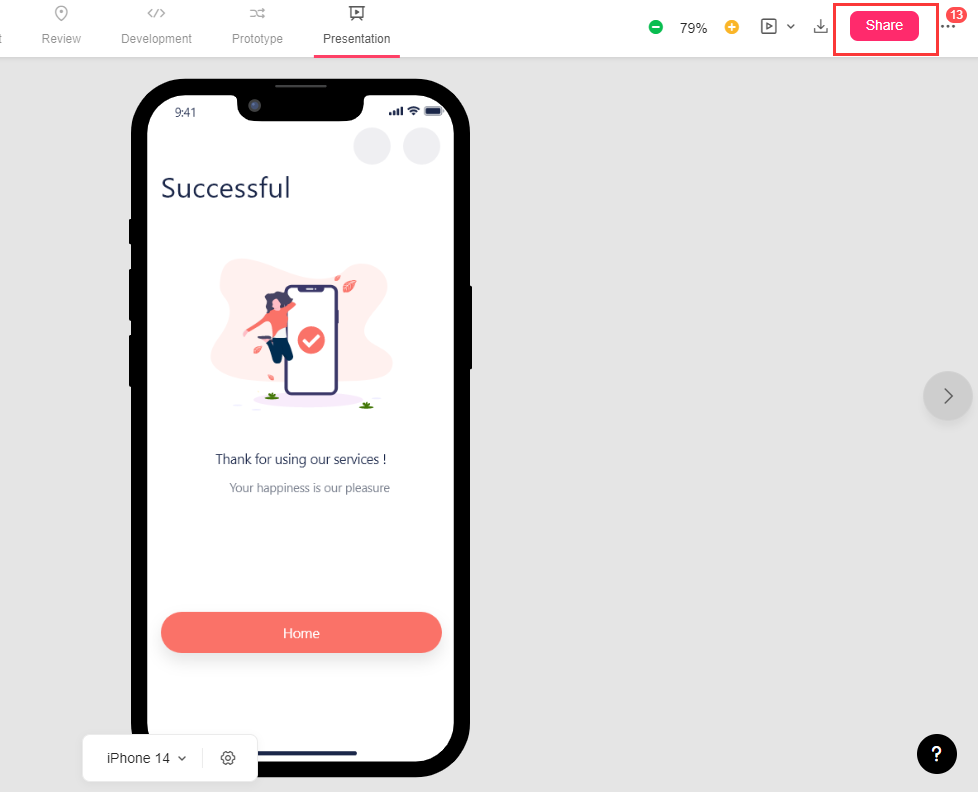
Share
To get more stakeholders involved, click the "Share" button, and a URL will automatically be generated. Copy any link (Private share, Public share, or Embedded project) from here and send it to others.
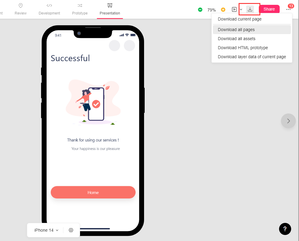
Download
Click the "Download" button at the top right to download the current page, all pages, all assets, or an HTML prototype package.
More
Here you can check notifications from your team, find the keyboard shortcuts, join our community, ask for help from our tech team, etc.