Mockplus allows you to download assets for different platforms and devices with one click in the "Development" mode. All widely-used device platforms, such as Web, iOS and Android devices, are supported.
Size and Resolution
Before starting to upload designs and assets into Mockplus using our plugins, you can choose a resolution ratio for your Web, iOS or Android projects.
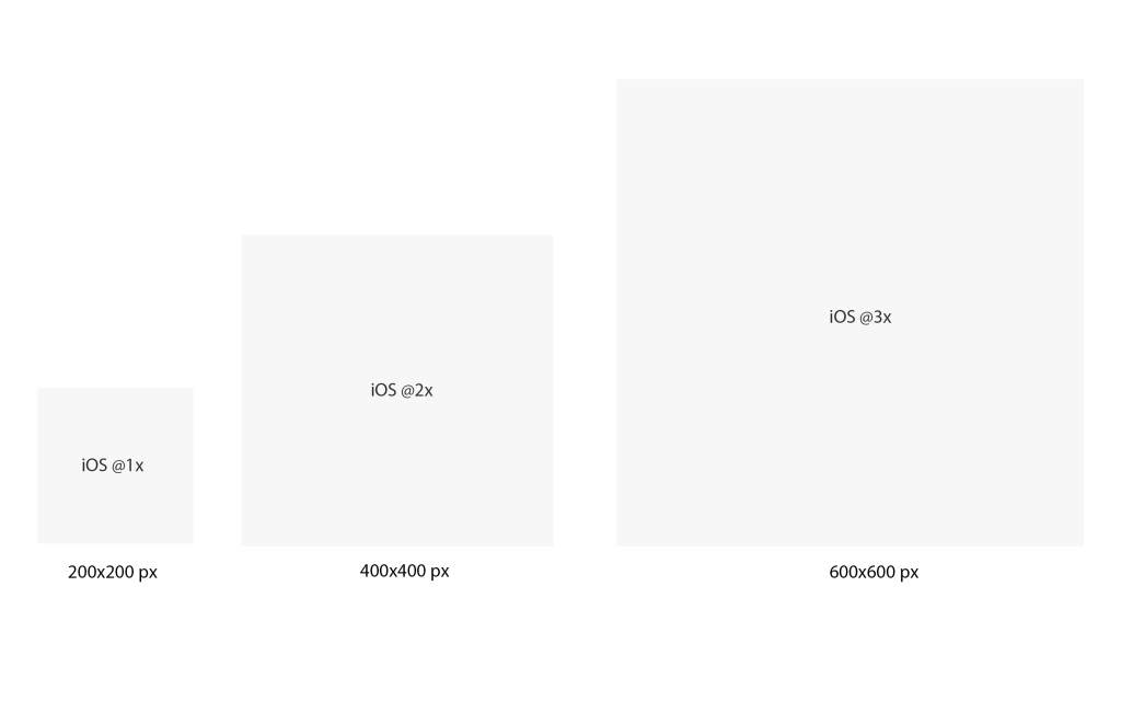
To make this clear, let's take an iPhone 8 design page (375×667) with an asset (200x200px) as an example. When you select "iOS @1x" in the Sketch plugin,
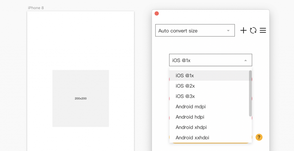
you will then get a page and an asset both at the original size after being imported. When downloading online, you can choose to download it at iOS@2x and iOS@3x. The iOS@2x means you will download the asset at twice the original size. The iOS@3x means you will download the asset at three times the original size.
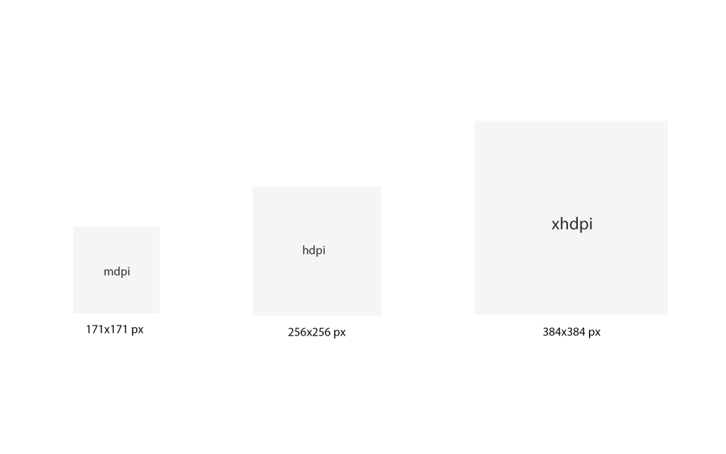
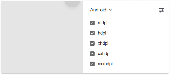
You can also switch to the "Android" platform to download the related asset in mdpi, hdpi, xhdpi, xxhdpi and xxxhdpi pixel dencities. hdpi and xhdpi piexl densities means you will download the asset at 1.5 times and 2 times the original size respectively.
Auto Fit to Different Platforms
There are two methods available to download assets for different platfoms in one go:
First
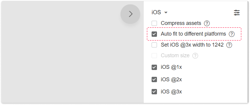
Select all assets on the right-hand "Assets" panel and tick "Auto fit to different platforms".
Second
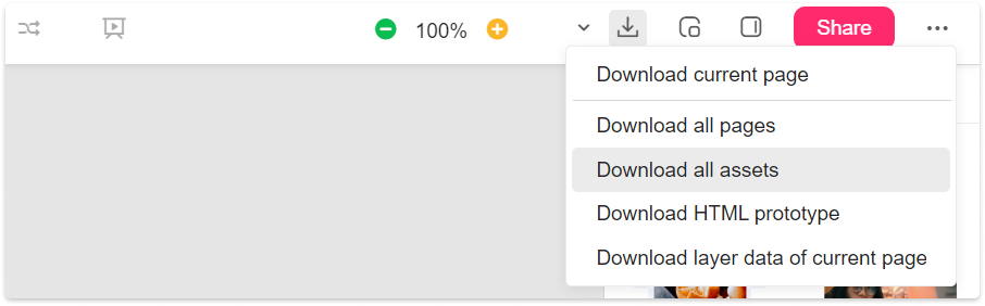
Go back to "Storyboard", click “Download” in the upper right corner of the screen, select "Download all assets"and tick “Auto fit to different platforms” in the pop-up window.
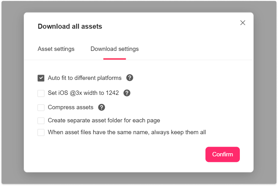
Asset Calculation Rules
When selecting “Auto fit to different platforms”, the size of the downloaded asset will be caculated as below:
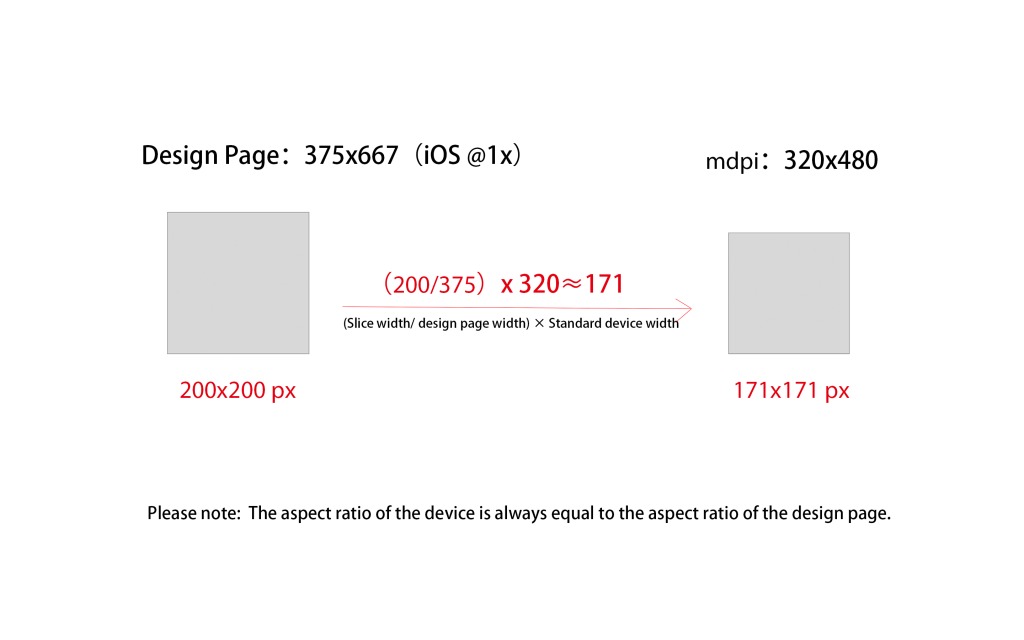
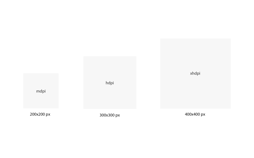
After switching to the Android device and enabling “Auto fit to different platforms”, you can download all Android assets at sizes as below: