Design System Libraries
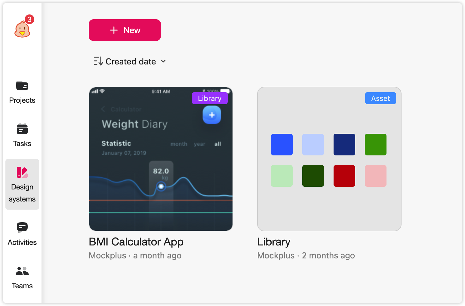
When using the Mockplus Design System, design system libraries are where you can gather, organize, and manage all design assets, such as colors, images, components, and other common UI patterns. You can define categories and groups to ensure brand consistency.
If your company offers users multiple products or services, it may help you to create several libraries to unify and manage the various design systems separately. Any changes you make are auto-synced online. And, with a simple link, your entire team can join, view, share, and maintain the same design language.
Here's how you can get the most out of the design system library:
Create New Libraries
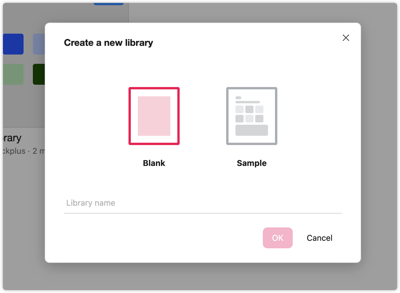
To create a new library, click "New" at the top left of the library homepage.
You will see two library options in the pop-up window:
Blank: The library is empty. You can add or import assets directly or use the Sketch plugin.
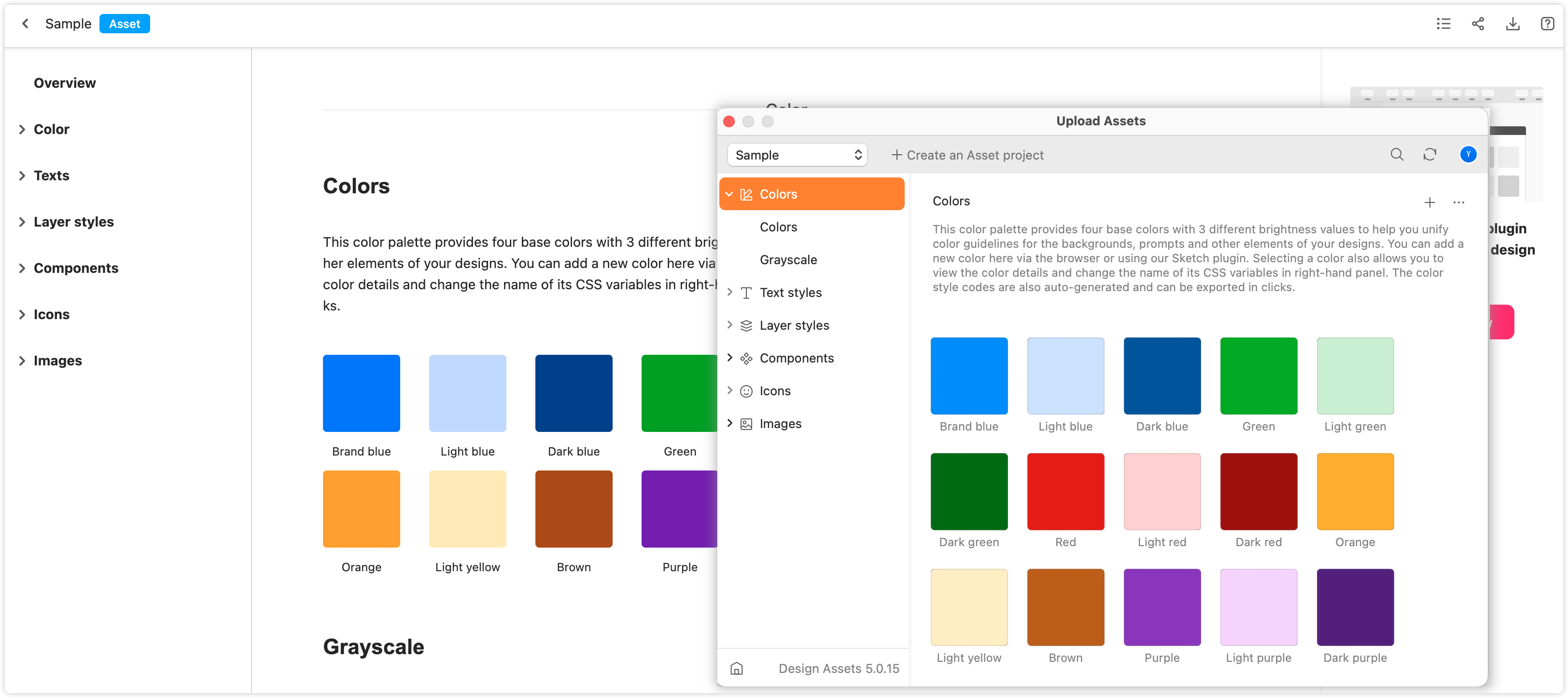
Sample: The library is already set up with basic assets like colors, fonts, layer styles, icons, texts, and images. You can edit these assets and then add or import new ones to customize the library to your own design system.
Select one and give it a name to create a new library.
Clone Libraries
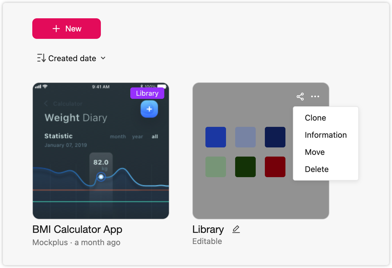
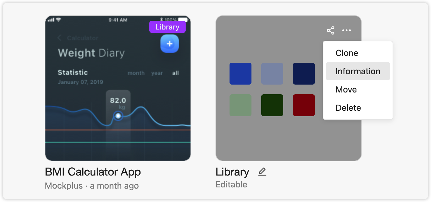
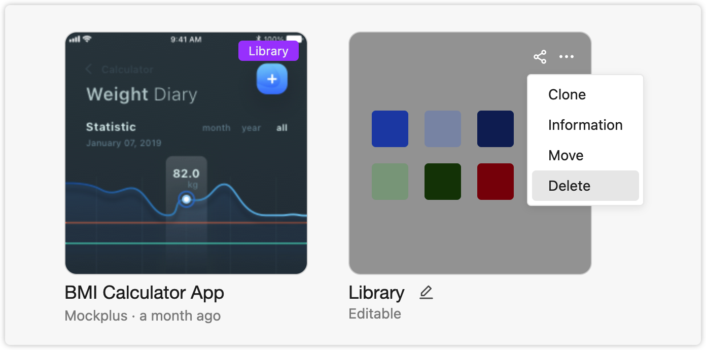
Click "More" on the cover of a library and choose "Clone" to make a copy.
Rename Libraries
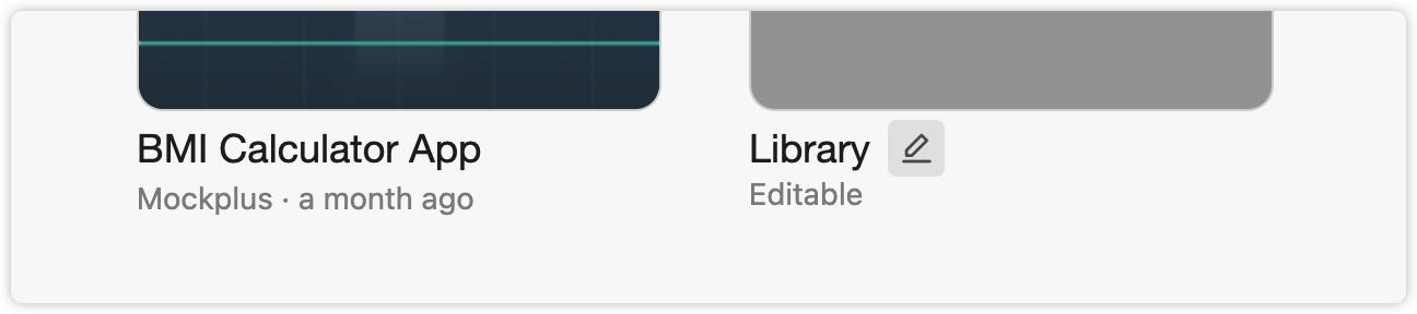
When hovering over any library, a pencil icon will appear. Click the pencil icon to rename the library.
Change Library Settings
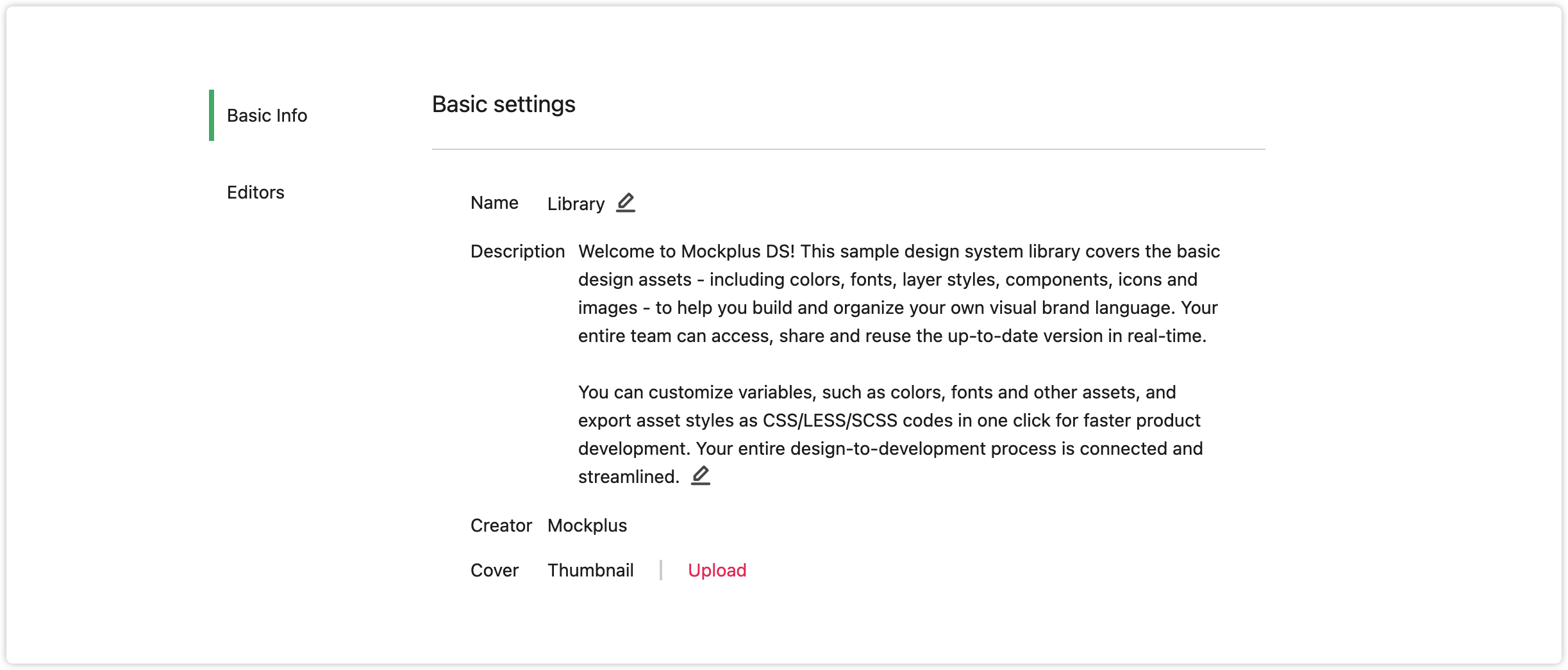
To change the library's settings, click "More" and "Information" on the cover of the library.
You can then change the basic settings of this library, such as its name and description.
Delete Library
Click "More" on the cover of a DS library and choose "Delete" to delete the DS library.
Asset Categories
After creating a library, you will be given six categories with which to gather and manage your colors, fonts, layer styles, components, icons, and images separately.
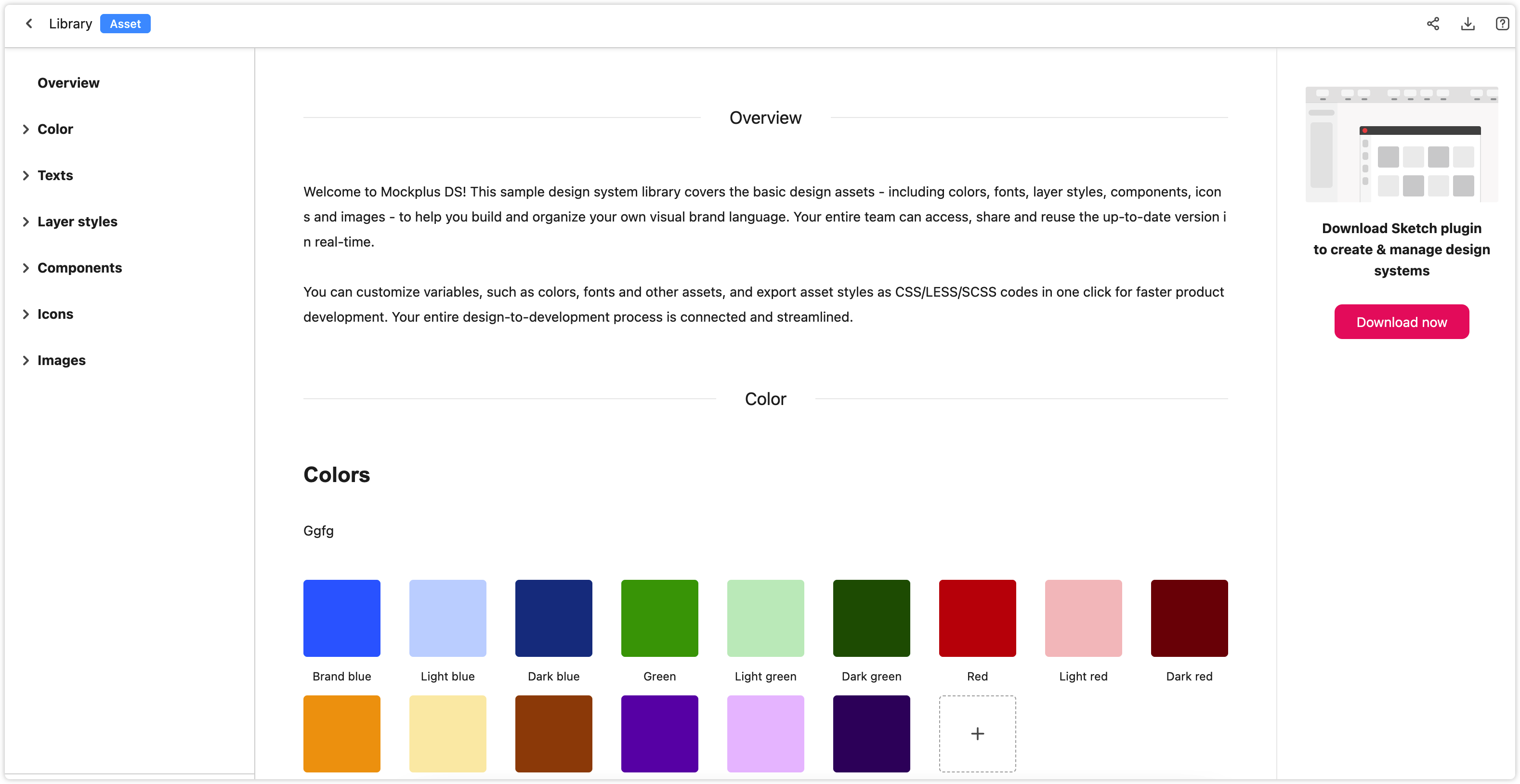
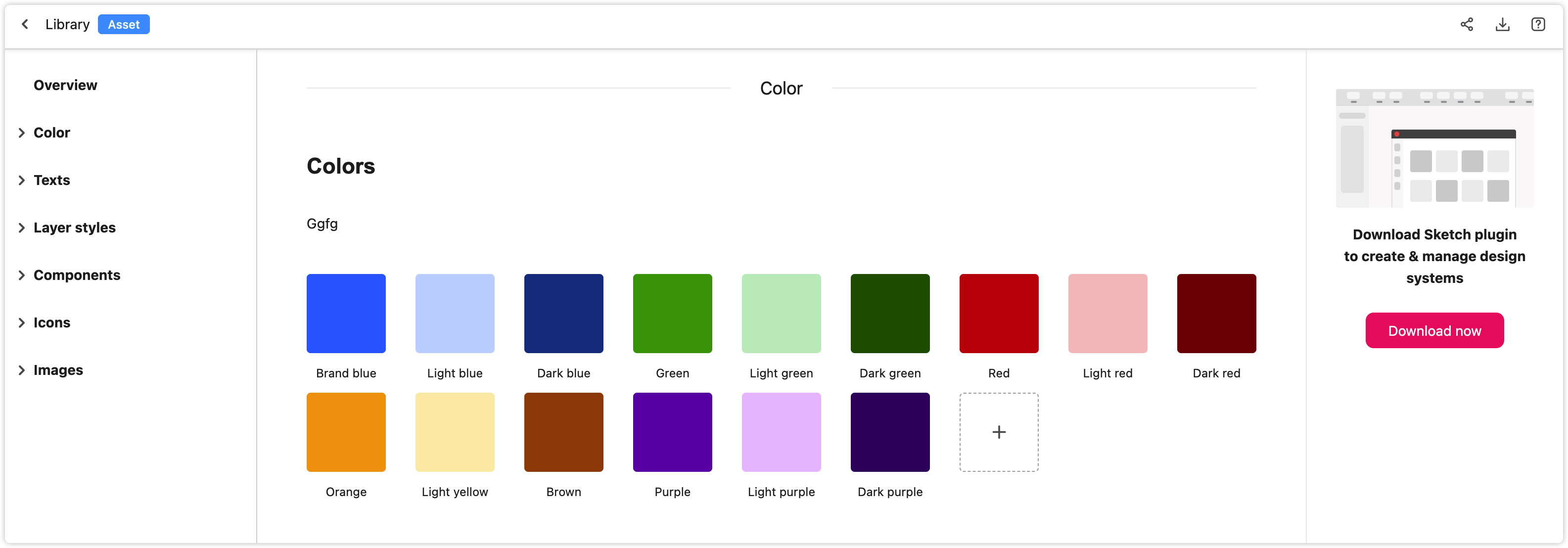
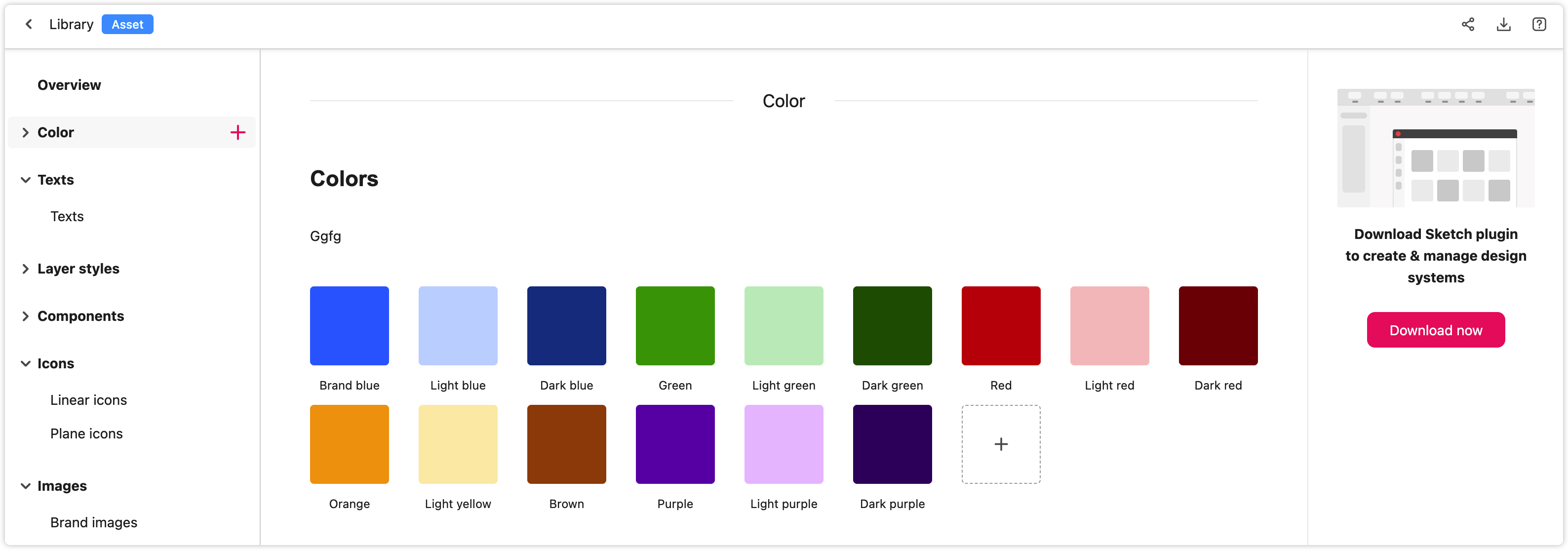
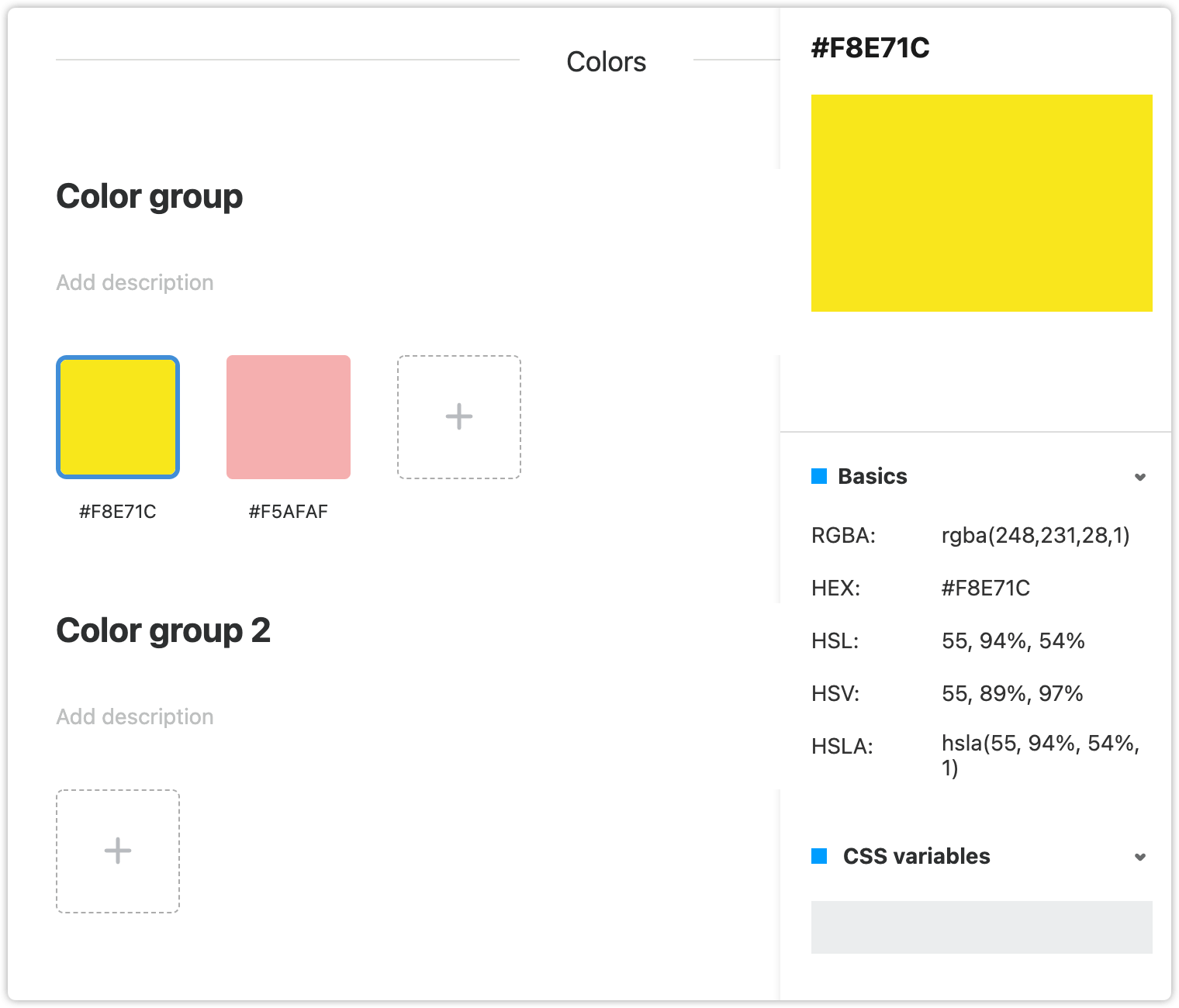
Colors
In order to build a unique brand identity, product teams customize a whole color system for their products and services. This way, they can apply these colors directly to different elements like texts, borders, and backgrounds to improve the site's ability to engage users.
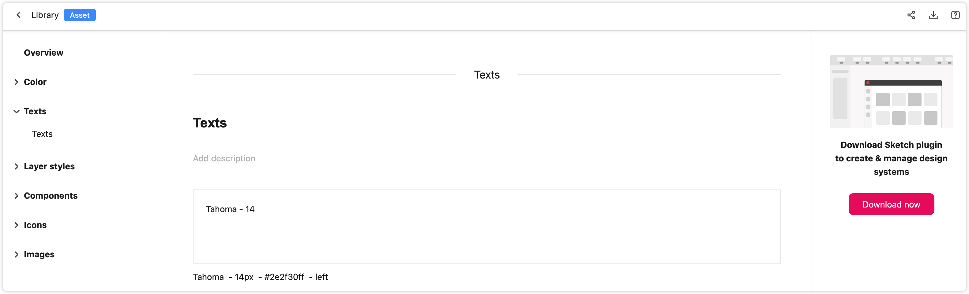
Fonts
Fonts are another element that is key to the creation of a unique brand identity. With the Mockplus Design System, you can create and reuse your own font systems.
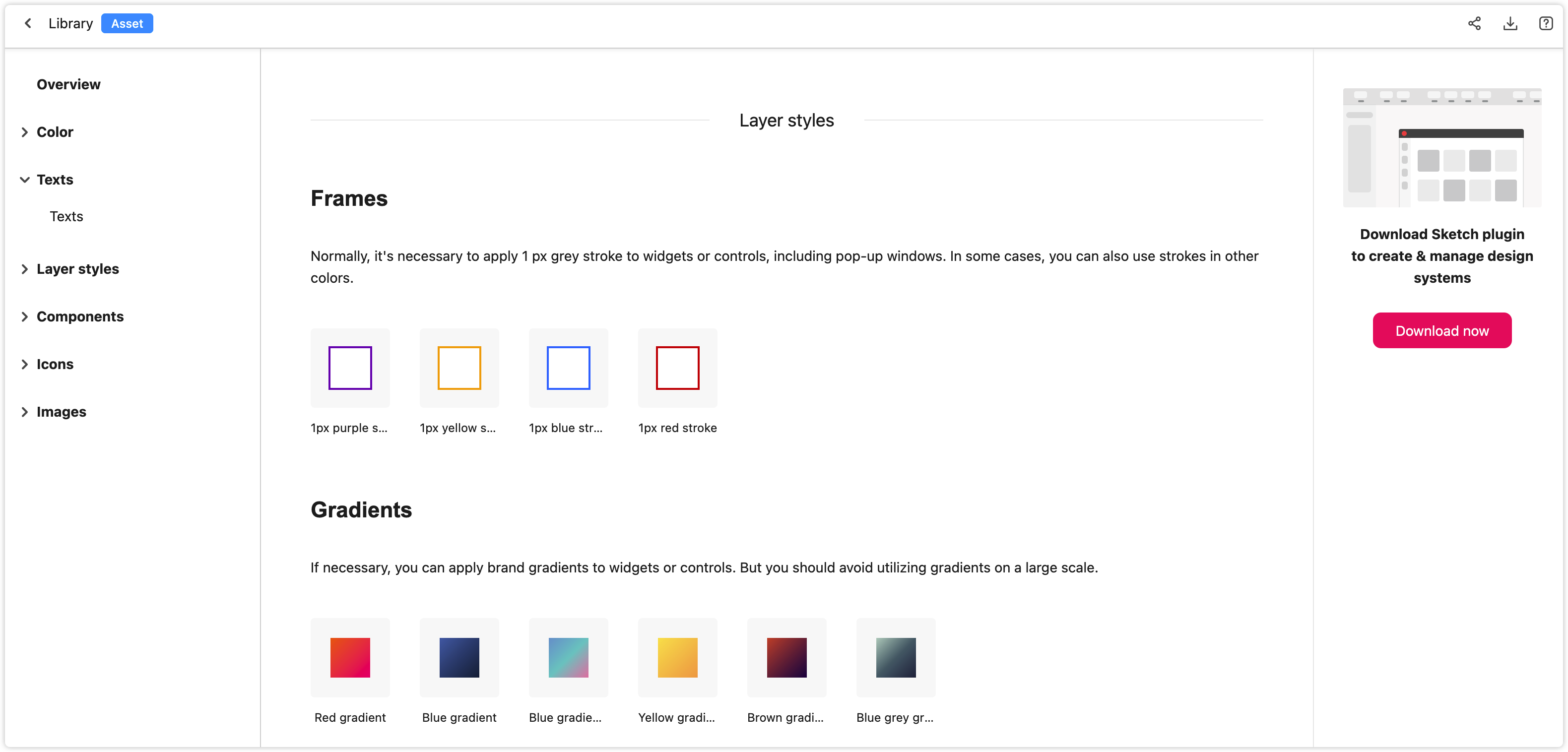
Layer Styles
Layer styles—such as element frames, shadows, and gradients—are frequently used in website or mobile design. With the Mockplus Design System, you can curate a layer style in your design tools and add it to the online libraries using our plugin. With some simple clicks, the layer style gathered in the online libraries can also be applied to any layer of your design tool.
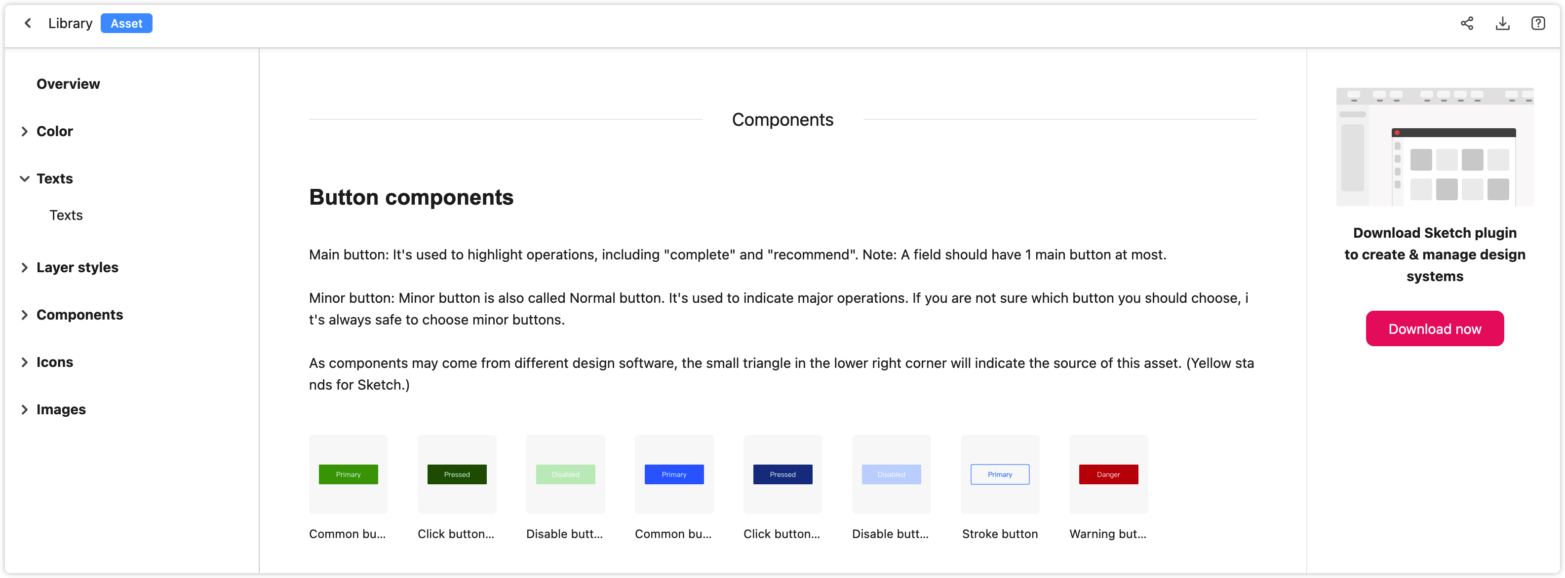
Components
You can import components to online libraries using our plugin. Once imported, any changes will be synced if you edit these components in your design tools.
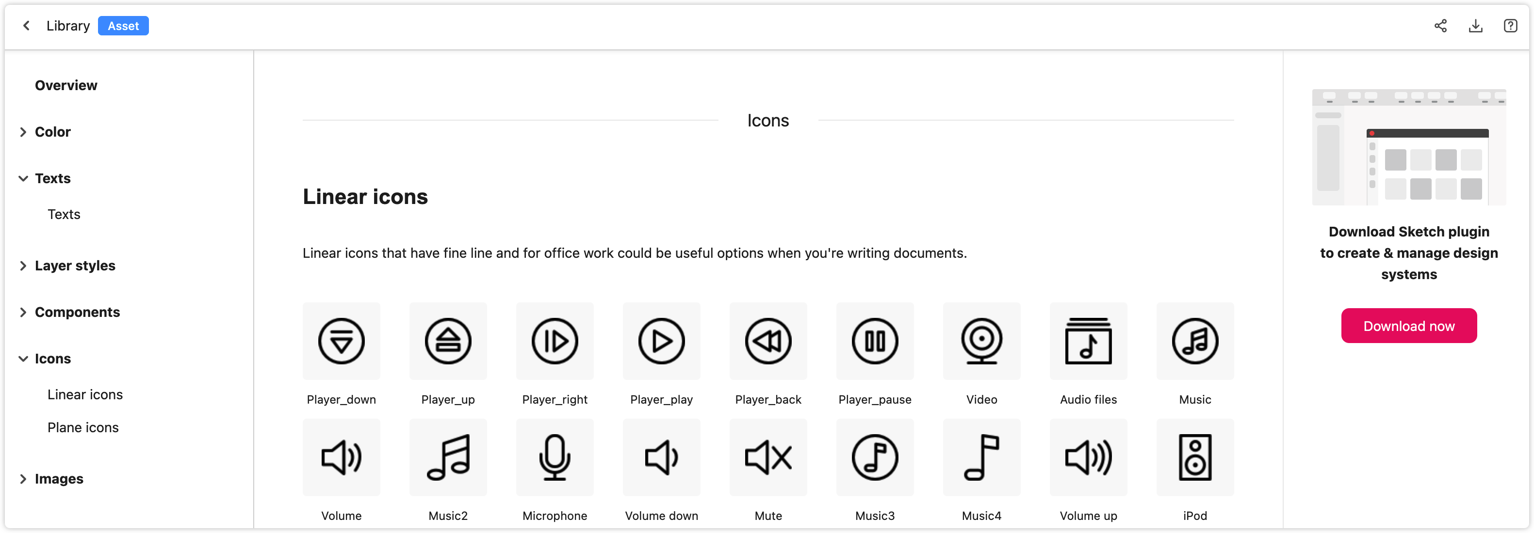
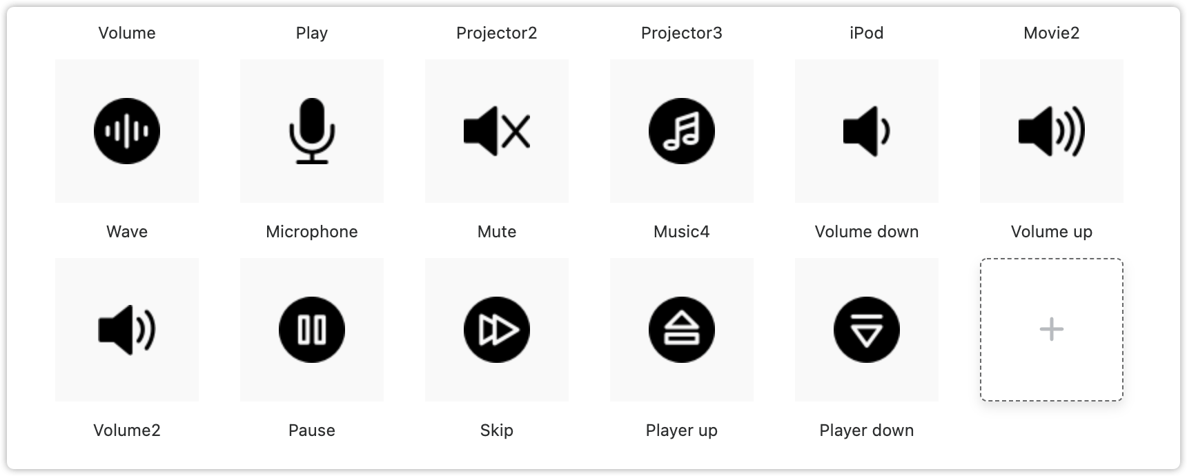
Icons
When developing software, icons are also widely used. With the Mockplus Design System, you can easily import different icons in both SVG and PNG formats.
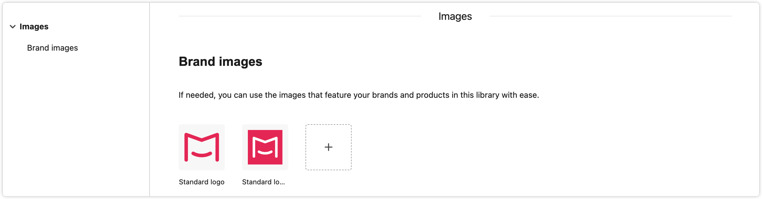
Images
As well as icons, you can also import images such as banners, and cover and background images. Many image formats, such as PNG, JPEG, JPG, SVG, and GIF, are supported.
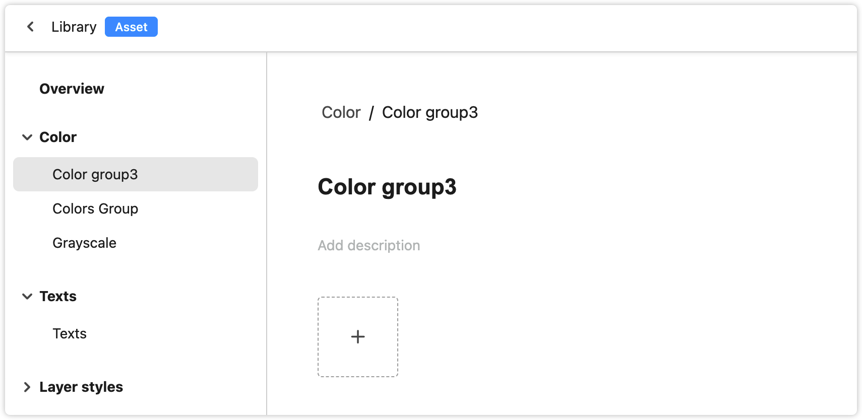
Asset Groups
To manage design assets better, you can create multiple groups under each category, and drag-and-drop these groups to reorder them.
Add Groups
When you create a design system library, you can find six categories on the left-hand panel, including colors, fonts, layer styles, components, icons, and images. If you hover over a group, a "+" icon will appear. Click the "+" icon to create a new group.
Rename Groups
To rename a new group, click on the group name in the workspace.
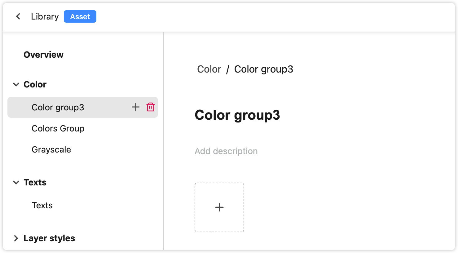
Delete Groups
On the left-hand panel, when you hover over a group, a trash can will appear. Click the icon to delete the group.
Edit Assets
Add Assets
There are two ways to add assets to your libraries. You can either add colors, images, or icons directly on the web or import fonts, layer styles, and components using our Sketch plugin.
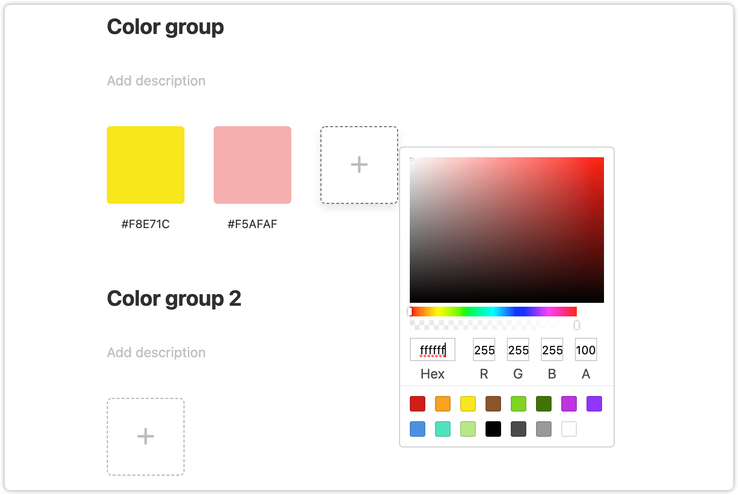
To add a color, select the color category and click "+." A color picker will then appear. You can select a color and click on the blank area outside the panel to add it to your palette.
When you switch to the Icon or Image category and click on the "+" icon, a window will appear to help you import an image (in PNG, JPEG, JPG, SVG or GIF format) or icon (in SVG or PNG format ) from local drives.
Rename Assets
The name of an asset is right below it. Double click on it if you want to rename it.
Add Description
You can add a description to illustrate a group more effectively and to enable team members to understand when and how this particular group should be used.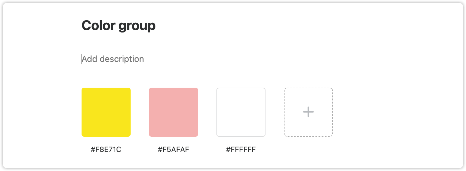
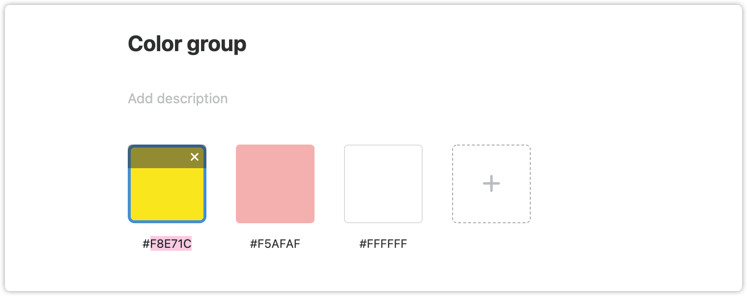
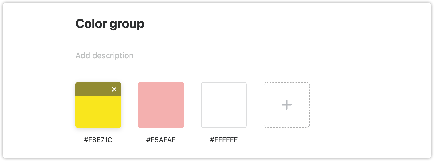
Delete Assets
When hovering over an asset, an "x" icon will appear. Click on this icon to delete the asset.
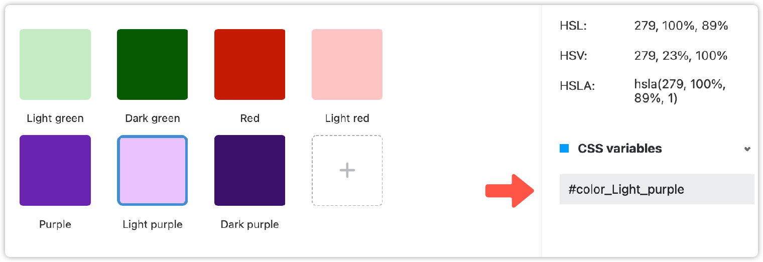
Asset Property Panel
When you click on an asset, the Property panel that showcases all details of this asset will appear on the right. This helps display many useful asset details, including the tags, asset name, sample picture, description, and CSS variables.
Edit CSS Variable Names
When clicking a color or font asset, you can customize the CSS variable name on the right-hand Property panel. Then, when you try to view or export the related style codes, these custom variable names will be automatically applied to the style codes.
Other Properties
The asset details vary depending on the asset you choose. From the Property panel, you can also check more details, including:
Name: The asset name;
Image: The sample image shows what the asset looks like;
Description: A short illustration that helps you explain how and when to use the asset.
Basics: This shows other basic properties, such as RGBA, HEX, HSL, opacity, size and name of the font, style, color, and row height of the font.
Tags: You can add tags to any asset which enables you and your team to find them easily with a search. If you enter a tag name when searching, any asset with that tag will be listed in the search results.
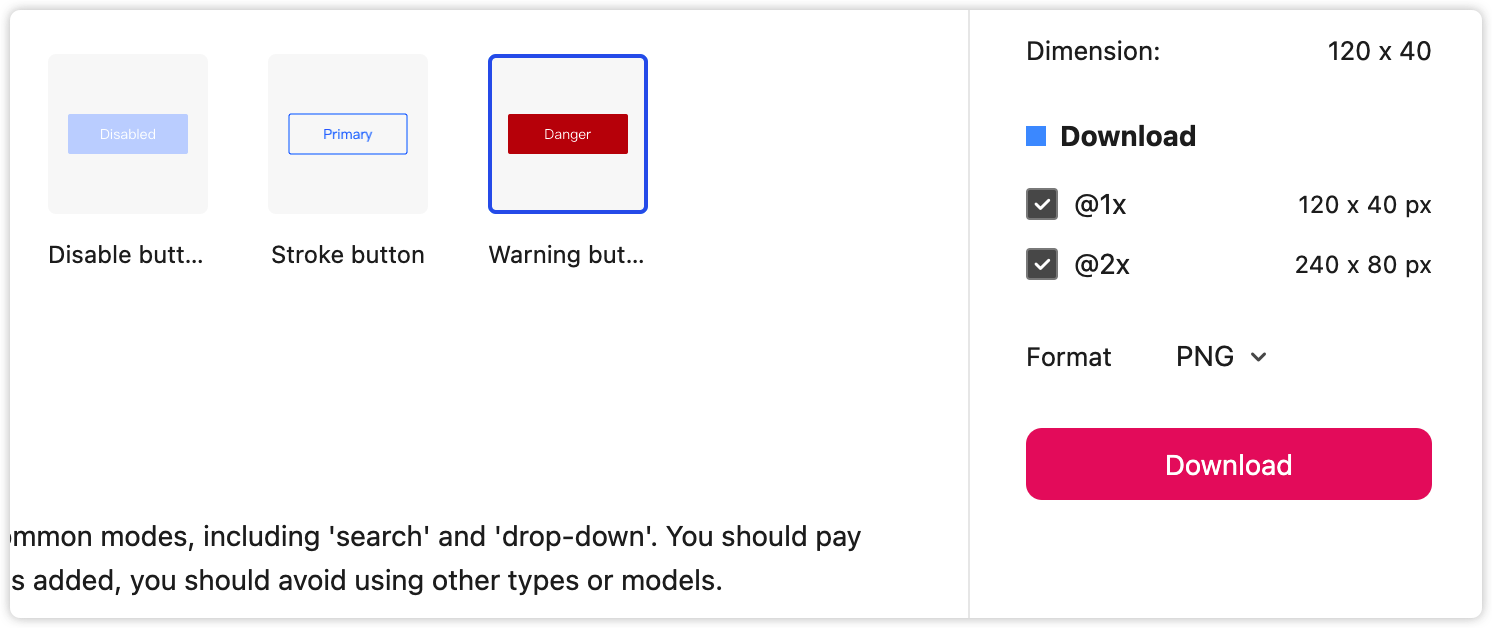
Select Pixel Densities
Download Assets at @1x or @2x
Click on an icon and select "@1x" or "@2x" in the Property panel to download it. (Note: SVG icons do not have resolution options.)
Click on an icon and select a desired format—such as PNG, WebP, or SVG—in the property panel to download it.
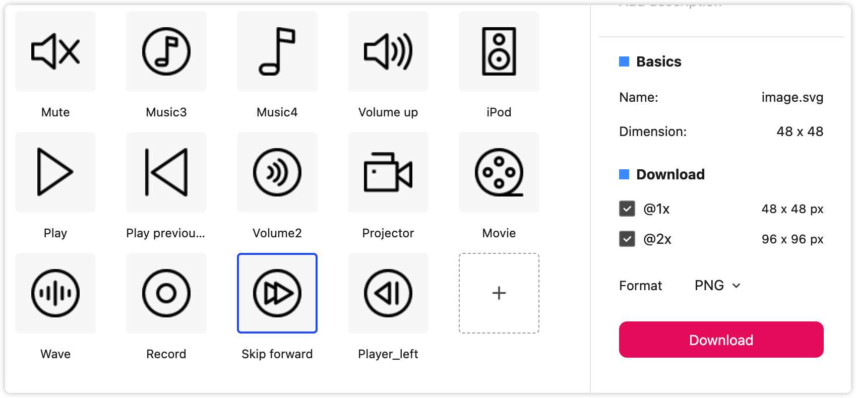
Download Assets
In the Mockplus Design System, assets including icons, images, and components—whether added online or imported using the Sketch plugin—can be downloaded in a PNG format.
To download assets, simply select an asset and click on "Download" in the Property panel.
Sync Assets
With the Mockplus Design System, it is a simple process to add assets directly online or import them using our plugin.
Either way, the asset data is synced simultaneously. Any changes in the plugin are auto-synced to the online libraries. So, when you edit assets in the plugin, your team members will be able to access the up-to-date version.