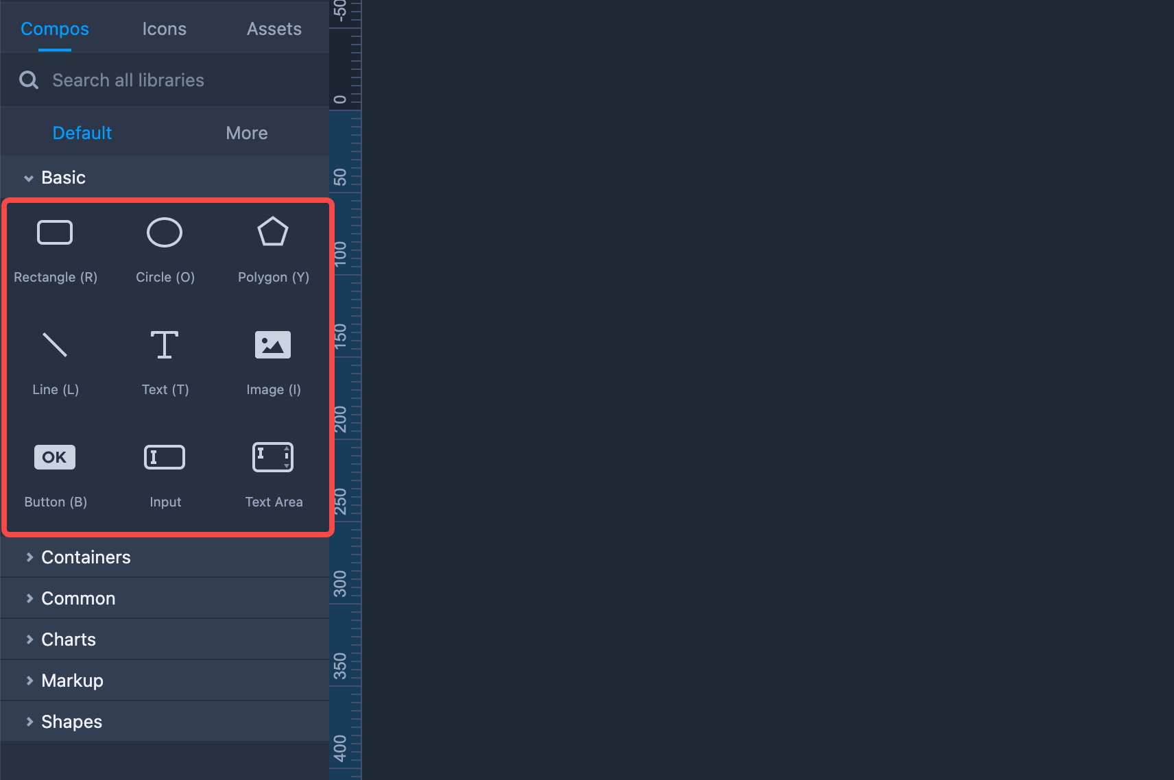
Mockplus RP comes with a variety of frequently used components and shapes. You’ll find them in the "Components" tab, located on the left-hand panel. With these ready-to-use components it is easy to get started wireframing and prototyping.
Rectangle
Here are a few tips to help you get the most out of the "Rectangle" component:
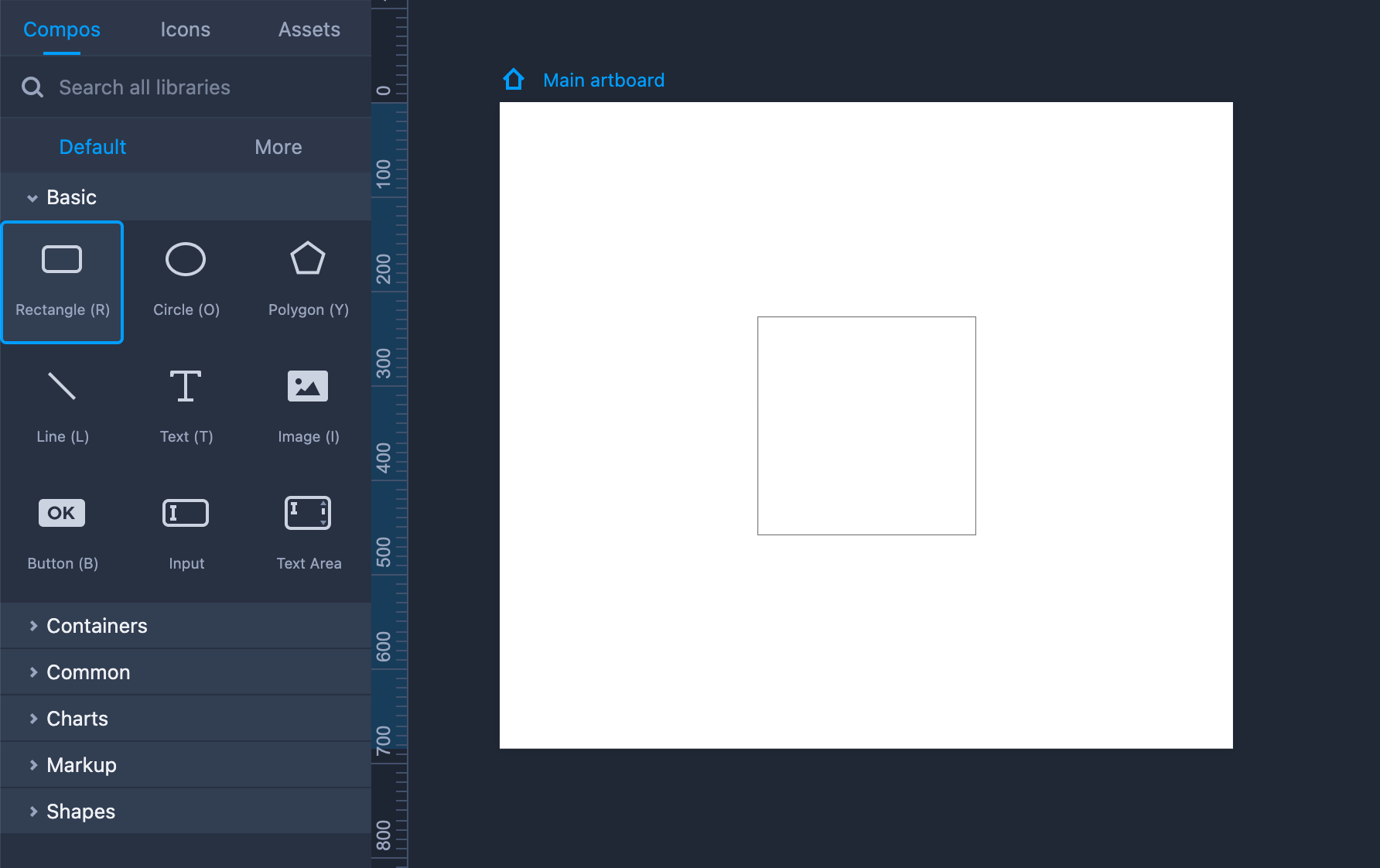
Add a Rectangle to your design by dragging it onto the workspace (Shortcut key: R).
Hold "Shift" to maintain the same aspect ratio while resizing the Rectangle.
Double click the Rectangle or click "Enter" to add text to the component.
Property Settings
You can set the text styles of the Rectangle on the right-hand Property panel. The other properties, such as the opacity, fill color, border, shadow, and corner radius can also be adjusted on that panel.
You can also show or hide the four borders separately.
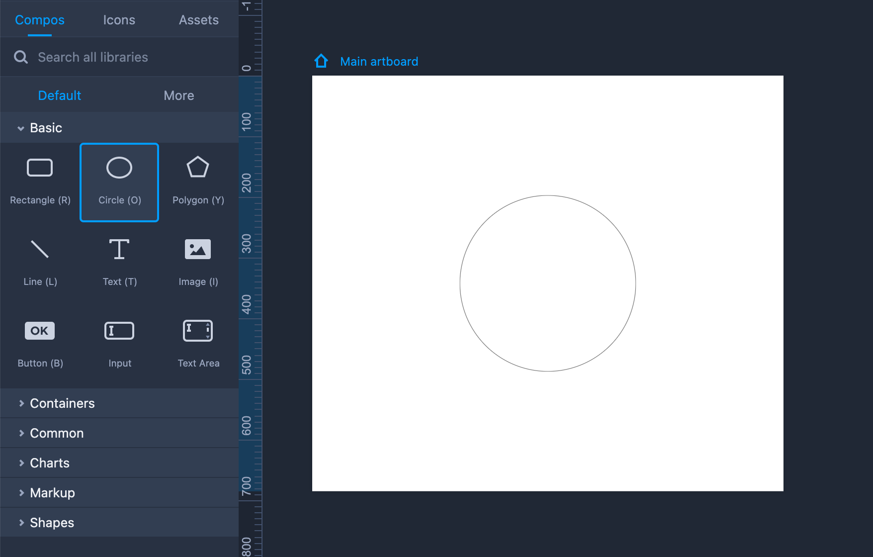
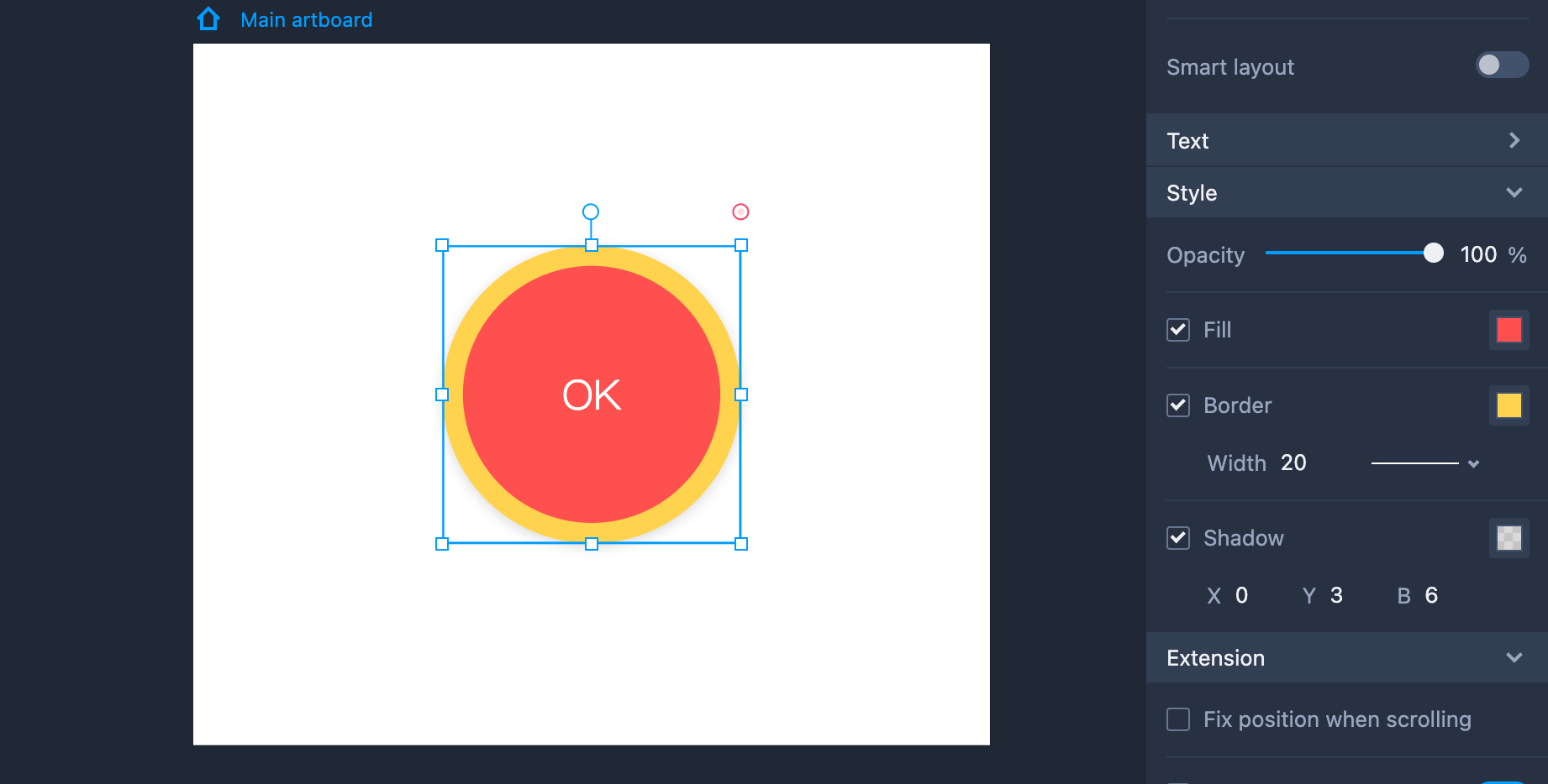
Circle
And now some tips to help you with the "Circle" component:
Add a Circle to your design by dragging it onto the workspace (Shortcut key: O).
Hold "Shift" to maintain the same aspect ratio while resizing the Ellipse.
Double click the Circle or click "Enter" to add text to the component.
Property Settings
You can set the text styles of the Circle component on the right-hand Property panel. Other properties, such as opacity, fill color, border, and shadow can also be adjusted there.
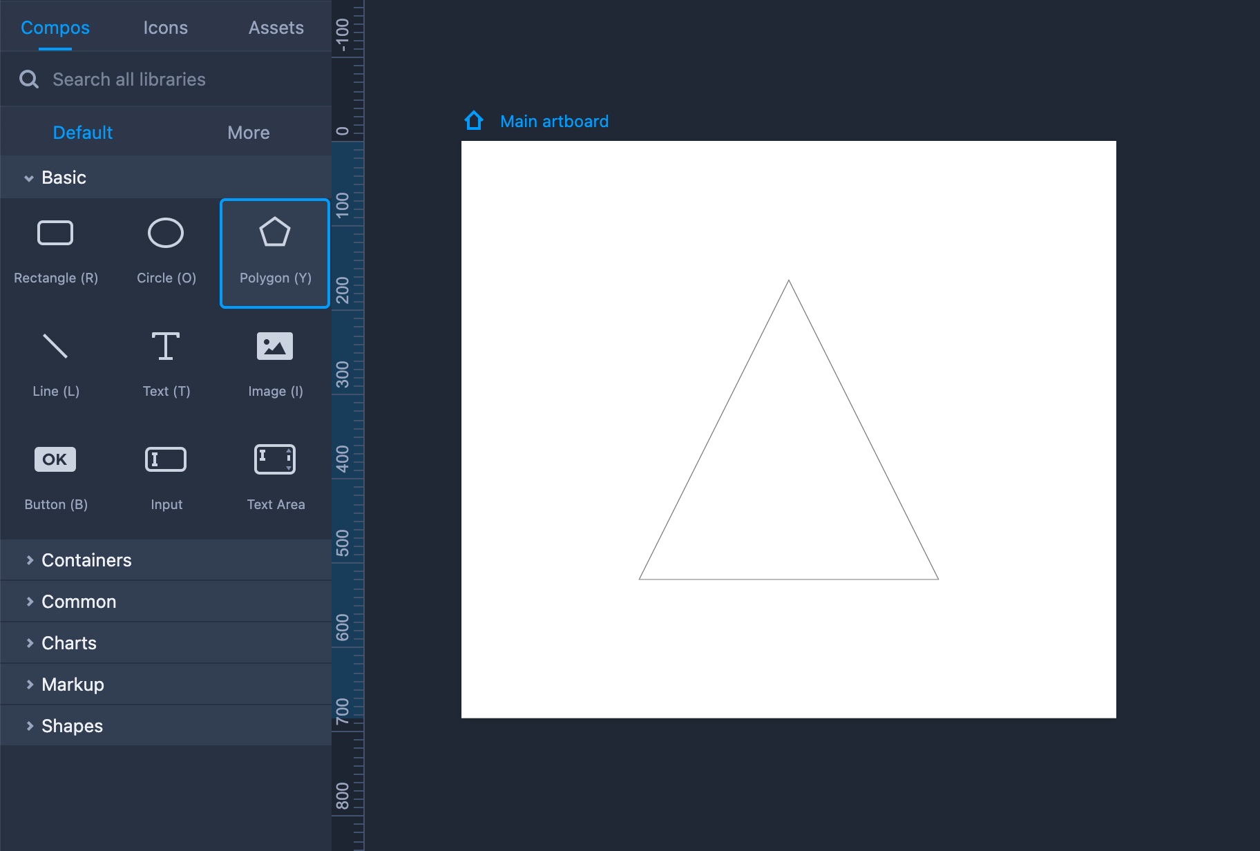
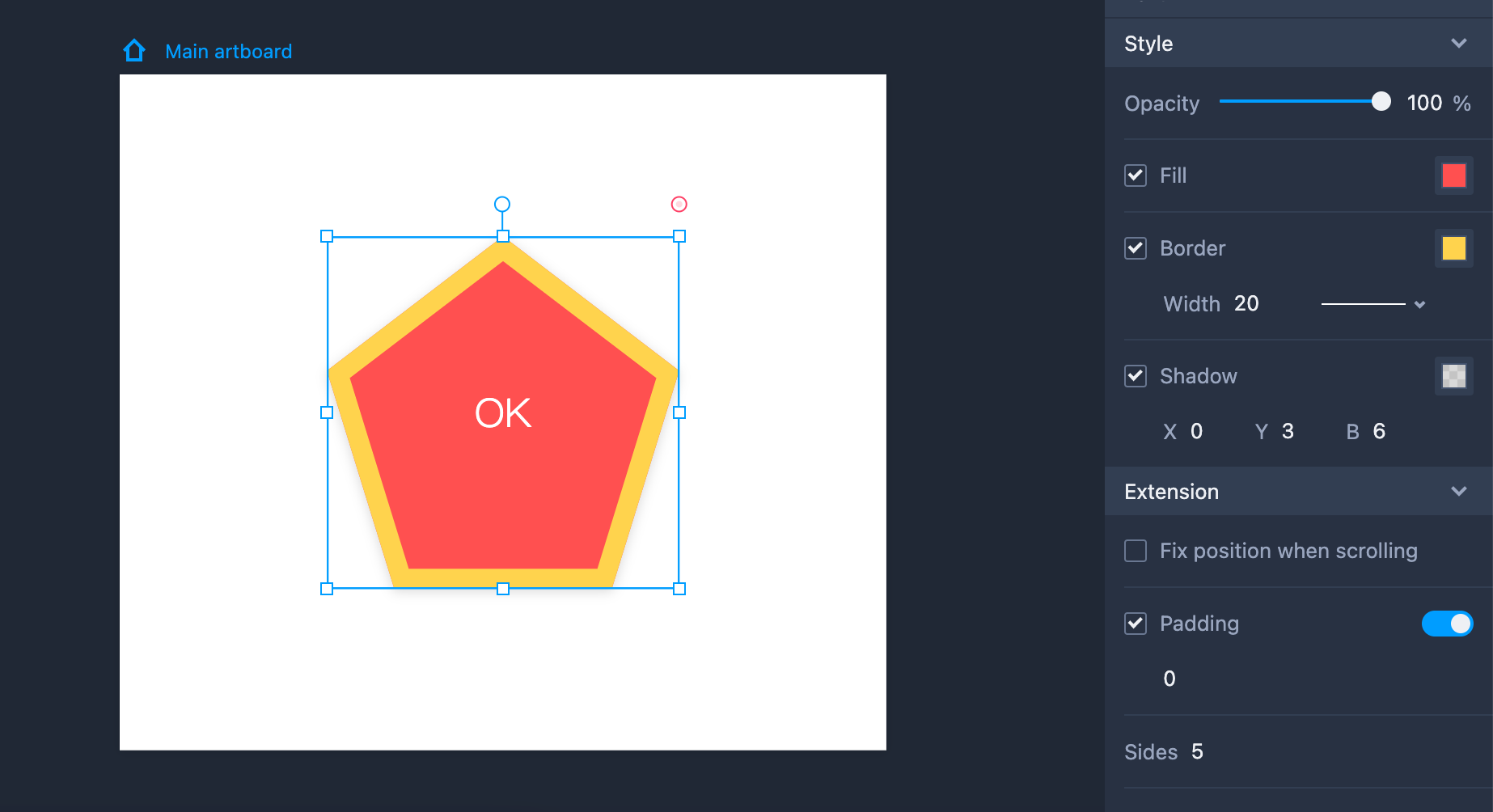
Polygon
The "Polygon" component enables you to add a polygon to the artboards with a customized number of sides. You can use "Polygon" component as follows:
Add a Polygon to your design by dragging it into the workspace.
Hold "Shift" to maintain the same aspect ratio while resizing the Polygon.
Double click the Polygon or click "Enter" to add text to the component.
Property Settings
Use the right-hand Property panel to style the Polygon component with the following properties: fill color, border, shadow, and side. You can customize the number of sides for your Polygon on the same panel.
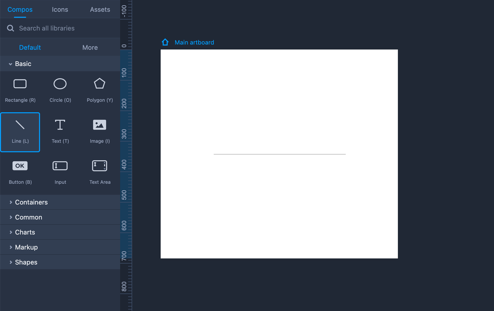
Line
You can use the "Line" component in the following ways:
Add a Line to your design by dragging it into the workspace (Shortcut key: L).
Hold "Shift" to adjust the Line direction or to stretch it.
Double click the Line or click "Enter" to add text to the component.
Property Settings
You can define the text styles of the Line component on the right-hand Property panel. Here you can also edit the line’s opacity, border, shadow, and other properties.
You can add an arrowhead to your line in the "Extension" section.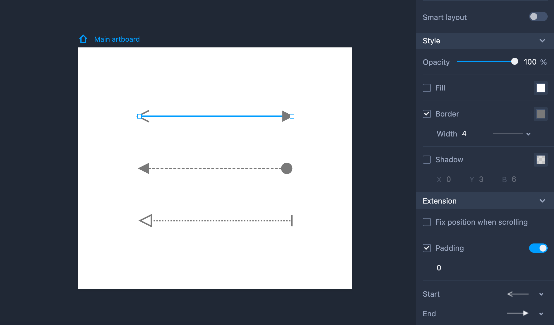
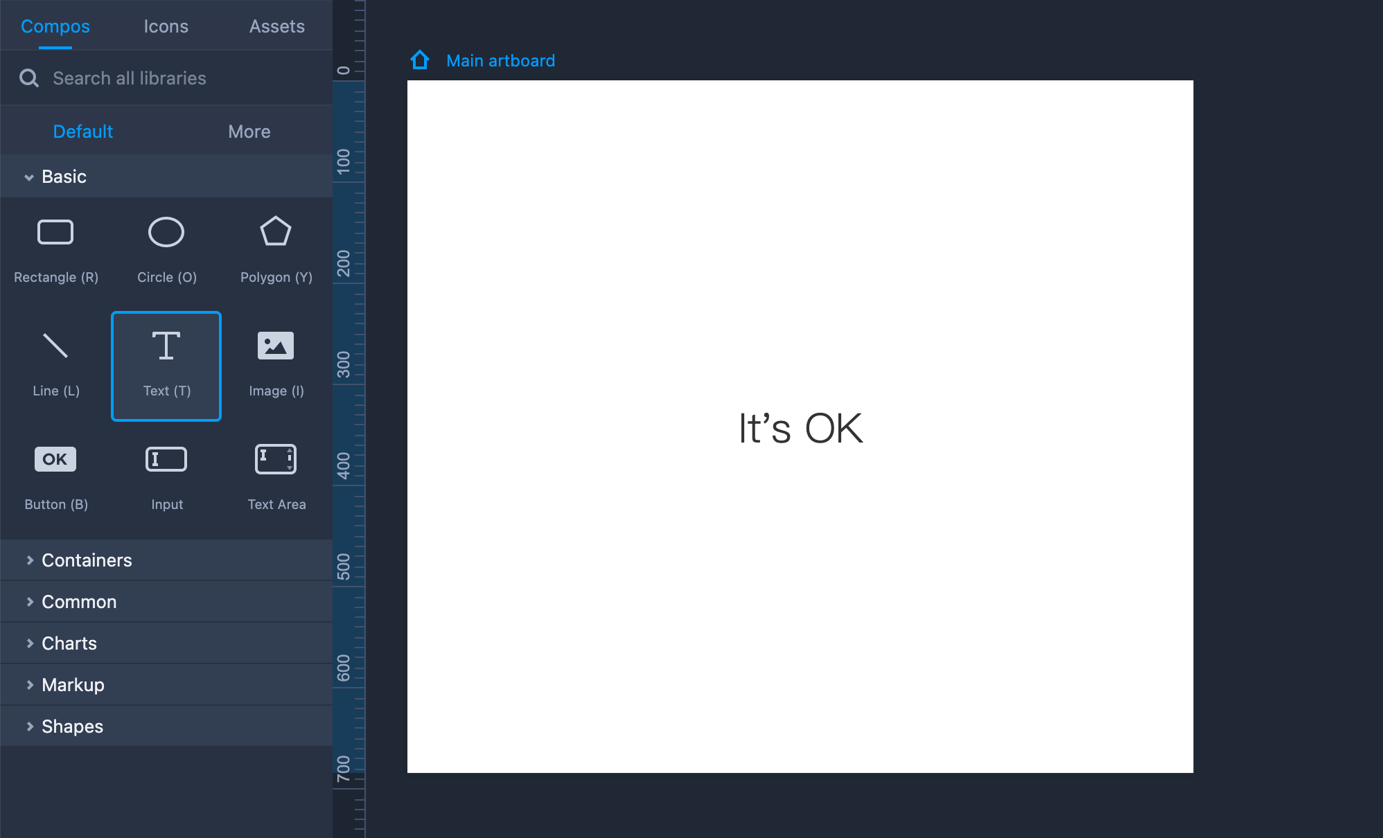
Text
Mockplus RP provides a "Text" component to add one or multiple lines of text, along with rich-text tools and auto text-filling features.
You can use the "Text" component in the following way:
Add text to your design by dragging it into the workspace (Shortcut key: L).
Edit text content by clicking the "Enter" key or double clicking.
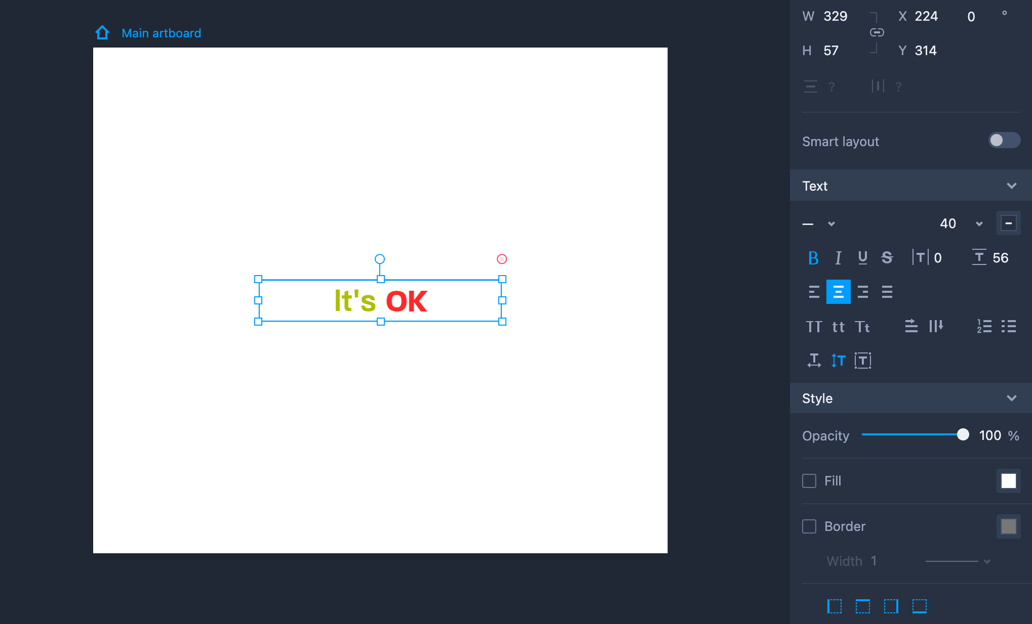
Property Settings
The Text components can be styled on the right-hand Property panel with the following properties: font, color, text indentation, vertical alignment, opacity, shadow, border, and so forth.
You can also edit parts of your text separately.
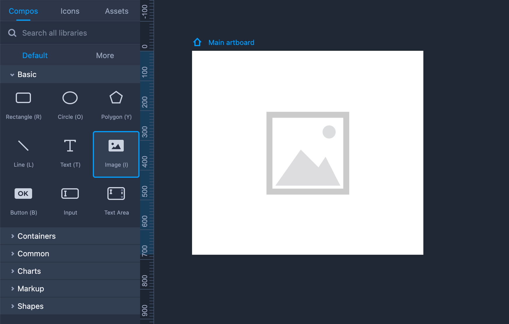
Image
This is how you can use the "Image" component:
Add an Image to your design by dragging it into the workspace (Shortcut key: I).
Hold "Shift" to maintain the same aspect ratio while resizing the Image.
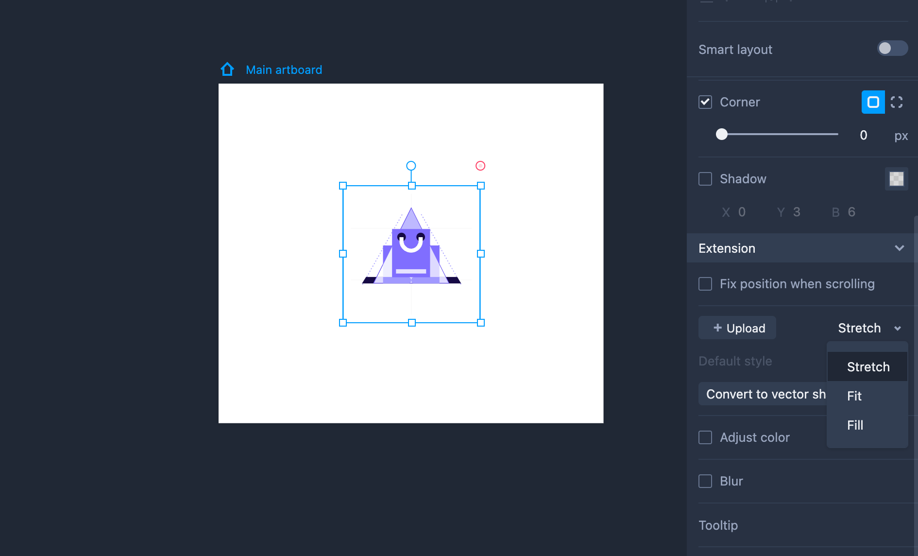
Property Settings
You can switch between different image fill modes in the "Extension" section: Stretch, Tile, Fit, Fill.
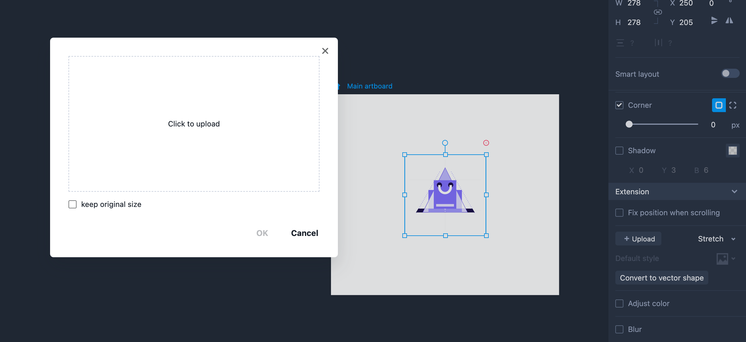
Upload Images
Use the image component to import both static images (PNG, JPG) and animated GIFs.
Drag an image component onto your artboard and click "Enter" to upload it. Once uploaded, you can choose whether to keep the original size of the image.
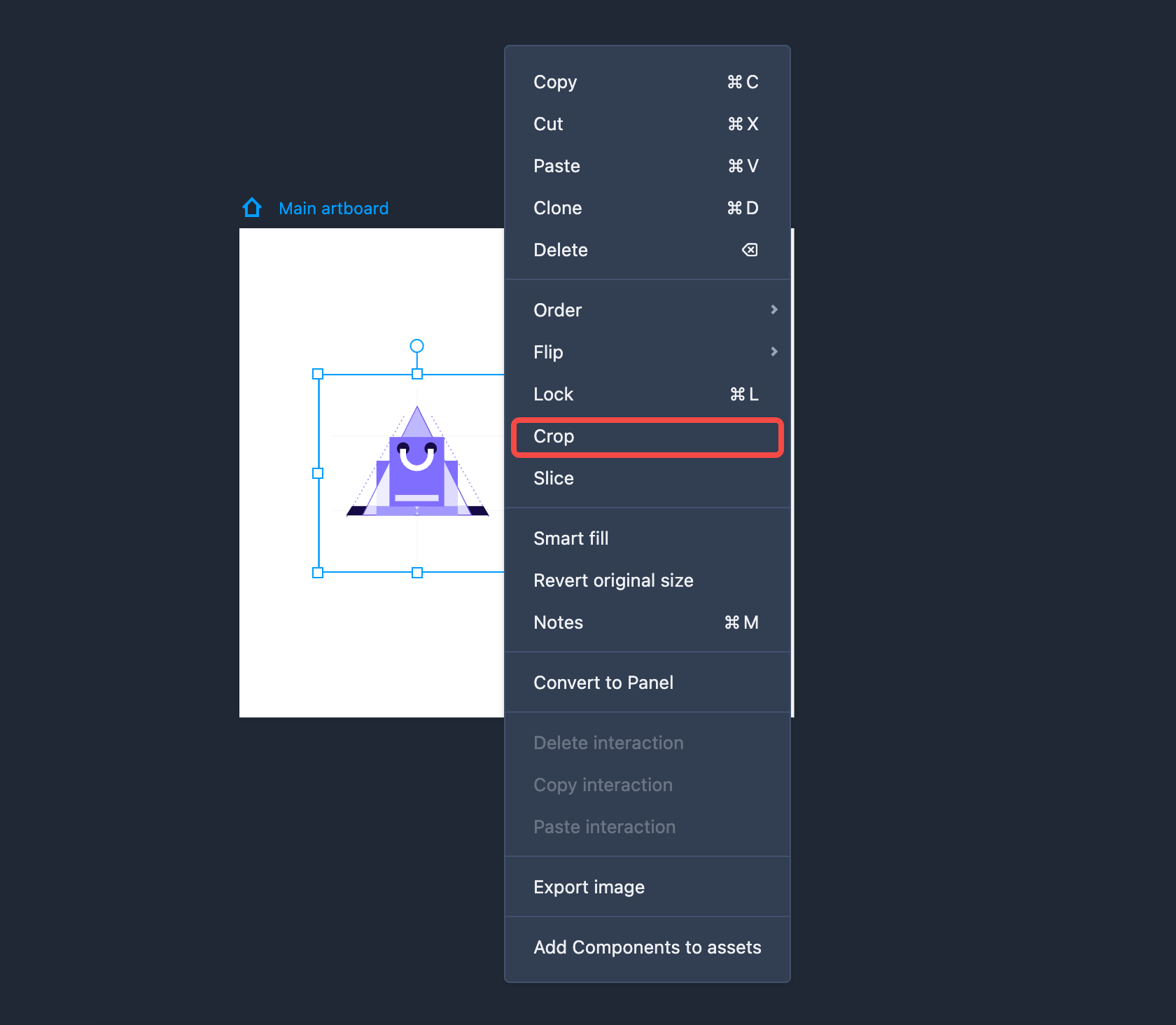
Crop Images
You can resize and crop an uploaded image by right clicking the image and choose "Crop" from the right-click menu to enter the editing mode.
Then, adjust the rectangle to select your desired image area and click "Crop" or "Enter" to confirm the cropping.
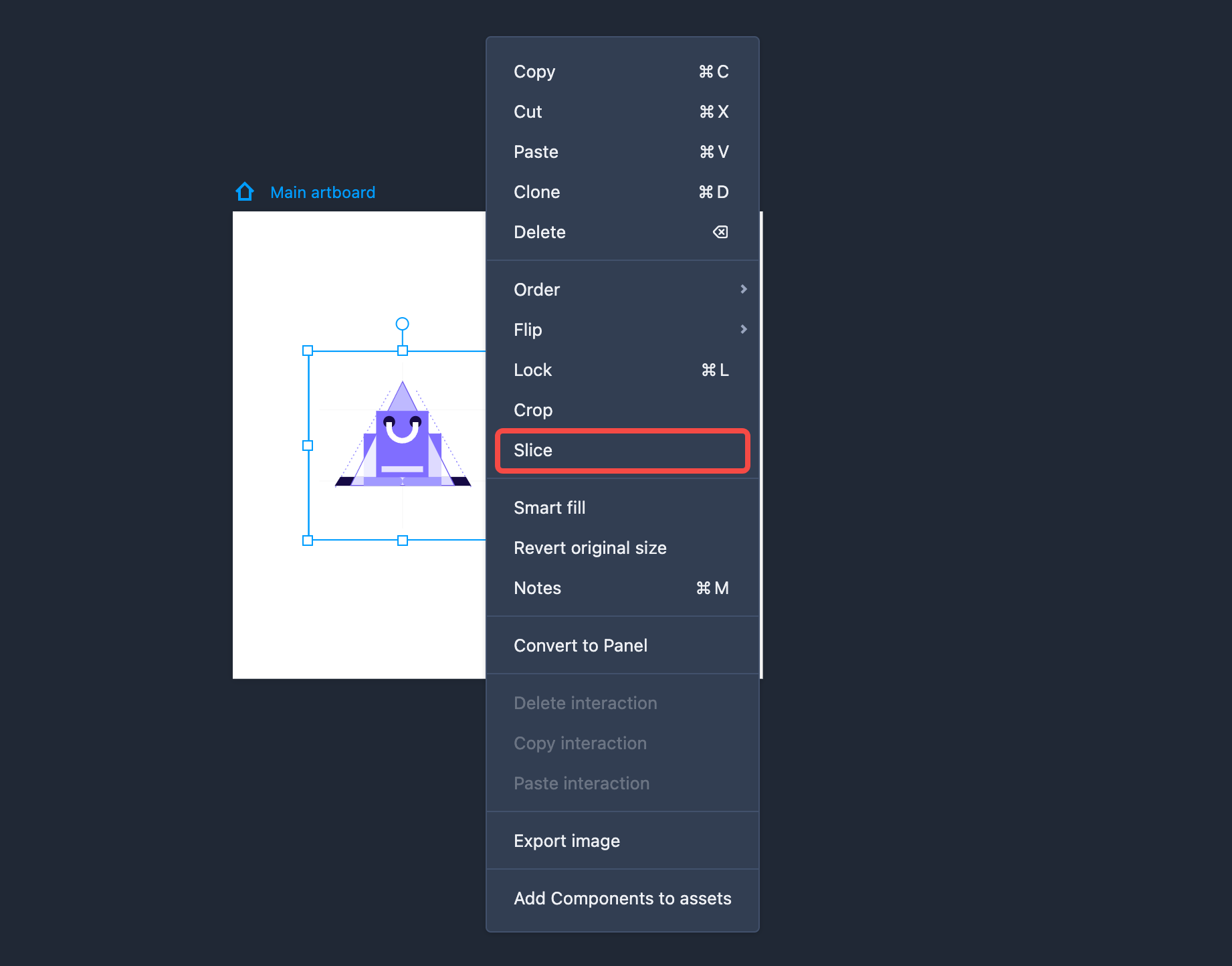
Slice Images
Right click on the image you want to slice and press Slice. This will then slice your image into four portions. You can then freely adjust the size and position of these portions however you need.
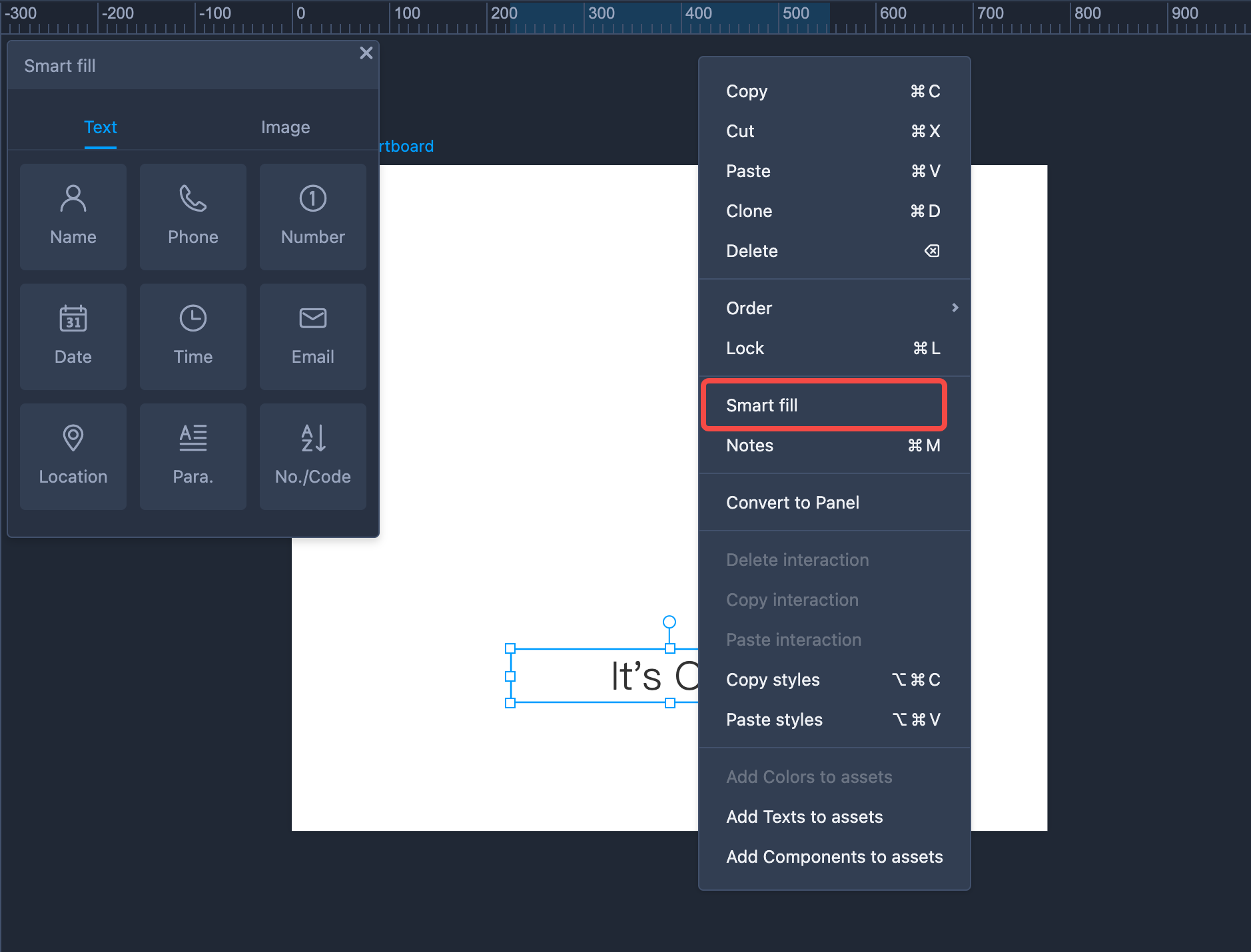
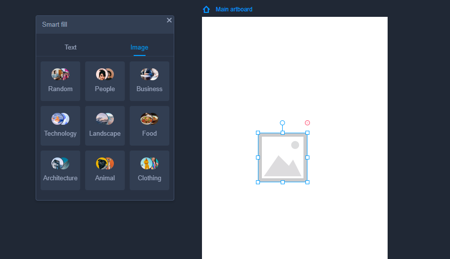
Smart Fill
If you've added a bath of text or image components, and do not have time to fill them all individually, try our "Smart Fill" features, allowing you to auto fill them all with just clicks.
Simply right click the text or image component and choose "Smart fill" from the right-click menus.
And then, for text components, you can choose from 9 different types of content to suit your design needs, such as names, phone numbers, dates, email addresses, paragraphs, and more.
When selecting an image component, you’ll find a variety of options, including categories like business, technology, landscape, food, animals and more.
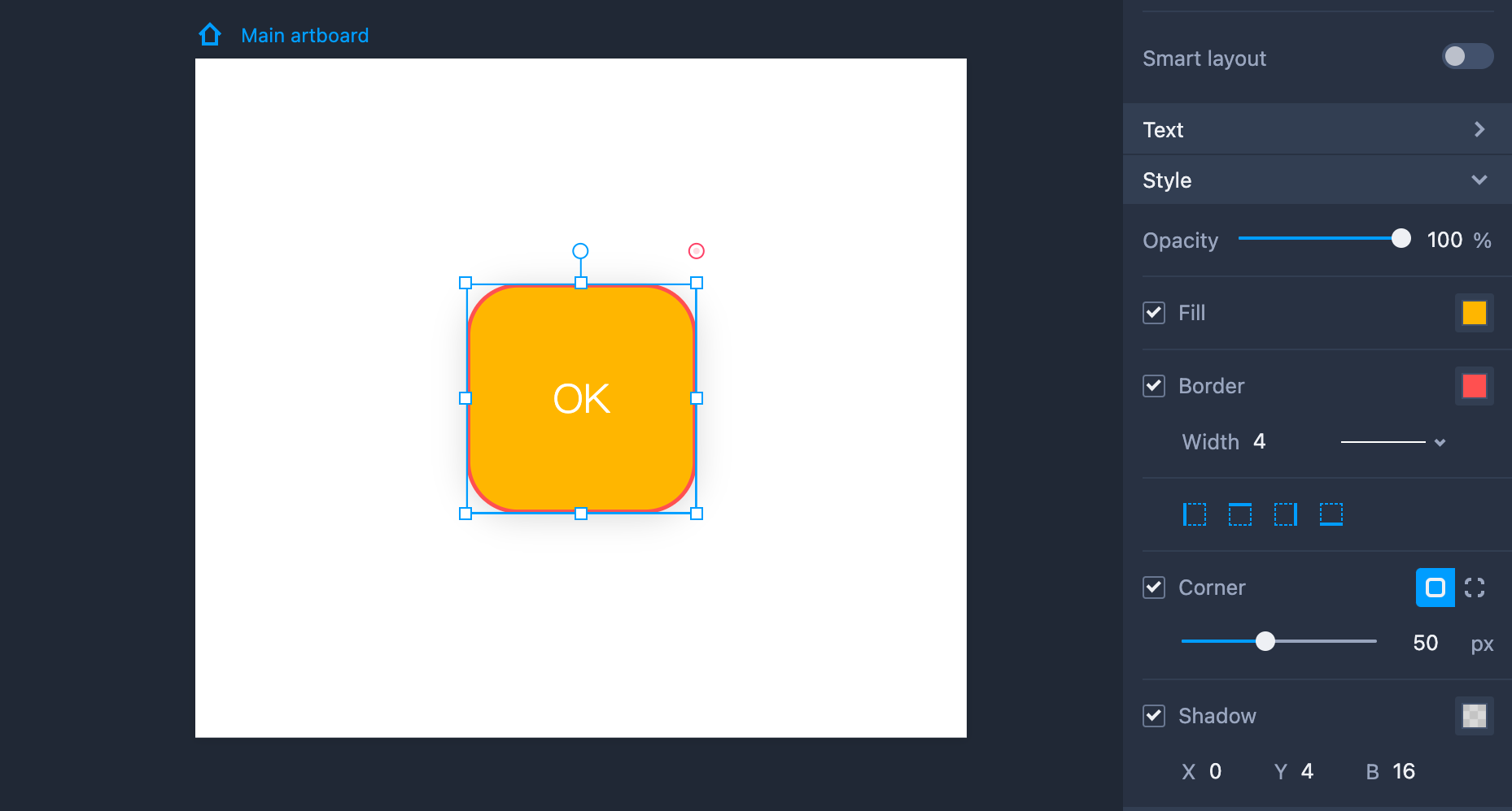
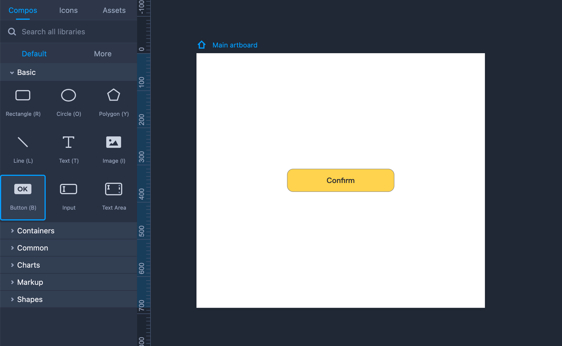
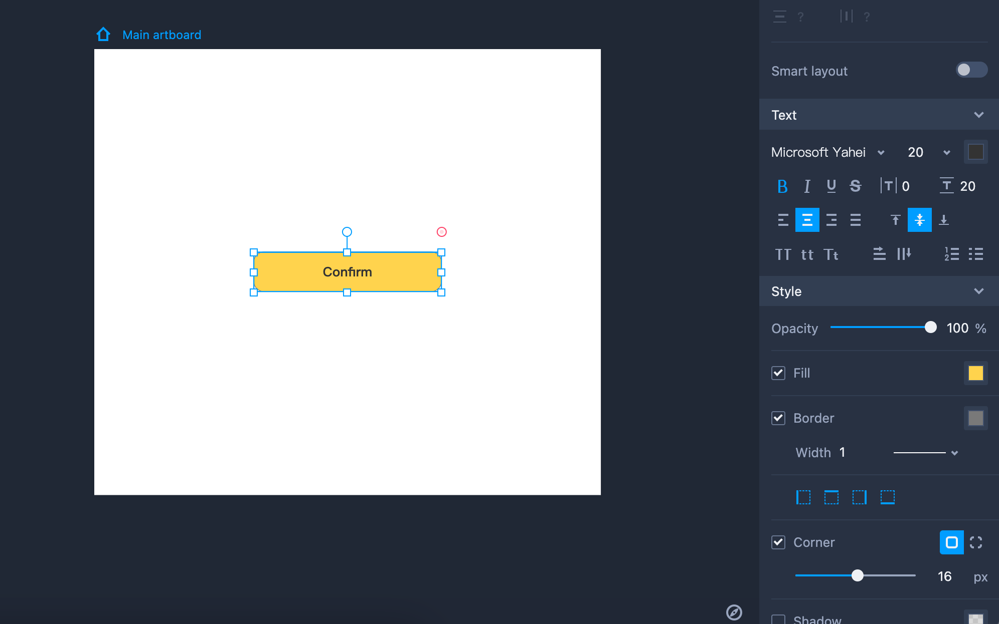
Button
Buttons are used widely in web/app user interfaces. Mockplus RP offers button components with rounded corners by default.
Here are some tips to get the most out of the "Button" component:
Add a Button to your design by dragging it into the workspace (Shortcut key: B).
Hold "Shift" to maintain the same aspect ratio while resizing the Button.
Double click the Button or click "Enter" to add text to the component.
Property Settings
The Button can be styled with the following properties on the right-hand Property panel: text color, fill color, border, shadow, and corner radius, and so forth.
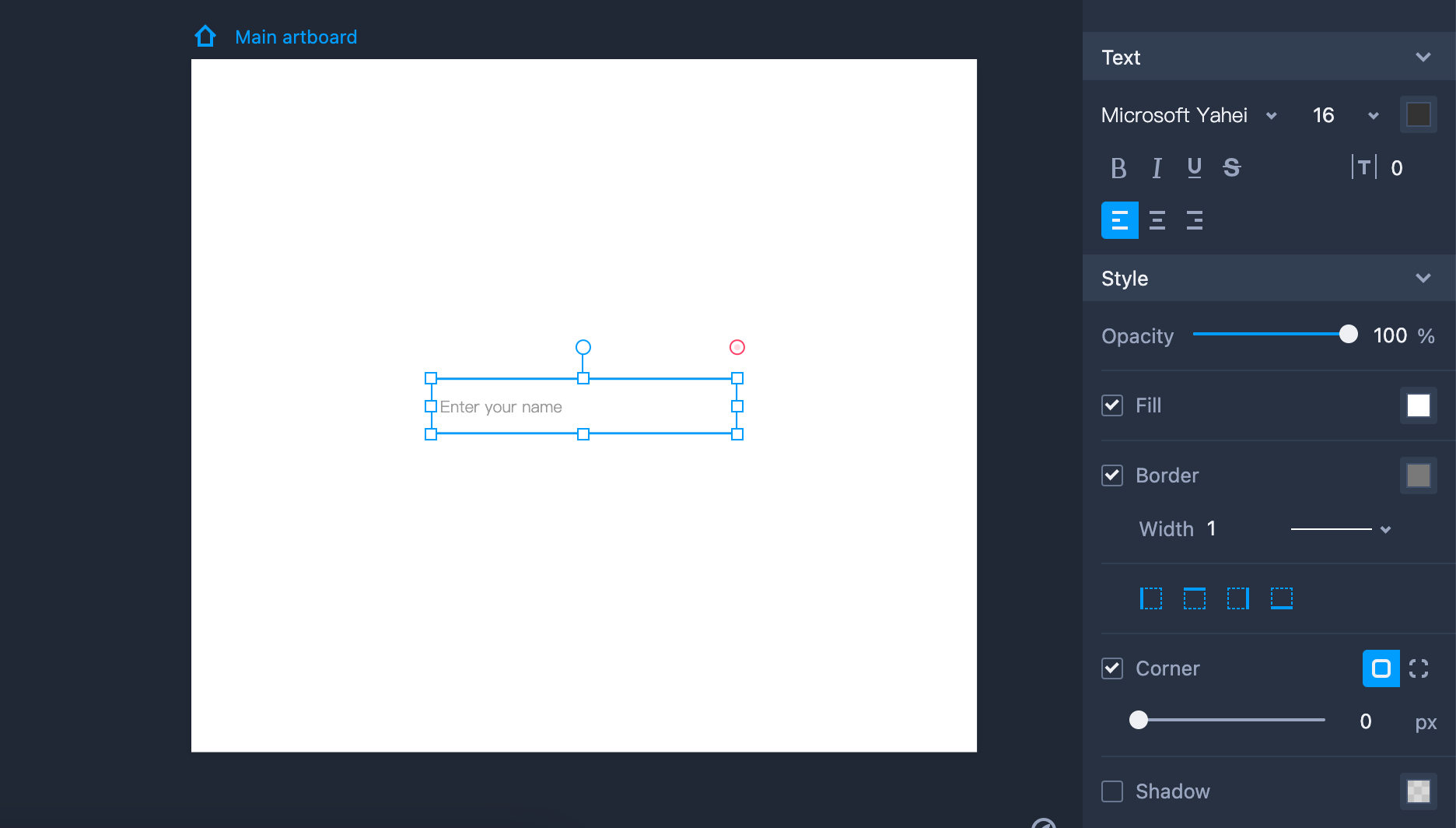
Input Box
Here are a few tips for using the "Input Box" component:
Add an Input Box to your design by dragging it into the workspace.
Hold "Shift" to maintain the same aspect ratio while resizing the Input Box.
Double click the Input Box or click "Enter" to add text to the component.
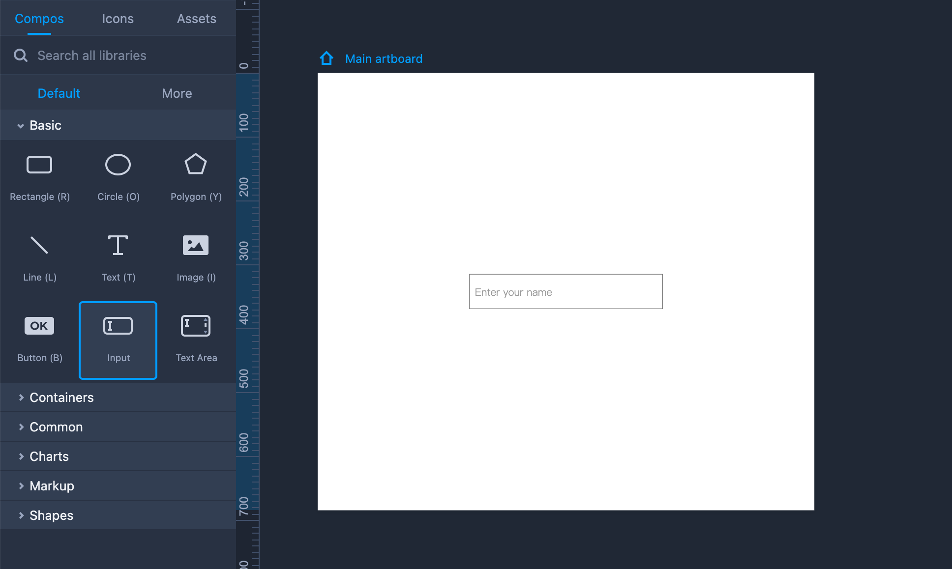
Property Settings
This component can be styled using the right-hand Property panel. The following properties are available: opacity, border, shadow, corner radius, and more. Text can also be placed here.
You can choose an input type in the "Extension" section: Text, Password, or Number.
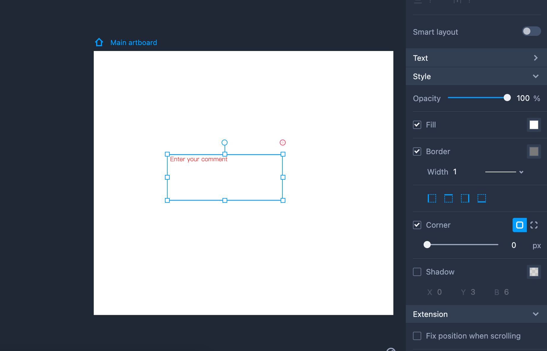
Text Area
Some tips for using the "Text Area" component:
Add a Text area to your design by dragging it into the workspace.
Hold "Shift" to maintain the same aspect ratio while resizing the Text Area.
Double click the Text Area or click "Enter" to add text to the component.
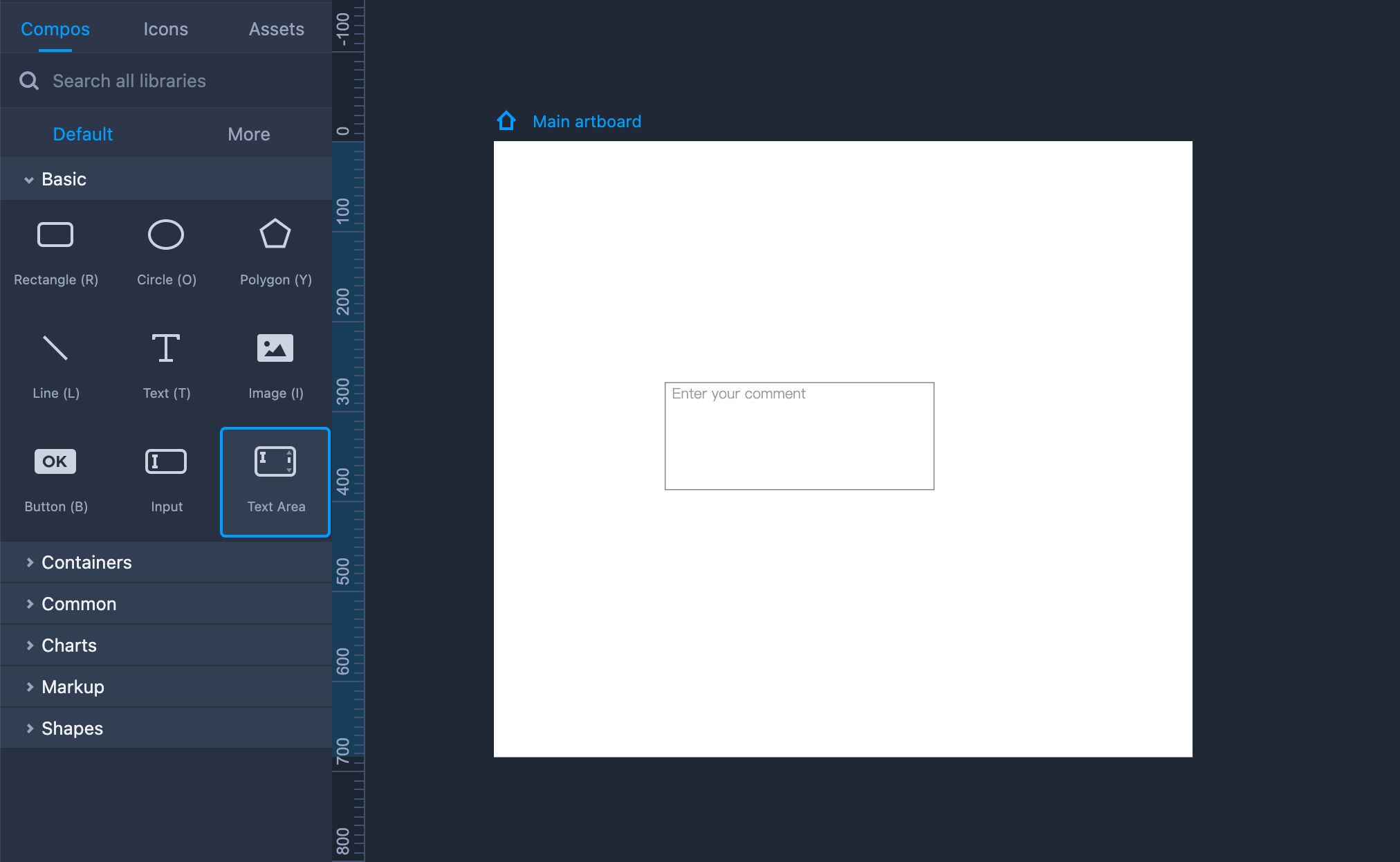
Property Settings
This component can be styled on the right-hand Property panel with the following properties: text style, opacity, border, shadow, and fill, and more.