You can set different states for your components or groups on this panel. Different component states can also have different property settings.
Click on "Show/Hide state panel" (on the top toolbar) to show or close the panel.
Click on "+" (in the upper right corner) to choose a state from the drop-down list.
Please note that you cannot choose more than two of them at a time.
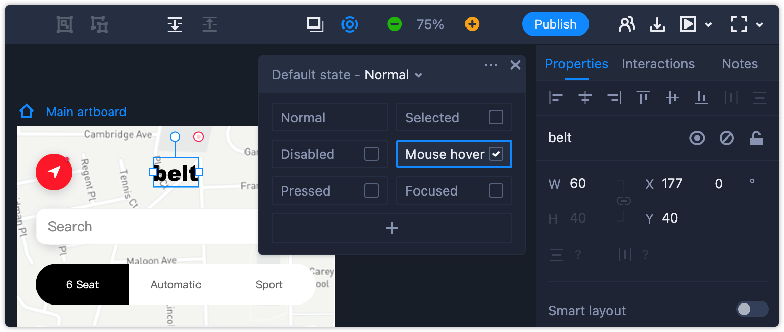
Apart from the Normal state, you can delete the other states. There are also options to rename or clone them.
When you group components with different states, the newly-created group will also keep the states that you’ve already made, without needing to rebuild the component state all over again.
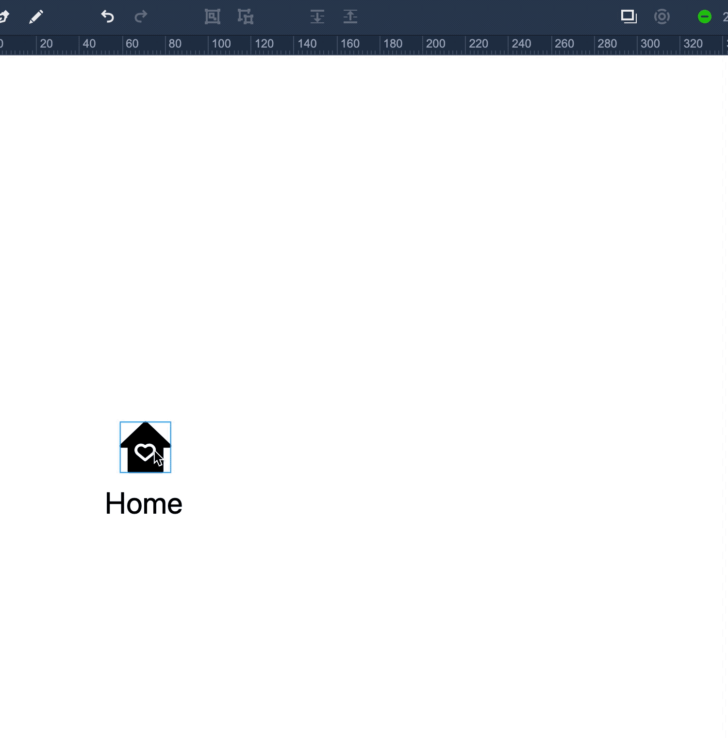
Let's take a bottom tab bar for an app design as an example. Drag the icons and label components onto the artboard, set the state you need for them to be in as usual, and then group the components together. You'll see all component states are still working in the new group.