


Column Chart
Column charts are most often used to create interactive data visualizations with easy to read data in vertical bars with two axes. To use the Column Chart component:
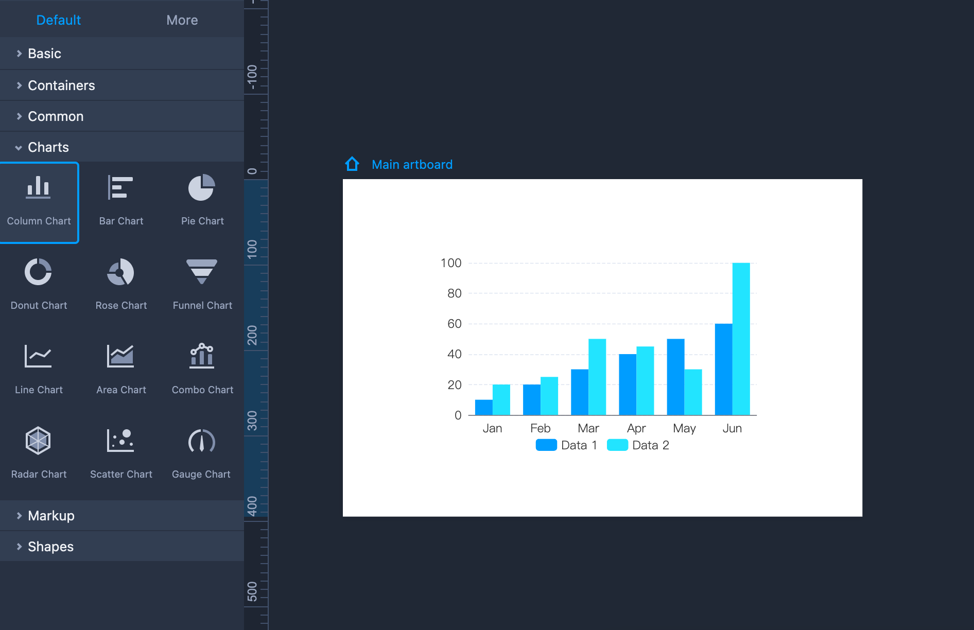
Drag the component onto the artboard. To customize chart details such as column categories, data values and column colors, double click on the component to show a data table. You can add a column or row by clicking on the + icon.
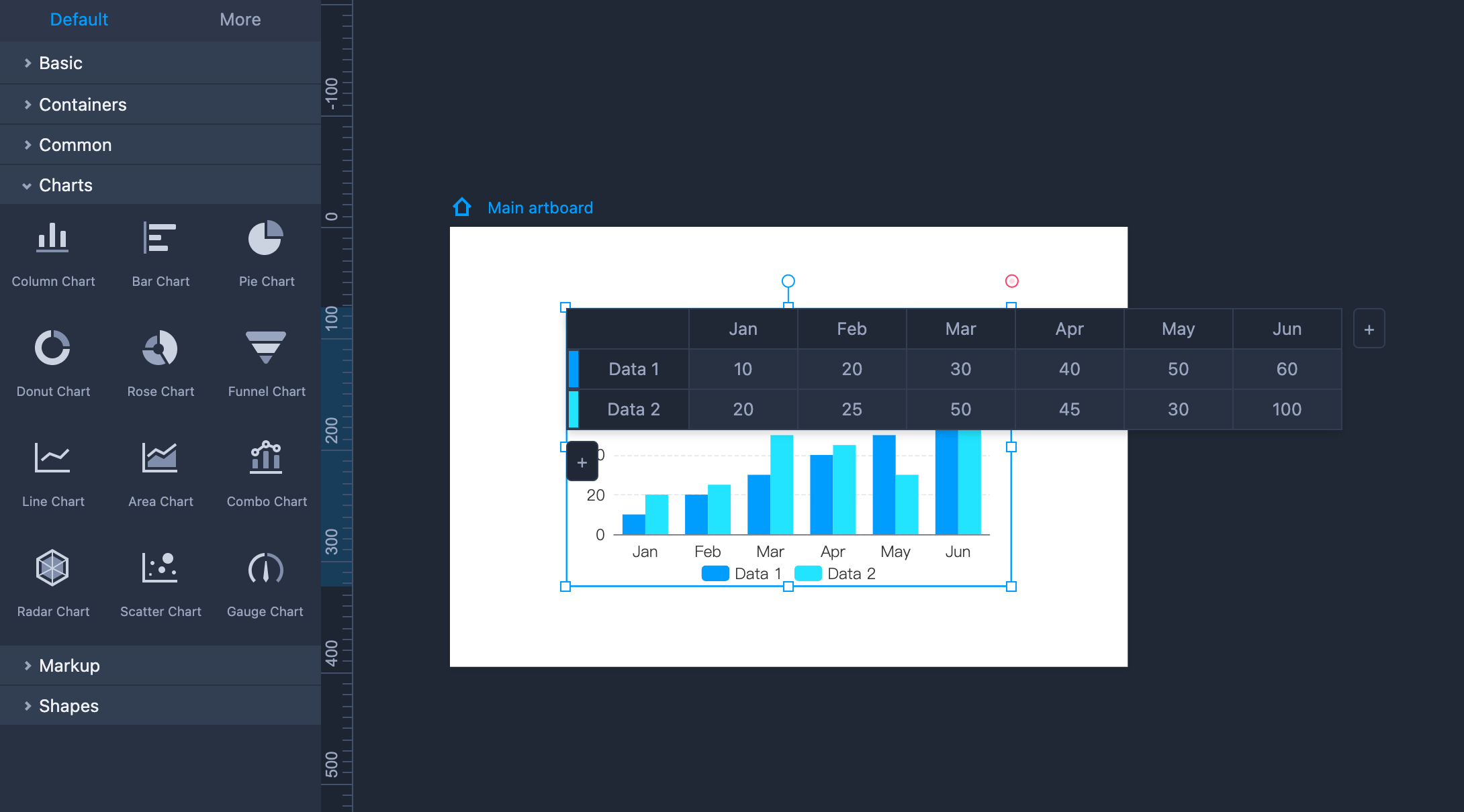
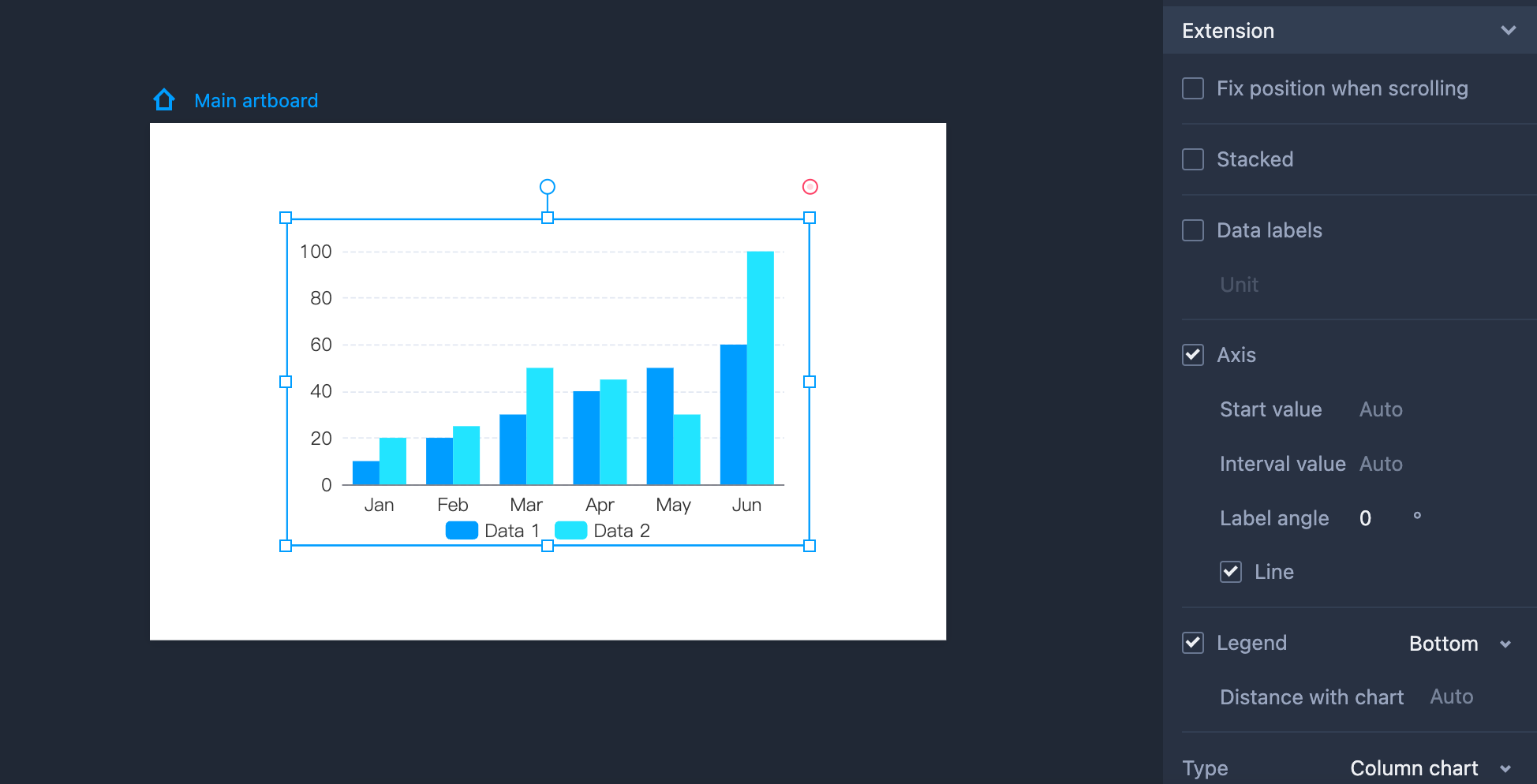
You can also show the axes, data labels and other details on the right-hand panel.
Pie Chart
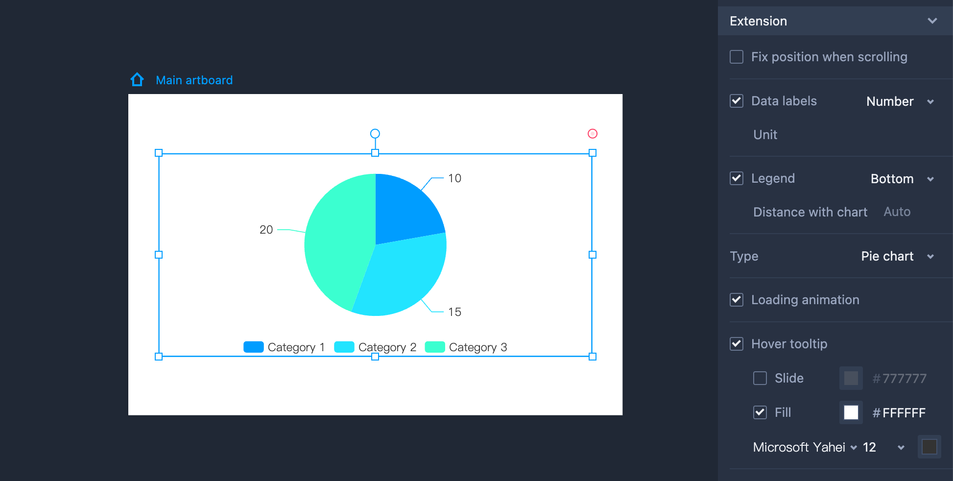
Pie Charts are interactive data visualization components that help you present your data as proportions of a whole more intuitively.
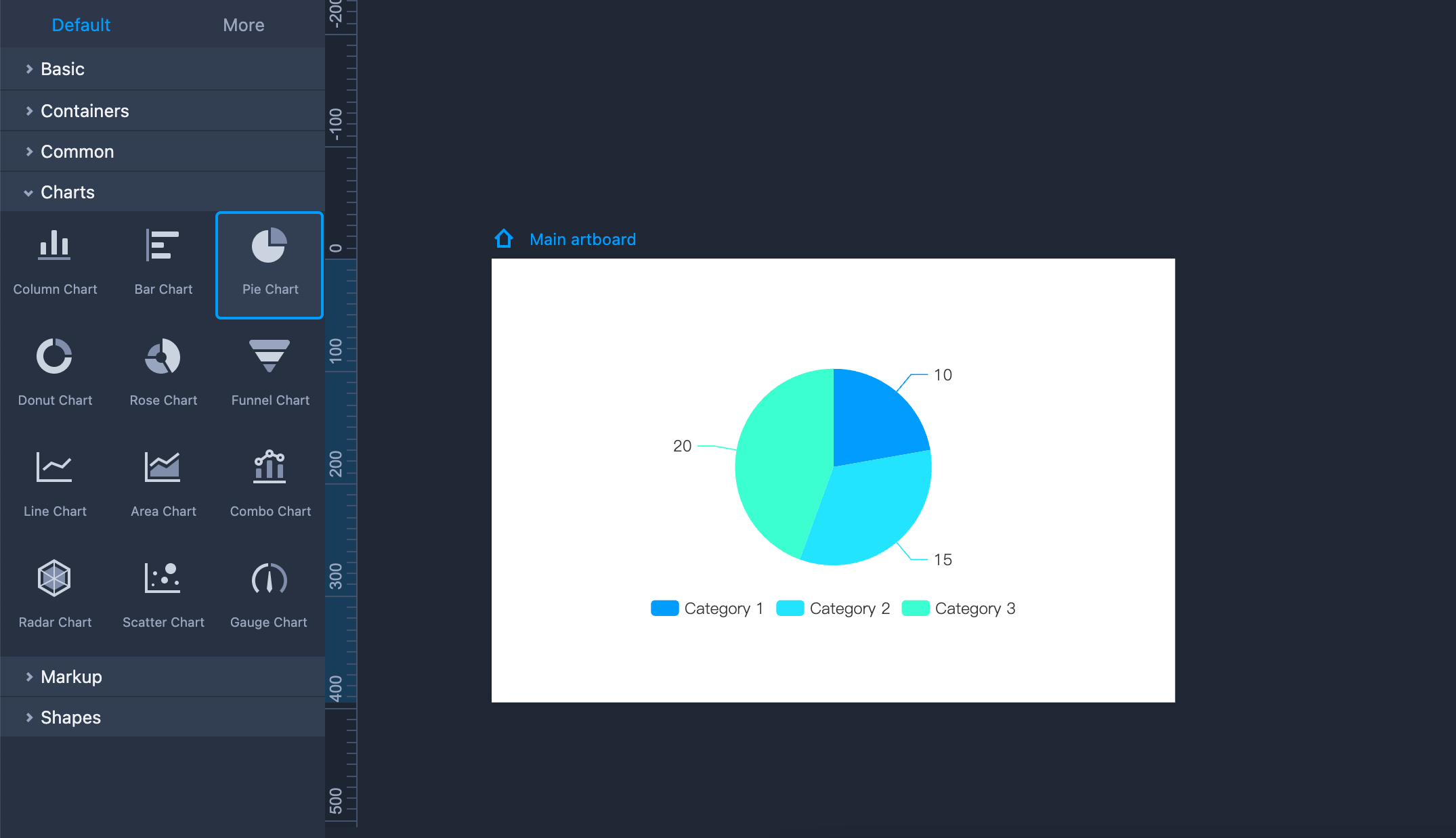
Drag the component onto the artboard. To customize chart details such as column categories, data values and column colors, double click on the component to show a data table. You can add a column or row by clicking on the + icon.
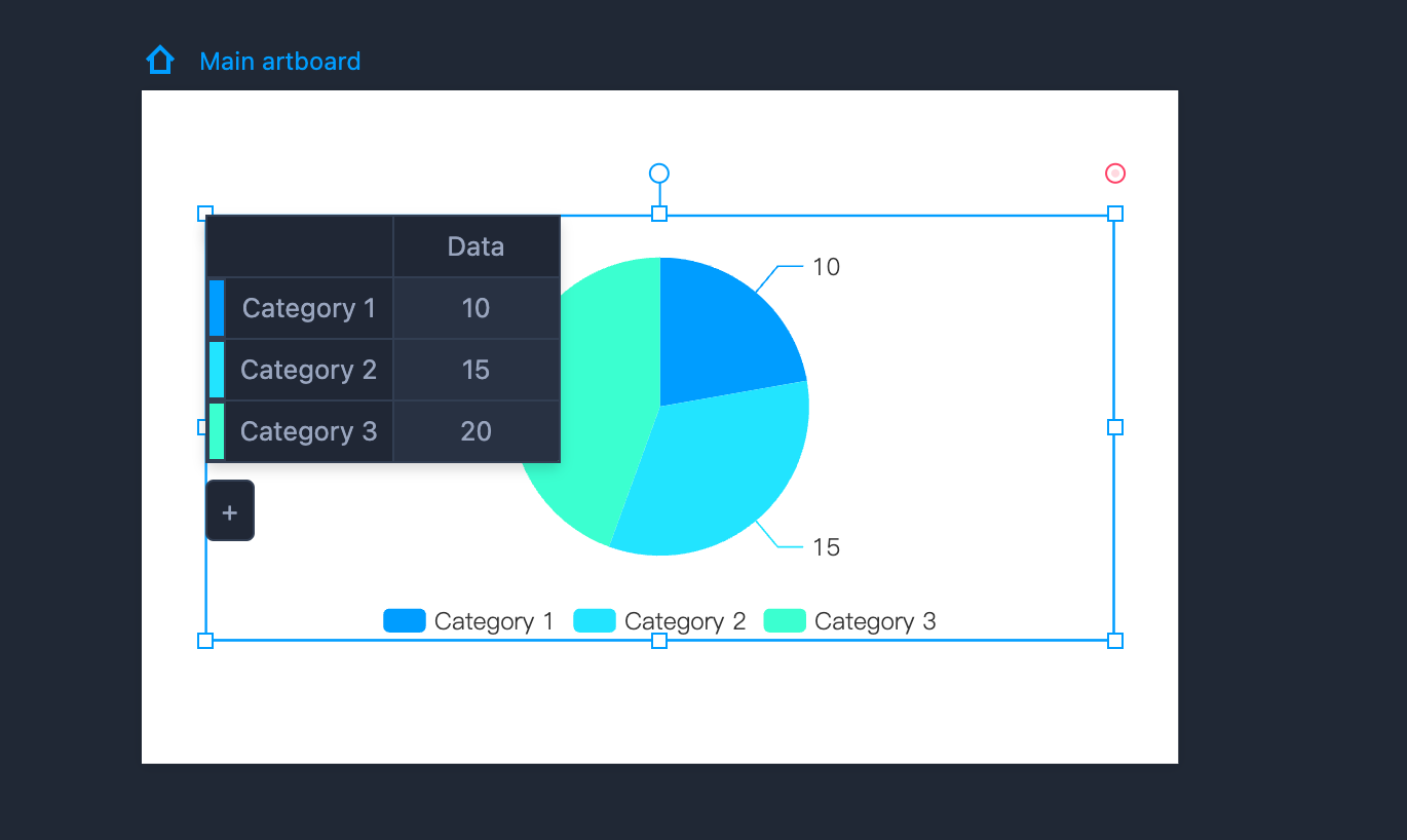
You can also show data labels, set the legend position and customize other details on the right-hand panel.
Combo Chart
A Combo Chart is a chart component that combines both a line chart and a column chart, typically used to highlight and compare different data sets. It is perfect for designers to clearly visualize data in their web or app design.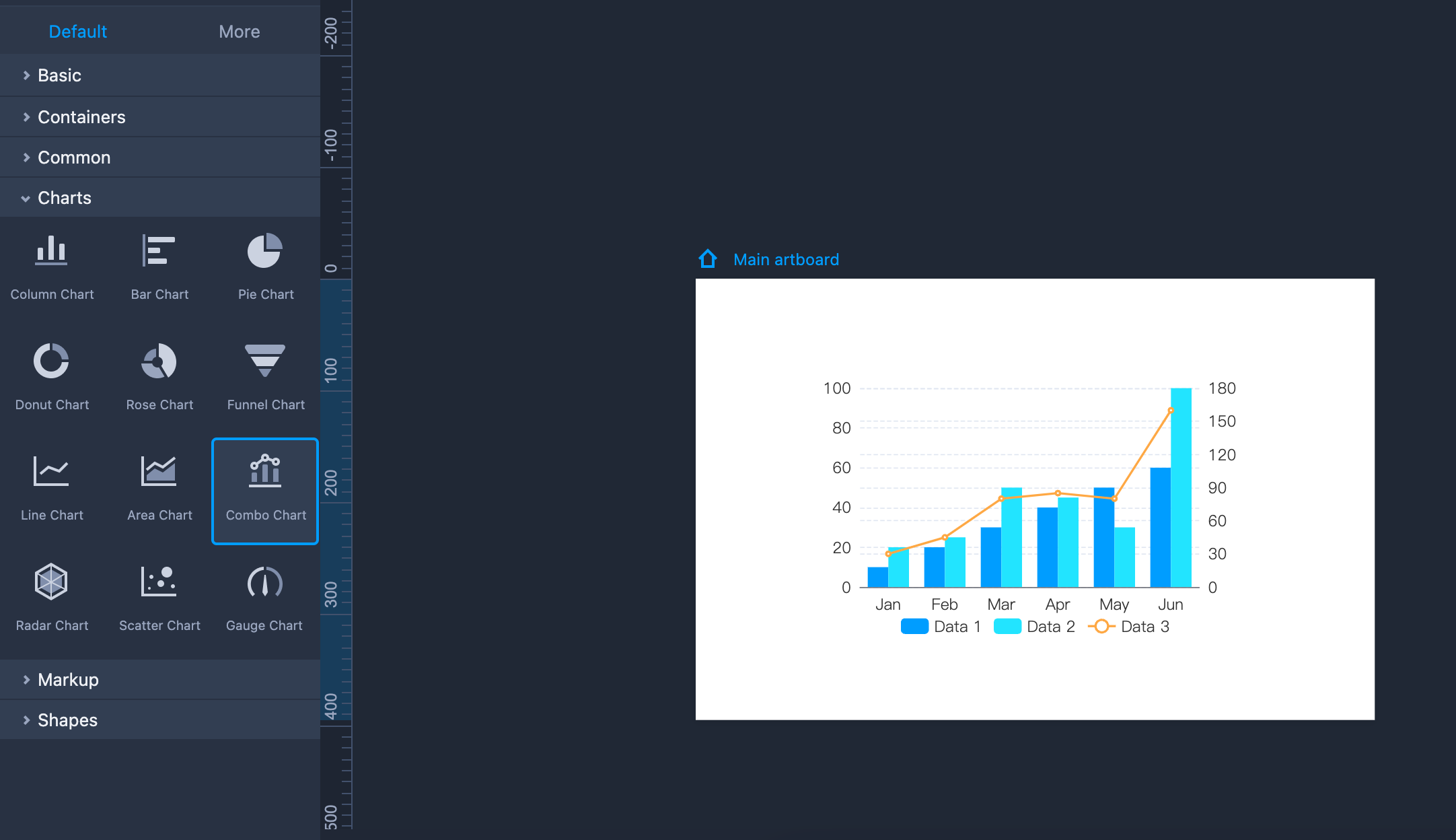
How to add a Combo Chart to your prototypes?
Drag and drop the Combo Chart component to your artboard
Double click to input all the data you want to display in the chart.
How to edit a Combo Chart?
Double-click to input all the necessary data.
Customize the row and column labels.
Insert or delete a data column or row using the right-click menus.
Show or hide Data labels
Show or hide Legend
Enable or disable Loading animation, and more.
Most importantly, set the Y-axis for both the Line and Column charts, and personalize the start value, interval value, and other details separately.
Gauge Chart
A gauge chart is a interactive data visualization that presents data in the form of a dial. It's also known as a dial chart or speedometer chart and is widely used for visualizing data.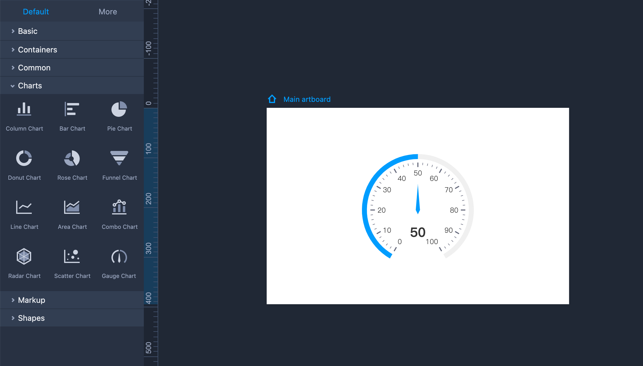
How to add a Gauge Chart to your prototypes?
Drag and drop the Gauge Chart component to your artboard
Customize the details to visualize your data
How to edit a Gauge Chart?
Choose a Gauge type - There are three options - Basic Gauge, Staged Gauge, and Level Gauge. All three types allow you to adjust gap angles, values, and endpoints. The Basic gauge lets you customize the background and progress colors, while the Stage and Level gauges offer three color styles.
Adjust gauge data - Modify the Default value to control the initial display value of the gauge chart during preview. By setting the maximum and minimum values, you can customize the numerical range displayed on the gauge.
Show tick label - Set the tick label below the pointer and add a custom unit for it.
Set ticks - The gauge chart's scales include ticks and minor ticks. You can change the interval values and choose whether to display these ticks or not.
Enable data fluctuation - Turn on "Data fluctuation" to simulate data fluctuations during the preview.