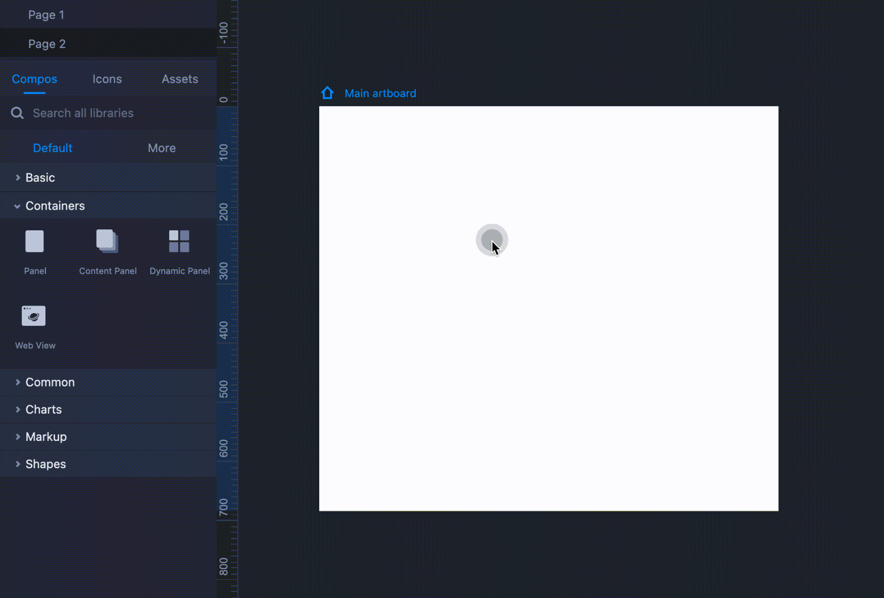
Containers are effective custom components that can contain UI elements, interactions, animations, and so forth. They are often used to show dynamic UI content.
PanelThe Panel component is one of the most widely used containers. You can add as many elements and interactions as you need. The Panel component can be extended infinitely in width and height.
The inner components and elements will not influence the outer size or position of the Panel component.
Double click to enable the edit mode.
Click anywhere outside the editing area to disable the editing mode.
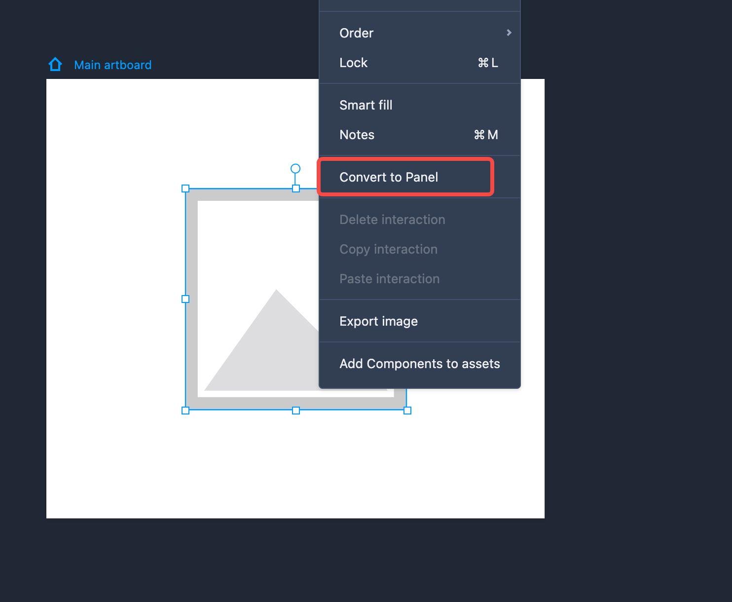
You can select multiple components to make a Panel container. To do so, select the components you would like to put in a Panel, right-click and choose “Convert to Panel”.
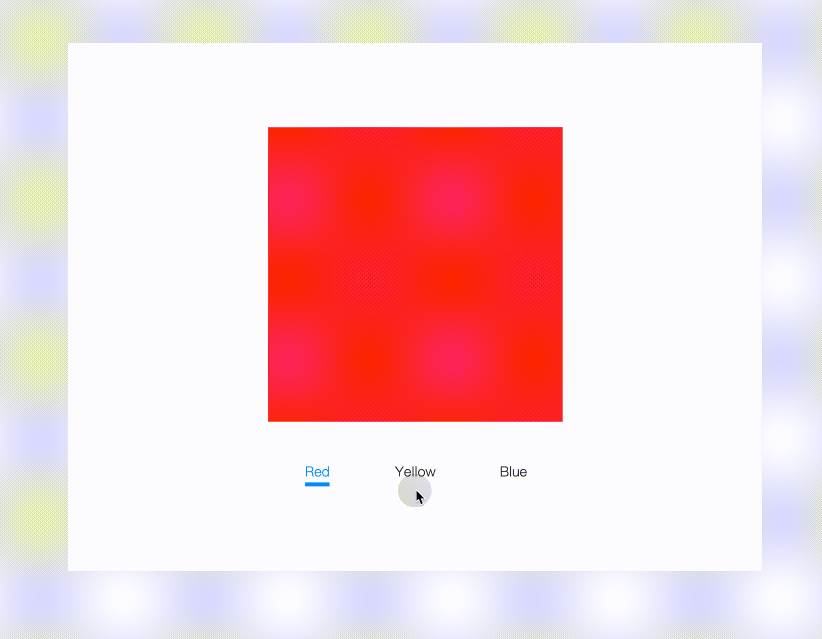
Content Panel The Content Panel is often used to achieve the effect of content switching. It is often used with sub-artboards to present dynamic content and complex interactions.
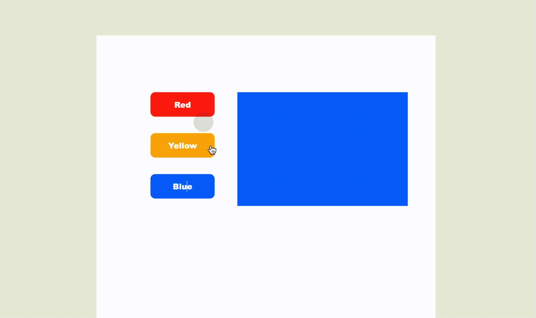
Here's an example of how you can create this dynamic content:
Here is how you can create such dynamic content:
First, drag the link point of the Content Panel to the desired sub-artboard to associate them with each other.
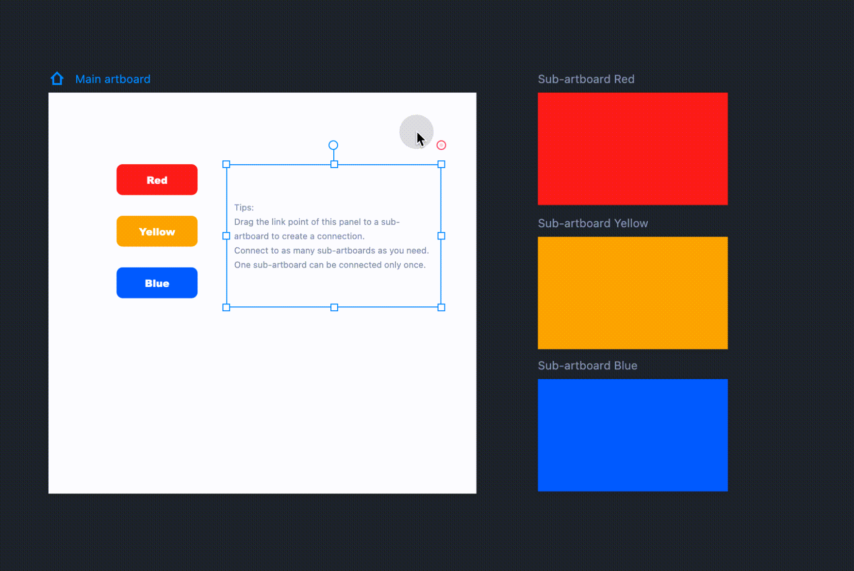
Then, delete, reorder, and manage the linked artboards by selecting the Stack Panel and clicking the "Enter" key.
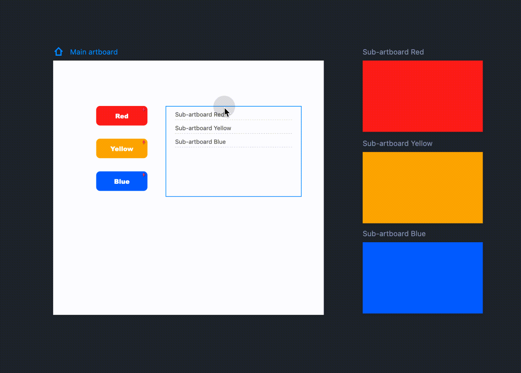
Finally, create interactions for the secondary artboards to get it done.
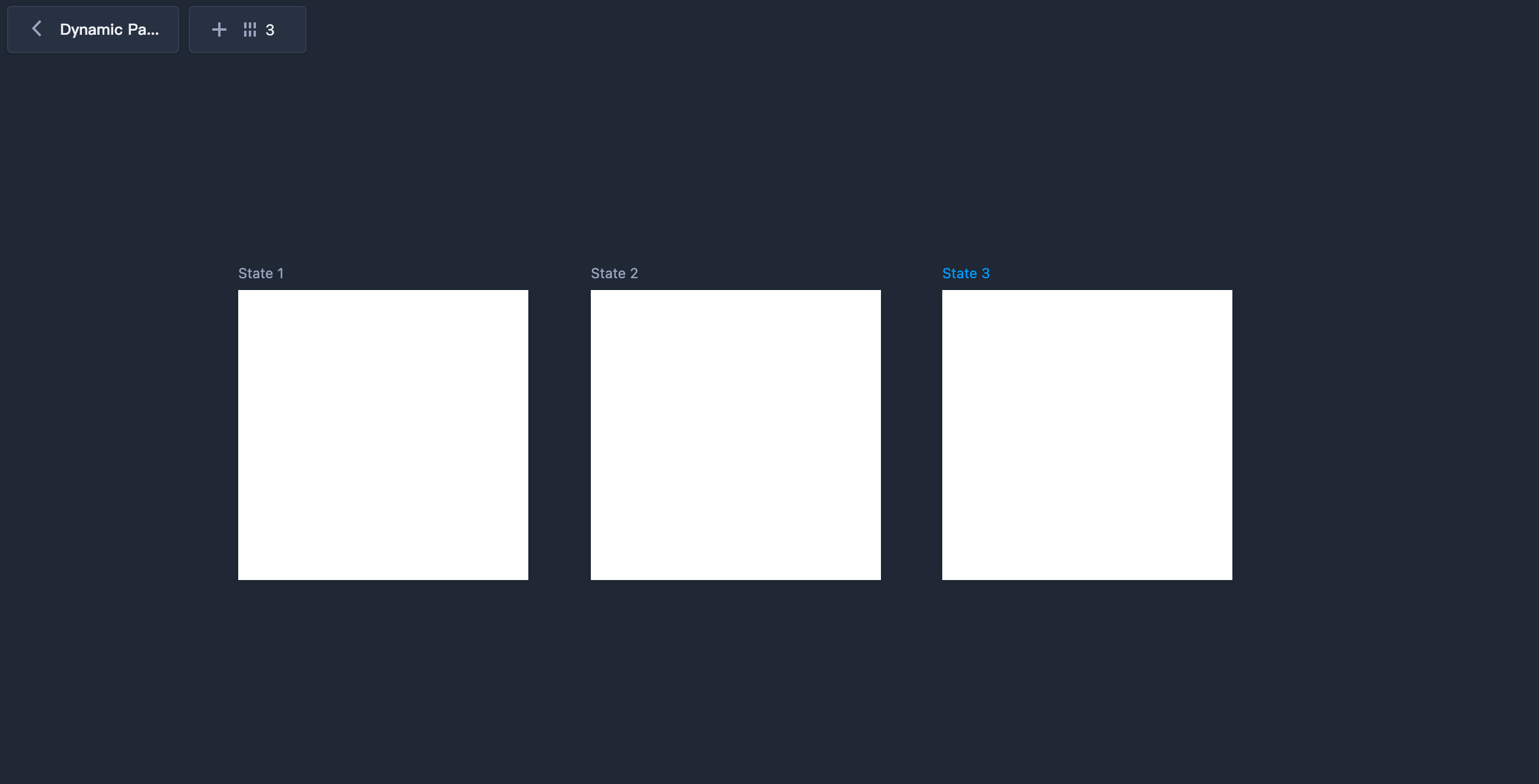
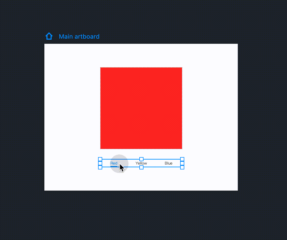
Dynamic PanelThe Dynamic Panel component is a container where you can add multiple States to hold your different pieces of content and switch between them within the same area of your user interface. One of these content States are available at a time during the preview.
It's ideal for creating a slideshow, carousel or content switching effect within any part of your web or mobile app design.
It operates similarly to the Content Panel but differs in its approach to creating a content-switching design.
Let's take a look at an example created using a Dynamic Panel:.
Here are the typical steps you can follow to create such a design:
Step 1. Add States and design content
Drag a "Dynamic Panel" component onto the artboard and double click to enter its editing mode. You can then add one or multiple States to place your different pieces of design content by clicking "Add State" in the top left corner.
Note: Dynamic Panels support nesting, allowing you to embed one Dynamic Panel within another. This enables you to create multi-level content switching.
Step 2. Manage States
In editing mode, the inner States are automatically placed and cannot be manually repositioned. However, you can reorder them through direct drag-and-drop or by using the arrow buttons in the top right corner.
Note: The order in which the States are sorted determines their presentation sequence during the preview.
In this mode, you can also copy and paste, delete, clone and manage these States.
Additionally, you can change the "Number of columns" in the top left corner to control the maximum number of States you can display in each row.
Note:
The size of each State is the same with the size of the Dynamic Panel itself. Changing the width or height of the Dynamic Panel or any individual State will auto apply changes to all other States and the Dynamic Panel itself.
Step 3. Add interactions
To complete your content switching design, set the Dynamic Panel as the interaction target. Choose the "Switch content" command and configure other interaction details.
Now, you have a content switching design that enables users to seamlessly switch between different pages or page sections within the same area.
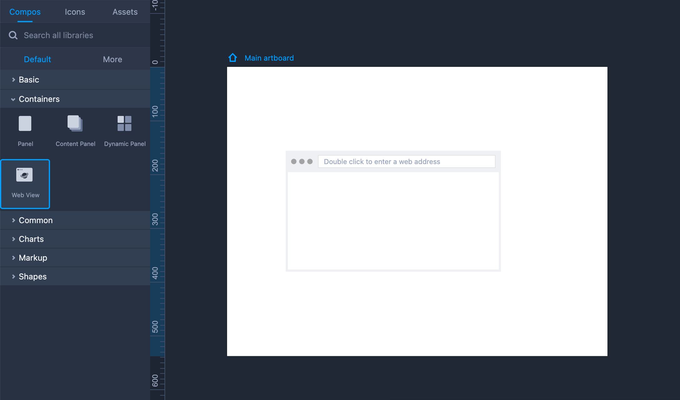
Web ViewThe Web View component helps you embed a custom external web page into your prototype.
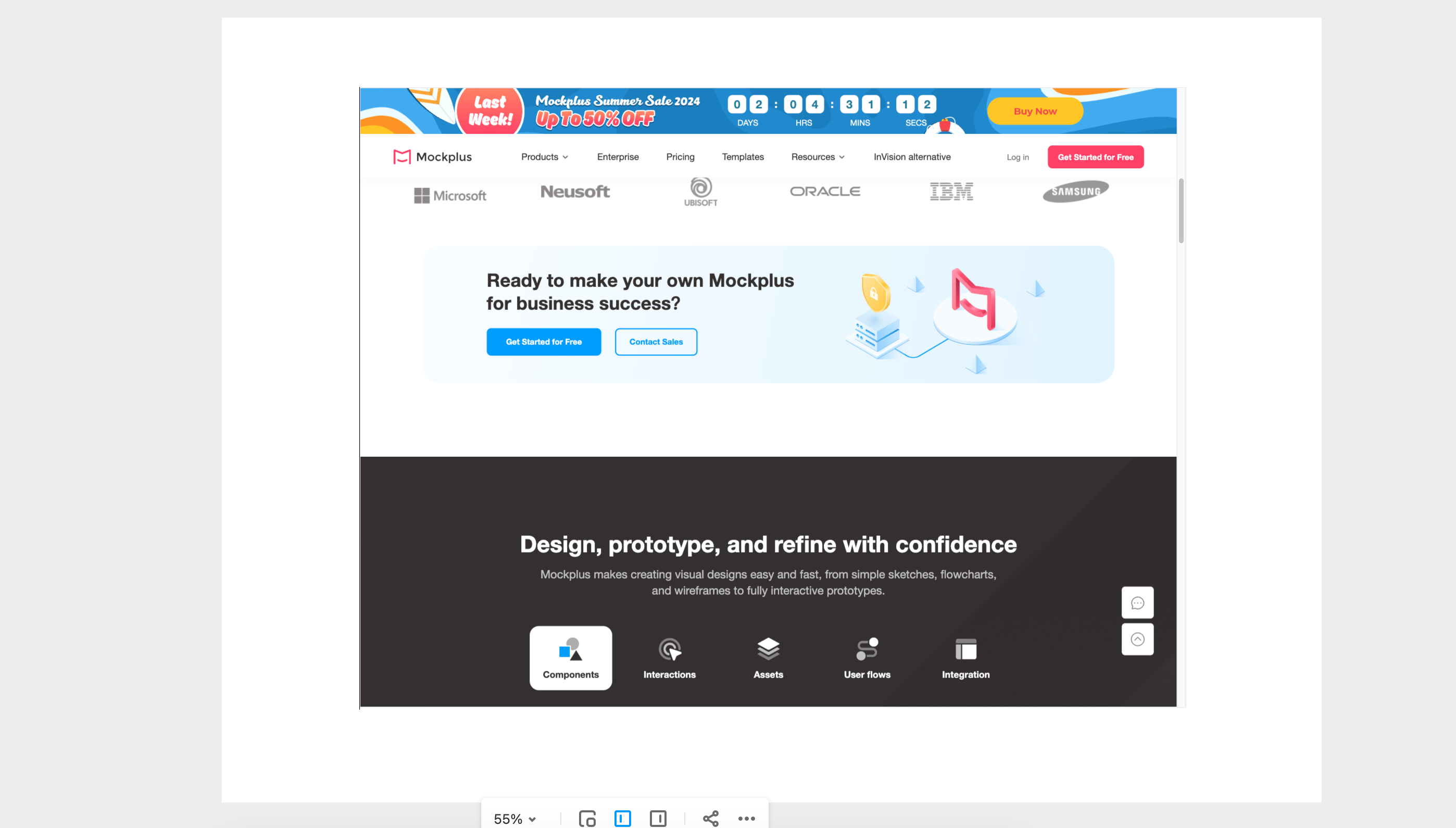
Drag it onto your artboard and double click the component to enter an external website address. Then, you can directly view that embedded web page when previewing the project.
This component is available in the "Containers" section of our default component library.
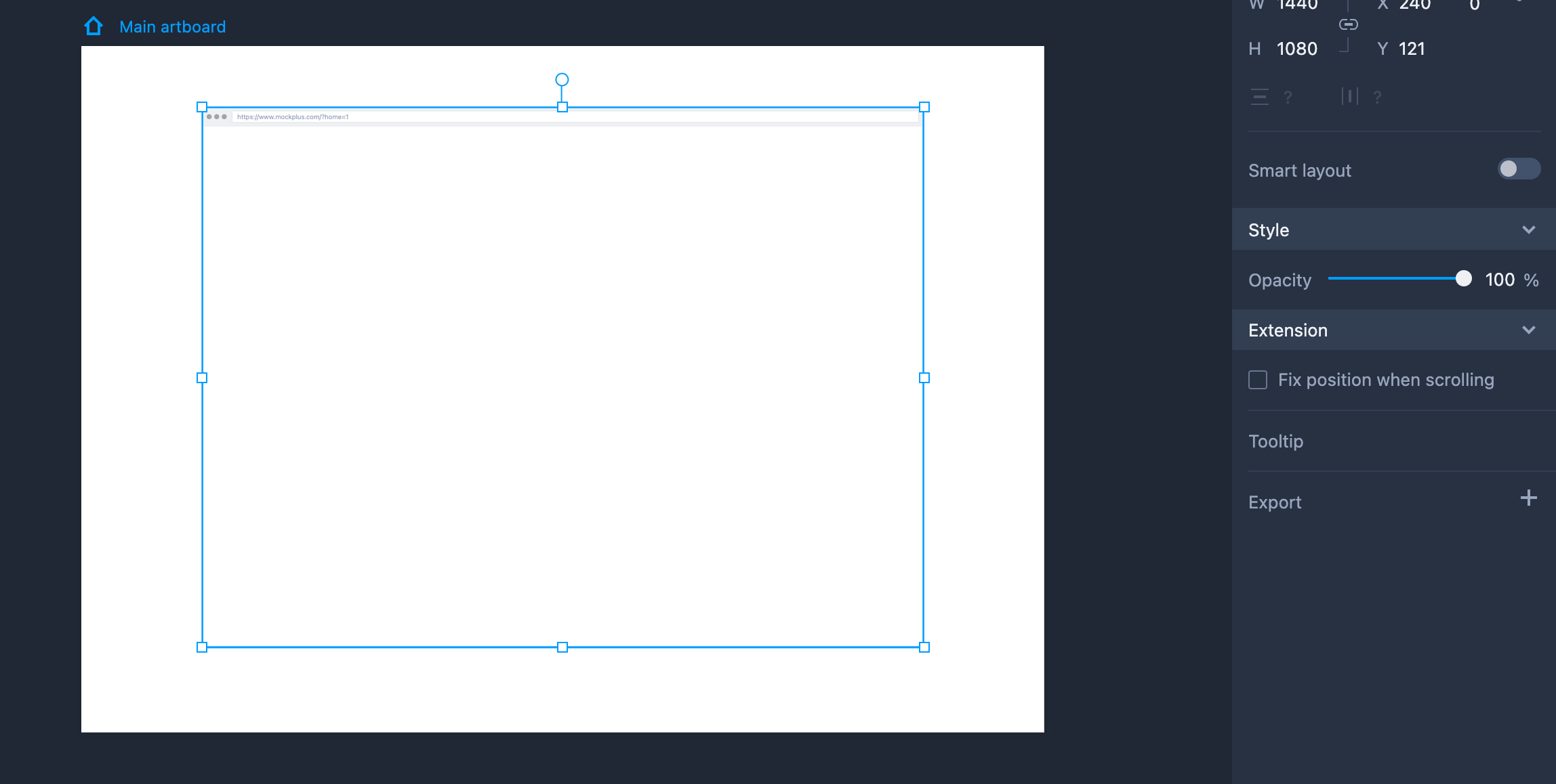
Property Settings
You can change the component details on the right-hand Property panel, such as enabling the responsive layout or adjusting its opacity.
Under the "Extension" section, you can select "Fix position when scrolling" to create a fixed area or directly add a note.
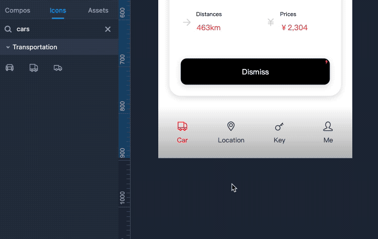
App NavbarApp Navbar offers an easy way for you to quickly create bottom navigation and tab bars with icons and labels for your mobile apps.
How to use App Navbar?
• Drag App Navbar from the Components Panel to use it directly;
• You can stretch it to customize its size for your needs. To resize it equally, please hold Shift and click to drag it.
How to set properties for APP Navbar?
• Head to the right-hand Property panel, where you can:
-- Set its label and icon properties;
-- Change its size, default color and selected color;
-- Show the indicator;
-- Swap its icons by double-clicking it to select its icon and clicking any one you need in the Icon Panel to get it switched.
Note: You may also click Advanced edit in the right-click menus to modify the details of the labels and icons, such as the icon and label styles, distance between the icon and label, and so on.
How to edit APP Navbar?
To further edit its items, you can double-click on APP Navbar or press Enter to customize them for your needs.