


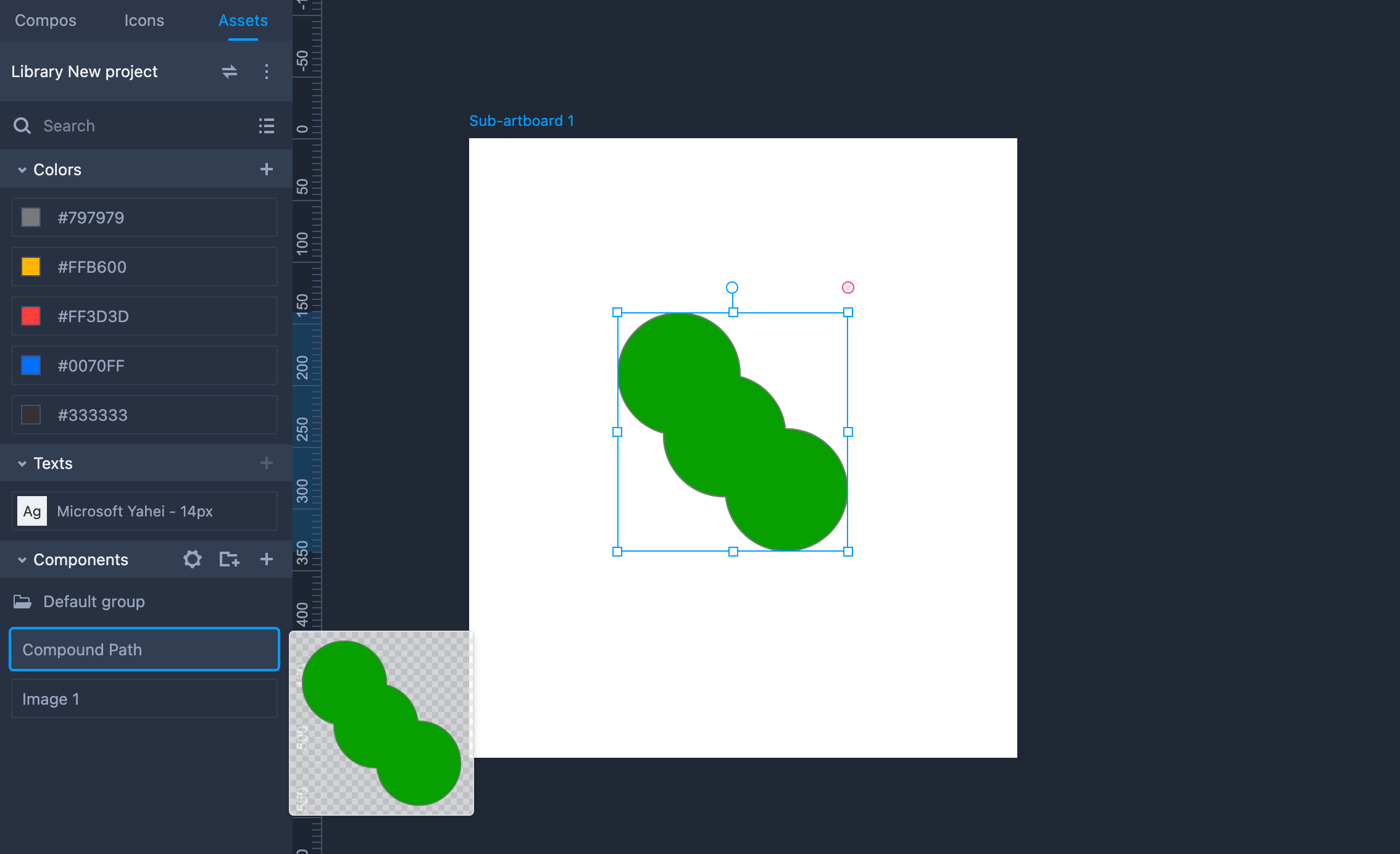
You can add any components, icons, shapes to your asset library in the Components section of the Assets panel. The component assets added here work just like Master, and can be reused with just drag-and-drop. Any changes made to them will also be auto-synced to instances scattered on all other pages.
Add Components to Assets
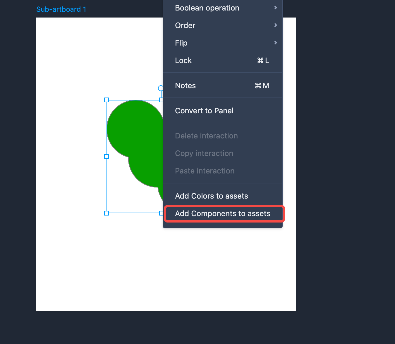
To add a component to the Assets panel, select "Add component to assets" in the right-click menu of the component; or select a component and click the "+" icon of the component section in the Assets panel.
Reuse Components
To reuse a component from the Asset panel, double-click on it in the Asset panel, or directly drag it to the artboard for later use.
Component Assets Editing
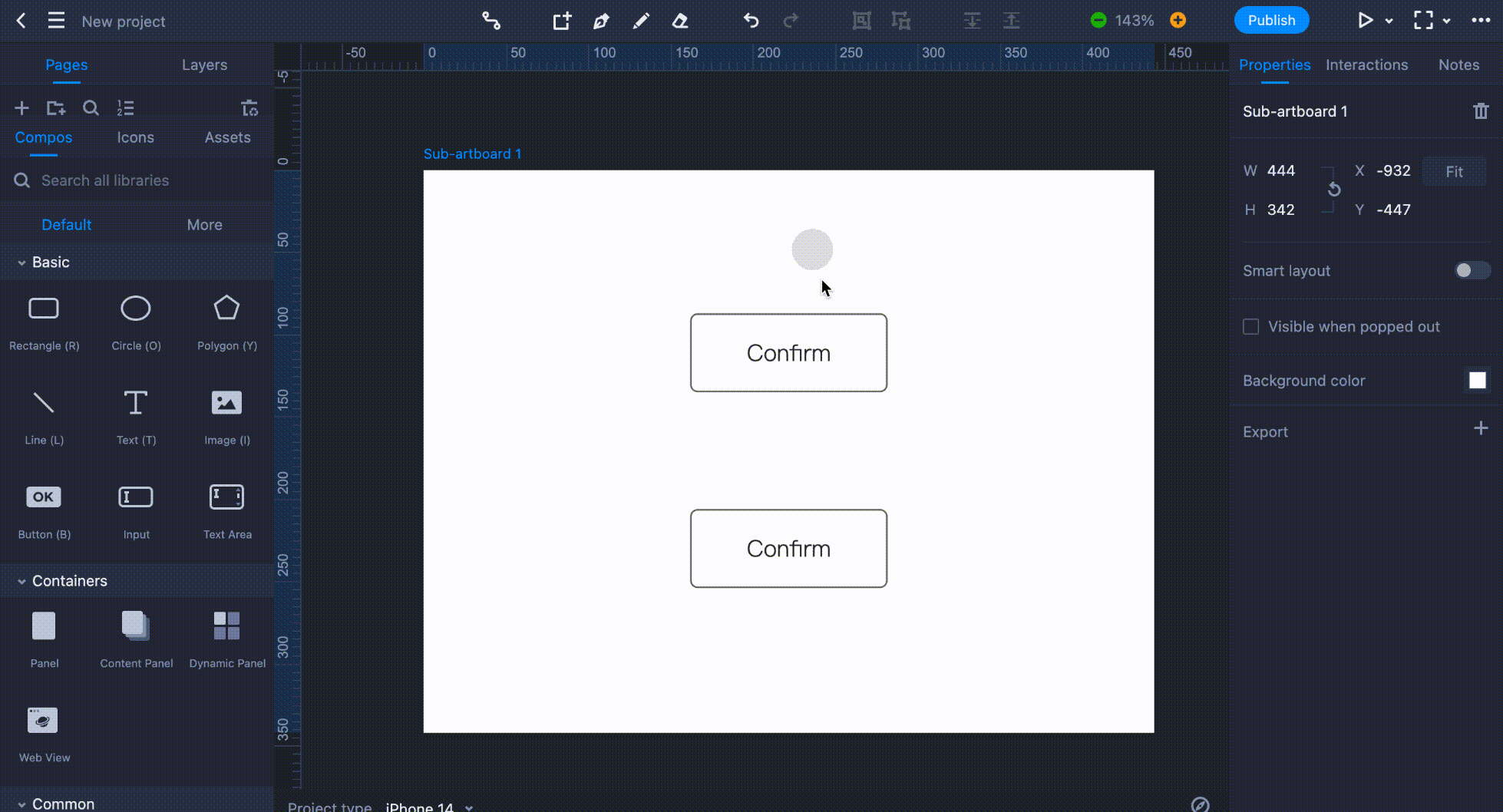
Drag a component asset onto the artboard and double-click on it to open its editing mode.
In this mode, the component is placed on an area that resembles an artboard. It simulates the visible portion of the components on the editing interface. You can drag the component to change its location, but keep in mind that the part of the component outside this area is not visible on the editing interface.
Component assets have a special reusing strategy. If a component asset has been added to several artboards, when one of them has been modified, the same modification will be automatically applied to all others.
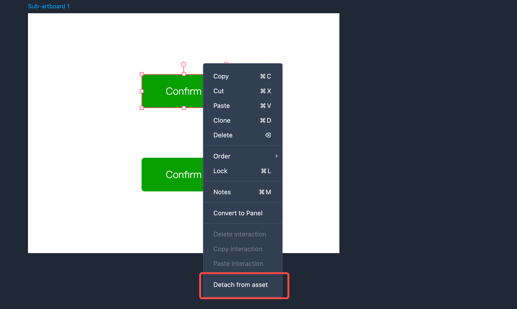
If you want to edit one of these component assets separately, right-click and select "Detach from asset." And then, the modifications you performed won’t affect other coexisting component assets.
When the editing is finished, click "Return" in the upper-left corner of the workspace to exit the editing mode and apply the changes.
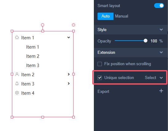
Unique Selection for Component Assets
When using menus or navigation components as Component Assets across different pages, maintaining consistent styling and content is essential. However, you may also need a different default selected item for each page. This can be achieved by defining a Unique Selection for the component instances.
Here is how:
1.Save your menus or navigation component as a Component Asset.
2. Select the instance on a page and locate Extension selection on the right Properties panel
3. Enable "Unique selection" and choose the item you want to be selected by default.
In this way, you will get the following:
1.Custom default selection. Each instance of the menu or navigation component can display a different default selected item.
2.Automatic expansion for hierarchical menus. For hierarchical components like Trees, Navigation Menus, or Vertical/Horizontal Menus, the parent items of the Unique Selection will automatically be expanded.
3.This unique selection will also overwrite the default selected item you made for the source component asset. Of course, this setting also only works on current page.