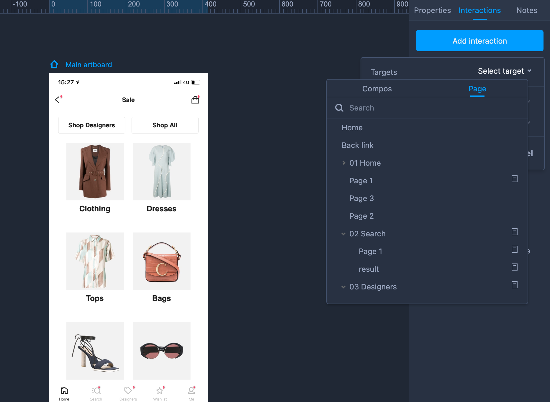
Page Interactions
Mockplus RP lets you apply a web or app interaction to an entire page. With this you can click anywhere on the page to trigger the interaction. Here's how it works:
- Select a page/component; open the "Interactions" panel on the right; click "Add interaction".
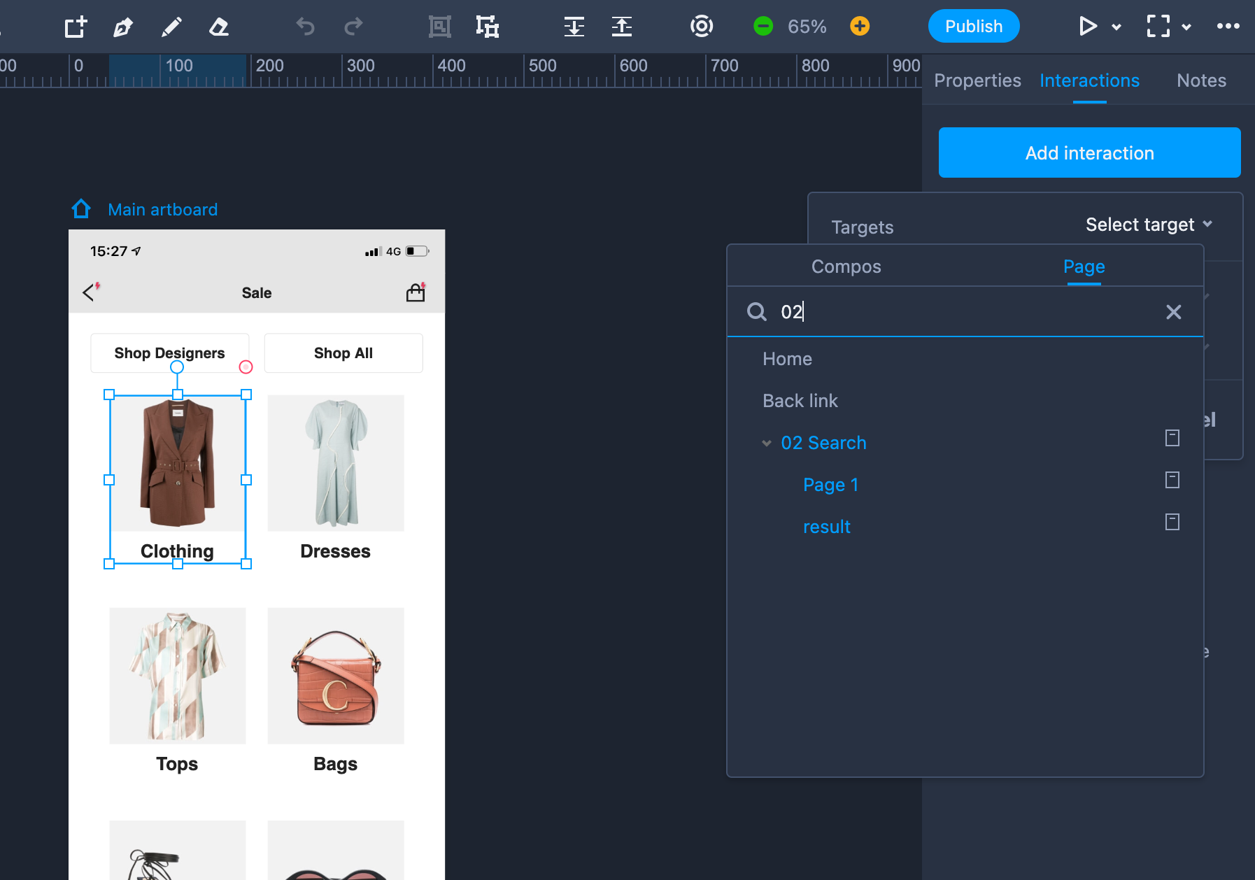
Click "Select target" to select or search for the target page under the "Pages" tab.
Add a trigger, command, duration or delay time to further define your interaction.
Please note:
Generally, the first page on the left Project Tree will be regarded as the "Home" page by default. (Even if the page order is readjusted, the page on the top will also be the "Home" page.)
The "Back link" enables you to create a link that will take you back to the page linked to your last operation.
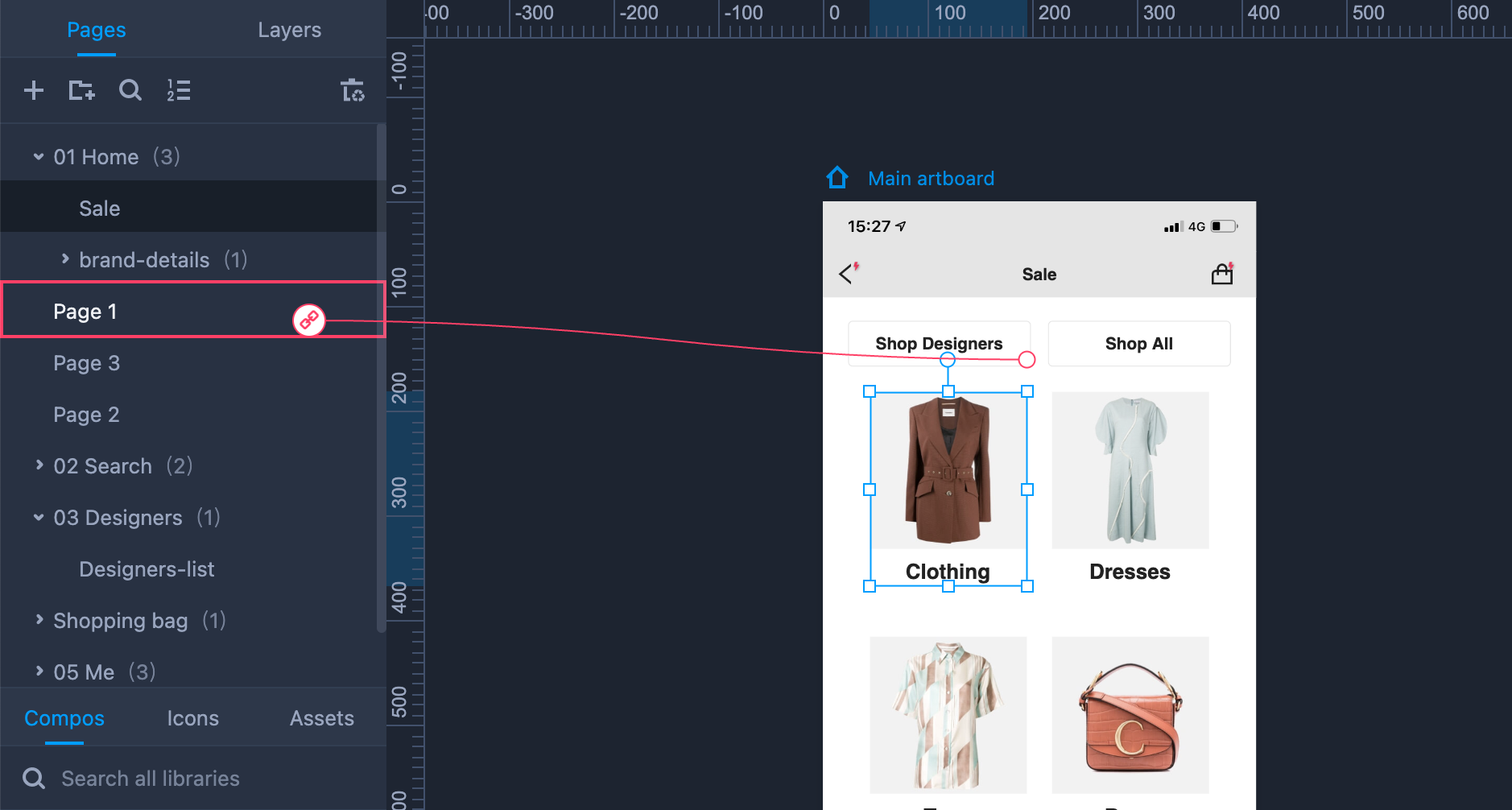
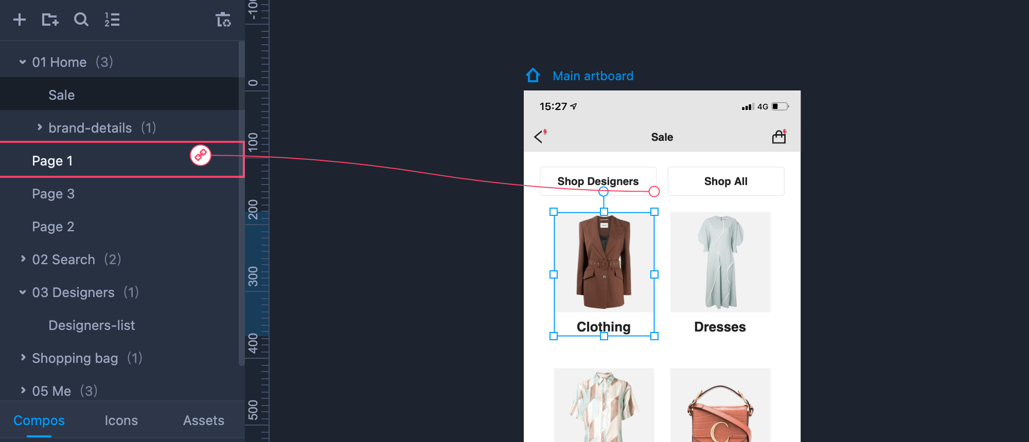
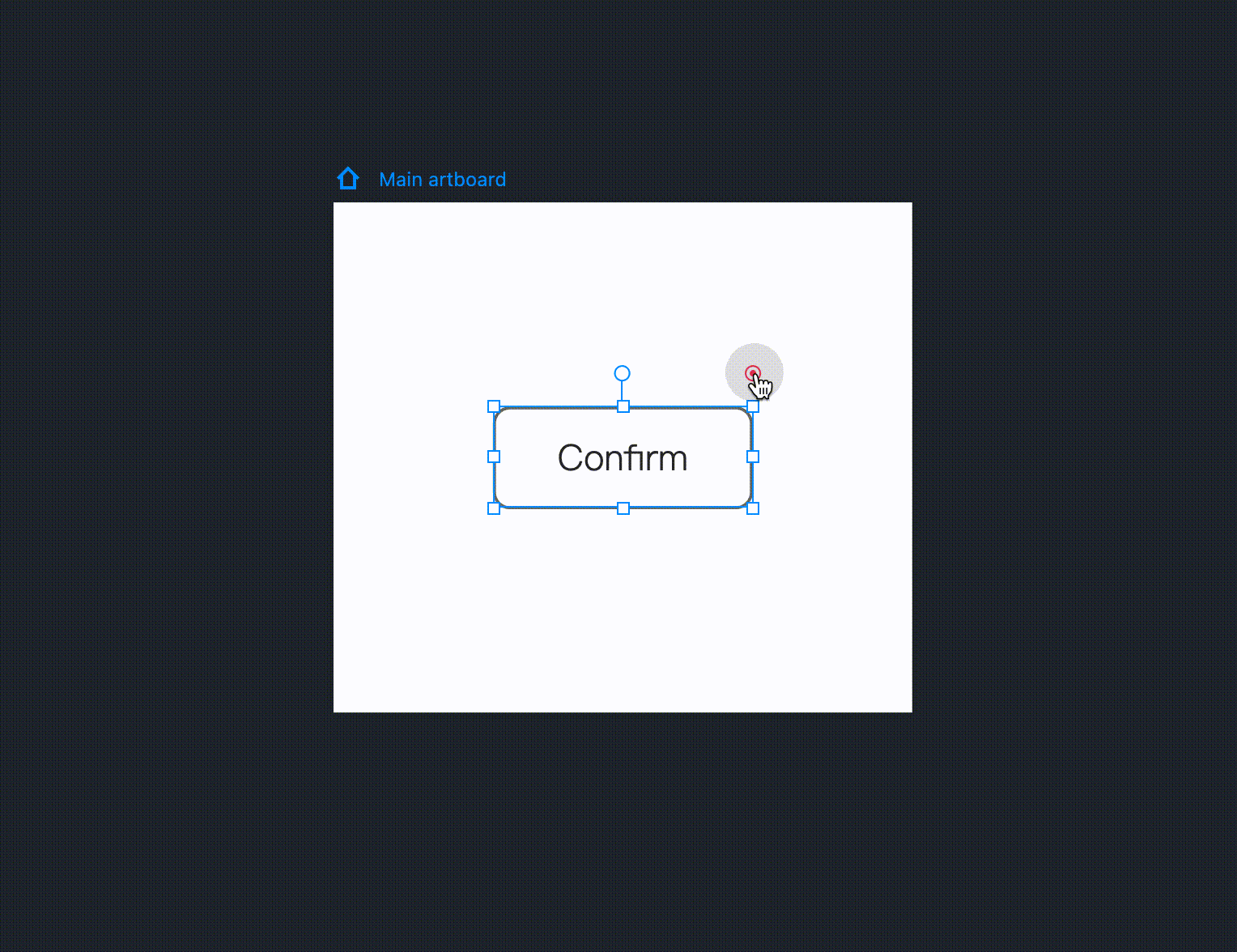
There is one further way in which you can create page interactions. Simply drag and drop the link point (a circular spot in the top right corner of the selected component) to the target page on the left Project Tree.
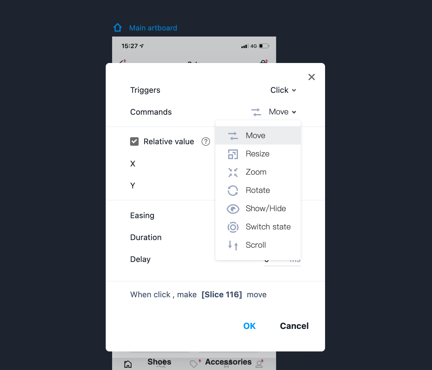
Command Interactions
You can create commands that produce smart interactions between components:
Select a page/component; open the "Interactions" panel on the right; click "Add interaction."
Click "Select target" to select or search for a target page under the "Components" tab.
You can then choose an interaction command from the following options:
Move: Move a component to any location on the page.
Resize: Change the width and height of a component based on your settings. (If you have added borders, shadows, or other properties to your component, these properties will be resized as well.)
Zoom: Zoom in/out at a set ratio. (Again, if you have added borders, shadows, or other properties to your component, these properties will be resized as well.)
Rotate: Rotate a component at a desired angle.
Show/Hide: Change the visibility of a component.
Switch content: Switch the contents of different panels. Note that this only applies to the Content Panel.
- Switch state: If you’ve added custom states to a component, this enables you to switch between them.
There is one more way to define a UI interaction between components. Drag and drop the link point (a circular spot in the top right corner of your selected component ) to the target component on the page.
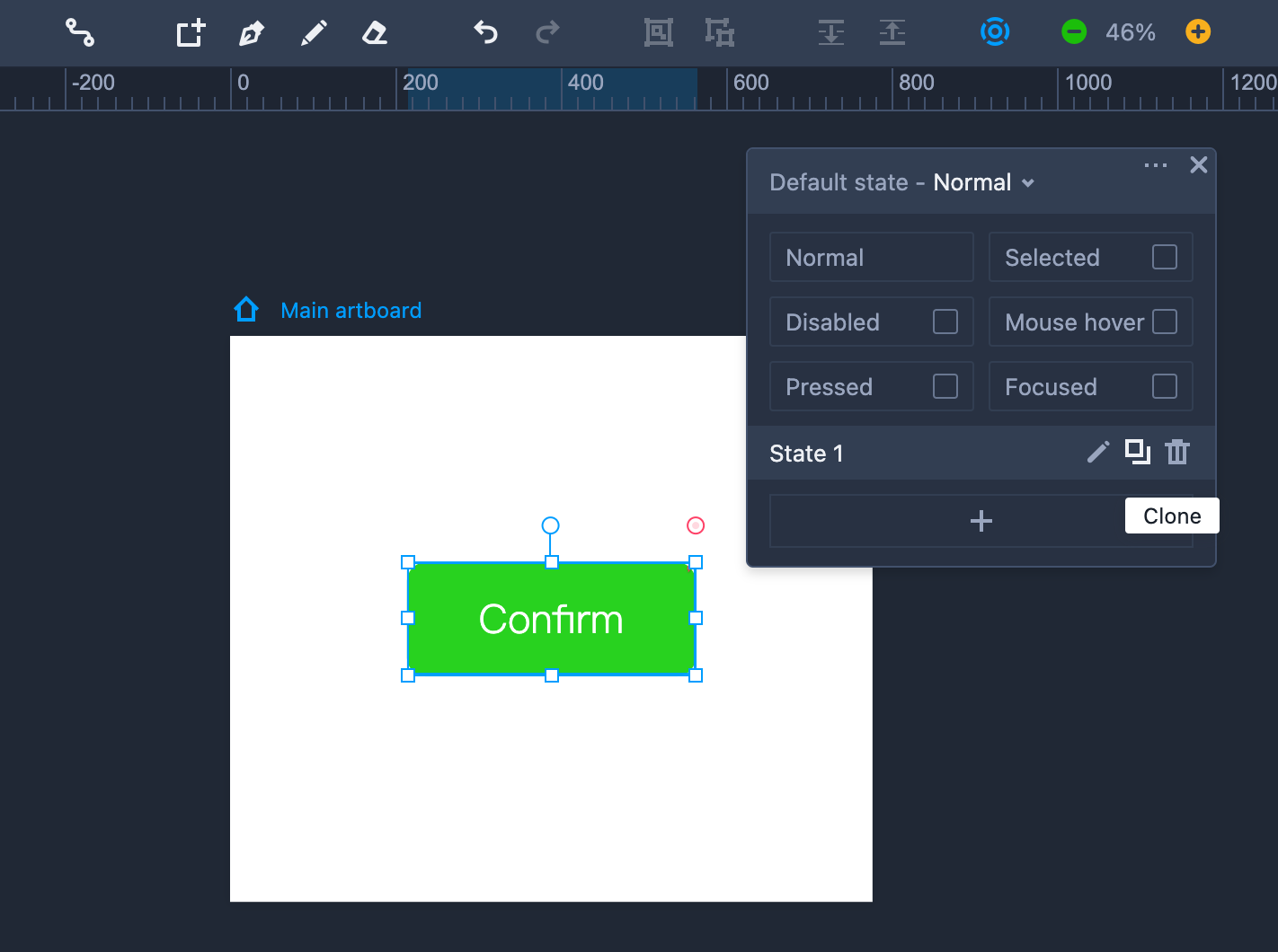
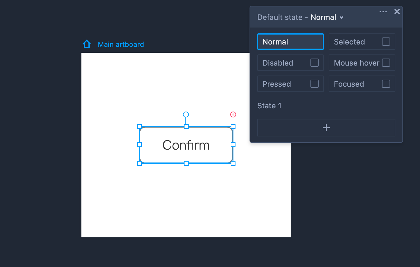
State Interactions
Mockplus RP provides a special "State panel" where you can create different states for a component, such as "Mouse Hover," "Pressed," "Selected," "Focused," and "Disabled, etc." You can also define a custom status for your prototypes according to your specific needs.
Let's first look at some examples of these states:
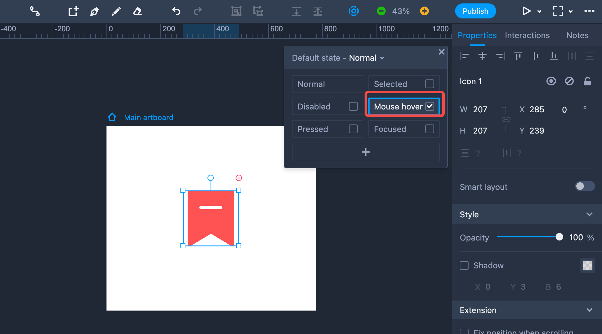
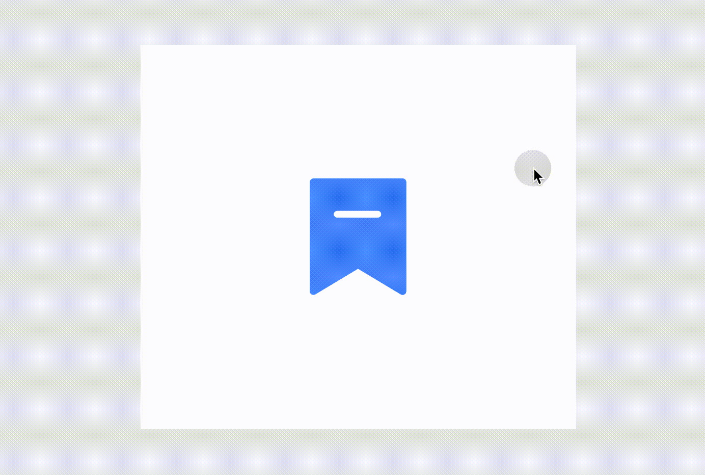
Mouse Hover
This state shows a component’s different style effects when the mouse hovers over or out of that component.
There are two quick steps to creating it:
Step 1. Select a component; click "+" (on the pop-out State panel); choose "Mouse Hover."
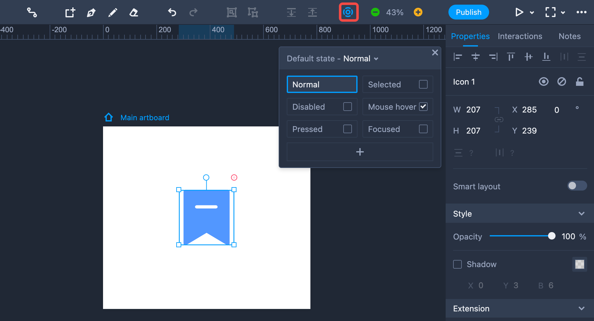
Step 2. Select "Mouse Hover" and choose a fill color for the component.
You will see the color change when you hover over or out of the object in Preview mode.
Pressed
This state is often used on buttons to make clear to users whether a button is pressed down or has been released.
Two steps to create it:
Step 1. Select a component: choose "Pressed" on the pop-out State panel.
Step 2. Select "Pressed" and choose a fill color for the button.
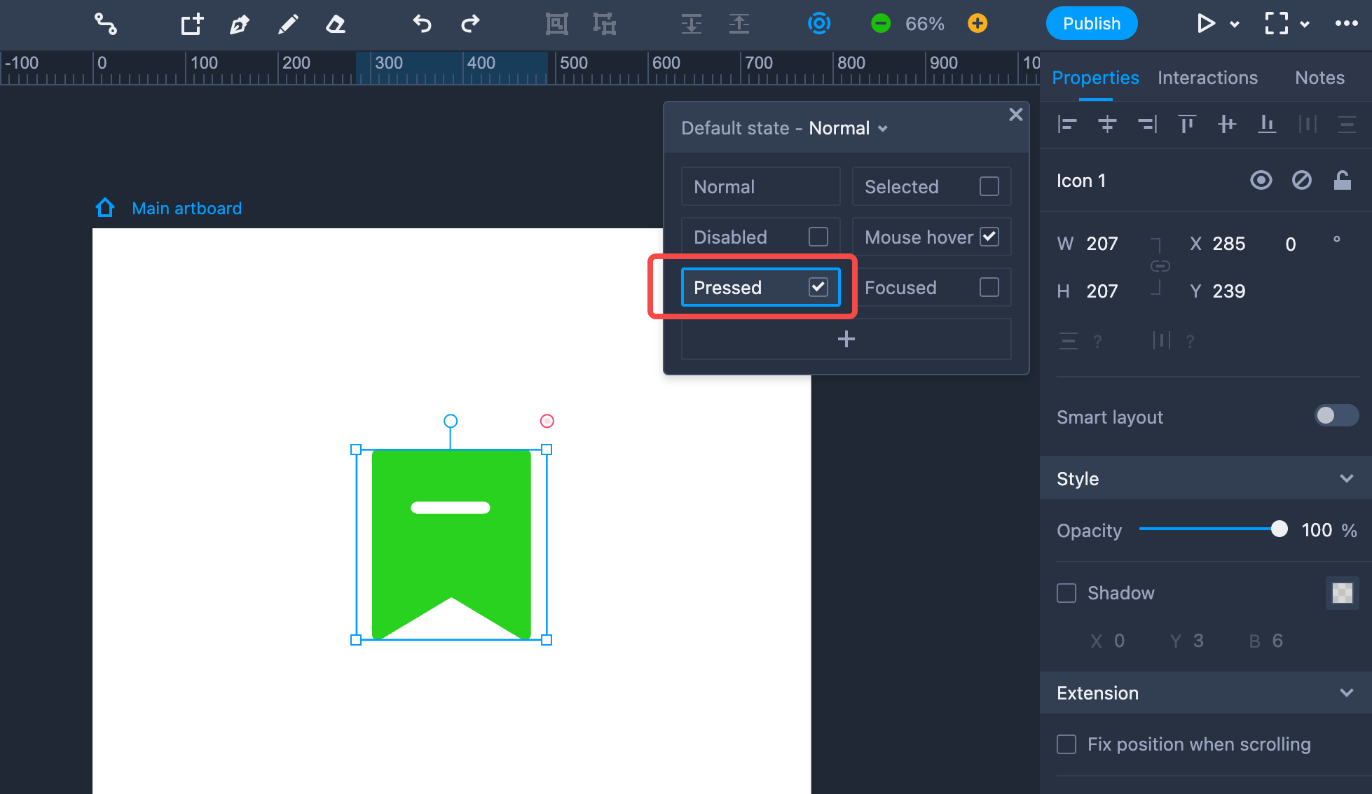
You will see the color change when the button is activated in Preview mode.
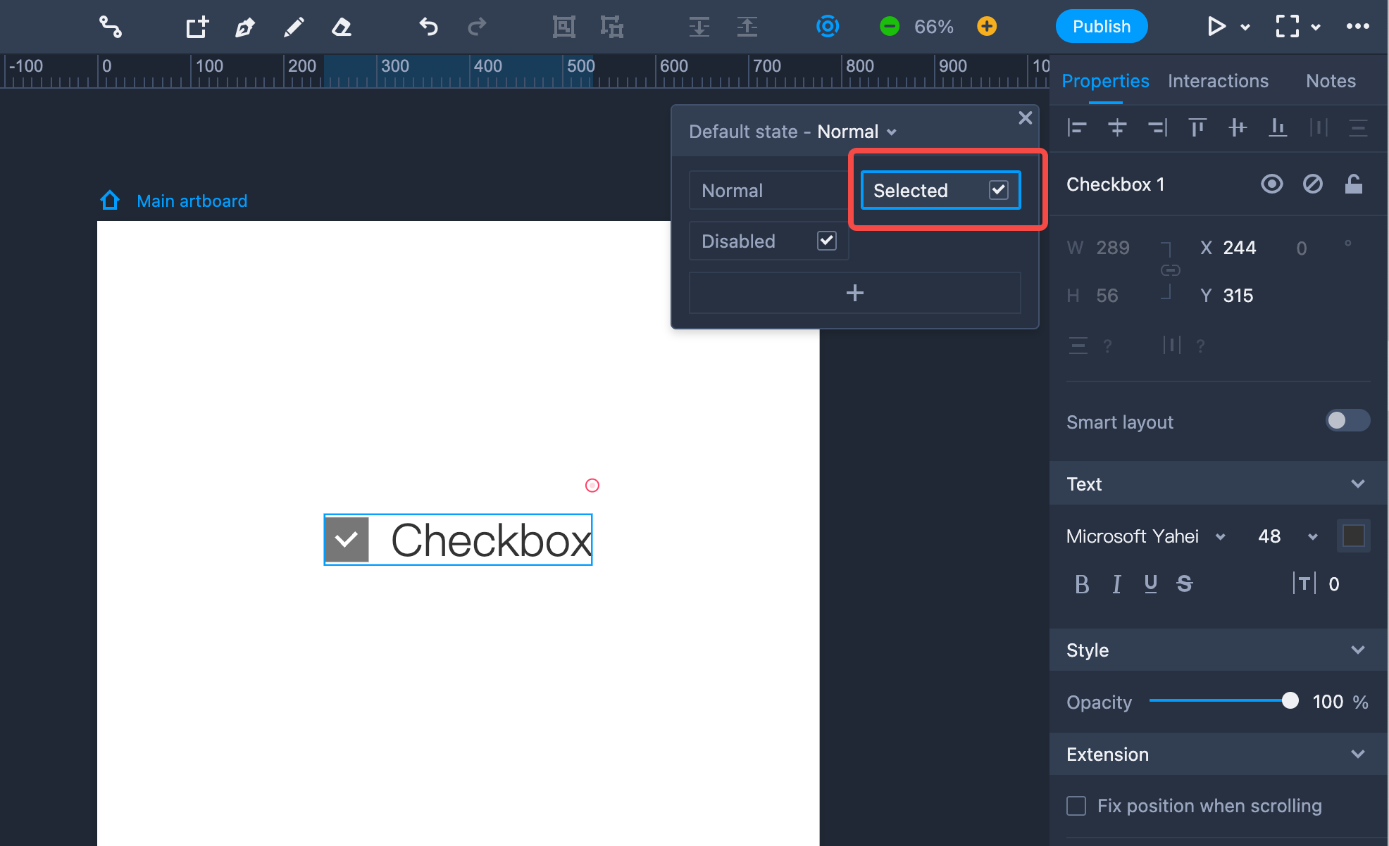
Selected
This state is often used on Checkboxes and Radio Buttons to indicate the selected state of an item in Preview mode.
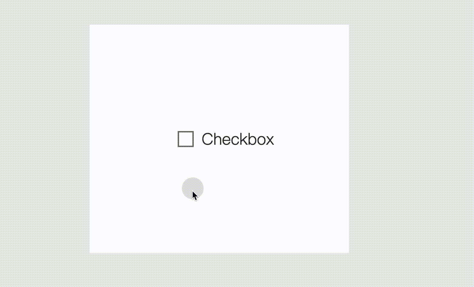
This effect is produced with a single step of selecting a component and choosing "Selected" on the State panel to the right. This item is then selected by default in Preview mode.
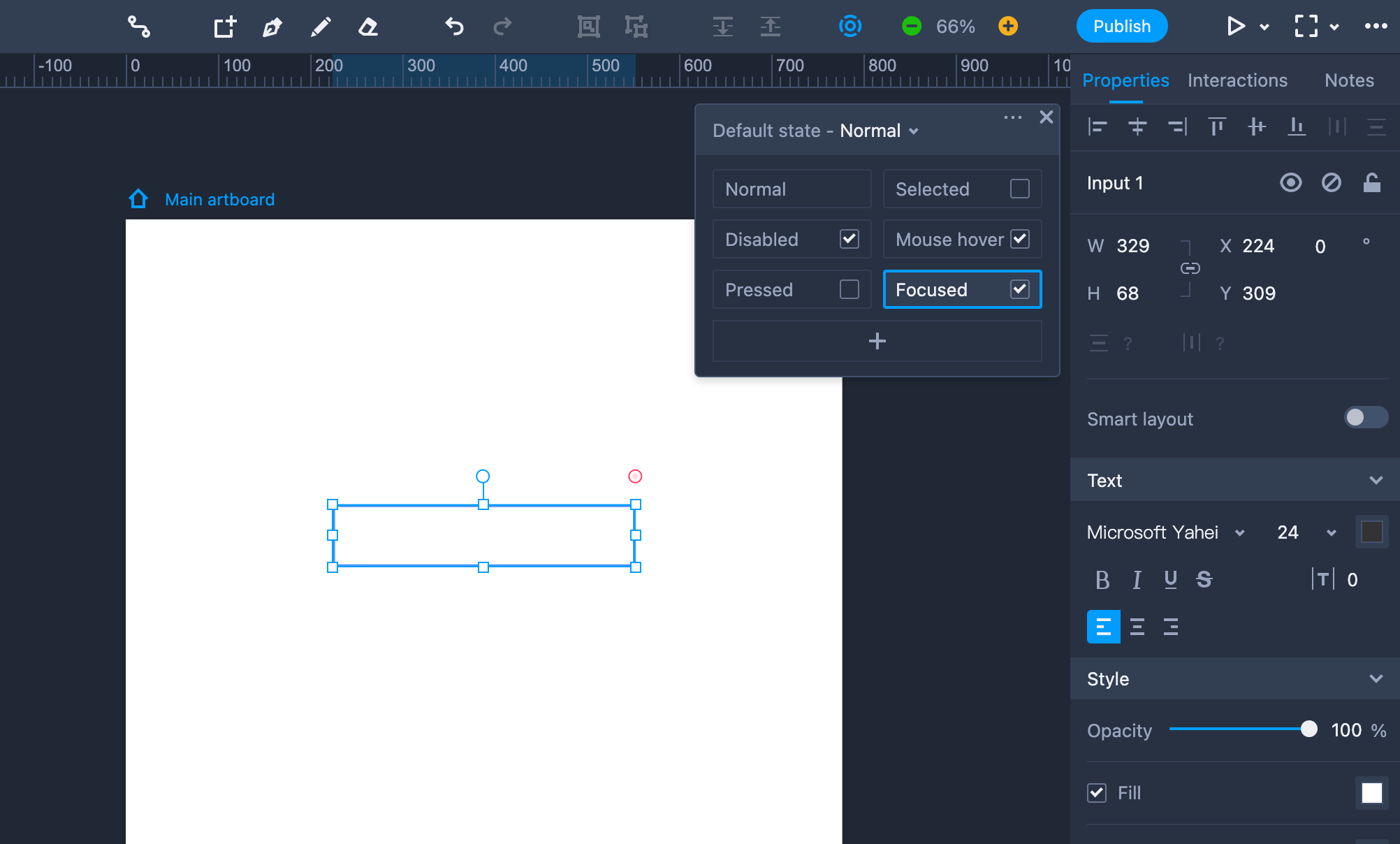
Focused
This state is often used on an "Input Box" component to indicate the input and non-input states of the component.
This effect is produced with a single step of selecting an object and switching to "Focused." You will then see the effect in Preview mode. You can also set a different border or fill colors for the input and non-input states.
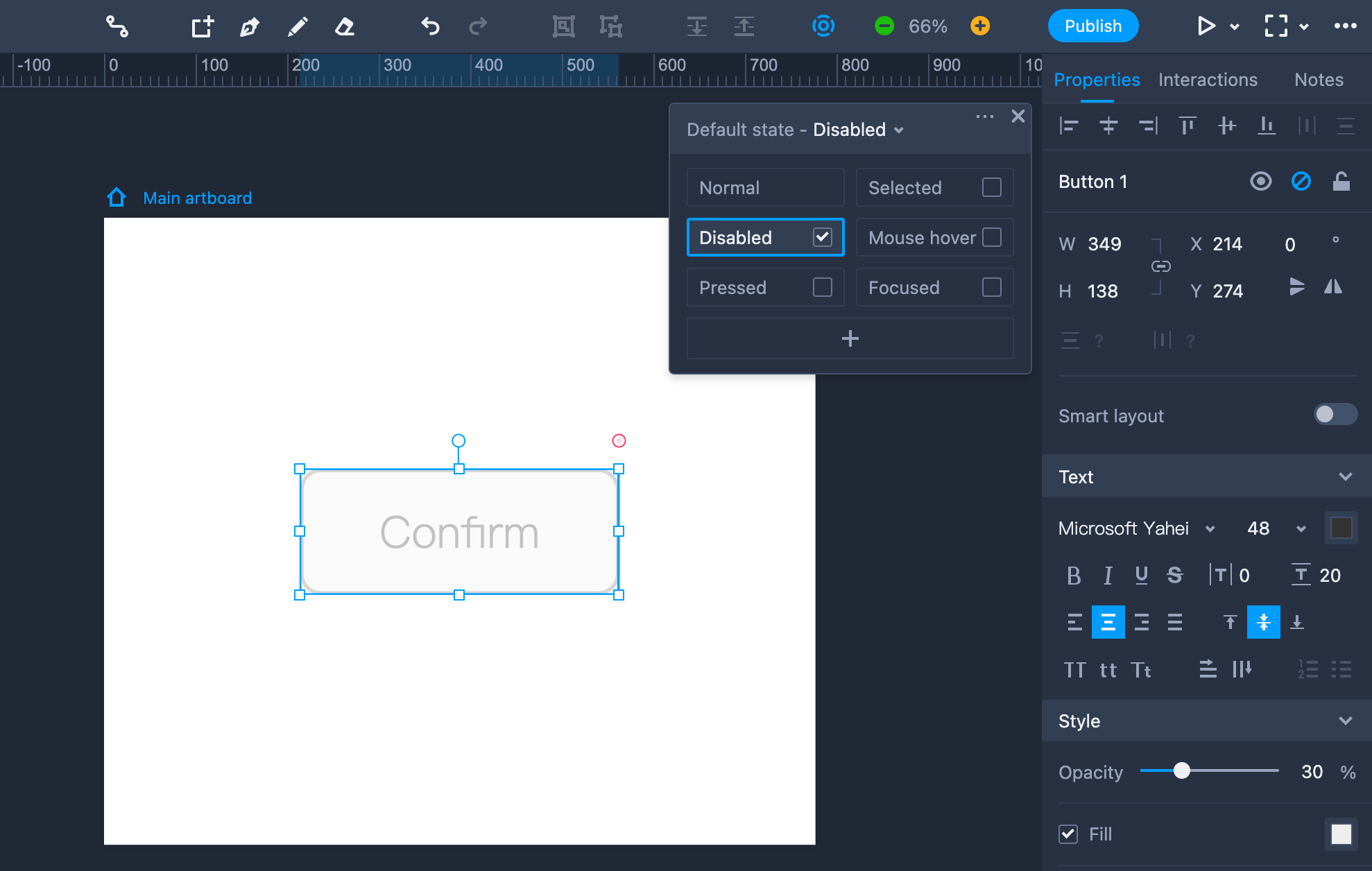
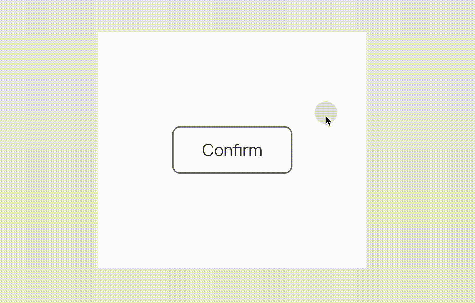
Disabled
This state is widely used to indicate when a component is unavailable.
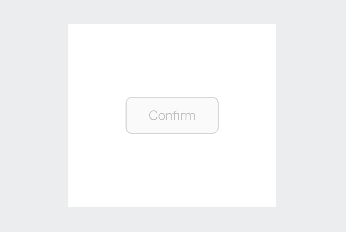
To create the disabled state, you need to select a component and check the "Disabled" item on the State panel to the right.
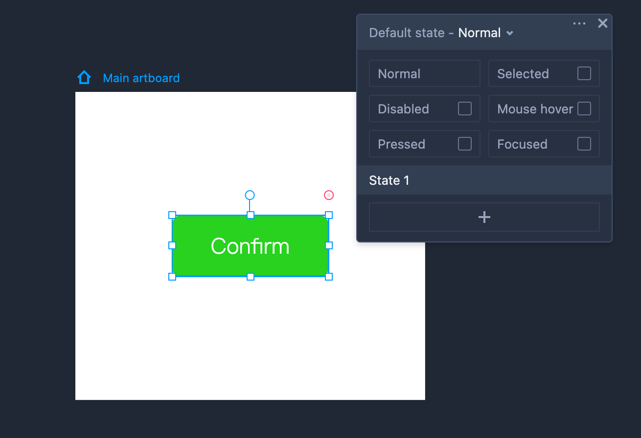
Custom State
You can create custom states to enhance the visual appeal of any component.
Follow these simple steps to customize a mouse hovering and a leaving state:
Step 1. Select a component; click "+" (on the pop-out State panel); choose "Custom state."
Step 2. Select the newly created "State 1" and set a different fill color for it.
Step 3. Drag the link point to the component itself; add a "Mouse enter" trigger and a "Switch state" command; then select "State 1."
Repeat this step; choose a "Mouse leave" trigger and a "Switch state" command; then select "Normal" instead.
Clone States
You can clone custom states in one click. Hover on the name of the custom state. Three buttons: "Rename," "Clone," and "Delete" will appear. Click "Clone" to create an identical state.