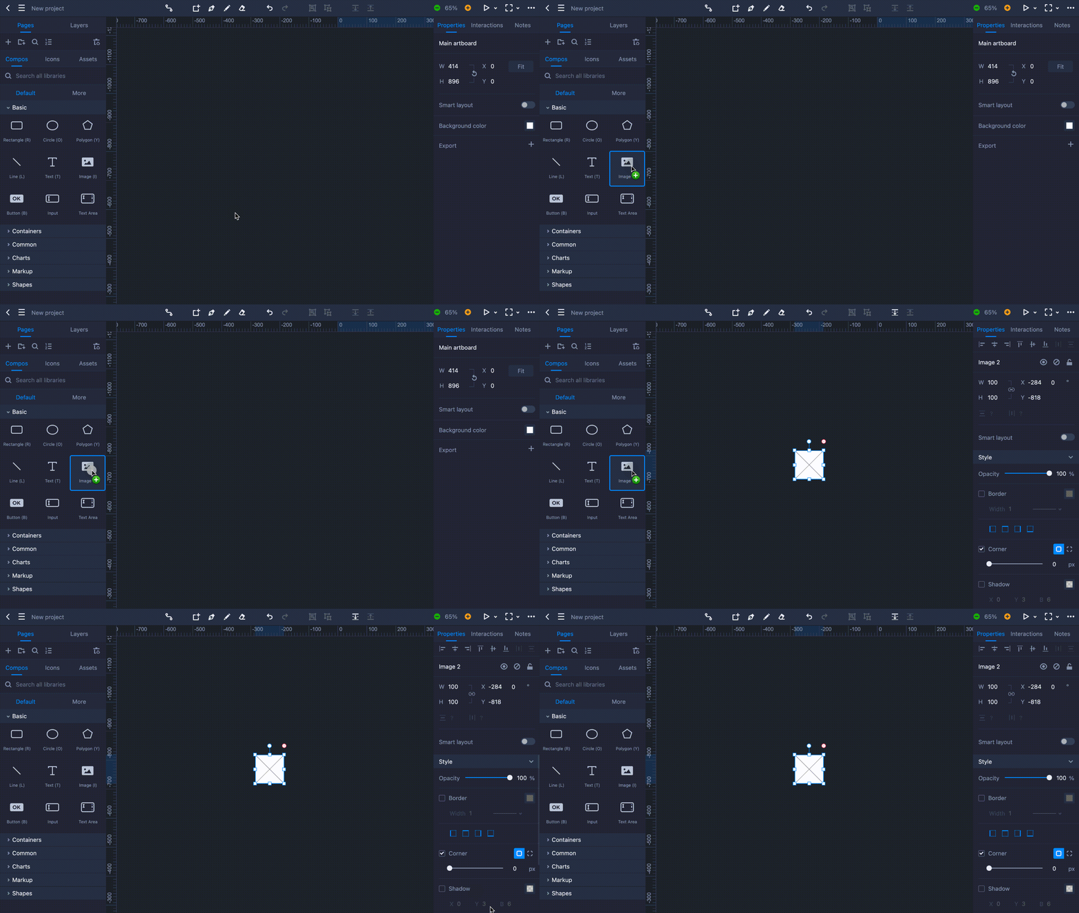
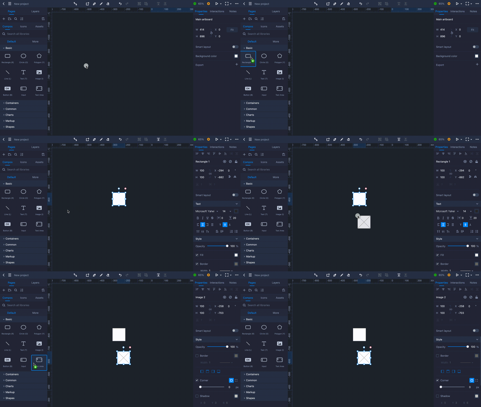
Click on the second "Components" tab on the left panel to access the built-in component libraries. Any common components, containers, or shapes that you will need can be found here.
Use the top search bar to quickly find the component or shape you need.
Component Libraries
Mockplus RP comes with four built-in component libraries: "Basic", "Containers", "Common" and "Shapes". Click the toggle next to the library name to show or hide the libraries.
Add Components
There are two ways you can add components to your design:
Double click on a component and it will be automatically added to your selected artboard.

Drag and drop a component to any location you want.
Component libraries are constantly expanded and improved.
Check "Components" to read more details on how to use different components.


