


Click the "Properties" tab on the right panel to open the Property panel. Here you can set or adjust the properties of your components.
Note that since different components have different properties, the properties in this panel can be shown differently.
In general, you will be able to see the following properties: Align left, Align center, Align right, Align top, Align middle, Align bottom, Distribute horizontally, Distribute vertically.
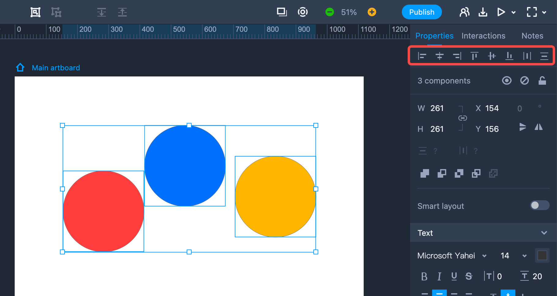
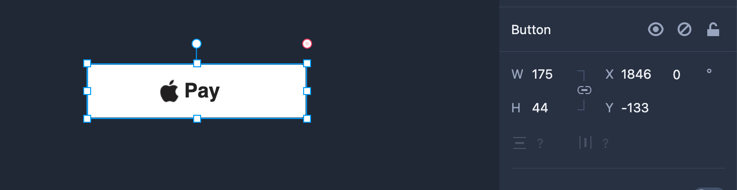
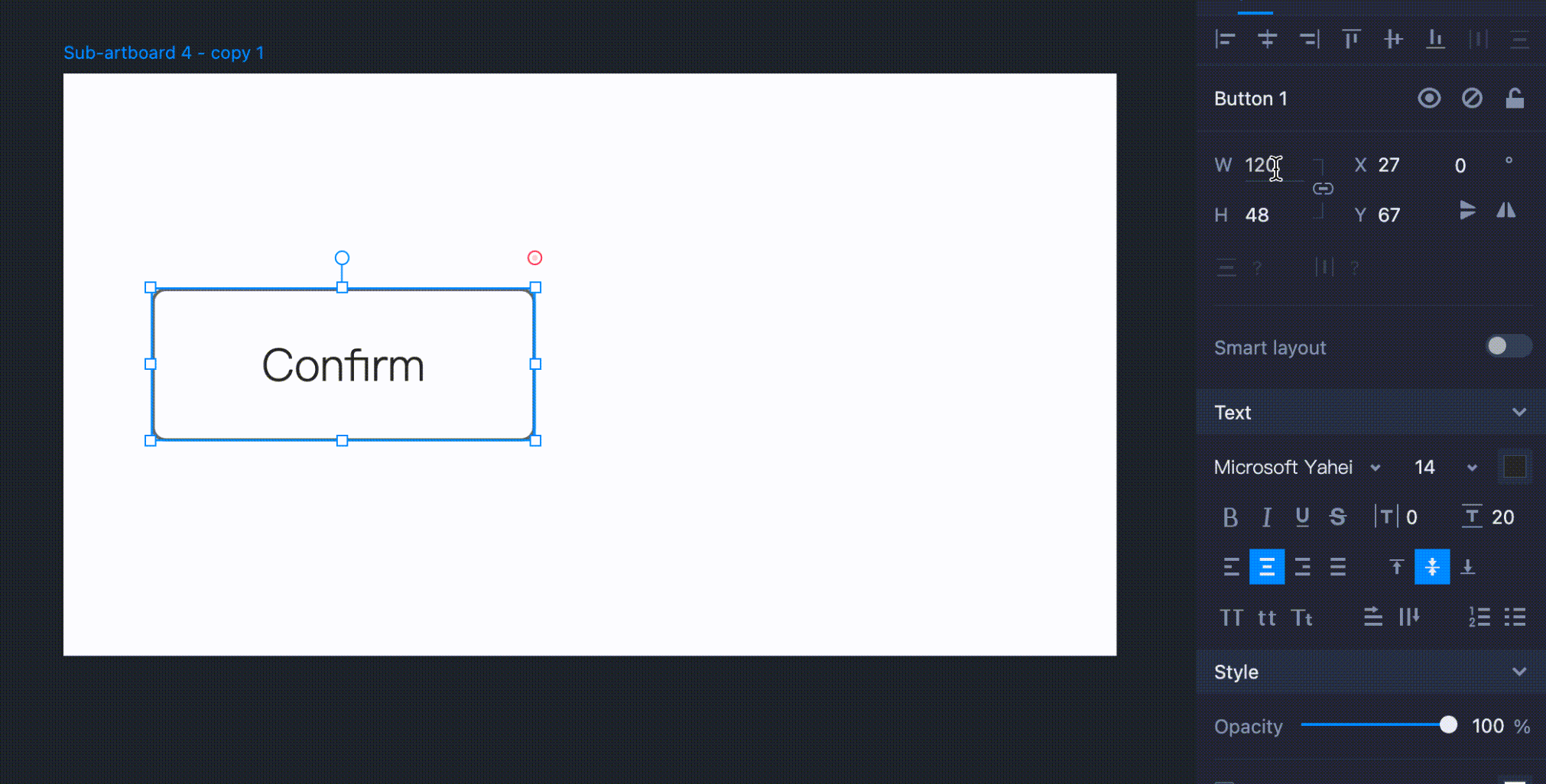
This section shows the name of the component you have selected. There are three icon buttons: “Hide,” “Disable,” and “Lock.”
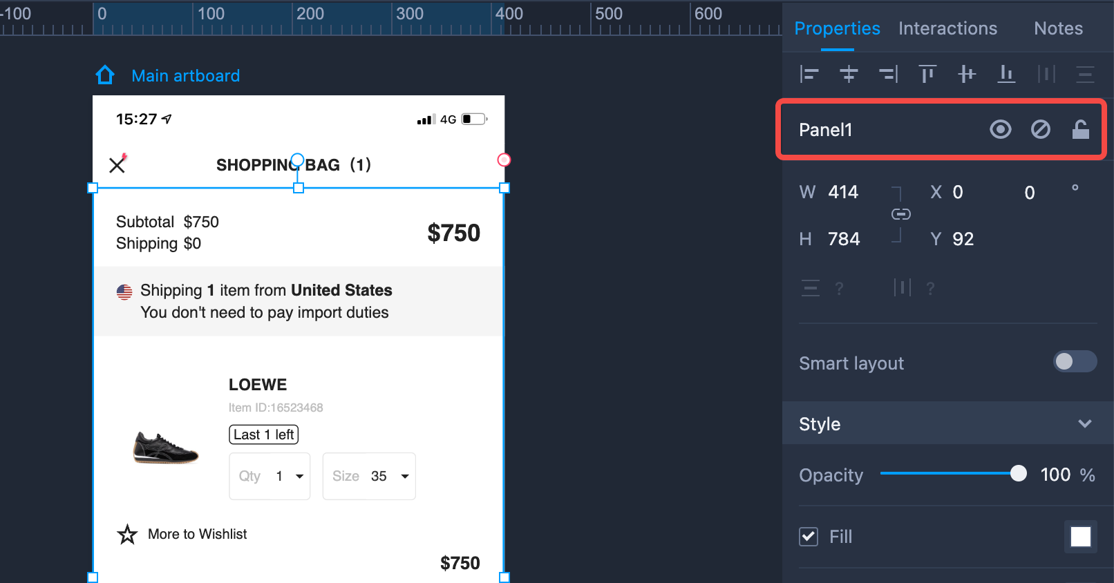
“W”and“H”represents the width and height.“X” and “Y”stands for the component's position on the workspace. The Lock icon in the middle enables you to lock the aspect ratio. Once clicked, you can only adjust the width and height of this component at an aspect ratio.
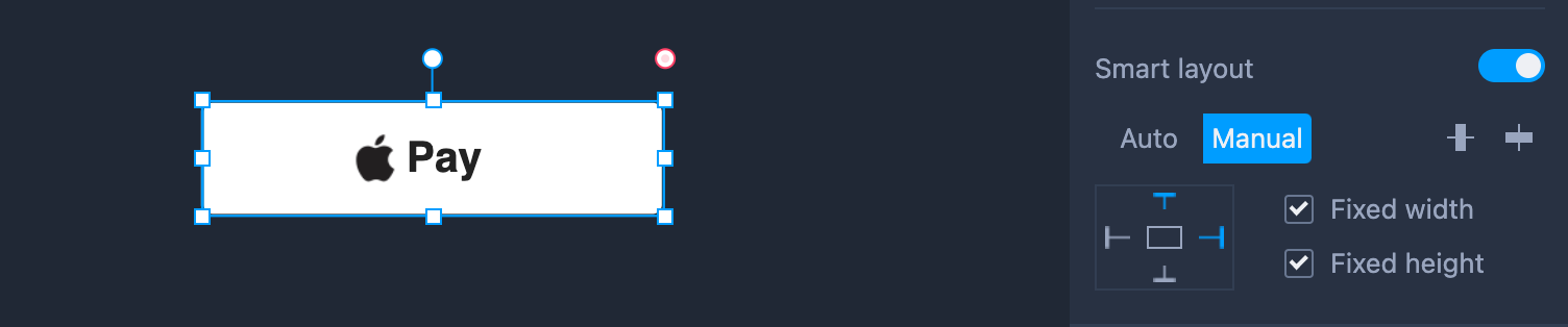
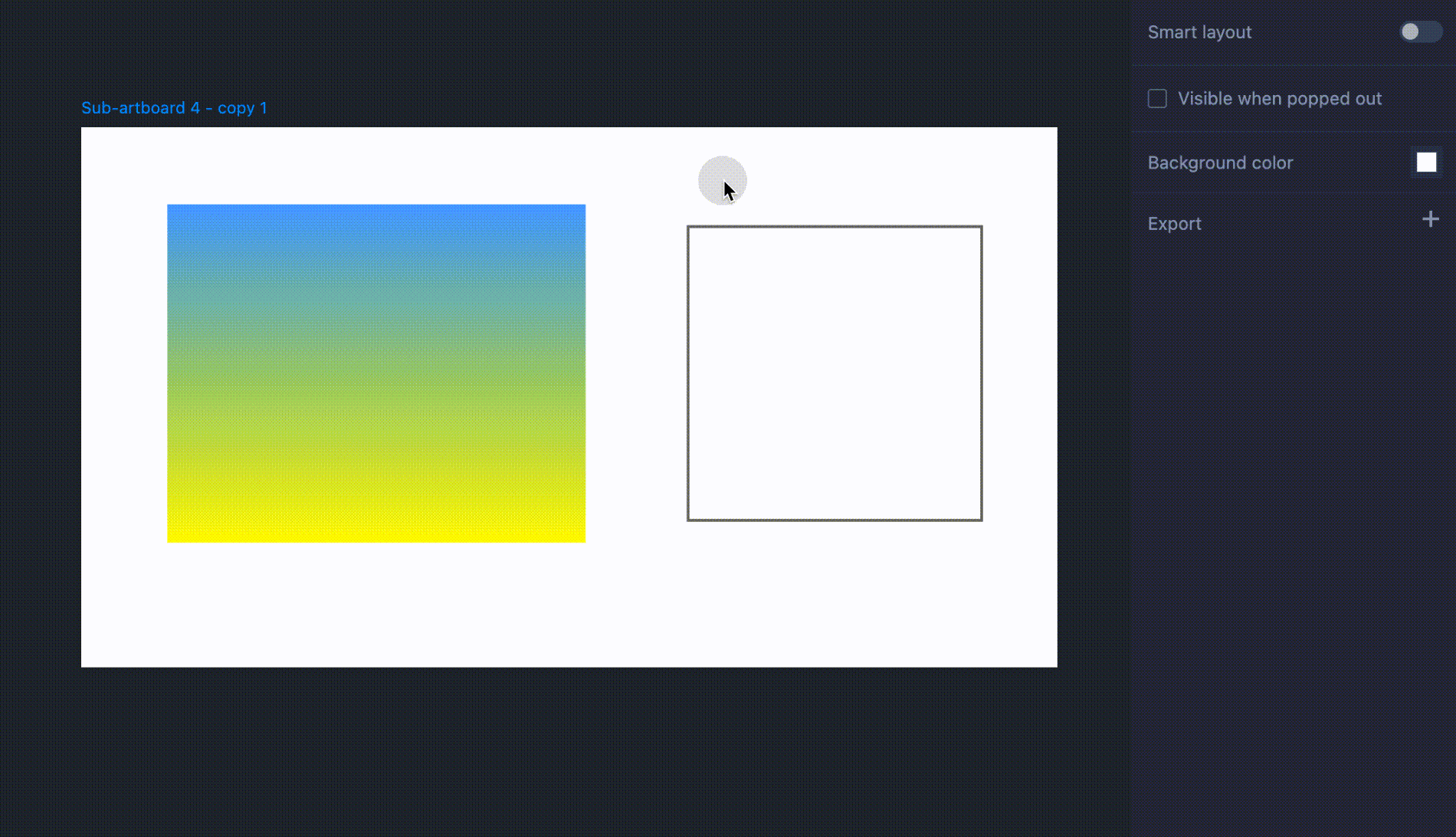
Check the featured “Responsive layout”in this section. For more deatils, check “Responsive layout” to learn more.
This section helps you adjust the component styles, including the "Opacity", "Fill", "Border" and "Shadow",etc.
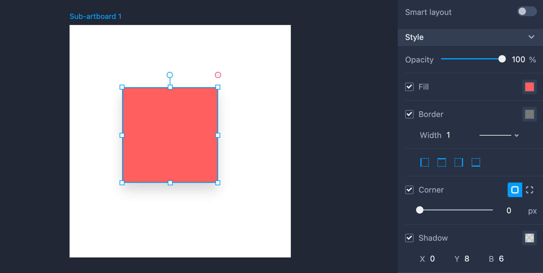
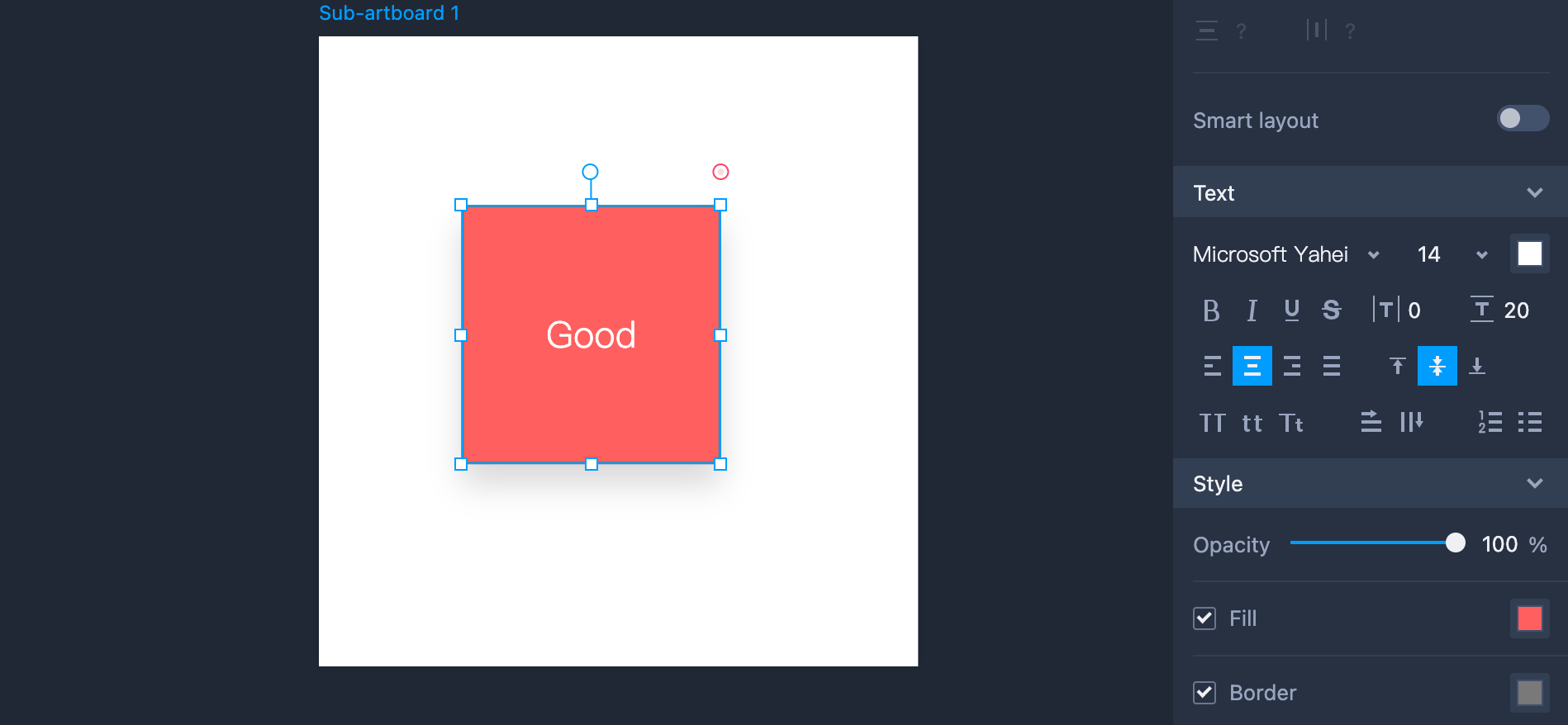
Here you can edit the text styles, including Font, Size, Color, Bold, Italic, Underline, Strikethrough, Spacing, Alignment, Upper/Lowercase, Text-indent, AutoSize and Align vertically.
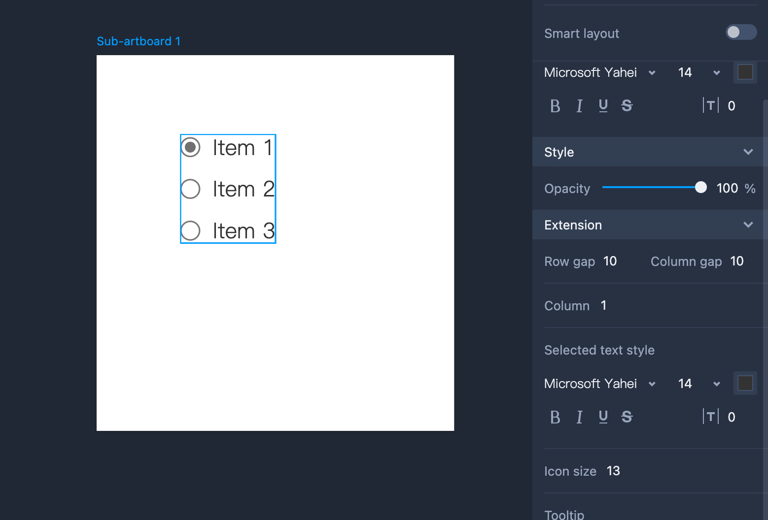
The extension section offers unique properties for some components. You can set even more component styles and effects.
Basic Operations
For most elements, you will be able to: Align middle, Align top, Align bottom, Distribute horizontally, Distribute vertically. This section shows the name of the component you have selected. There are three buttons: “Hide,” “Disable,” and “Lock.”
"W" and “H” represents the width and height of the selected component. "X" and "Y" stands for the component's position in the workspace. The Lock icon in the middle enables you to lock the aspect ratio. Once clicked, the width and height of the component can only be adjusted at a fixed aspect ratio. Mockplus also offers "Responsive layout." Check "Responsive layout" to learn more about this feature.
Eyedropper tool
The eyedropper tool is a tool that lets you pick colors from an image or element in the current workspace and apply them to other elements immediately.
To use the Eyedropper tool, you are supposed to firstly open Mockplus RP on your Google browser and download the tool plugin package.
And then, please follow the below steps to install the plugin:
Step 1. Extract the plugin .zip package
Step 2. Open Chrome and navigate to "Options > More Tools > Extensions" from the top-right menu.
Step 3. Switch on "Developer Mode" in the top-right corner. Then click "Load Unpacked" and select the extracted plugin folder (choose the folder itself, not individual files inside).
Step 4. Turn off the "Developer mode" in the upper right corner to start using it.
Please note:
First, if you encounter lag or serious performance issues while using this Eyedropper tool, you can try using the Chrome's native API for color picking. To enable this feature, go to "Preferences > General Options" and check "Use the new Chrome API for color sampling."
And this feature is currently under testing, and there might still have some compatibility issues; you can choose based on your needs and situation.
Second, this tool plugin works only on Chrome browser. You are supposed to download and install Chrome browser as well in advance.