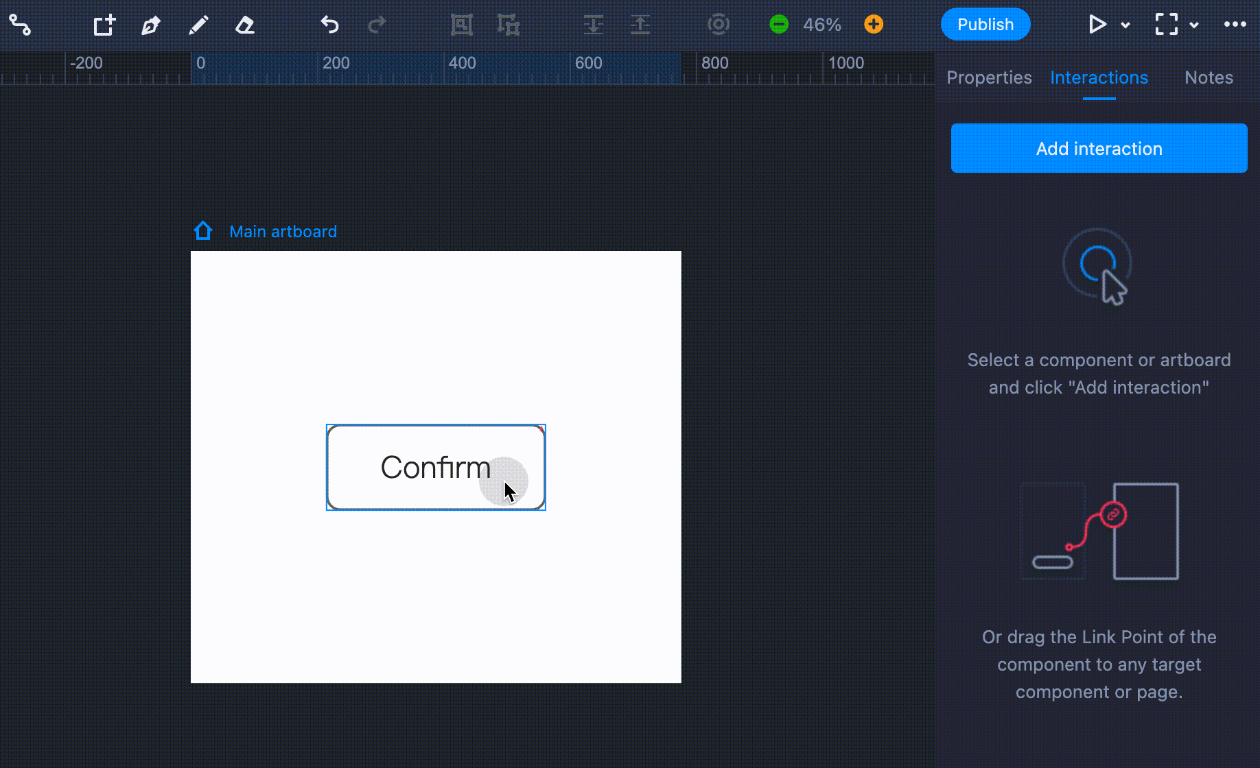
Targets
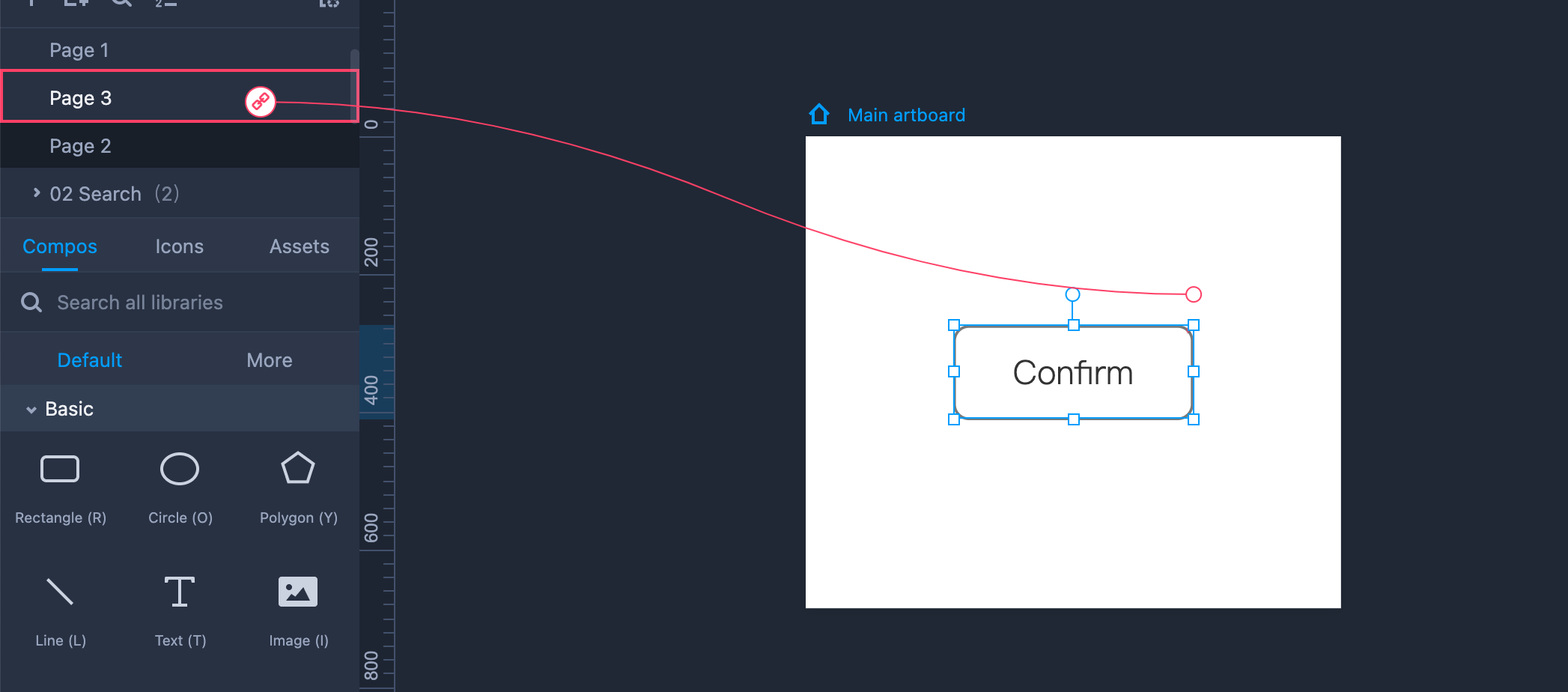
When designing with Mockplus RP, you can create an interaction by simply dragging the link point (a red dot in the upper right corner of a component) onto the target. Pages, artboards, and components can all serve as targets.
The example below illustrates how you can create an interaction between a component and a page.
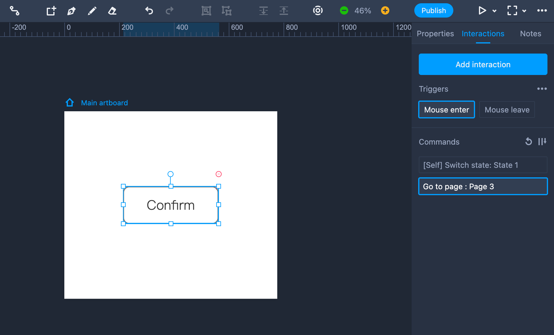
Tiggers
Mockplus provides users with up to 13 triggers: Click, Double Click, Right Click, Mouse Down, Mouse Up, Mouse Enter, Mouse Leave, On Load, Moved, Zoomed, Rotated, Shown and Hidden.
You can choose any of these triggers to make fully interactive prototypes.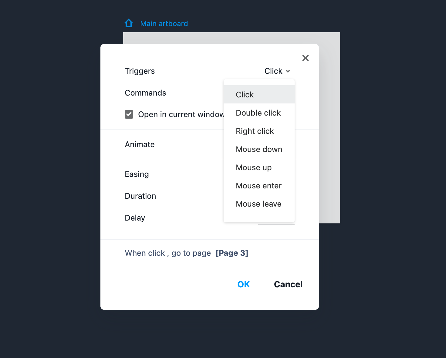
Easing Animations
When creating an interaction, you can also add smart easing animations at the same time to create more natural experience. There are four options to choose from: "Linear," "Ease in," "Ease out," and "Ease in out."
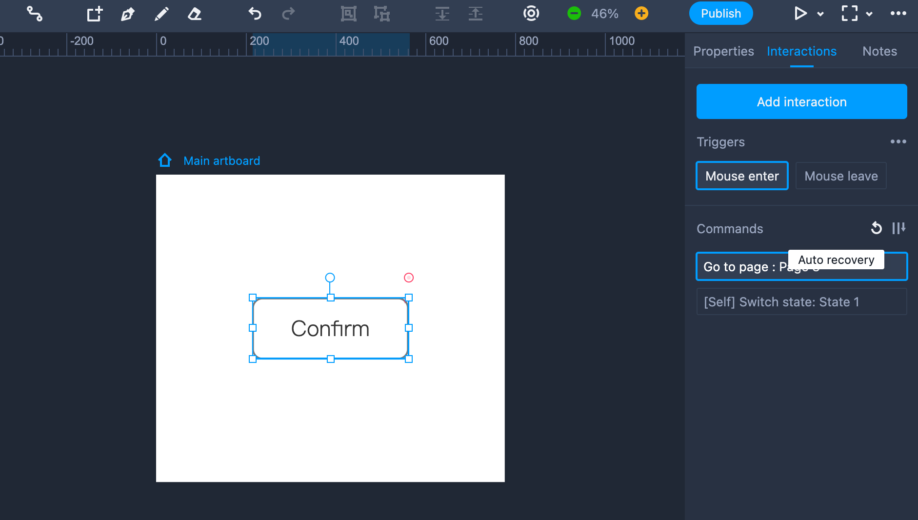
Command Order
To create lifelike prototypes, you can assign multiple commands for the same component. To prevent execution conflict, these commands will be auto-arranged.
 You can drag and drop these commands to put them in a different order.
Auto Recovery
While adjusting the command order with drag-and-drop, you will find an "Auto recovery" icon button located on the right side.
Once it is on, the component will be auto restored to the original state when its action triggers have been executed for the second time.
For example, when a zoom-in transition was set on a component with the click as its trigger, the second click on it will zoom it back out to the original size.
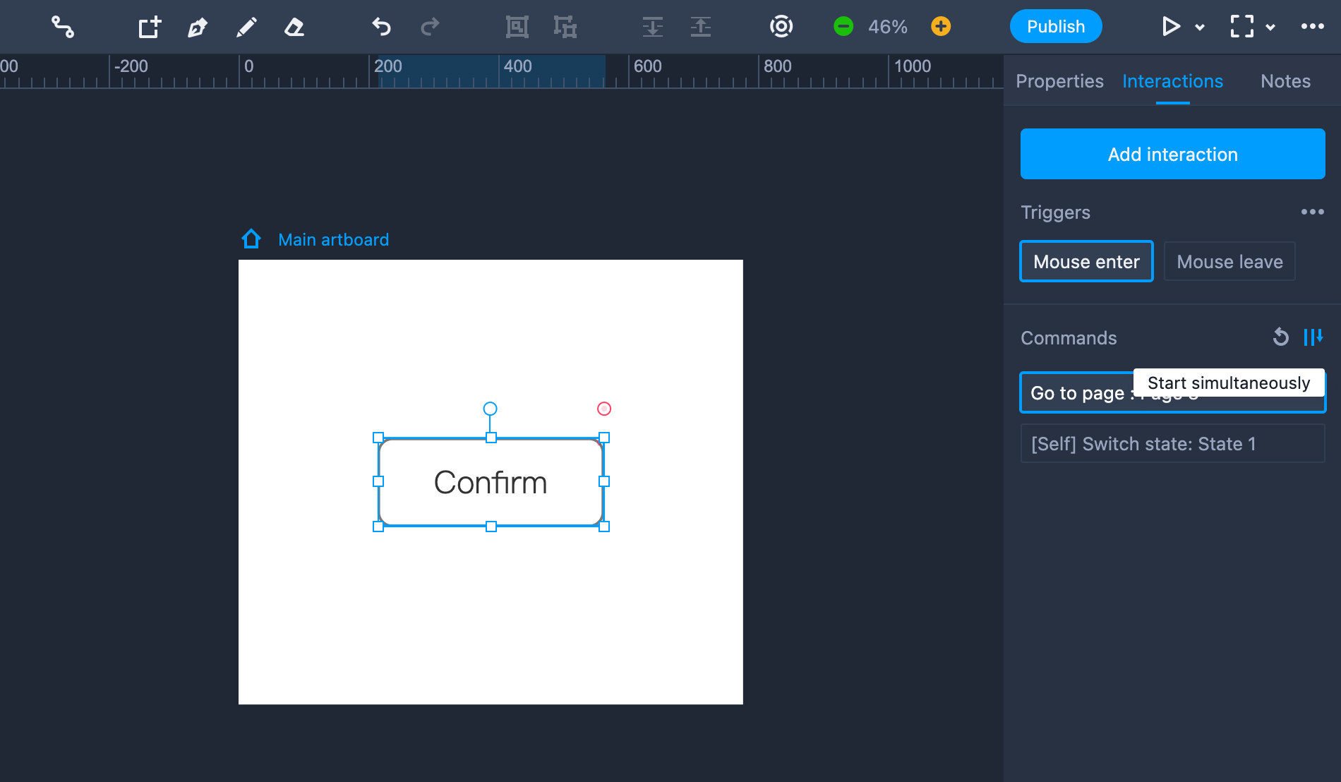
Start Simultaneously
Next to "Auto recovery" is another icon button labeled as "Start simultaneously." When this is on, Mockplus will start executing all commands assigned to the component simultaneously.