Smart Layout makes it fast and easy for you to adjust the interfaces for different screen sizes. This feature allows you to edit the intelligent scaling for your artboards, components, or component groups.
When scaling an artboard or a group of components, the intelligent scaling automatically adjusts the size and layout of the components to mimic the original conditions. You can easily adapt your design to different sizes under the Edit mode.
Enable Smart Layout
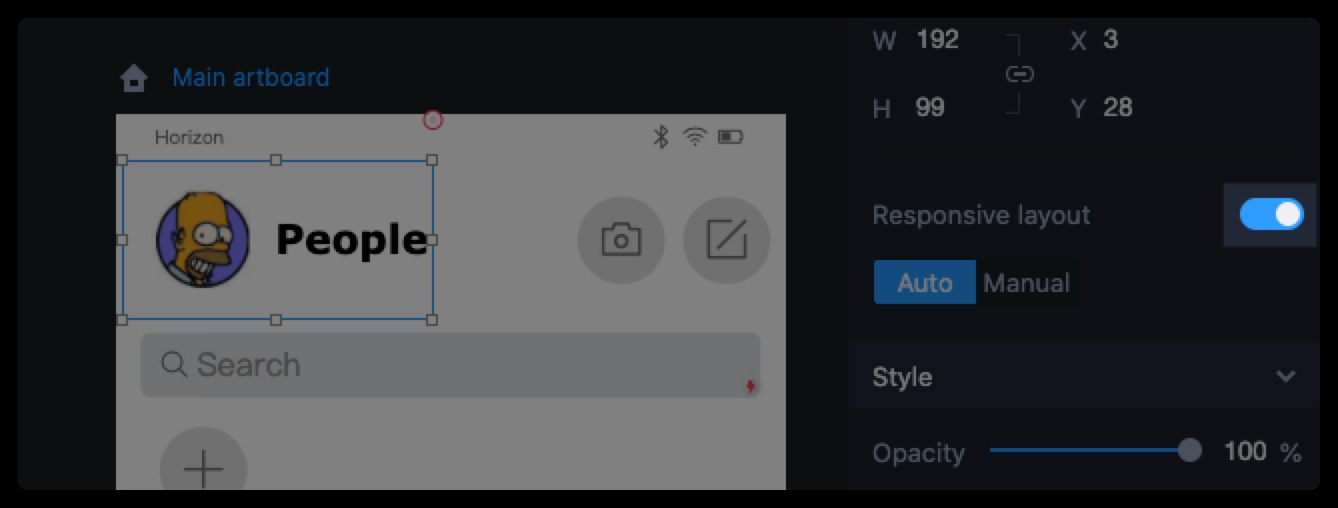
You can enable the intelligent scaling of an artboard or component group on the right Properties panel by toggling a "Smart layout" switch. When it is ON, the intelligent scaling of all components will also be enabled automatically. You can disable the intelligent scaling of different components separately by toggling the switch as well.
Note that if you don't want the intelligent scaling to affect a particular component on the artboard, you need to toggle off the switch in the right Properties panel.
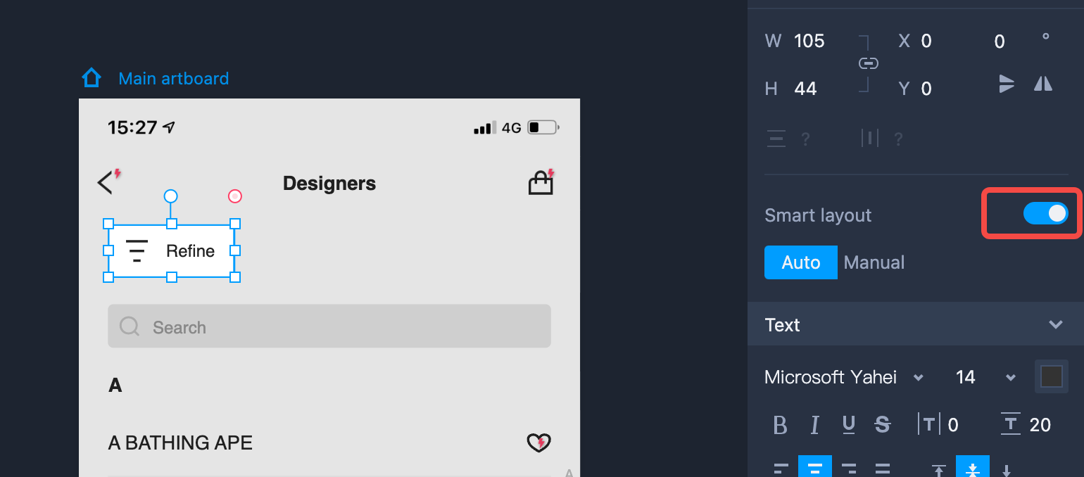
Auto Layout
When the "Smart layout" switch is toggled ON, an "Auto" layout mode will be enabled automatically, and it will maintain the constraints for the size and position of each component according to the layout within the artboard or group.
You can group multiple components to auto-scale all of them together.
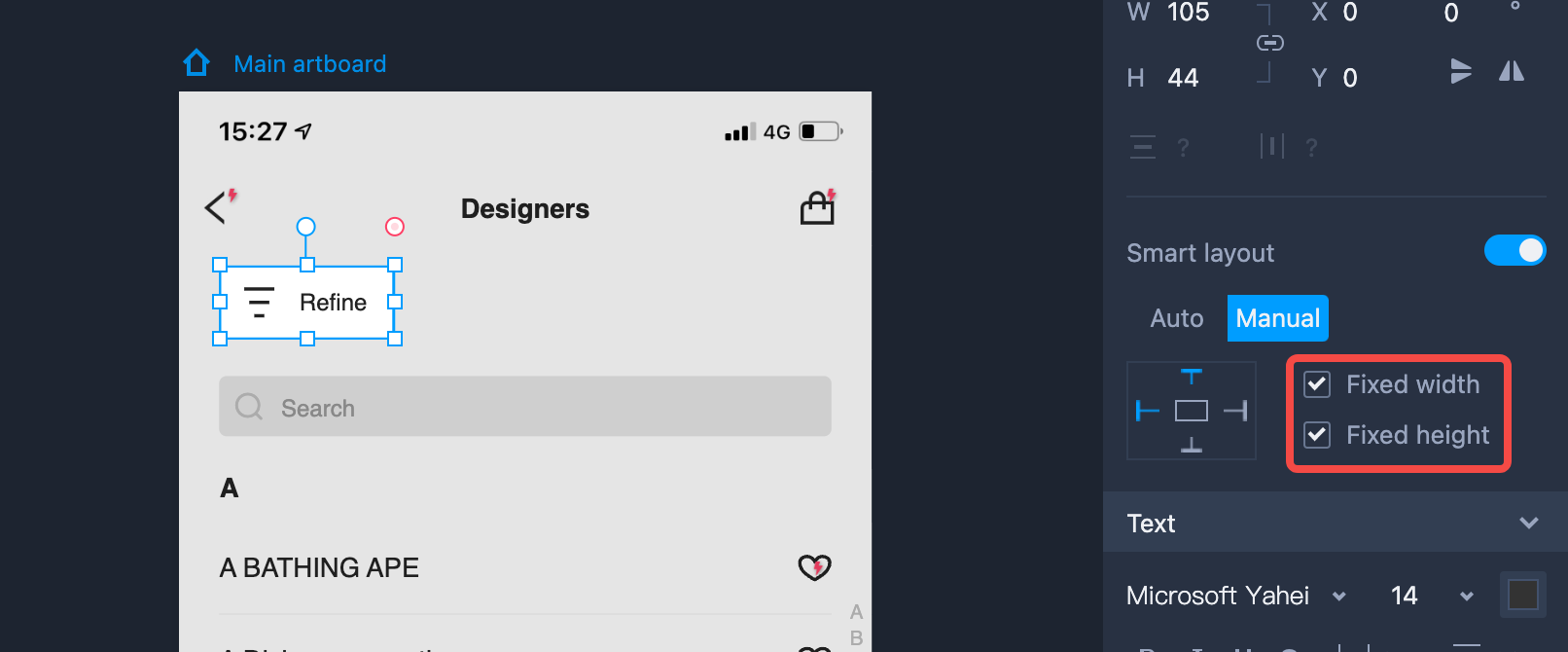
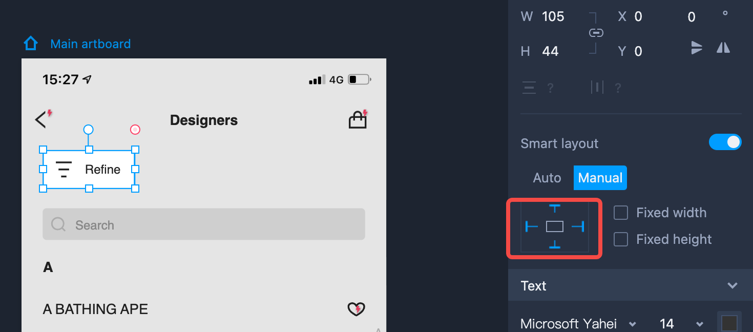
Manual Layout
Click on “Manual” to set the layout constraints manually:
Use four anchors to fix the top/bottom/left/right alignment of a component within the artboard or group.
Click buttons, "Fixed height" and "Fixed width", to fix the height or width of a component.
Note that anchoring the component to both the left and right position of the artboard or group at the same time can conflict with the "Fixed width" option. Anchoring the component to both the top and bottom of the artboard or group at the same time will conflict with the "Fixed height" option.