Mockplus helps you make a popup or overlay to present your content.
Let's first watch a video to see how you can do that:
With Mockplus RP, you have two methods to create a popup or overlay:
Method one
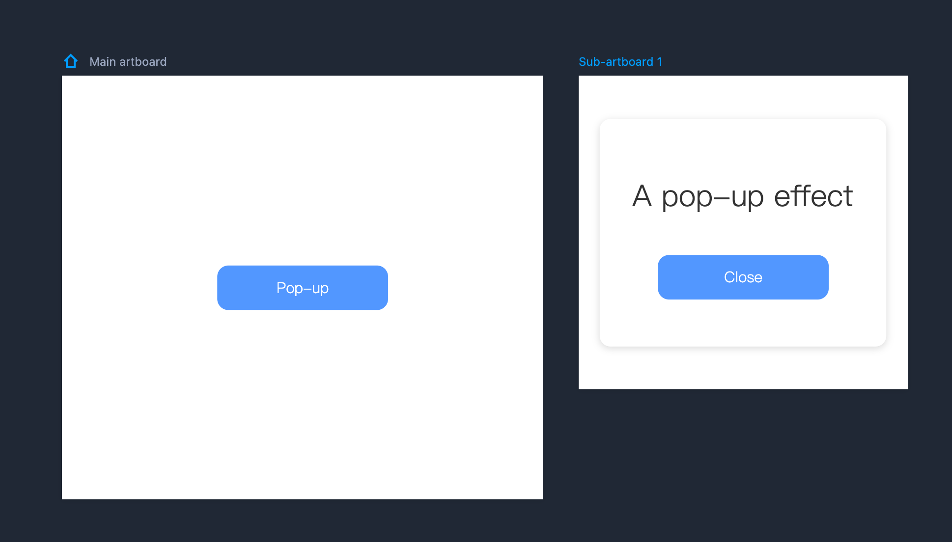
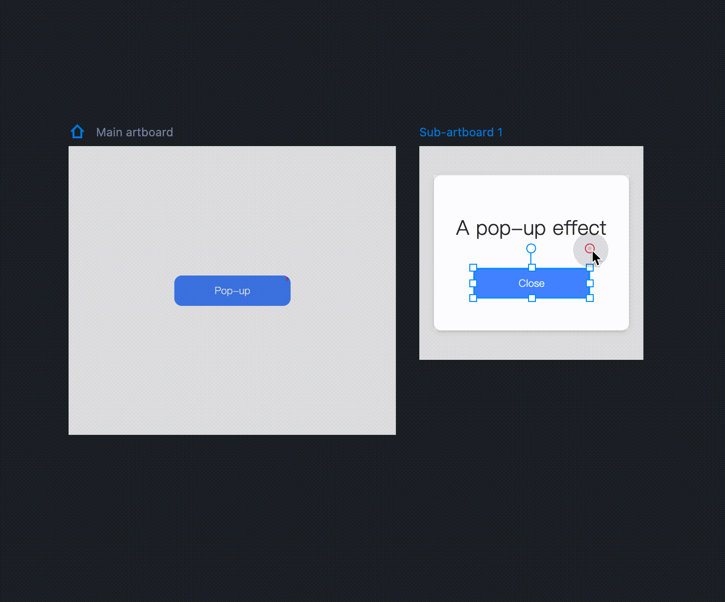
Use sub-artboards to create a popup.
Step 1: Put all content of your popup into an sub-artboard
Add a sub-artboard and drag all the components you need onto the sub-artboard.
Step 2: Make it pop
In the Main artboard, drag the link point of the trigger component onto the sub-artboard. (Note that it is important to link to the artboard itself rather than an individual component on it.) You can then define the details and your pop-up is finished!
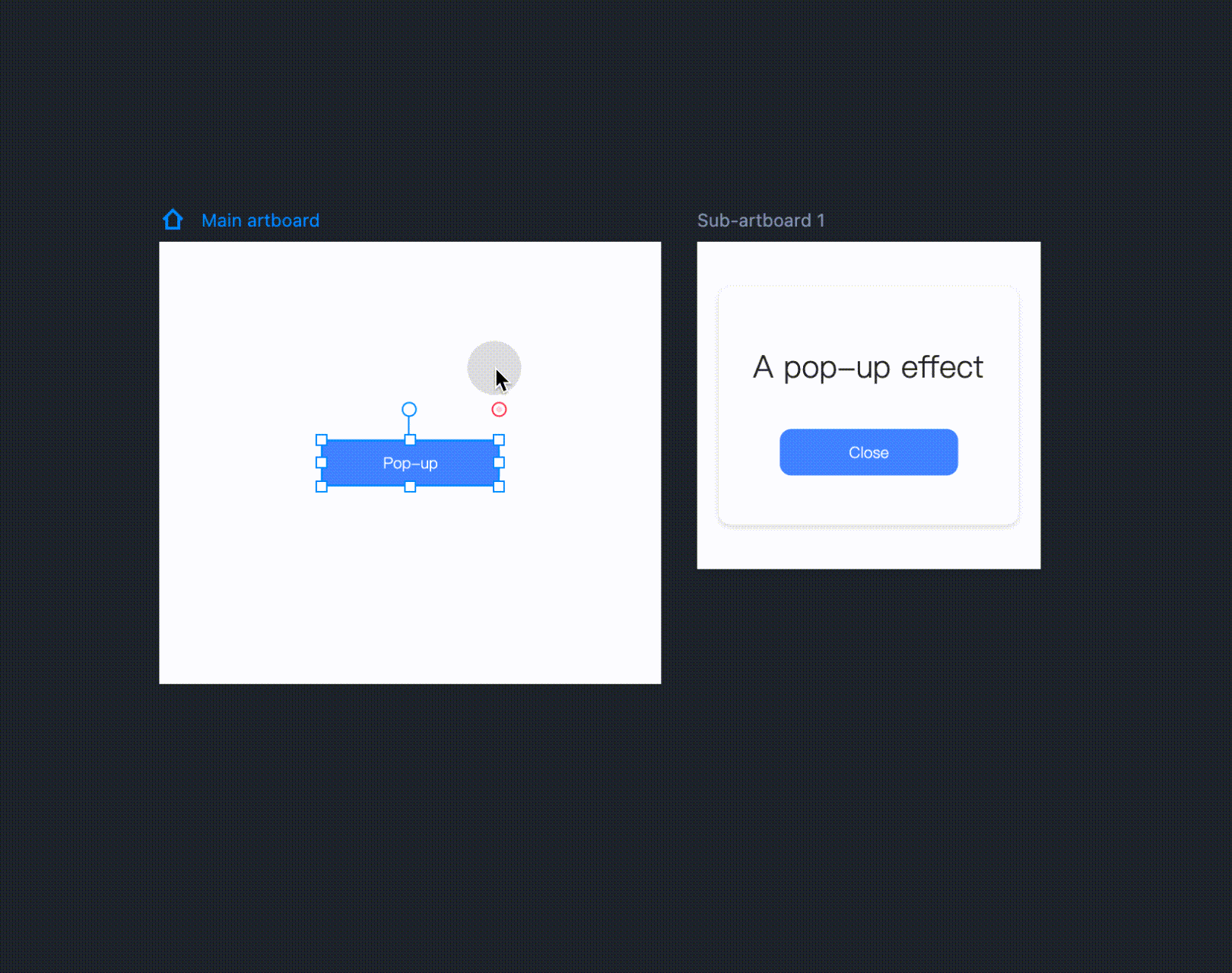
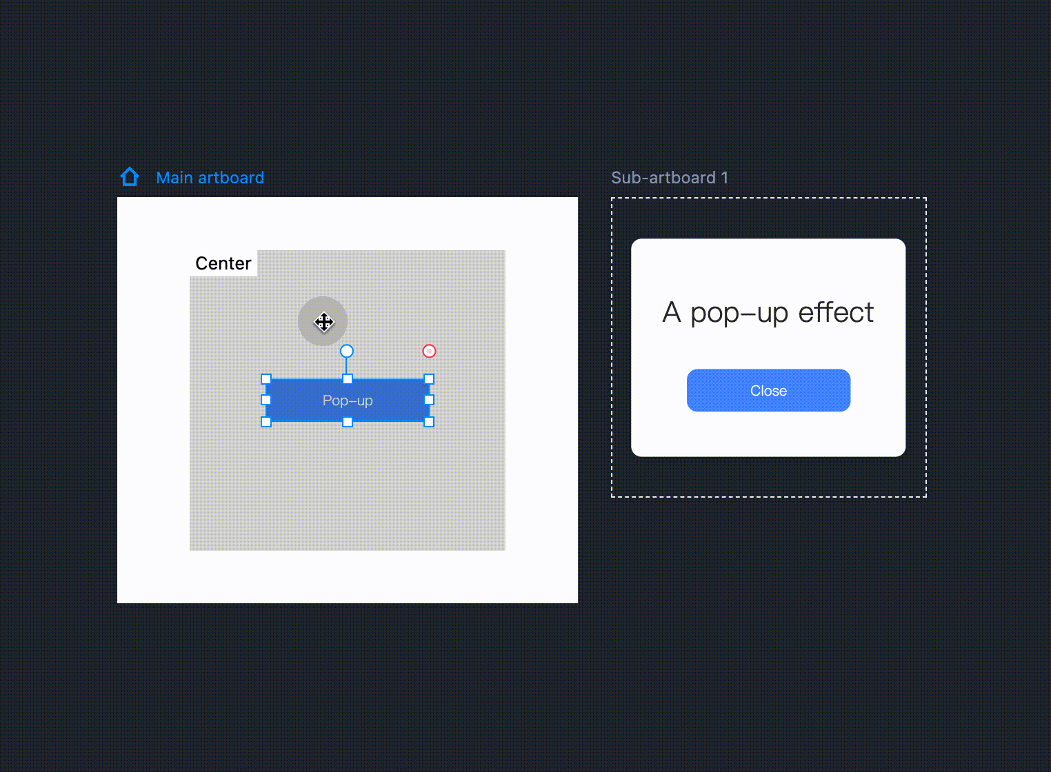
The relative position of the sub-artboard to the main artboard can be defined by the user. Once you’ve created the interaction, select the interaction command in the interaction panel, and a mirror image of the sub-artboard will appear in the main artboard. Drag the mirror image to adjust the position of the sub-artboard during the presentation.
To close the pop-up window, simply click the pop-up component. You can then drag the interactive link point of a component on a sub-artboard to the sub-artboard and then complete the setting.
Method two
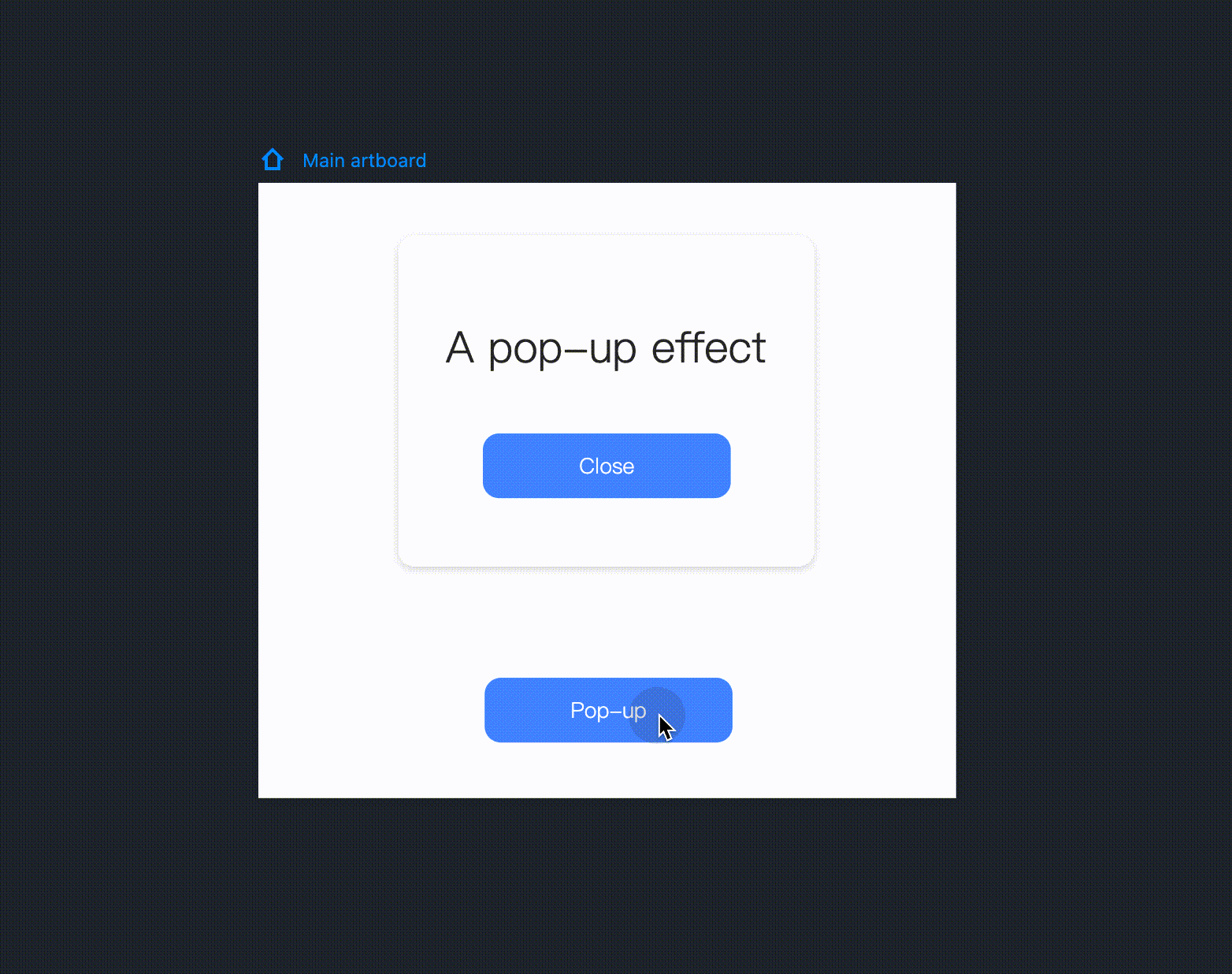
Use "Show/Hide" commands to create a popup.
Step 1: Choose components
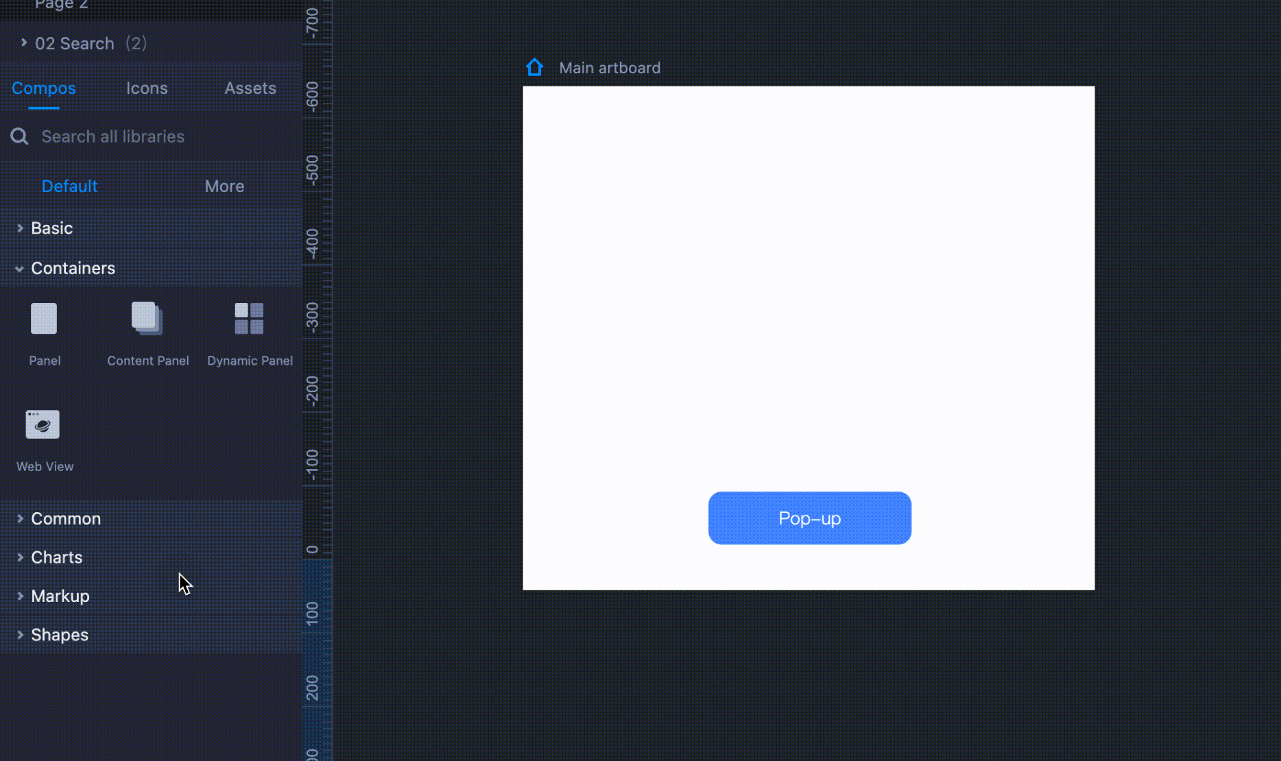
Drag a Button and a Panel onto the main artboard (Generally, the Button will serve as a trigger, while the Panel will serve as the pop-up window.) Double click the Panel to present your message by dragging a "Text" and a "Button" component into this Panel.
Step 2: Edit component style
You can edit these components to improve their visual appeal.
Step 3: Make it pop
Drag the link point of the Button outside the Panel; choose a "Click" trigger and a "Show" command for it. Then, double click on the Panel and set a "Click" trigger and a "Hide" command for the Button inside. Finally, you can hide the Panel. That way you will get a pop-up that can be triggered by clicking the Button outside.