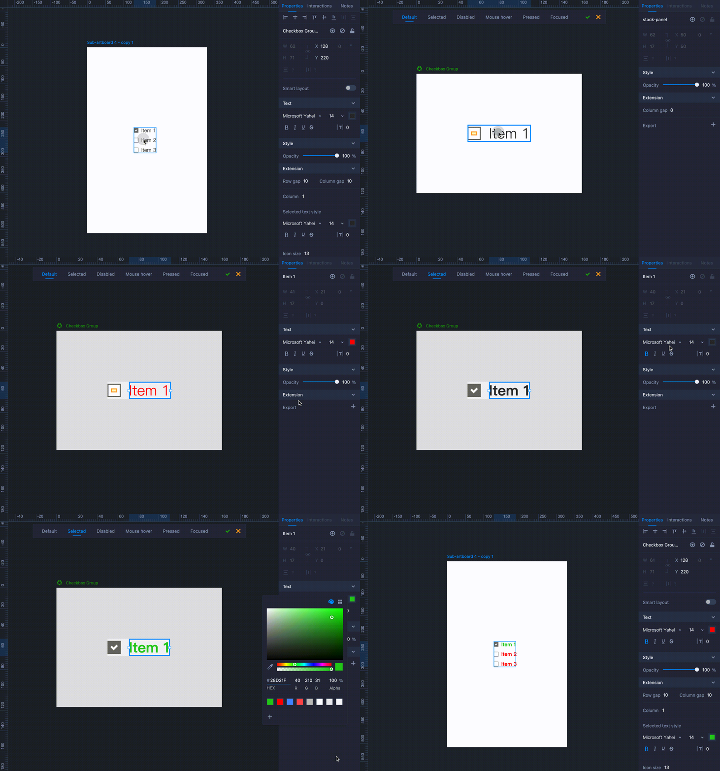
With compound components (those containing multiple items and options), you can fine-tune every small detail and set different states by entering the "Advanced Edit" mode.
Advanced Edit
To access this mode, simply right-click on a compound component, such as a Checkbox Group or Radio Button Group, and select "Advanced edit" from the menu.
In this Advanced Edit mode, you can:
- Customize the smallest elements of the component to fit your design
- Set different states for the component
This mode consists of three sections: Preview, Element and State.

Preview Section
In the Preview section, you can see all the basic elements of a component. When
you adjust the properties or styles of the component, the effect will take place automatically, and you will see the result of the operation in real-time.
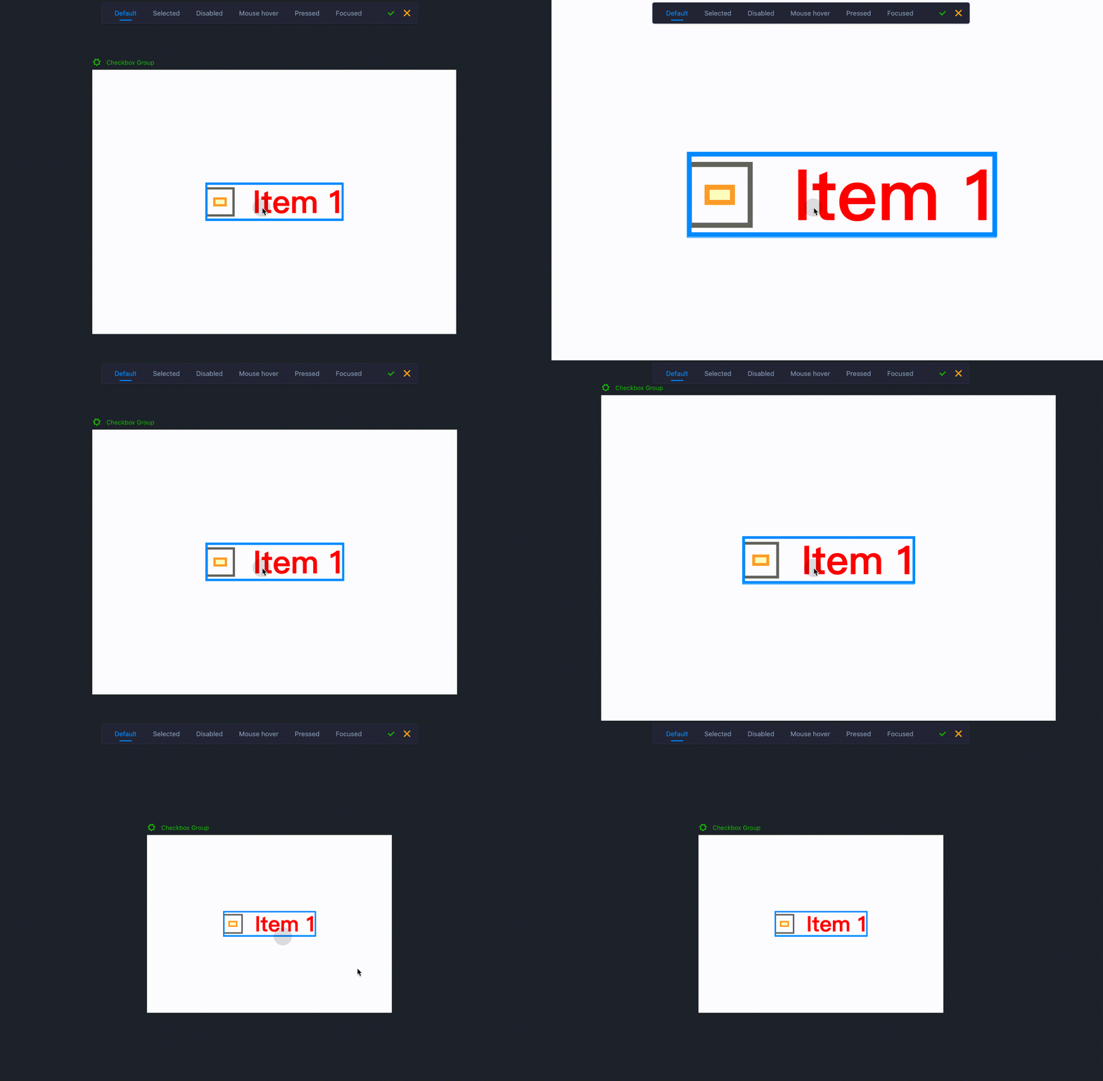
Use the scroll wheel while holding "Ctrl" to zoom the component or element.

Element Section
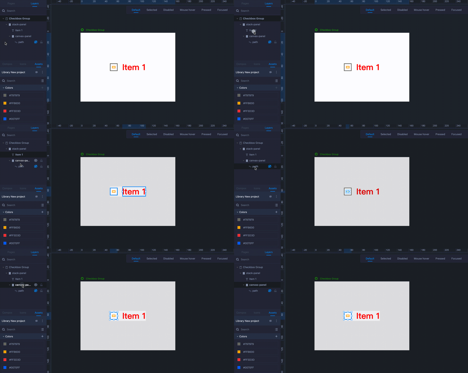
Different components consist of different elements, each with its own properties.
You can edit the properties of an individual element by selecting it in the right Element section.

State Section
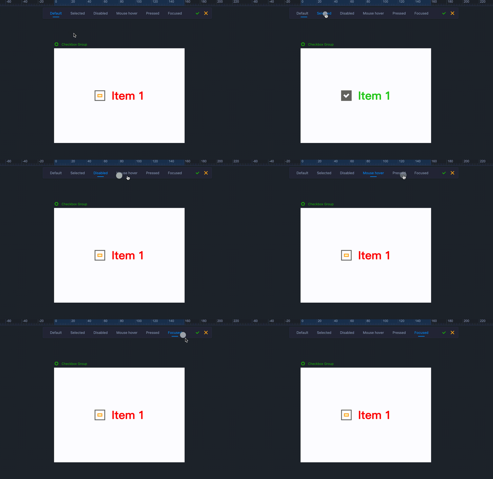
In this section, some components are displayed with different states, such as "Default," "Selected," and "Mouse hover." You can switch between these states, style the state of an item, and then, the same state settings will automatically be applied to all similar items of that component.
Note that after editing styles, you need to click on "√" to apply or on "×" to discard the changes.

You can double-click on a component to access the component editor, in which you can adjust the inner element's properties.
By double-clicking on a component a few times, you can switch between the component's elements and edit their properties in the right Property panel.
Editing one element's properties automatically trigger the same editing to the other elements in the same state.


