


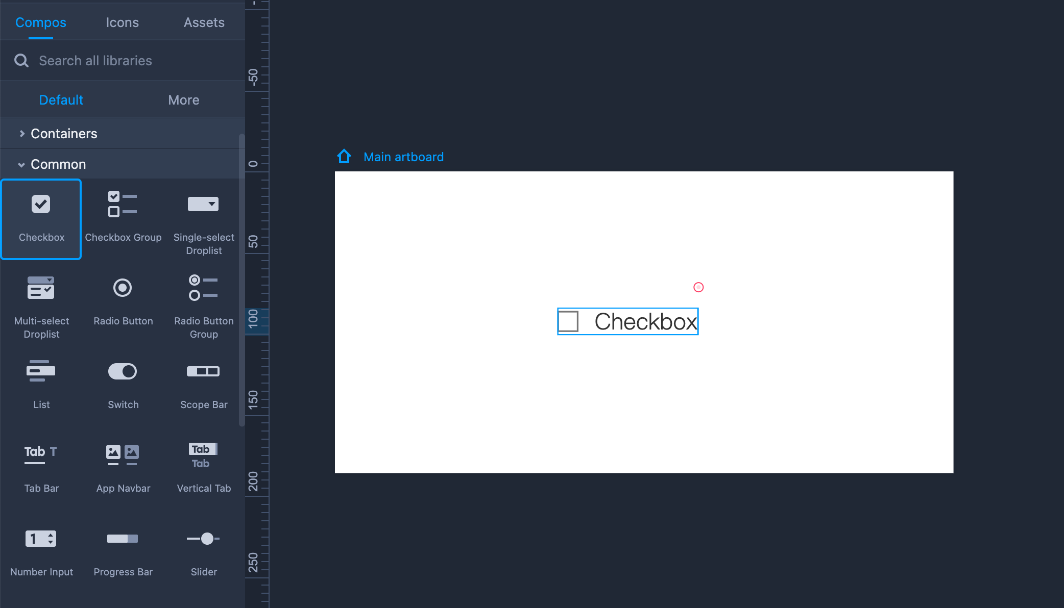
Checkbox
Drag the Checkbox from the left-hand Common library to use it in your design.
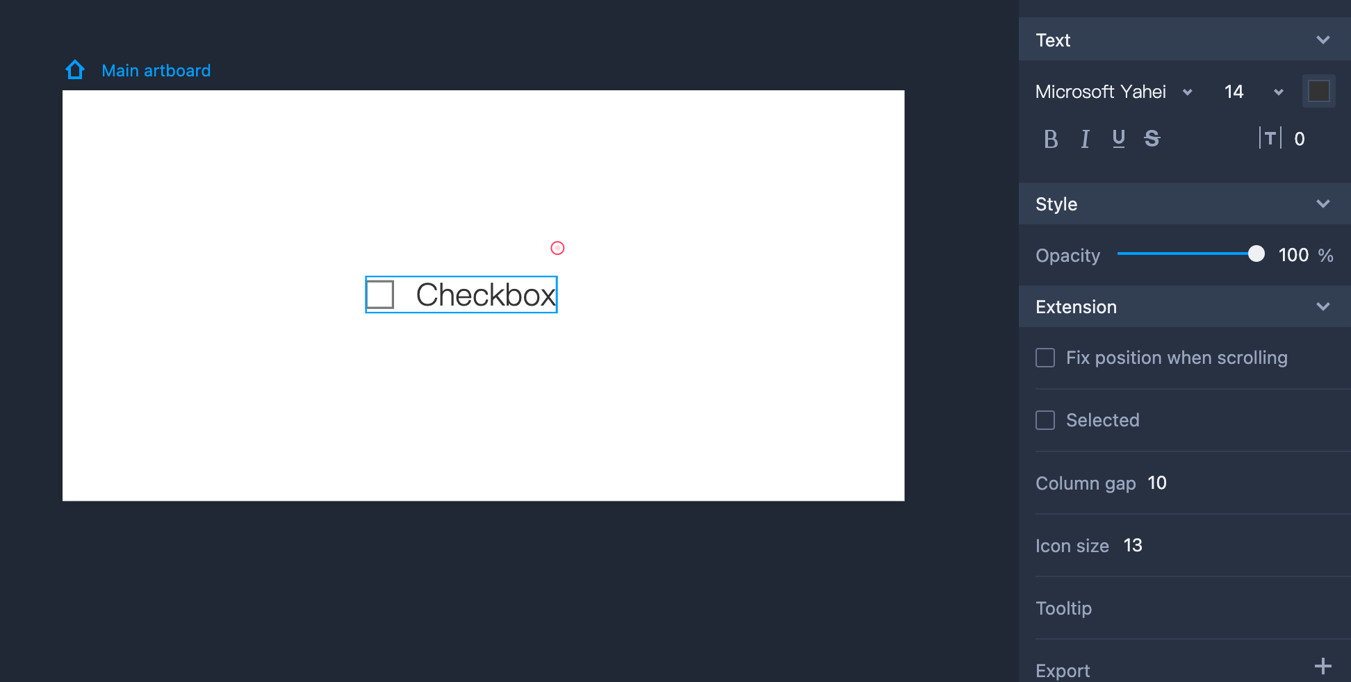
Property Settings
You can set the text styles, opacity, and other properties on the right-hand Property panel. The checkbox comes with a "Selected" state in the "Extension" section. The distance between the text and the front icon can be adjusted as well.
Edit Checkbox
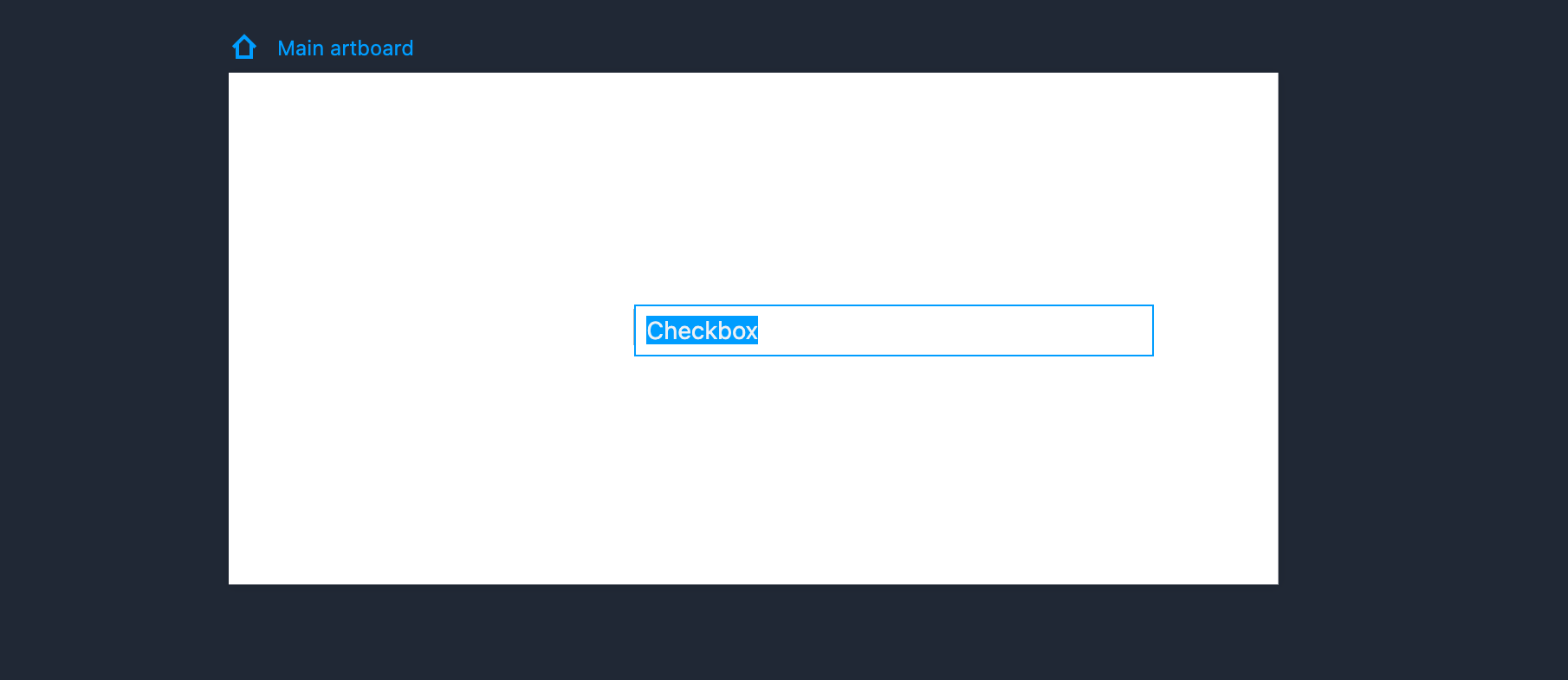
You can edit the item’s text simply by double clicking the component or clicking "Enter."
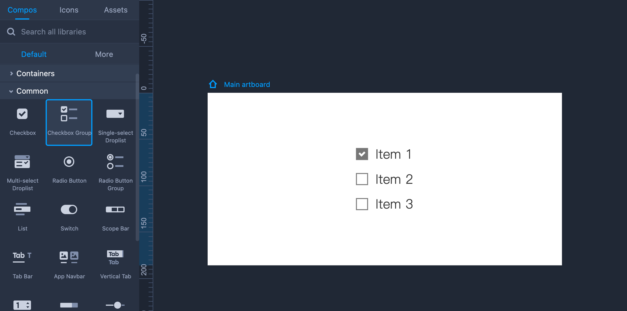
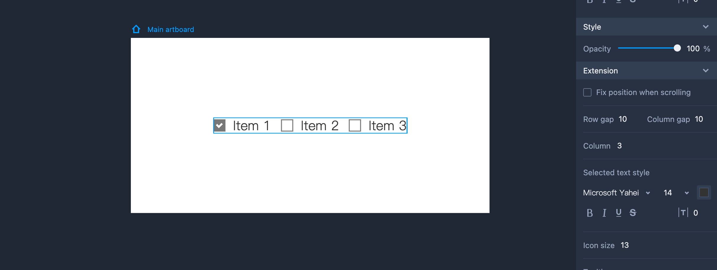
Checkbox Group
Drag the Checkbox Group from the left-hand Common library to add it to your artboard.
Property Settings
You can set Checkbox Group text styles, opacity, and other properties on the right-hand Property panel. You can also style the selected texts and set the distance (between the text and the front icon) in the "Extension" section.
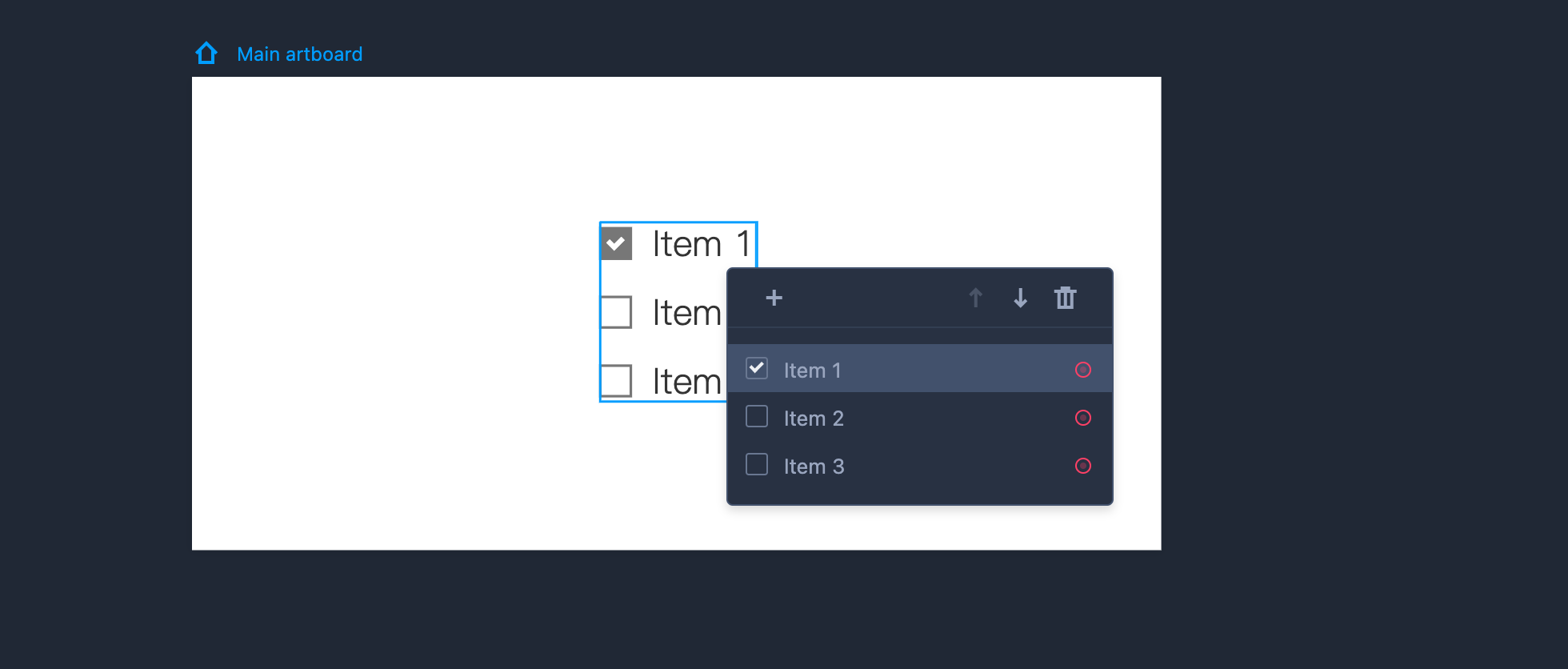
Edit Checkbox Group
To edit the Checkbox Group component, you need to enter editing mode first by double clicking the component or clicking "Enter."
You can then adjust the details as follows:
Tick the checkbox in front of each item to set a default selection state.
Click "+" to add a new item.
Reorder items by dragging them directly or clicking Up and Down arrows.
- Delete an item by clicking the trash can icon.
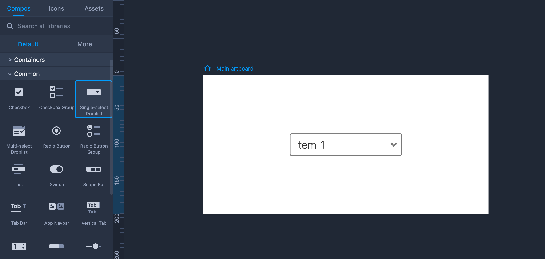
Single-select Droplist
Drag the component from the left-hand Common library if you want to use it.
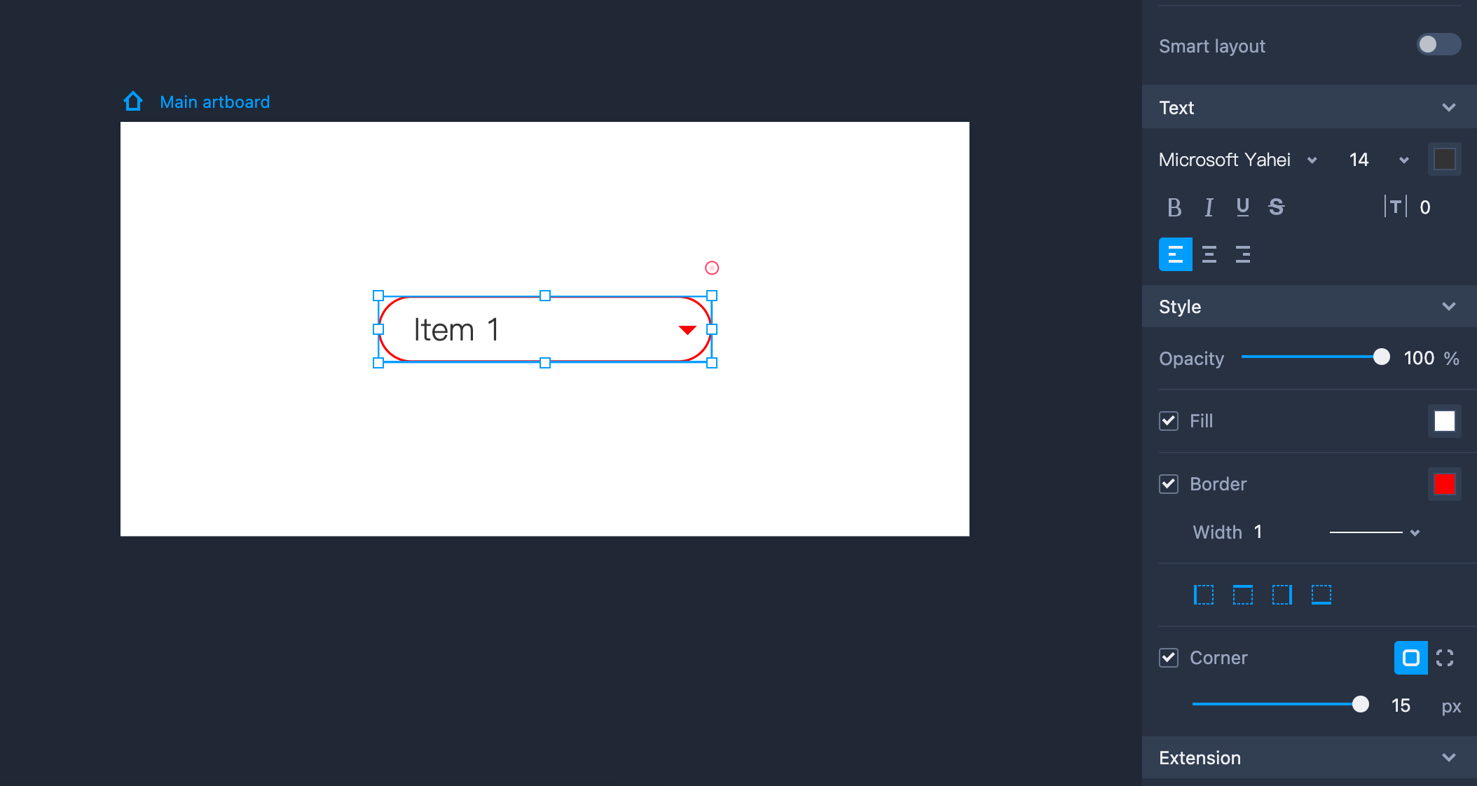
Property Settings
This component can be styled with the following properties on the right-hand Property panel: text style, opacity, fill color, corner radius, and so forth.
You can also set the icon color, border, and other properties in the "Extension" section.
Edit Single-select Droplist
To edit the Droplist component, you need to enter the editing mode first by double clicking the component or clicking "Enter."
You can then adjust the details as follows:
Tick the radio button in front of each item to set a default selection state.
Click "+" to add a new item.
Reorder items by dragging them directly or clicking the Up and Down arrows.
- Delete an item by clicking the trash can icon.
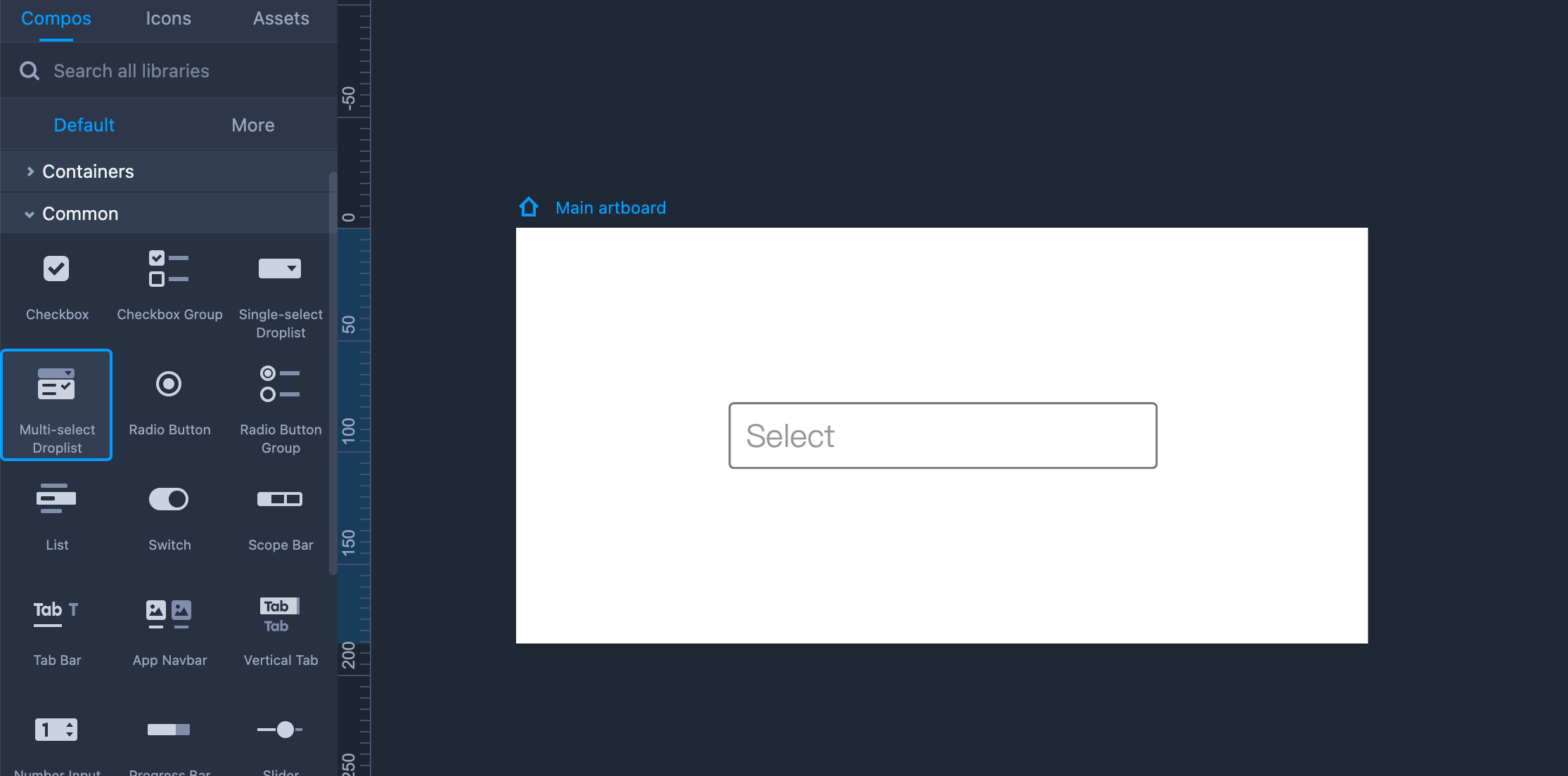
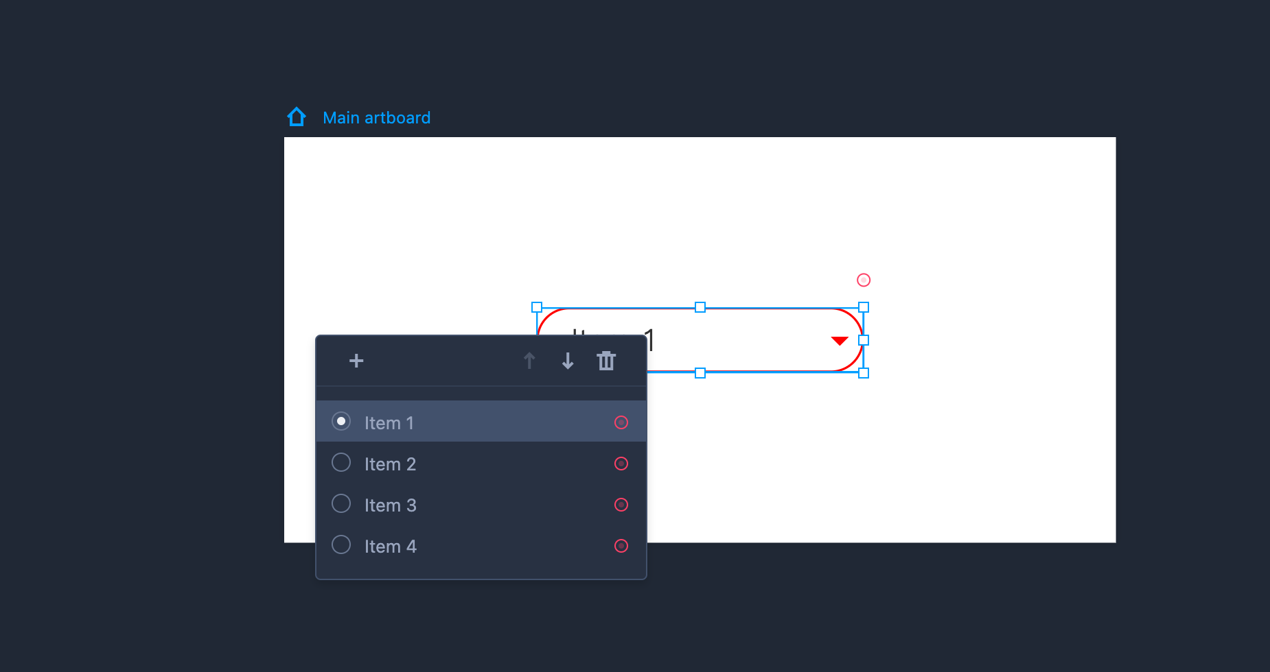 Multi-select Droplist
Drag it onto the artboard for your design needs.
Property Settings
This component is also styled with the following properties on the right-hand Property panel: text style, opacity, fill color, corner radius, and so forth.
You can also set the icon color, border, and other properties in the "Extension" section.
Edit Multi-select Droplist
To edit this component, you need to enter the editing mode first by double clicking the component or clicking "Enter."
You can then adjust the details as follows:
- Tick the radio button in front of each item to set a default selection state.
- Click "+" to add a new item.
- Reorder items by dragging them directly or clicking the Up and Down arrows.
- Delete an item by clicking the trash can icon.
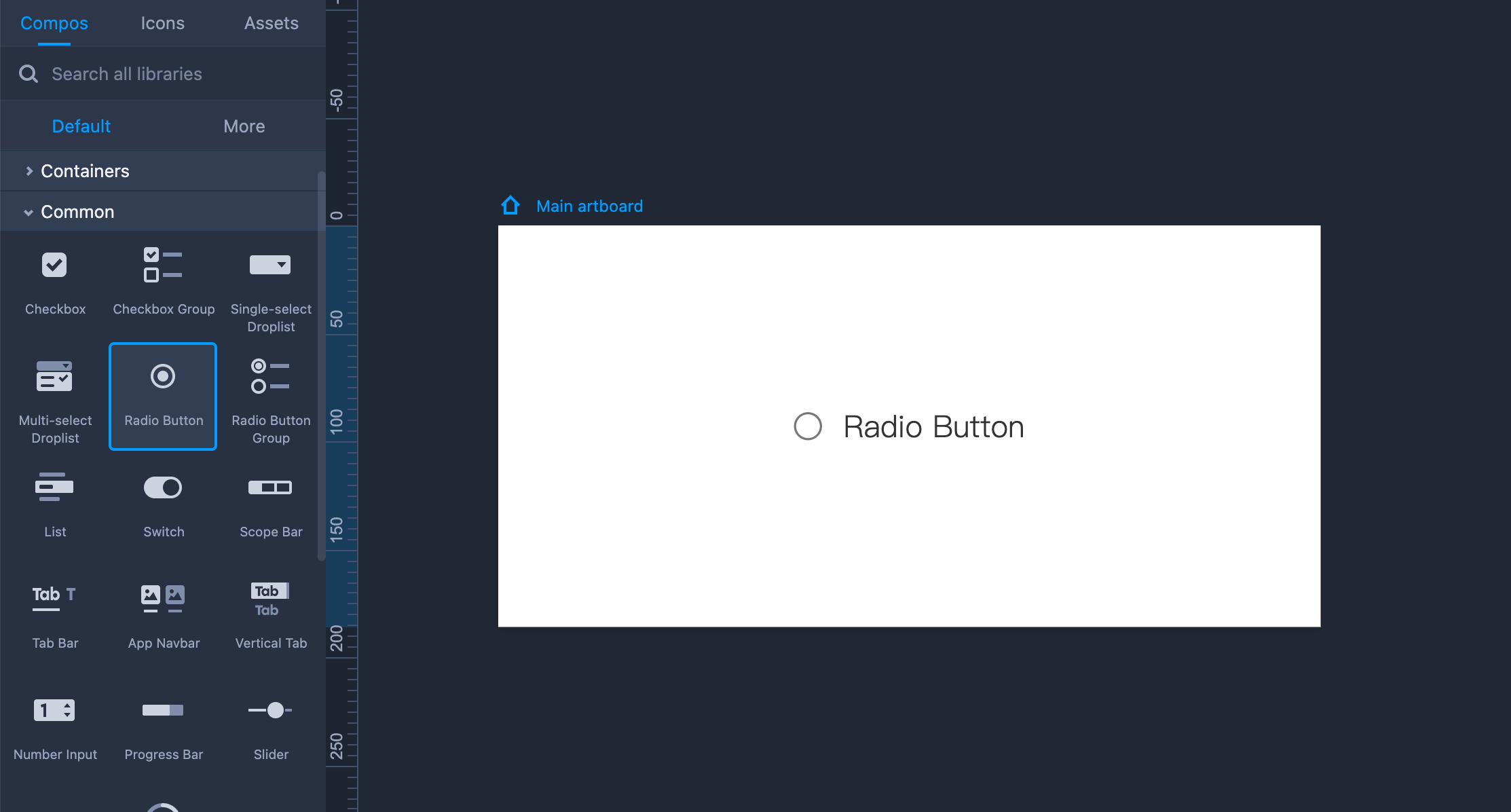
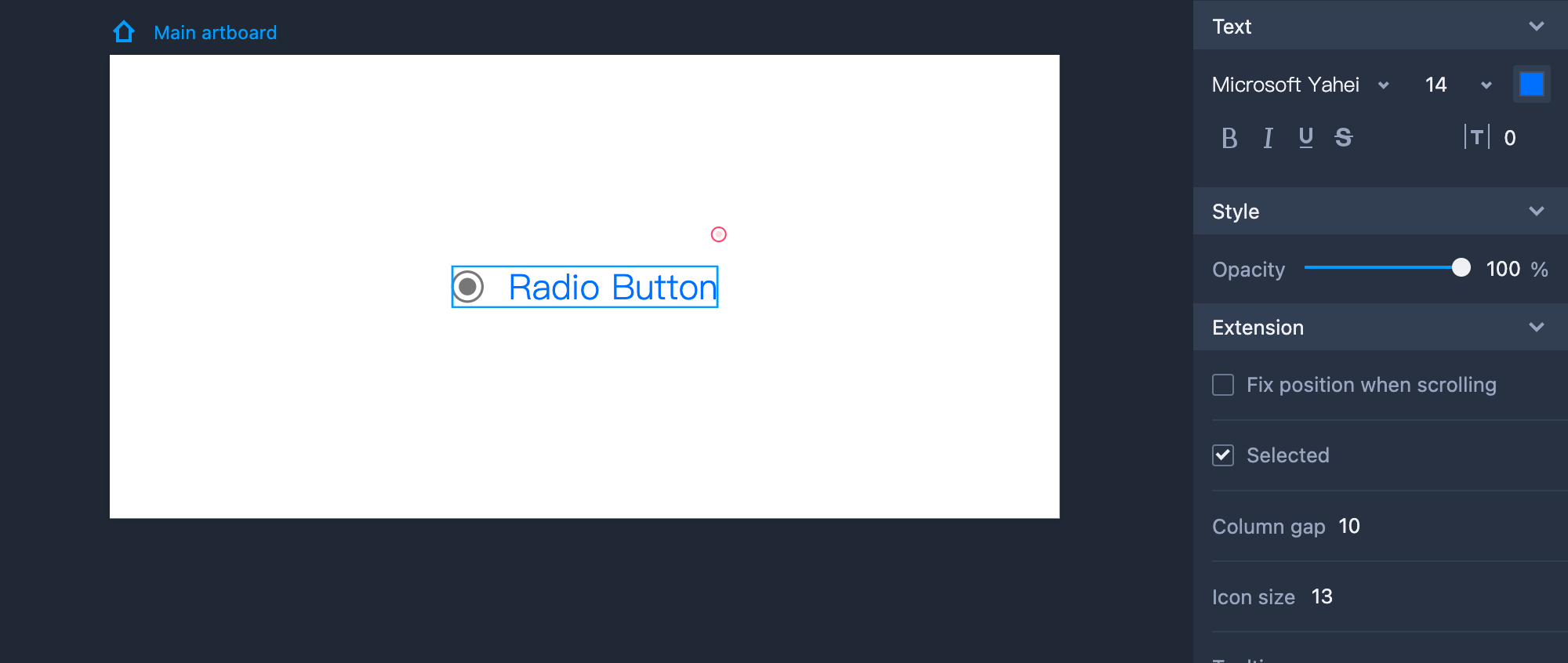
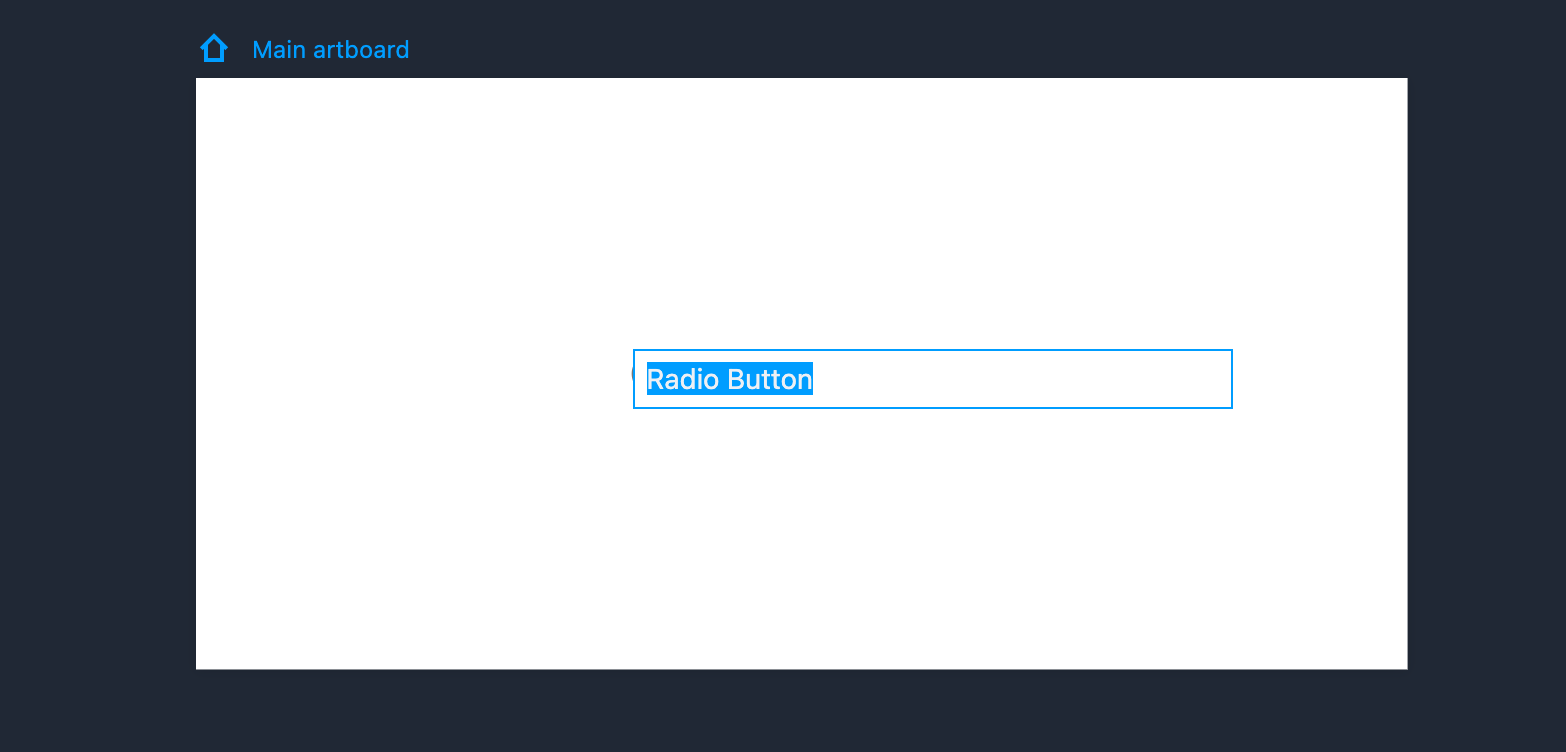
Radio Button
Drag the Radio Button from the left-hand Common library if you intend to use it.
Property Settings
You can set its text styles, opacity, and other properties on the right-hand Property panel. You can also set a "Selected" state for it in the "Extension" section. The distance between the text and the front icon can also be adjusted.
Edit Radio Button
It is easy to edit the item’s text by double clicking the component or clicking "Enter."
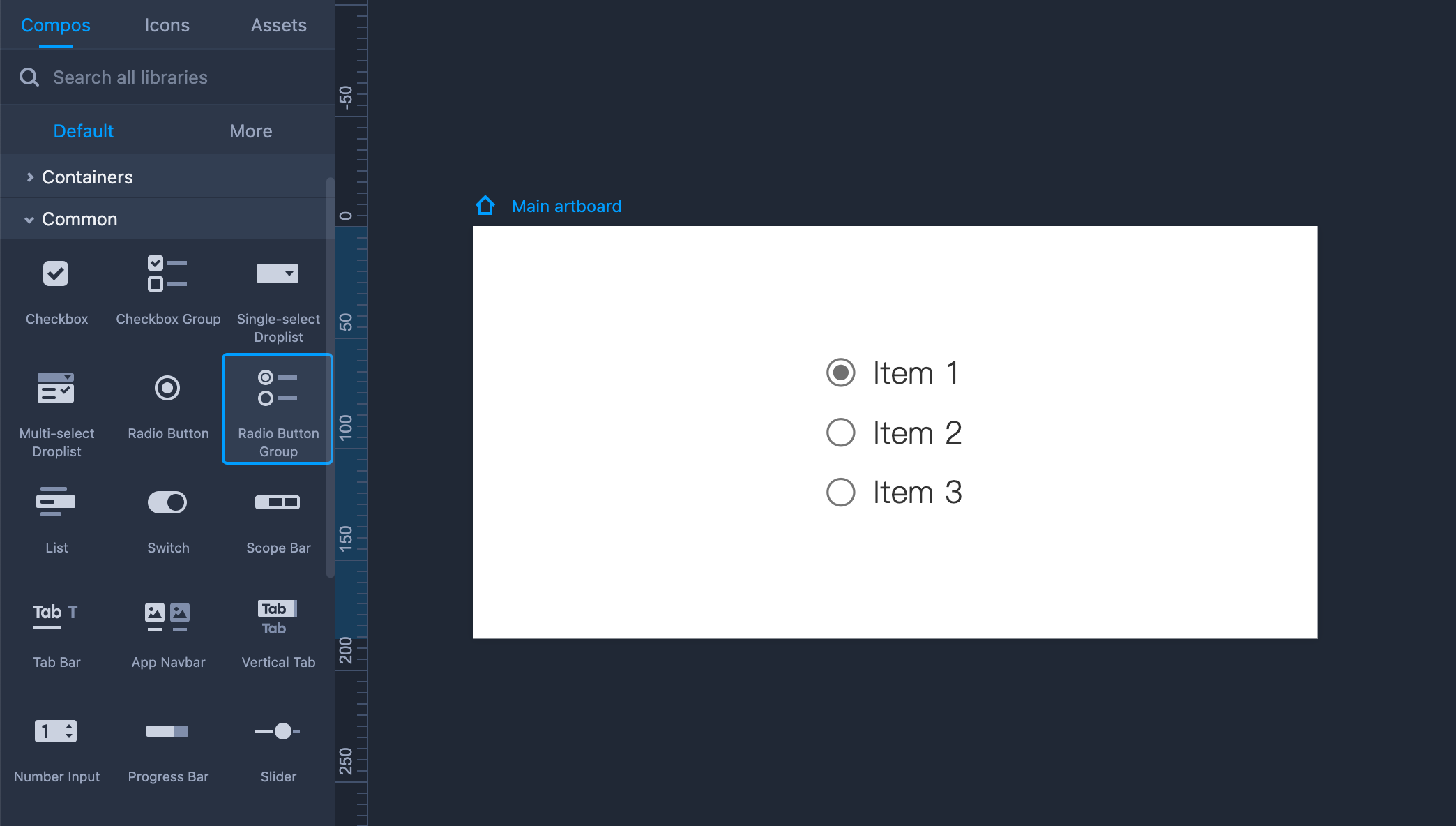
Radio Button Group
Drag the Radio Button Group from the left-hand Common library.
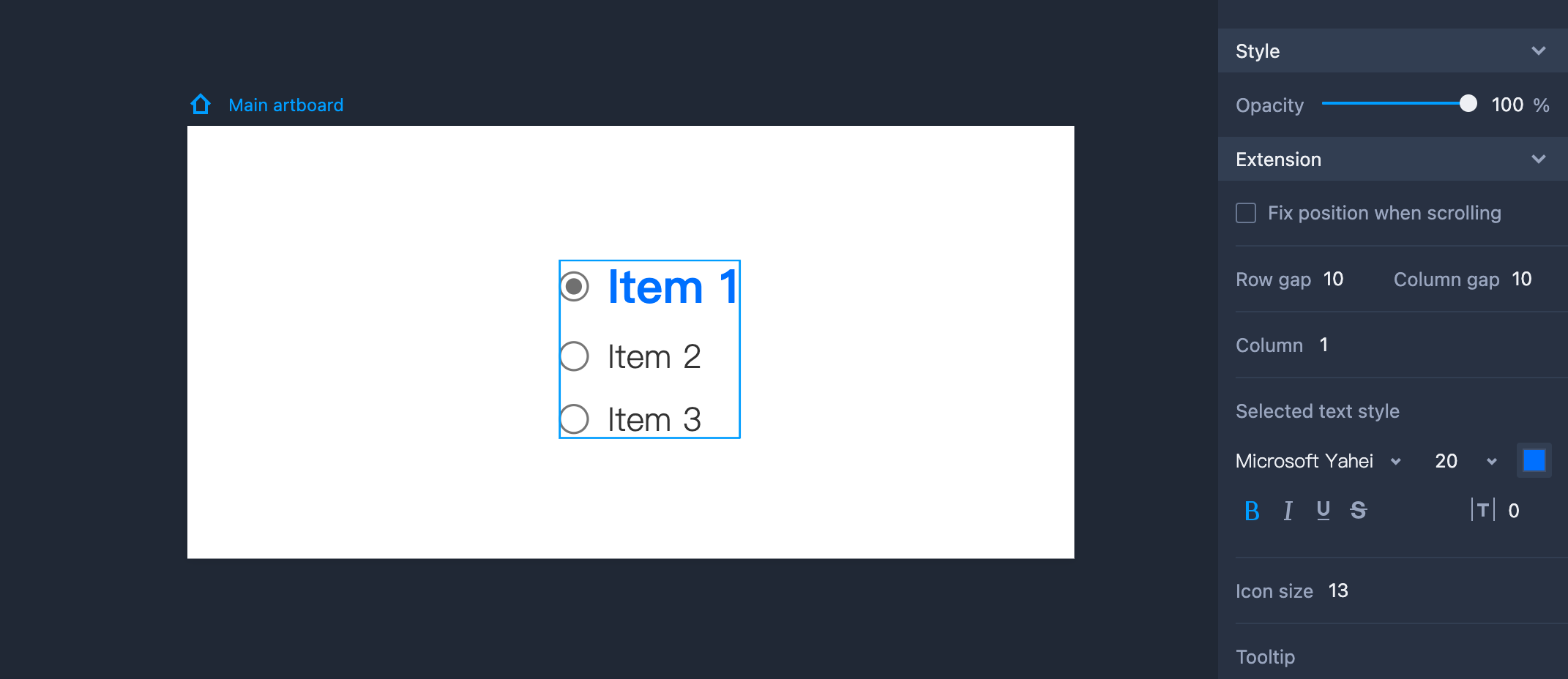
Property Settings
You can set its text styles, opacity, and other properties on the right-hand Property panel. You can also style the selected texts and set the distance (between the text and the front icon) in the "Extension" section.
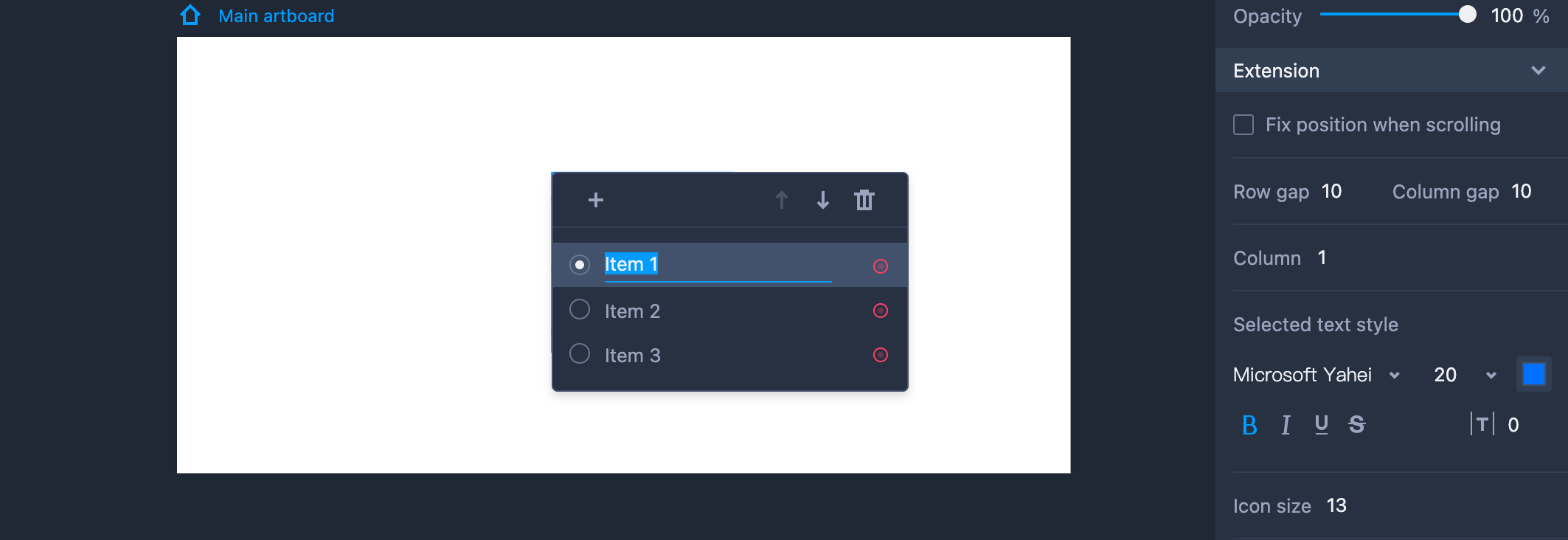
Edit Radio Button Group
To edit the Radio Button Group component, you need to enter the editing mode first by double clicking the component or clicking "Enter.”
You can then adjust the details as follows:
Tick the radio button in front of each item to set a default selection state.
Click "+" to add a new item.
Reorder items by dragging them directly or clicking the Up and Down arrows.
- Delete an item by clicking the trash can icon.
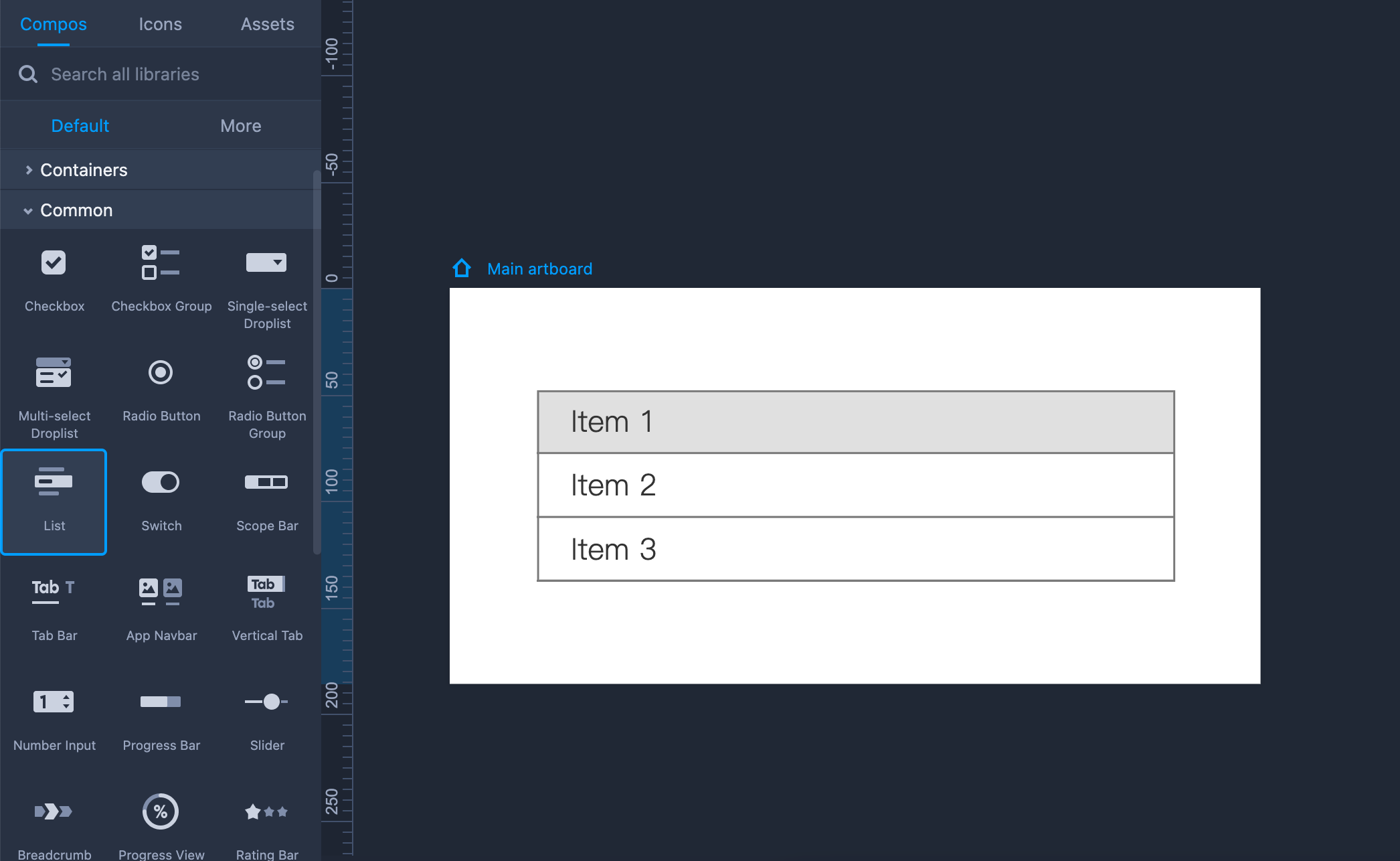
List
Drag the List component from the left-hand Common library to use it.
Hold "Shift" to maintain the same aspect ratio while resizing the List.
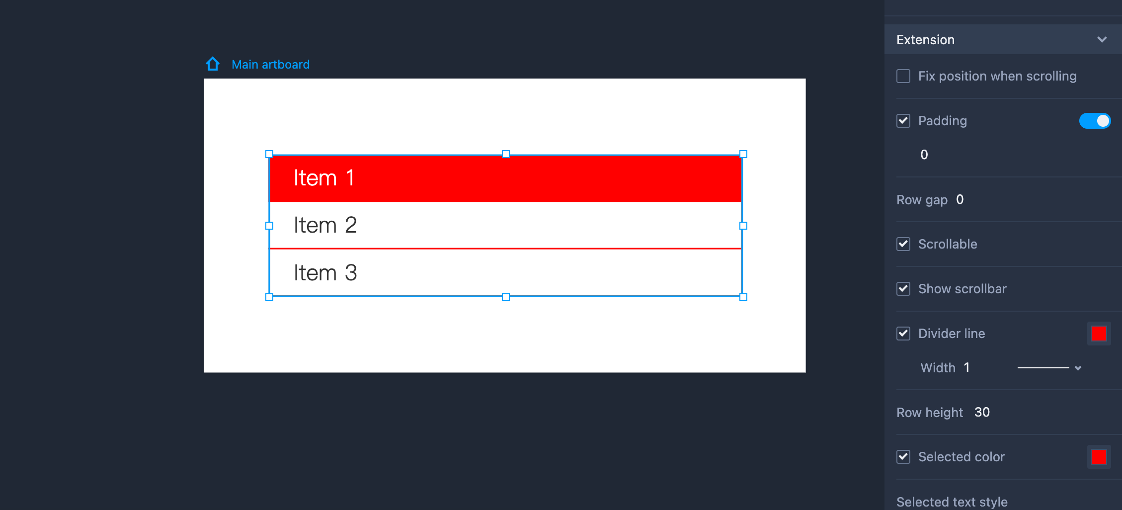
Property Settings
This component can be styled with the following properties on the right-hand Property panel: text style, opacity, background color, border, and so forth.
You can set the text padding, scrolling state, and the text styles of the selected items, in the "Extension" section.
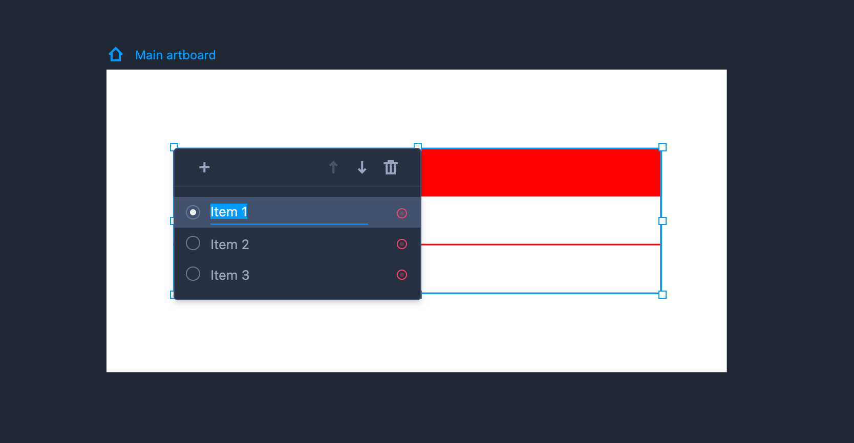
Edit List
To edit the List component, you need to enter the editing mode first by double clicking the component or clicking "Enter.”
You can then adjust the details as follows:
Tick the radio button in front of each item to set a default selection state.
Click "+" to add a new item.
Reorder items by dragging them directly or clicking the Up and Down arrows.
- Delete an item by clicking the trash can icon.
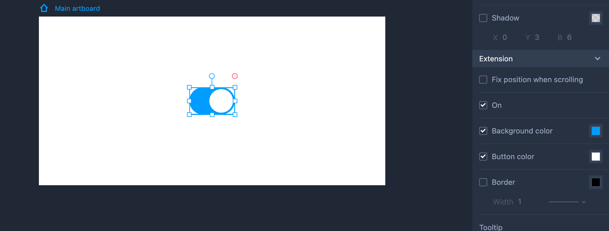
Switch
Drag the Switch component from the left-hand Common library.
Hold "Shift" to maintain the same aspect ratio while resizing the Switch.
Property Settings
You can set its opacity, shadow, and corner radius on the right-hand Property panel. You can also set "On" or "Off" states for it in the Extension section. The colors for the background, button, and border can be set there as well.
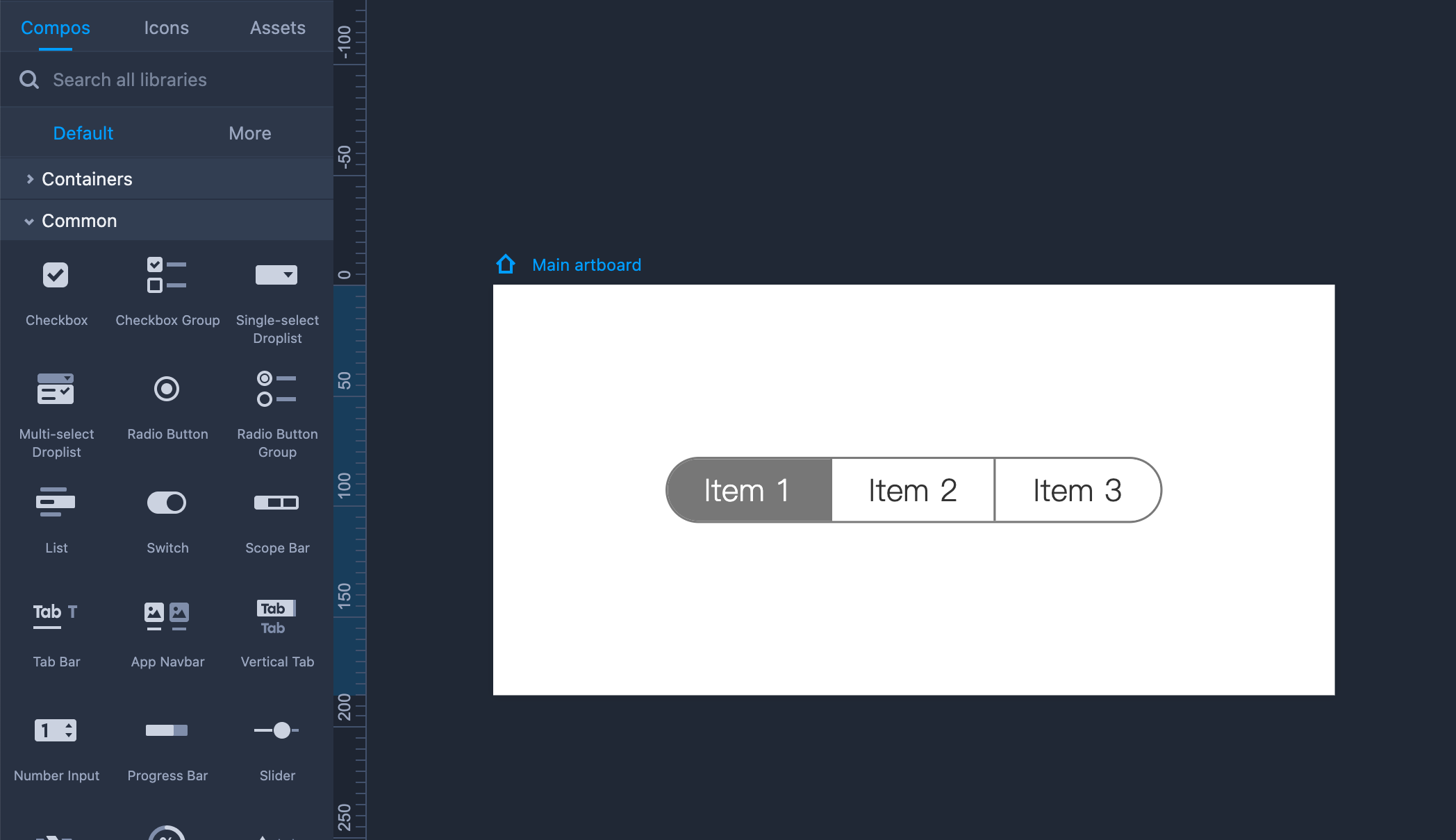
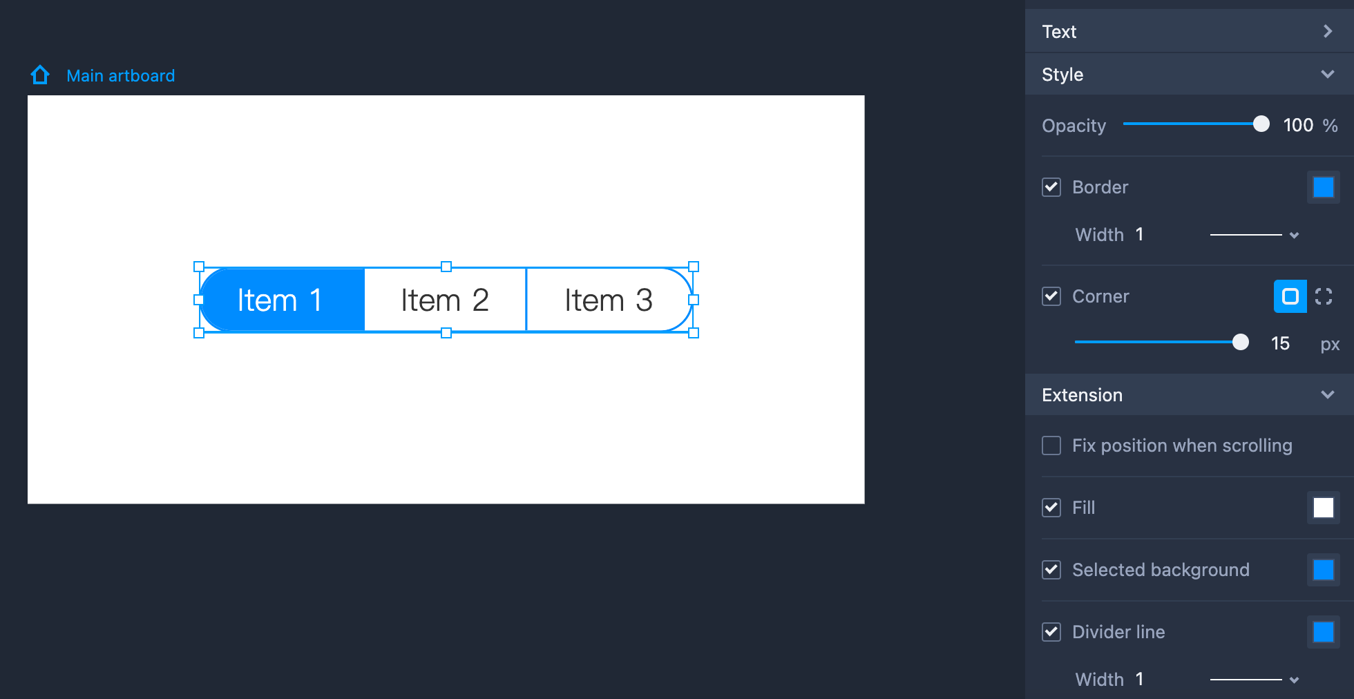
Scope Bar
Drag the Scope Bar component from the left-hand Common library to use it.
Hold "Shift" to maintain the same aspect ratio while resizing the Scope Bar.
Property Settings
You can set the text styles and opacity of the component on the right-hand Property panel. You can also edit the text style, fill and background colors, and other properties of the item selected.
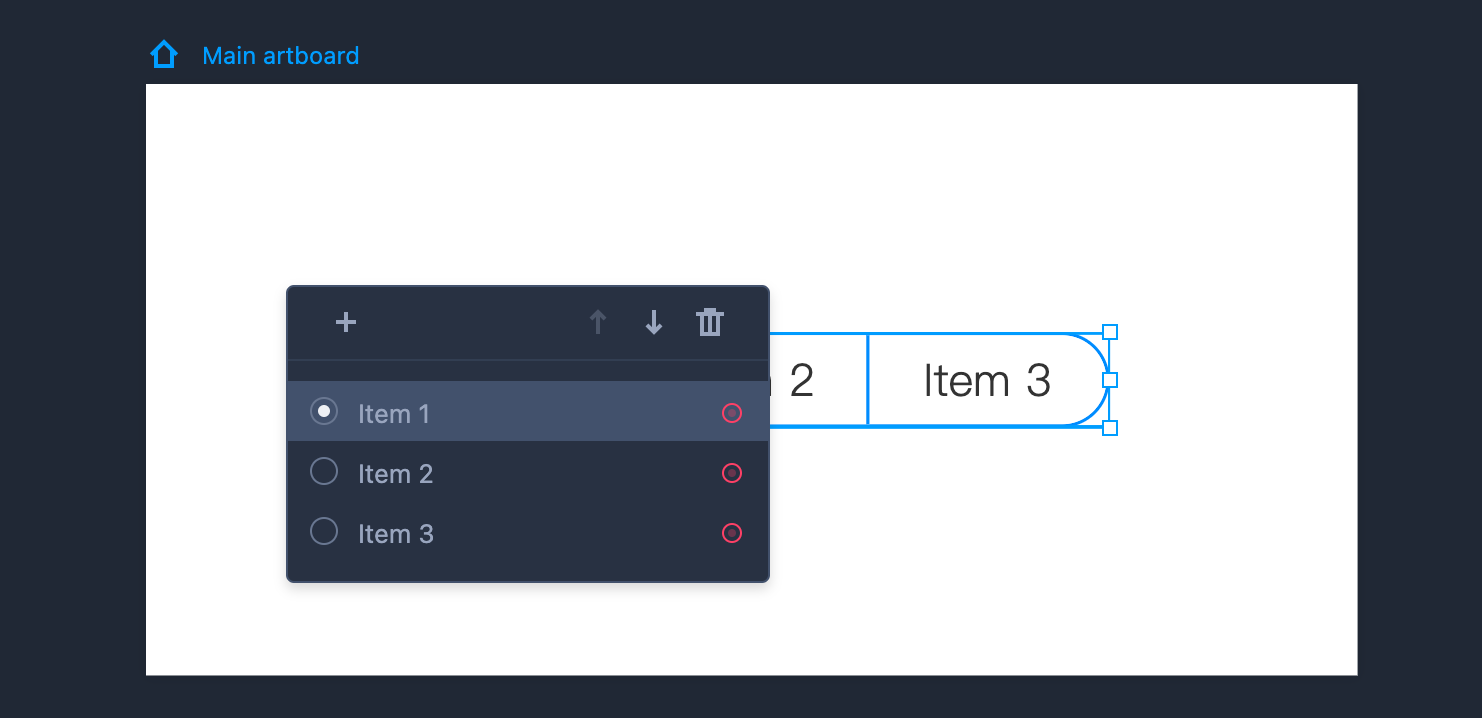
Edit Scope Bar
To edit the Scope Bar component, you need to enter the editing mode first by double clicking the component or clicking "Enter.”
You can then adjust the details as follows:
Tick the radio button in front of each item to set a default selection state.
Edit the item text by double clicking the item.
Add, delete, or reorder items in the same editing mode.
Tab Bar
This is how you use Tab bars:
Drag the Tab Bar component from the left-hand Common library.
Hold "Shift" to maintain the same aspect ratio while resizing the Tab Bar.
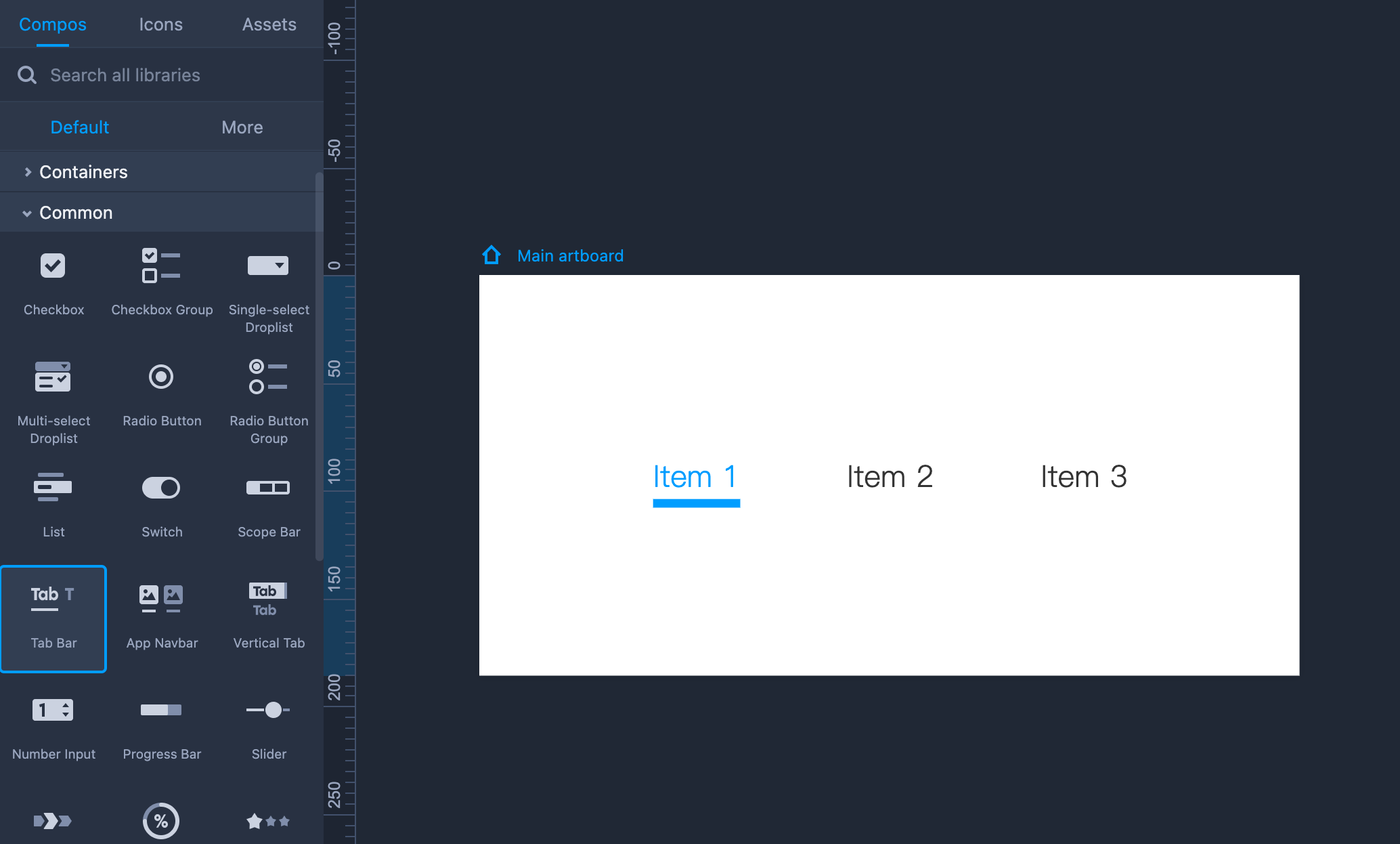
Property Settings
You can easily set the overall text styles, opacity, and fill color on the right-hand Property panel. You can also set the text style, underline, and margins around the item selected.
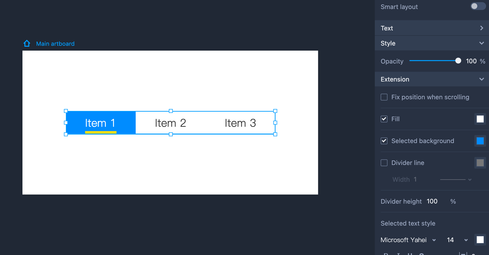
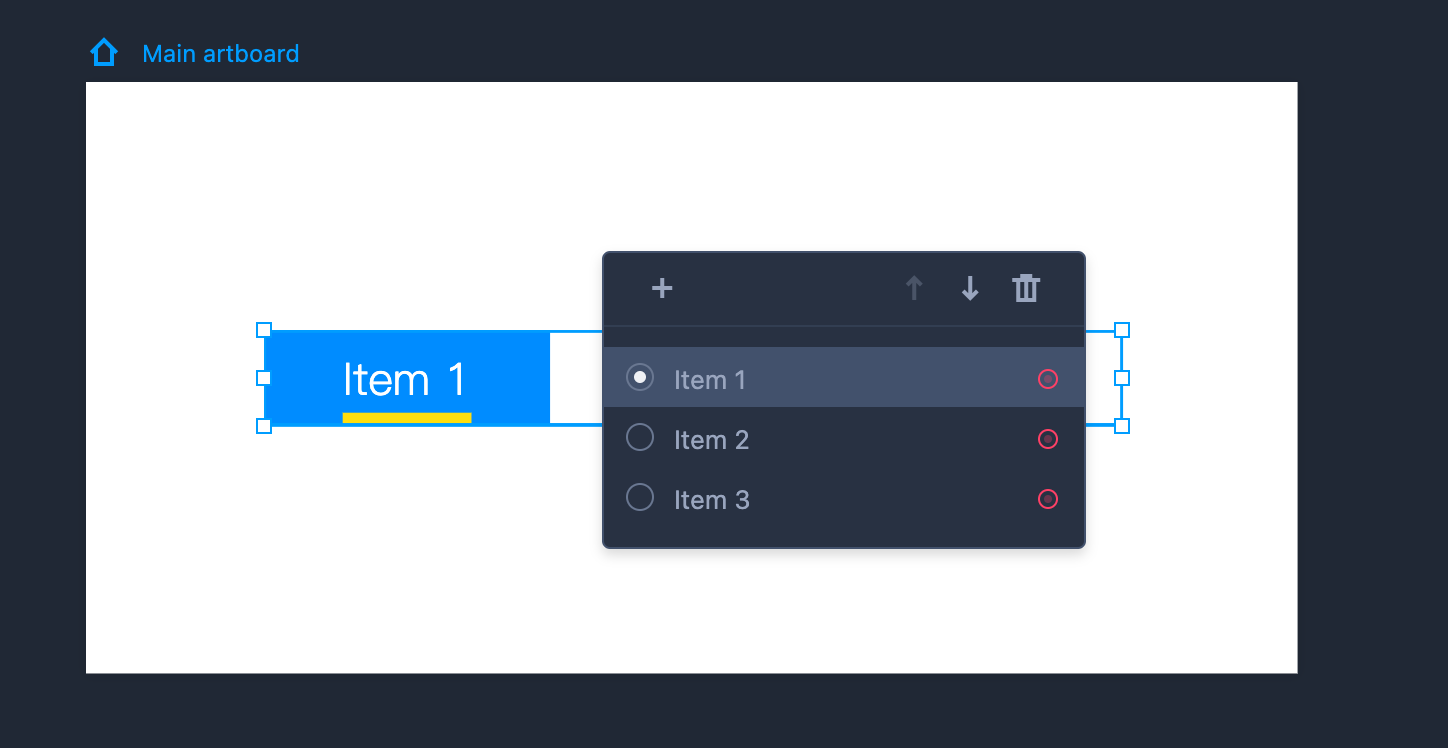
Edit Tab Bar
Here are some tips on how to edit the Tab Bar:
By default, Tab Bar selects the first item automatically. If you want to change the default item selected, enable the editing mode by clicking "Enter" and ticking the radiobox in front of these items.
Edit the item text by double clicking the item.
Add, delete, or reorder items in the editing mode.
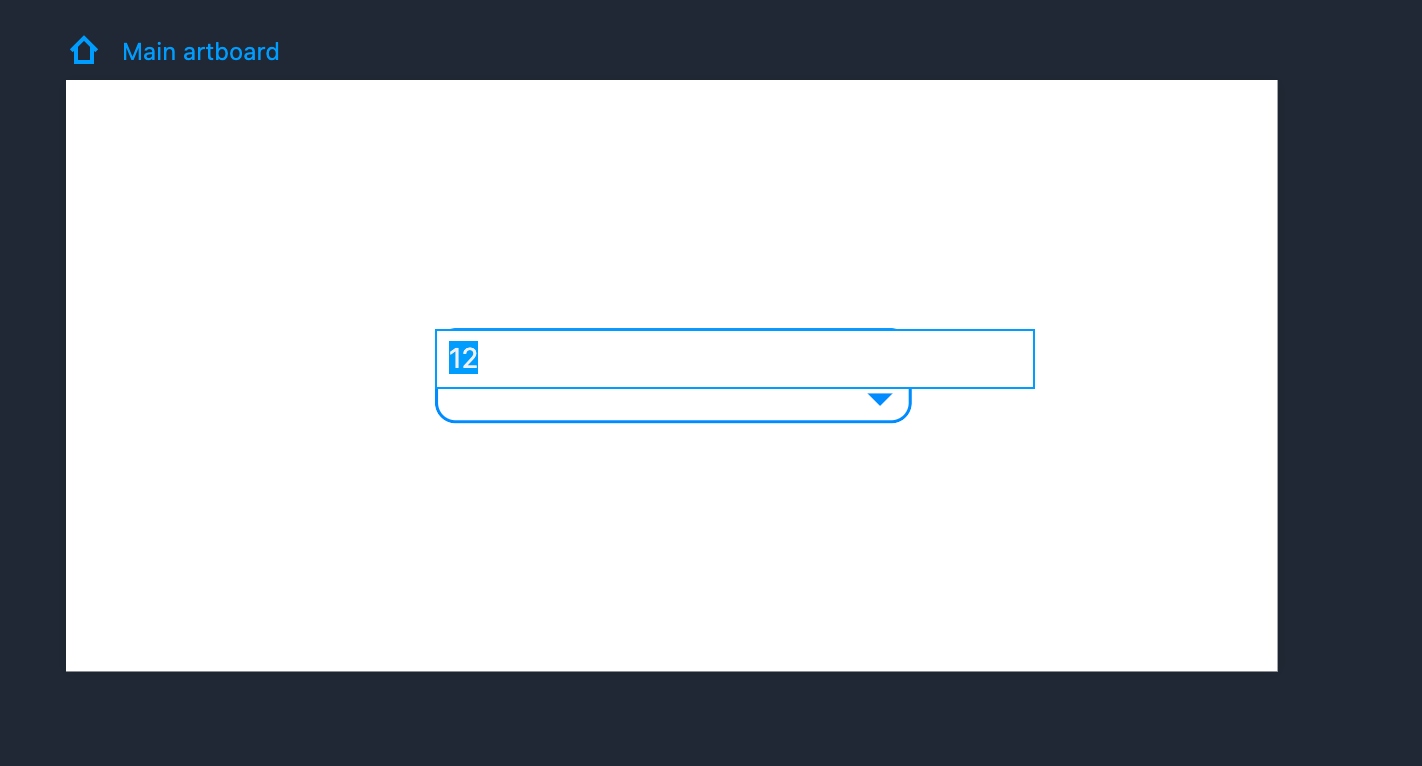
Numeric Stepper
The Numeric Stepper component enables you to adjust a numeric value by using the Up and Down arrows. Clicking the Up arrow will increase the value of the variable by one. Clicking the Down arrow will decrease it by one.
Here is how to use this component:
Drag the Numeric Stepper component from the left-hand Common library.
Hold "Shift" to maintain the same aspect ratio while resizing the Numeric Stepper.
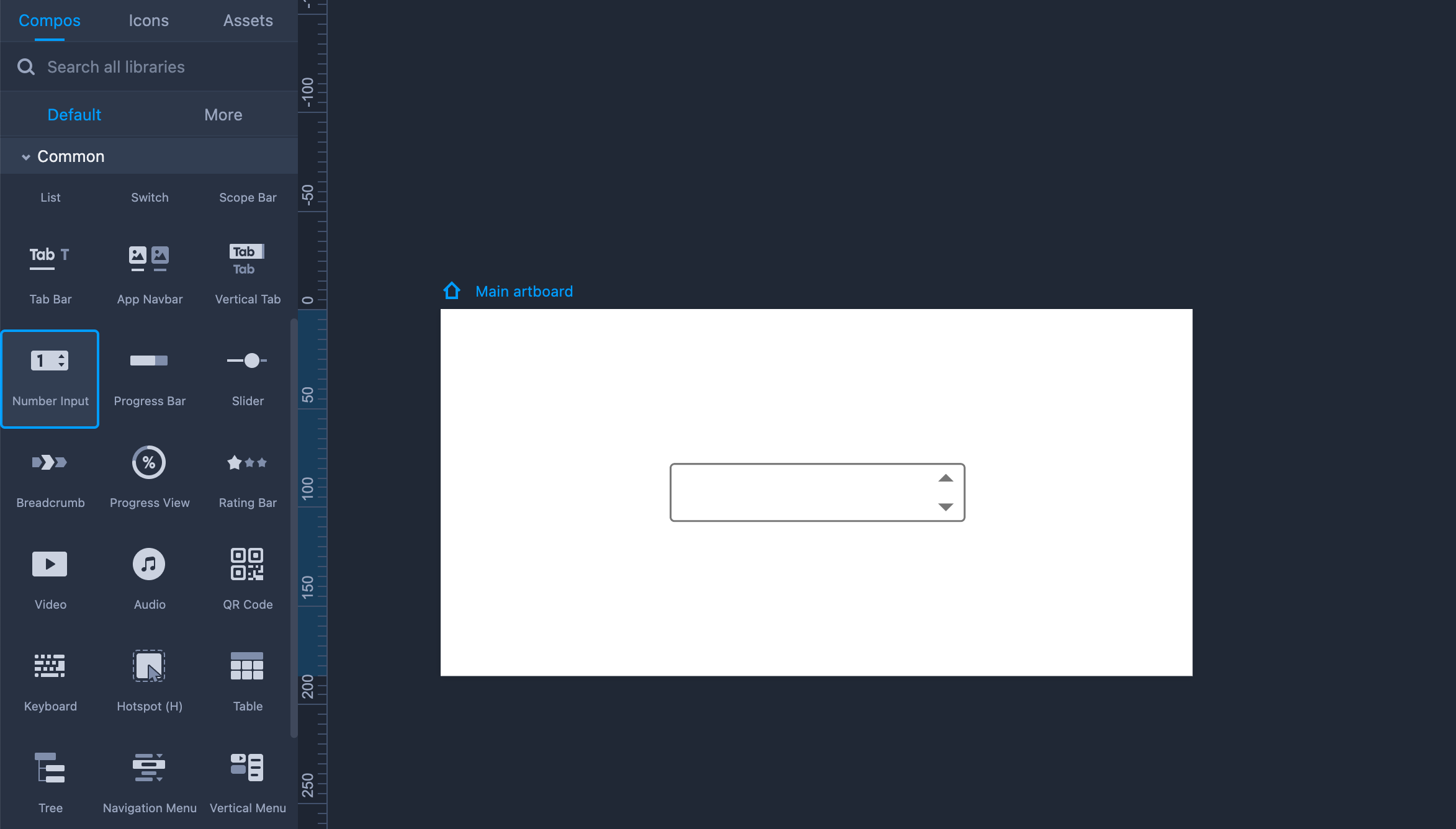
Property Settings
You can easily set the text styles, opacity, and fill color on the right-hand Property panel.
You can also set the color of the two triangle icons in the "Extension" section.
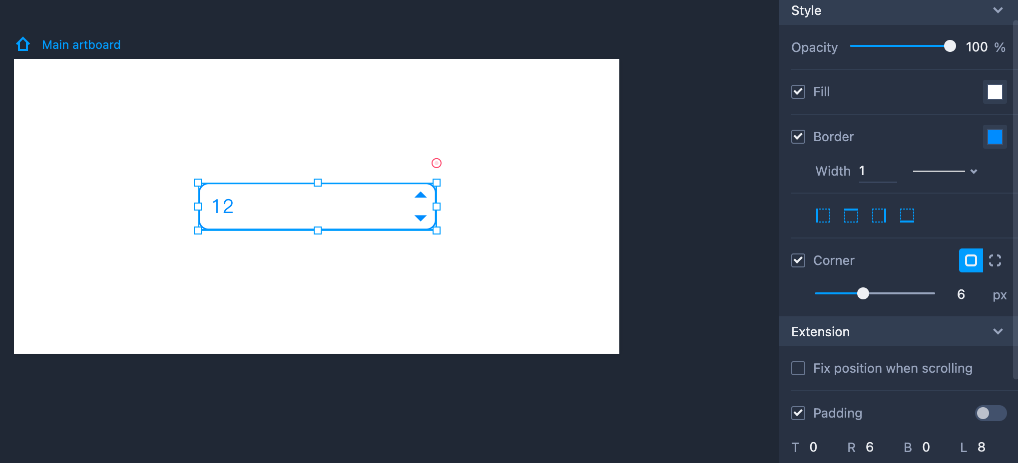
Edit Numeric Stepper
It is easy to edit the text; just double clicking the component or click "Enter.” Then you can edit and change the default value.
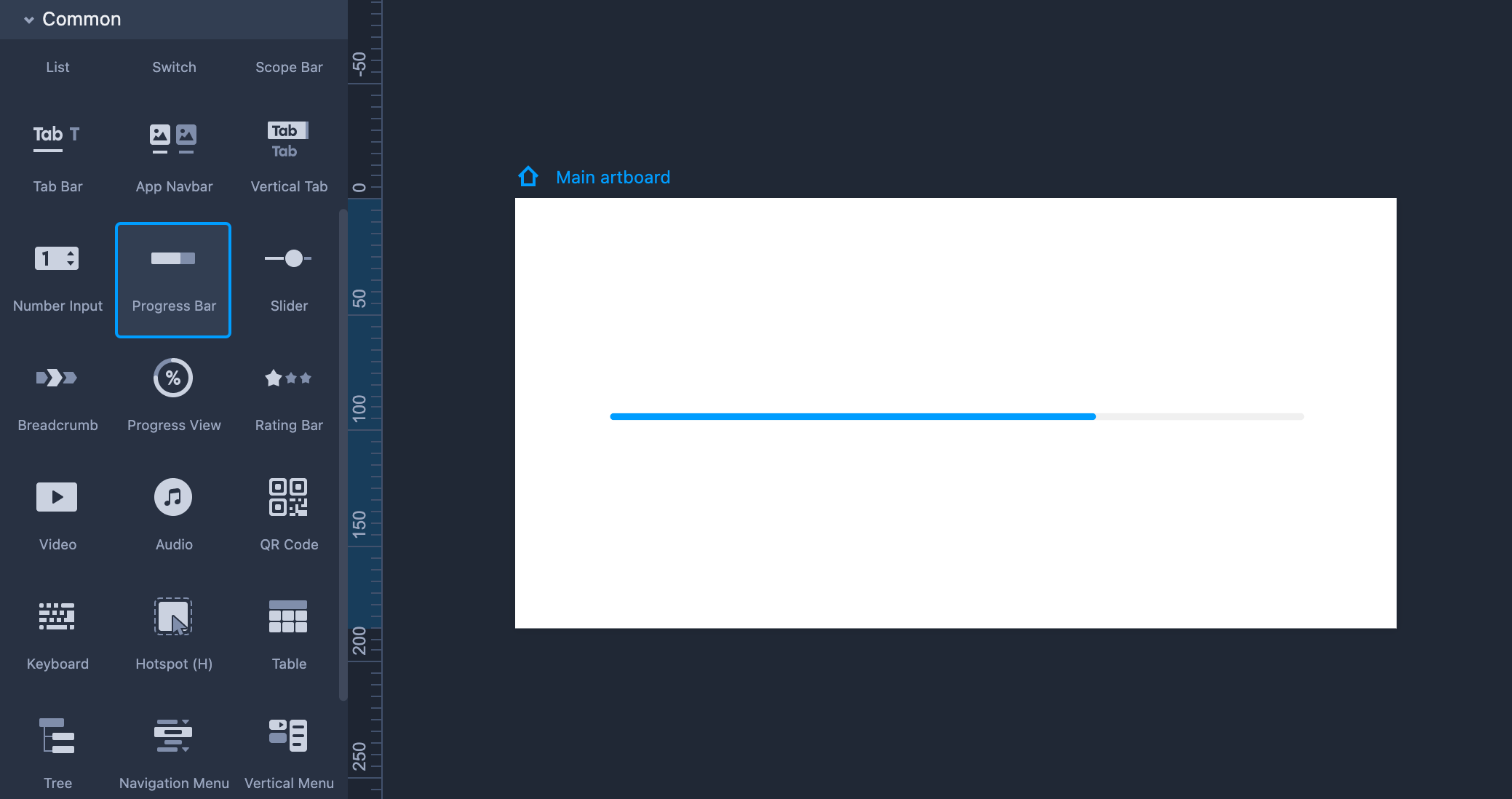
Progress Bar
Drag the Progress Bar component from the left-hand Common library.
Hold "Shift" to maintain the same aspect ratio while resizing the Progress Bar.
Property Settings
You can adjust its opacity, track color, border style, corner radius, and other settings on the right-hand Property panel.
It is also possible to set the slider color in the "Extension" section. If you want to change the current percentage value of the progress bar, click "Value" and enter the number you want (from 0 to 100).
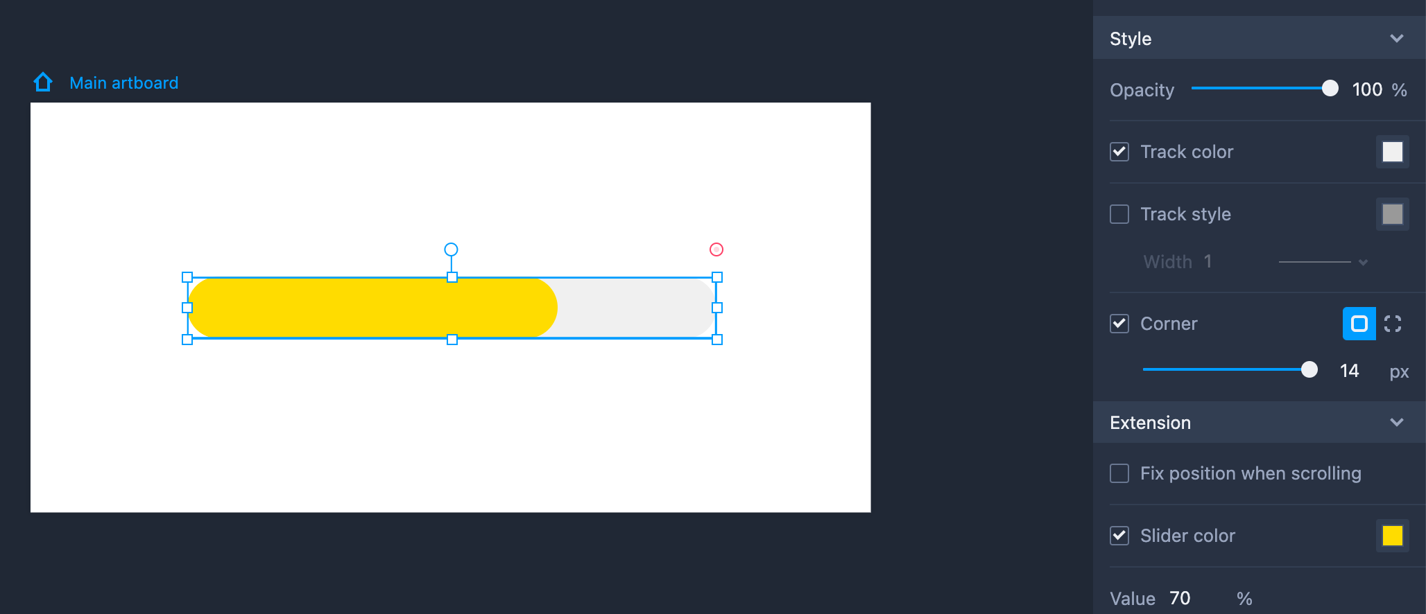
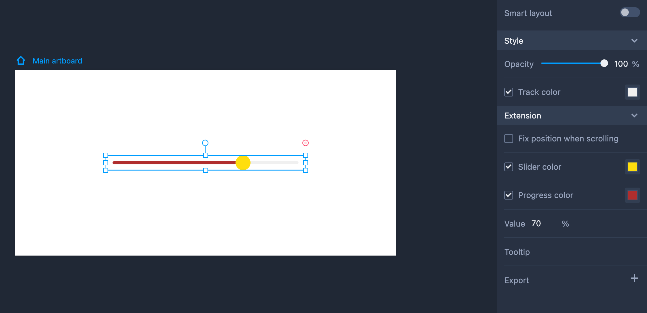
Slider
Drag the Slider component from the left-hand Common library.
Hold "Shift" to maintain the same aspect ratio while resizing the Slider.
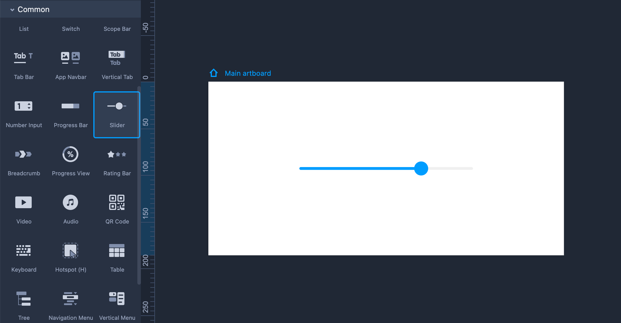
Property Settings
You can set its opacity, track color, and other properties on the right-hand Property panel. It is also possible to set the slider color and progress color in the "Extension" section. If you want to change the current percentage value of the slider, click "Value" and enter the number you want (from 0 to 100).
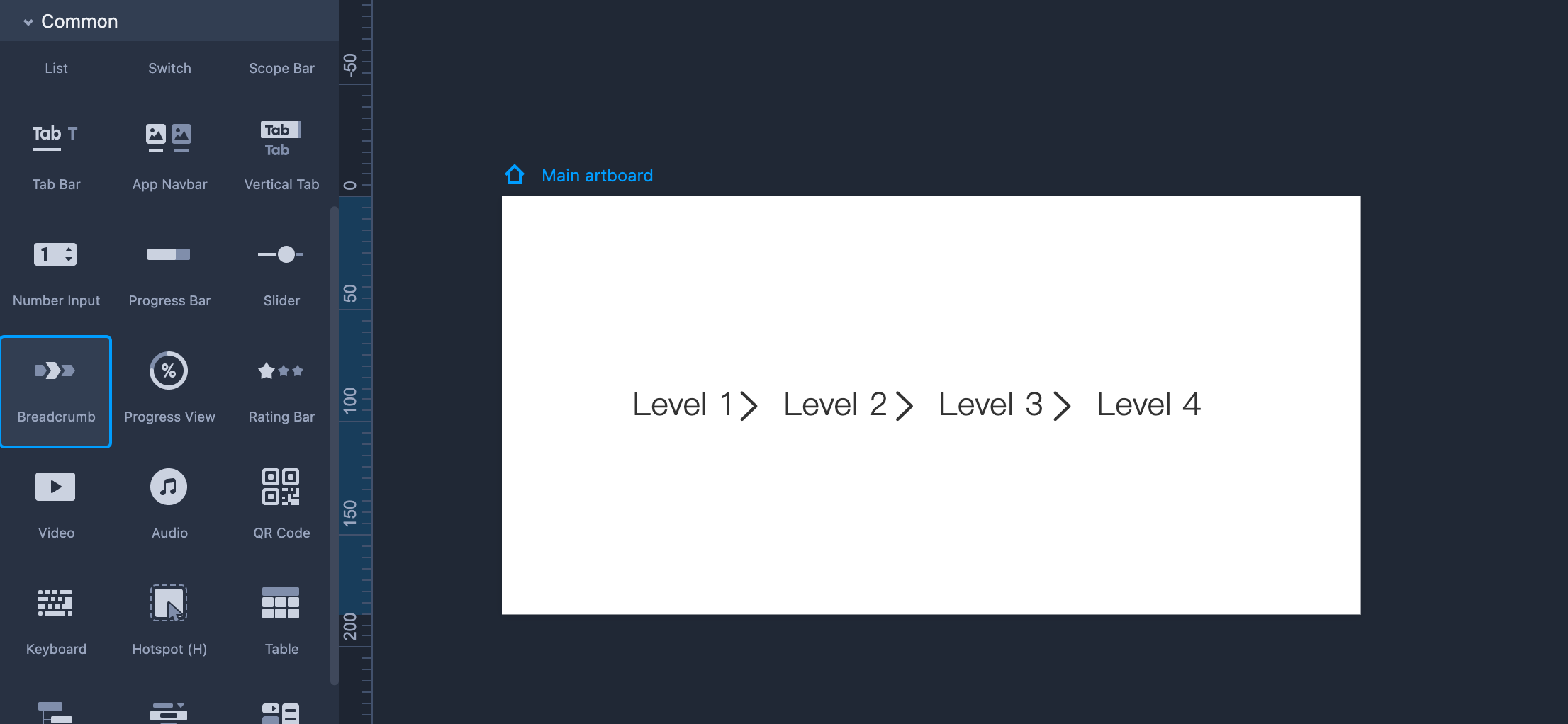
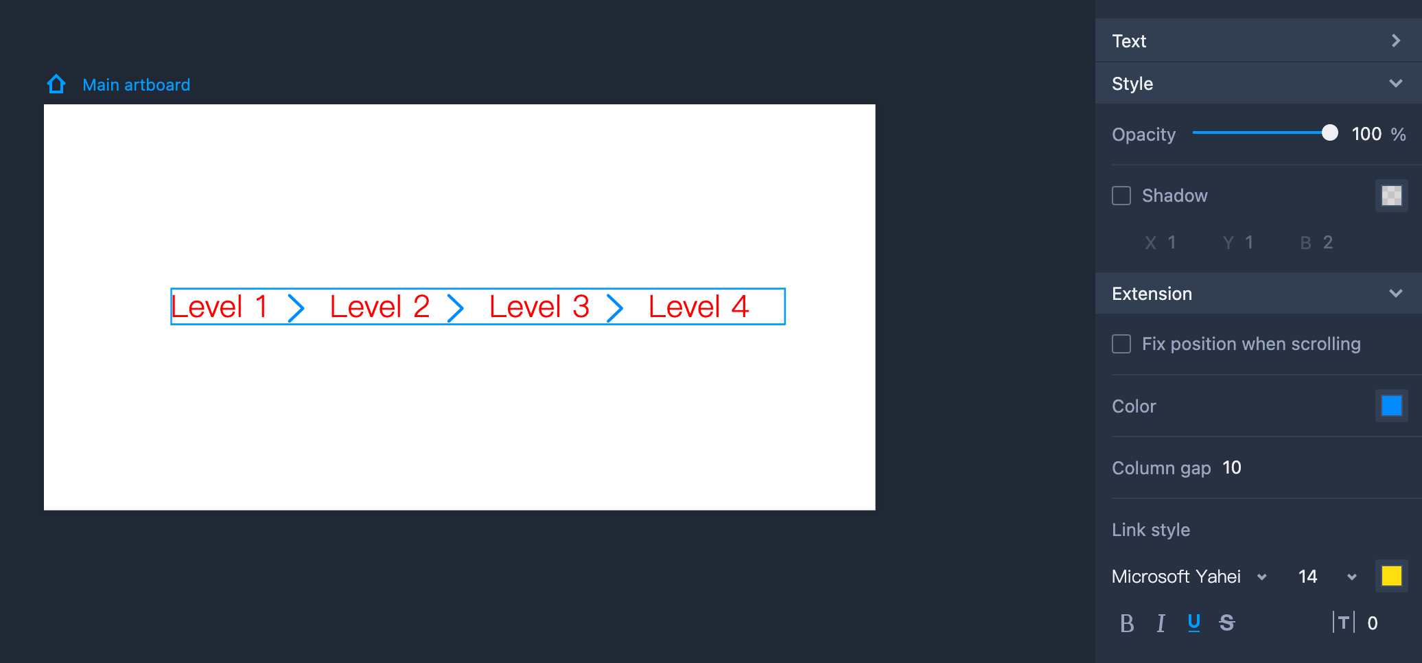
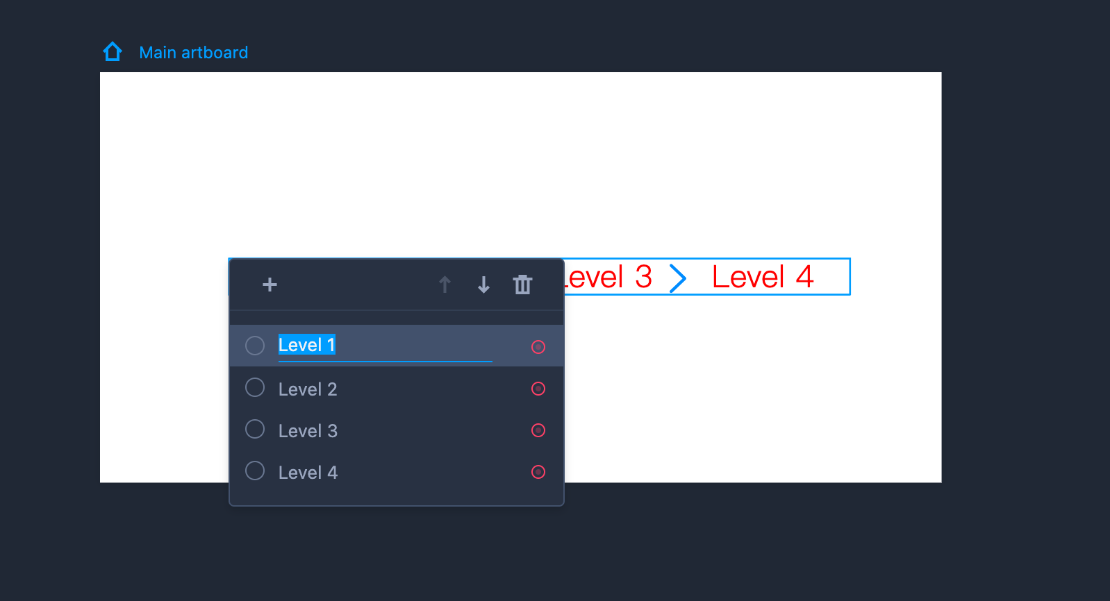
Breadcrumb
You can drag the Breadcrumb component from the left-hand Common library.
Property Settings
You can set its overall text styles, opacity, shadow, and other properties on the right-hand Property panel.
In the "Extension" section, you can customize the hover-over text styles and icon color, as well as the gaps between different items.
Edit Breadcrumb
To edit the Breadcrumb component, you need to enter the editing mode first by selecting the component and clicking "Enter.” You can then:
reorder items by dragging them directly or clicking the Up and Down arrows;
add or delete items; and
double click items to edit texts.
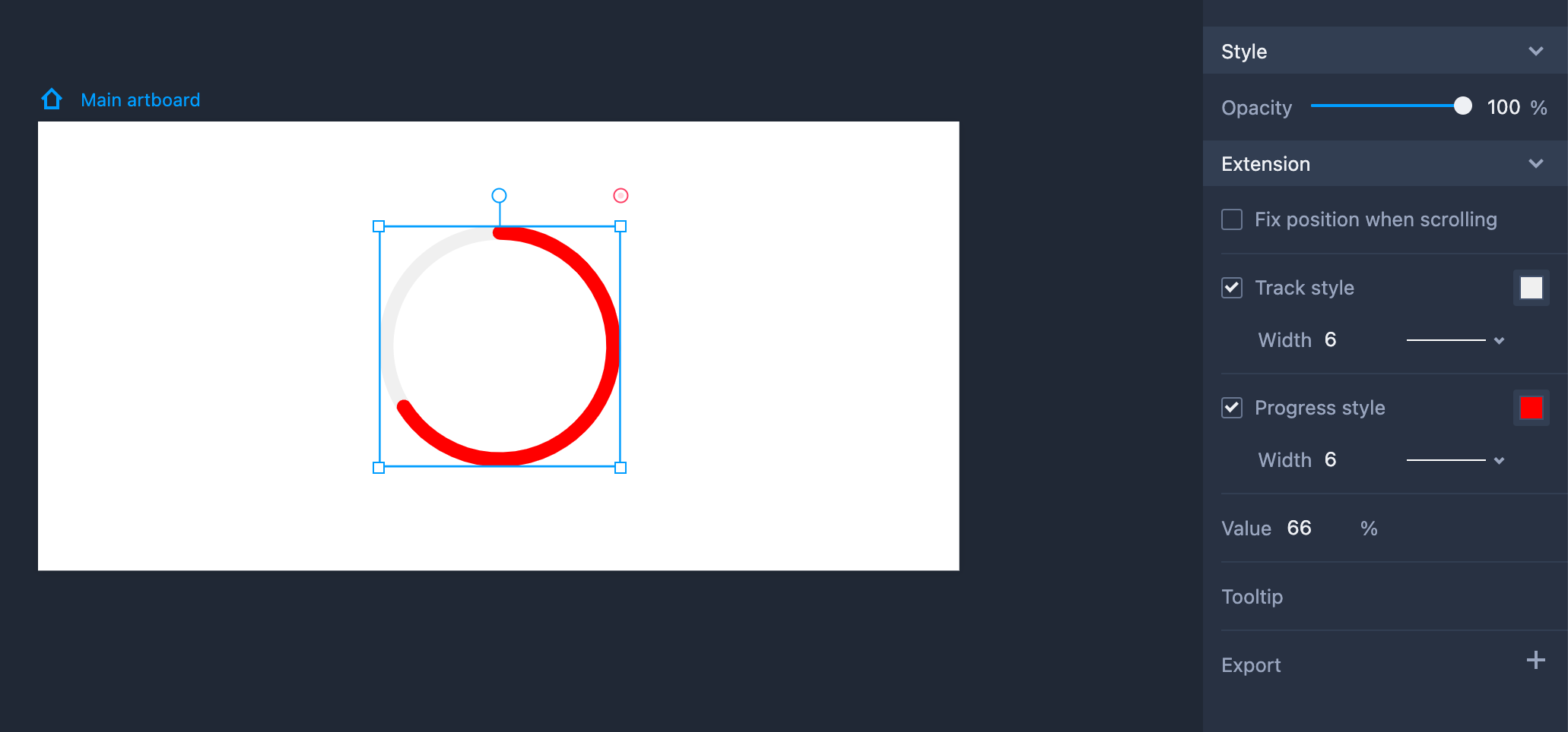
Progress View
Drag the Progress View component from the left-hand Common library.
Resize the component. You can maintain an aspect ratio by default.
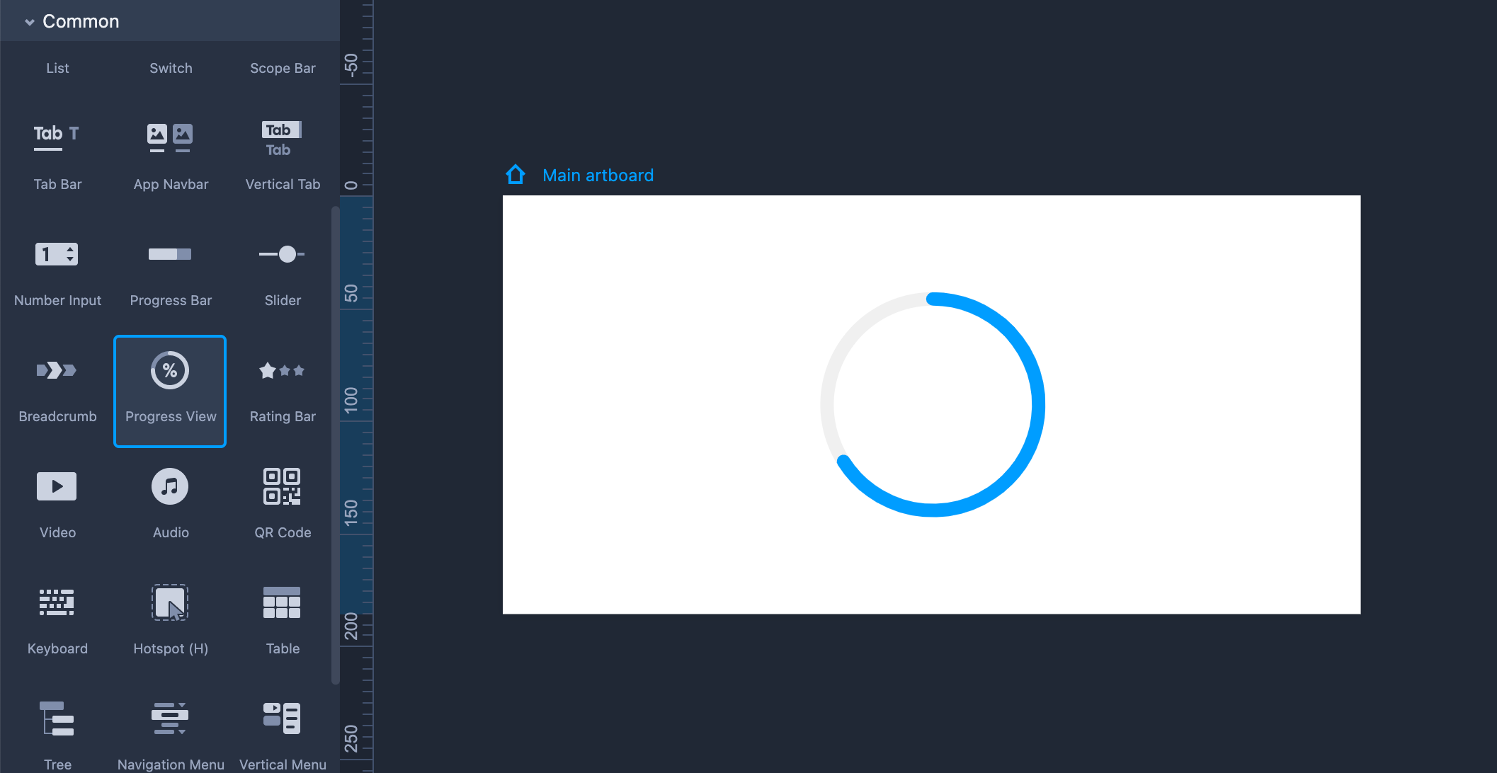
Property Settings
- Set the opacity and other properties on the right-hand Property panel.
Set the track color and progress color in the "Extension" section.
Click "Value" and enter the number you want (from 0 to 100) to change the percentage process.
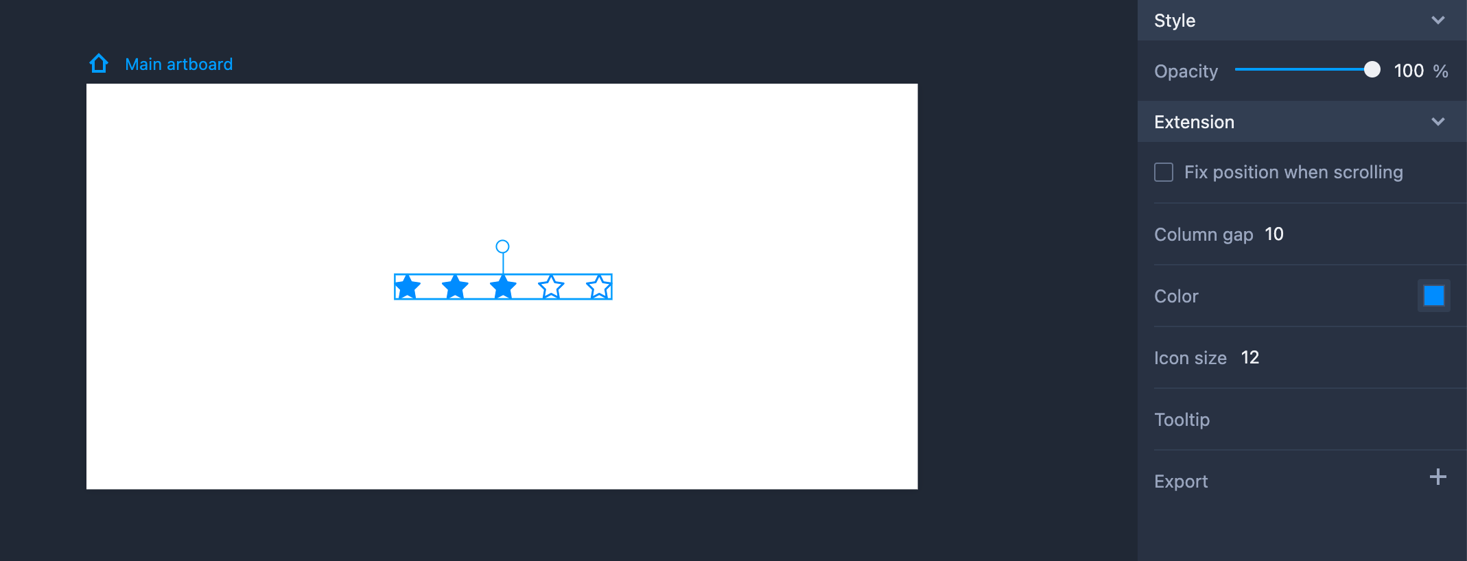
Rating Bar
Drag the Rating Bar component from the left-hand Common library.
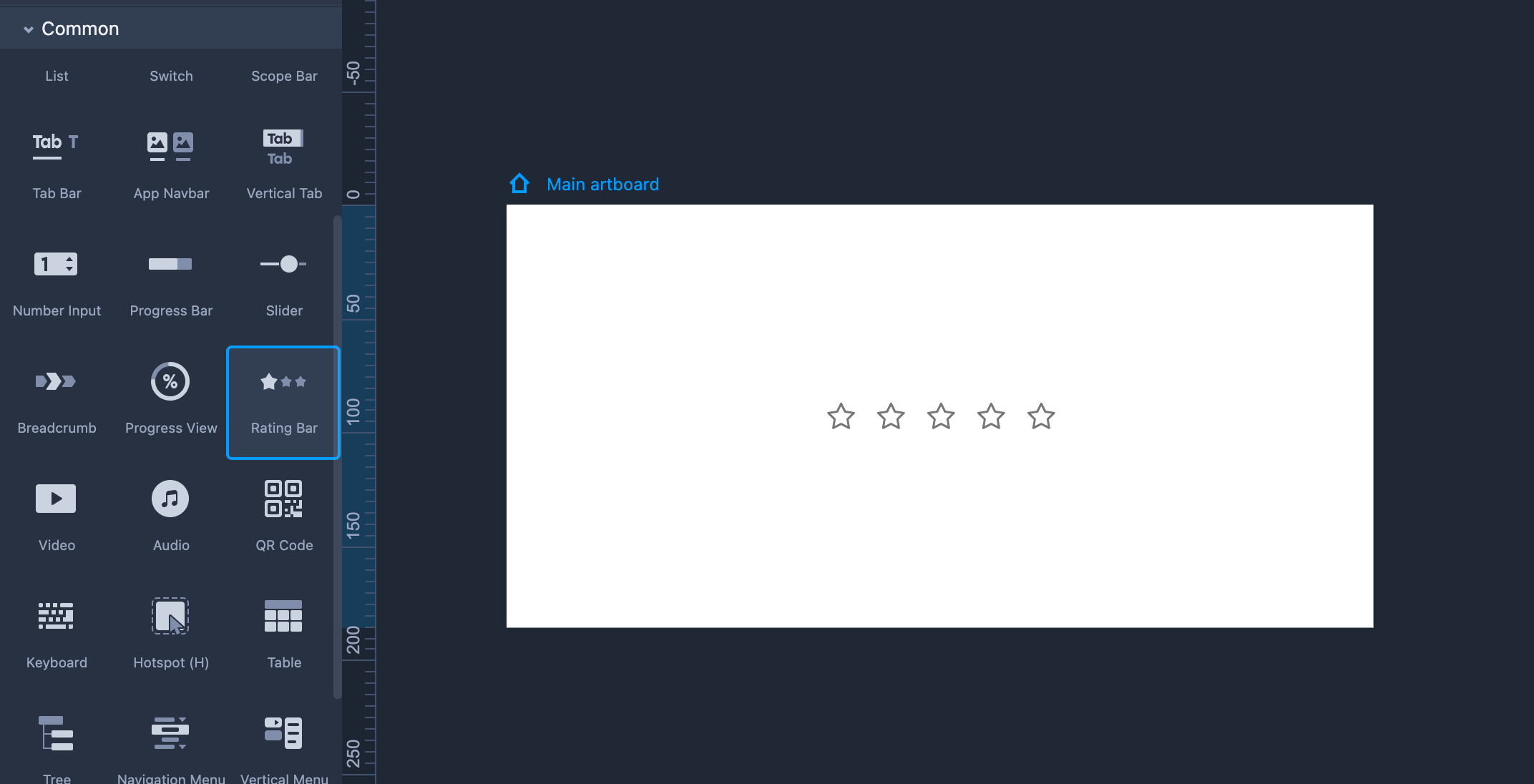
Property Settings
Set the opacity and other properties on the right-hand Property panel.
Set the color, size, and gap between stars in the "Extension" section.
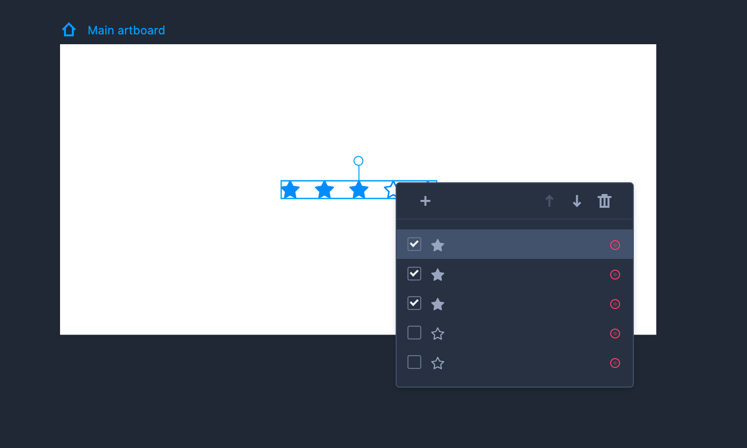
Edit Star Rating
To edit the Star Rating component, you need to enter the editing mode first by selecting the component and clicking "Enter.” You can then:
tick or untick an item to set the fill state for the rating stars;
reorder rating stars by dragging them directly or clicking the Up and Down arrows; and
delete or add stars according to what you need.
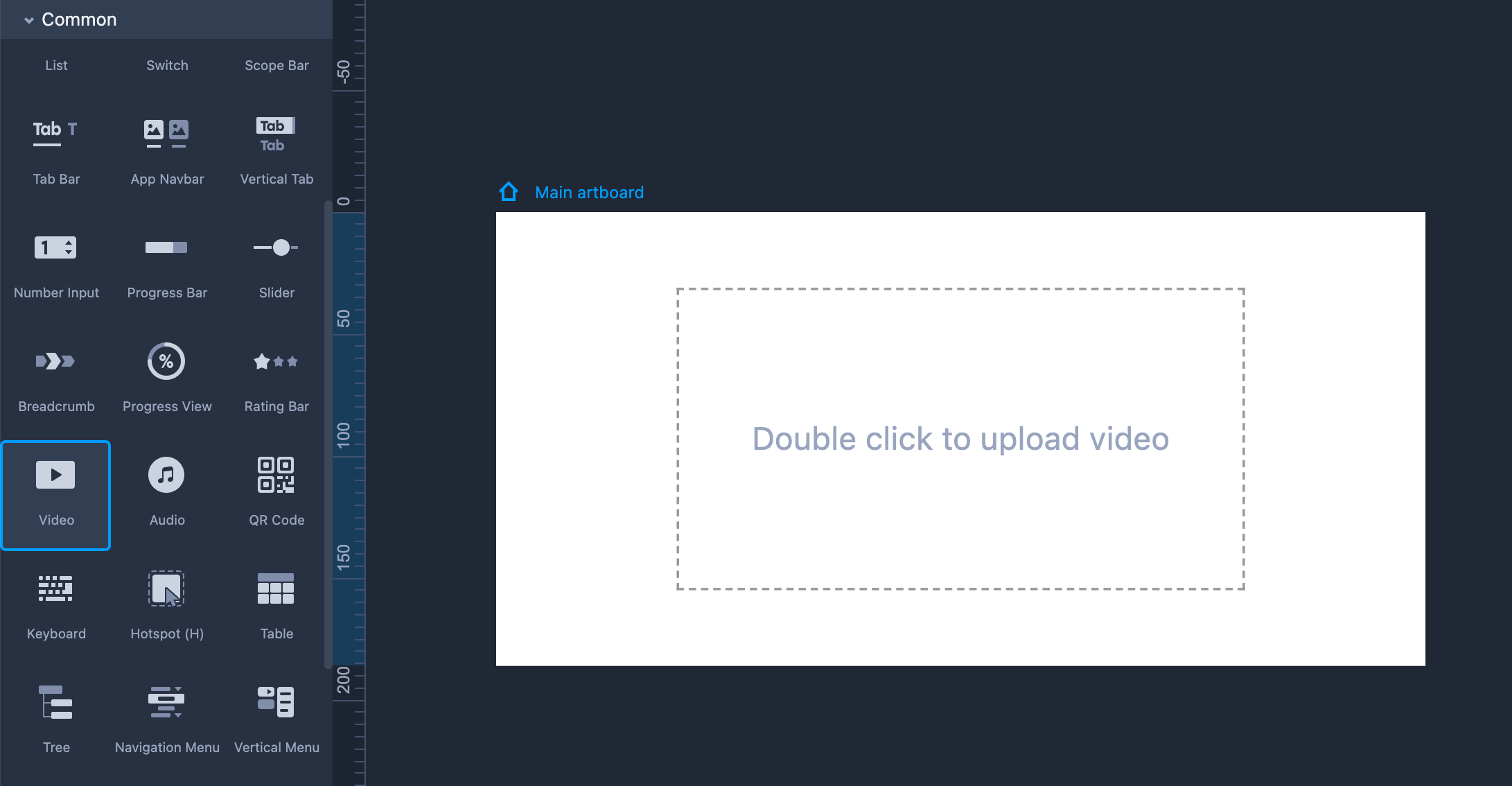
Video
How to add a video to your prototypes?
It's pretty easy to get it done:Drag and drop the Video component to your artboard;
Double-click on it and paste your video link from a video platform, like Youtube or Vimeo;
Then click Preview to check how the video works.
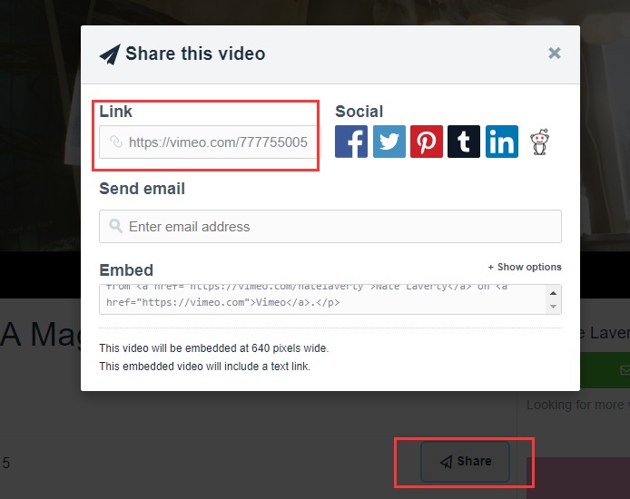
How to get a video link?
Here are the steps:First go to a video platform, like Vimeo;
Choose and click to watch the video you want to add to your prototype;
Audio
How to add audio to your prototypes?
Here is how:Drag and drop an Audio component onto the artboard;
Simply paste your .mp3 or .ogg file link to your Audio component;
Click Preview to check how the sound will be played.
Only Mp3 and Ogg files are supported;
Only one link for one Audio component. If you have multiple audio files that you want to use in your design, you’ll need to add multiple Audio components and add each file to a separate component.
How to add a local audio file to your prototype?
If you want to add a local audio file to your prototype, you will need to go through the following steps to generate a link for your local audio file:Go register at http://skydrive.live.com and get your Windows Live ID;
Click Upload to add your local audio file;
Click the Share button and you can copy the link on the pop-up window.

Then go to OneDrive, and generate a link with the .mp3 suffix that can be added to an audio component.

FAQs
Can I directly paste the share link from SoundCloud or any other music app?
The shared link from some music apps like SoundCloud does not have the .mp3 suffix, so it can not be used and played after being pasted to an audio component.Why does it show "Unable to fetch the audio data" after you add an audio link?
Your link is not with the Mp3 or Ogg suffix;
Your link contains some text words and you will need to remove them;
There may be a problem with the source audio. Just open its link in a browser to see if it works.
Your audio is not allowed to be shared and accessed by other applications.
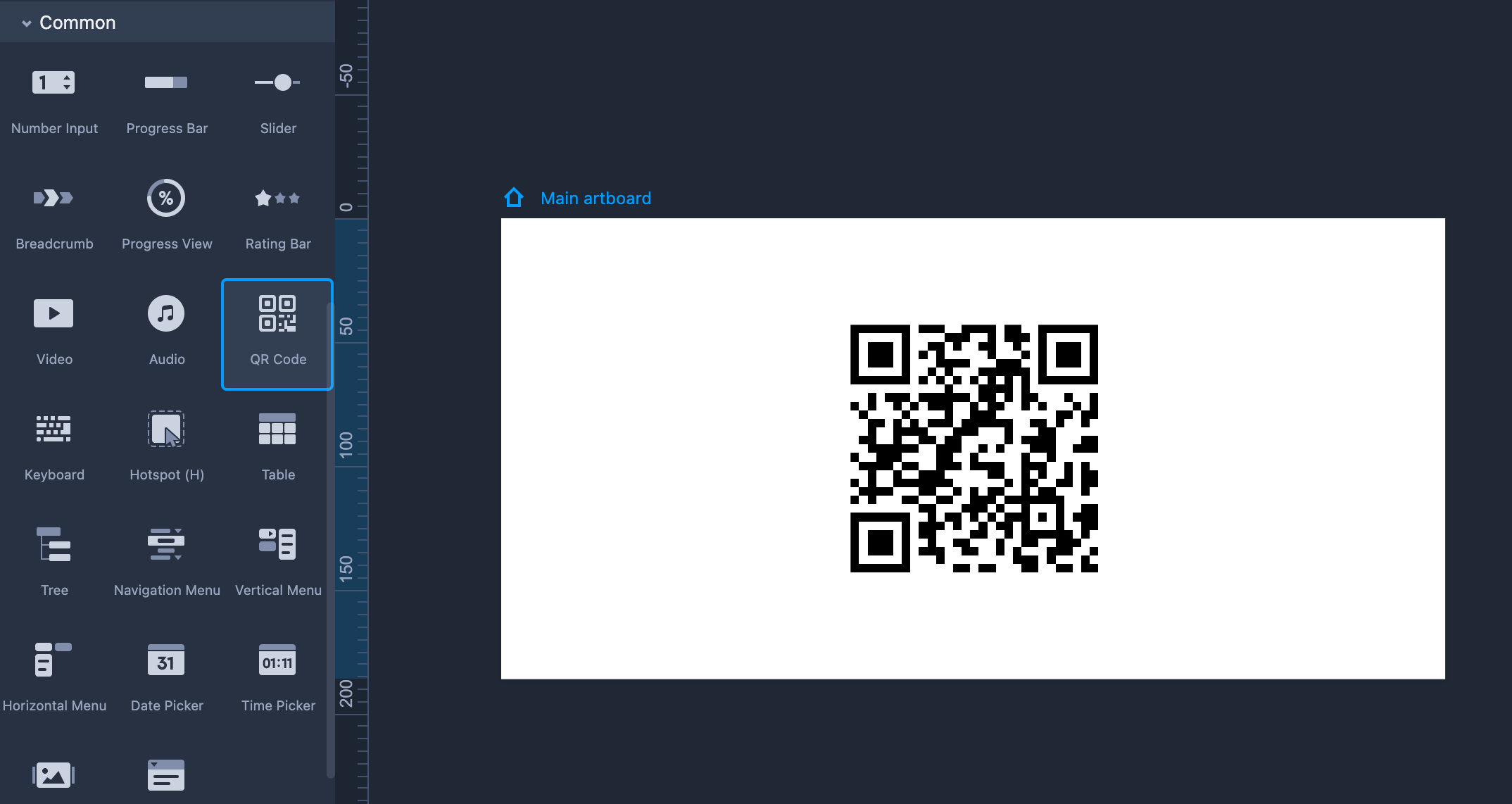
QR Code
Drag the QR Code component from the left-hand Common library.
Resize the component as much as you need. You can maintain an aspect ratio by default.
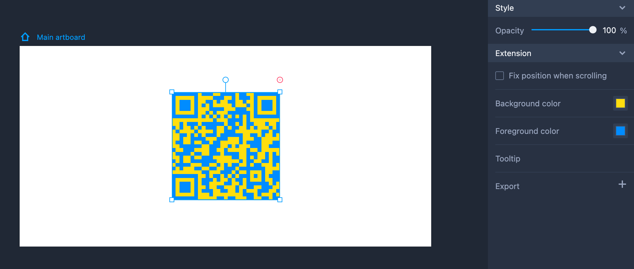
Property Settings
Set the opacity and other properties on the right-hand Property panel.
Set the background and foreground color in the "Extension" section.
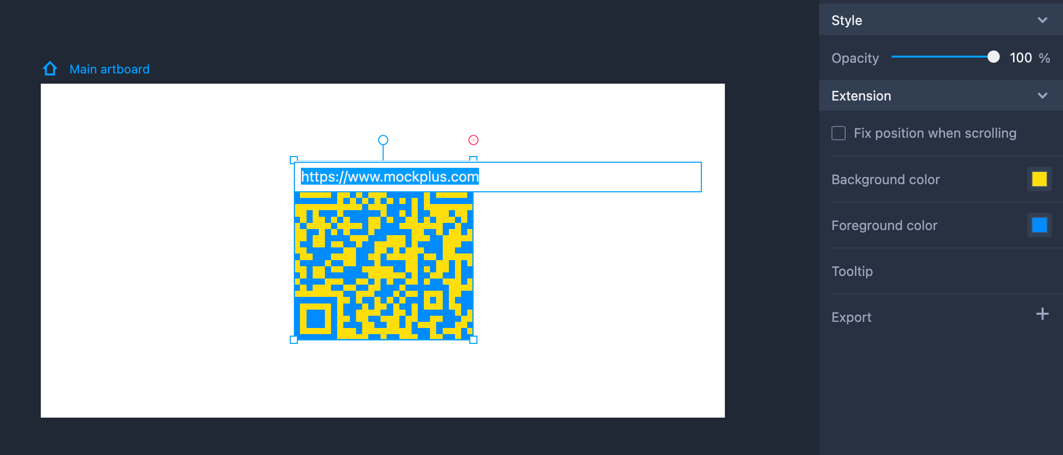
Edit QR Code
Click "Enter" to enable the editing mode and add an external link to the QR code.
Then, while previewing projects, an external link will be shown to take you to other web pages when the QR code is scanned.
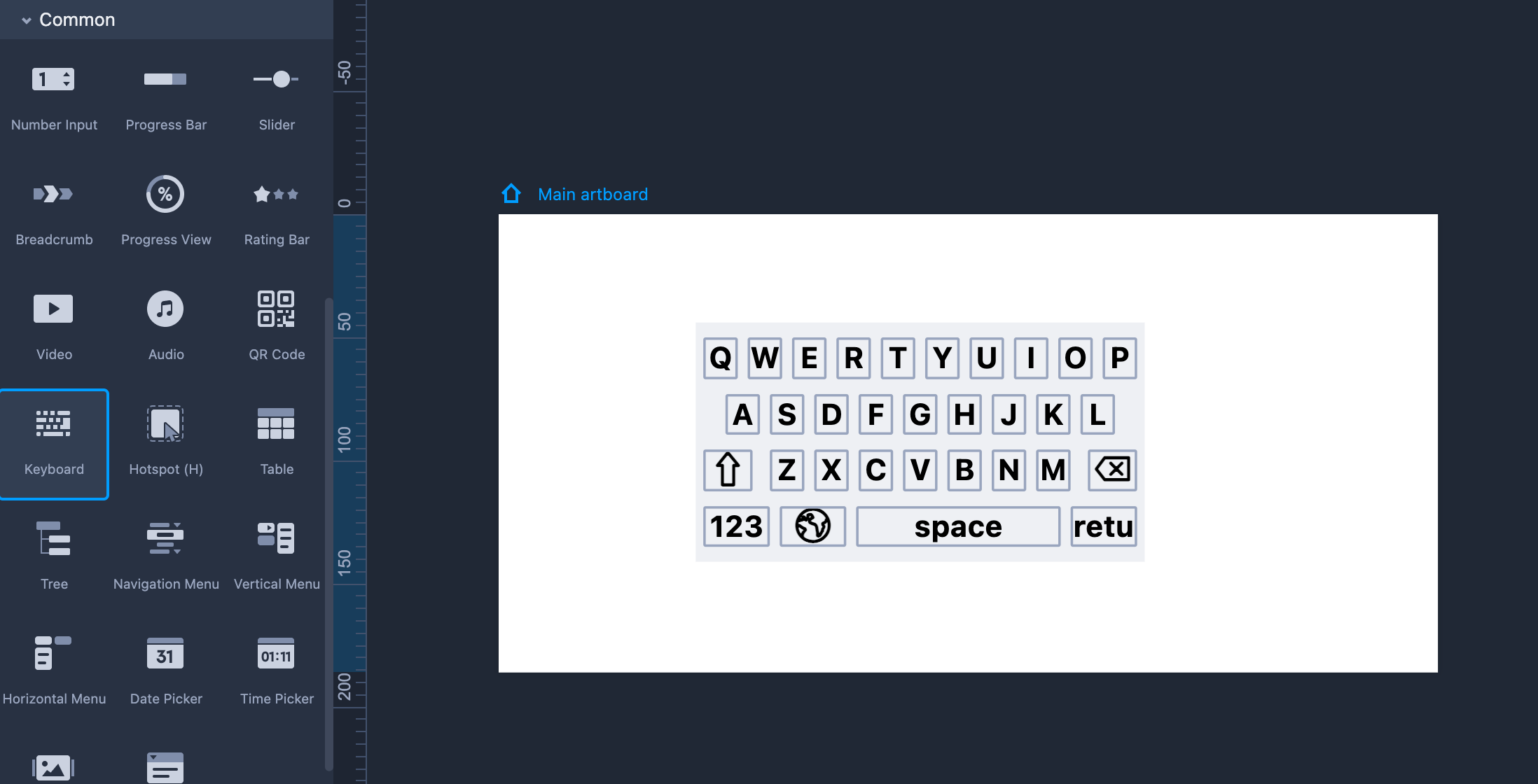
Keyboard
Drag the Keyboard component from the left-hand Common library.
Hold "Shift" to maintain the same aspect ratio while resizing the Keyboard.
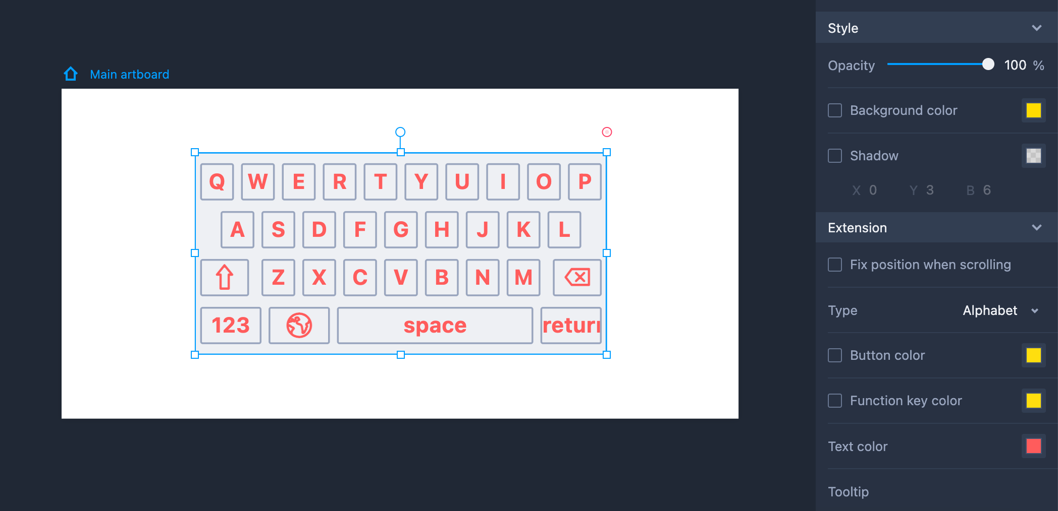
Property Settings
Set the opacity, background color, and shadow properties on the right-hand Property panel.
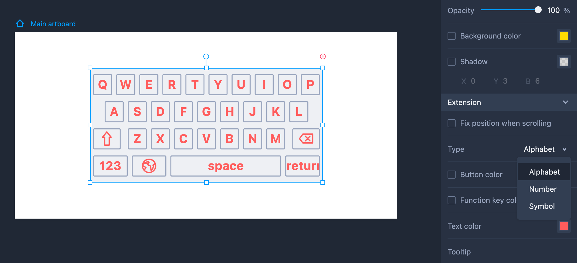
Set the keyboard types, text colors, and function key colors in the "Extension" section.
Keyboard Types
There are three types of keyboard available: Alphabet, Number, and Symbol.
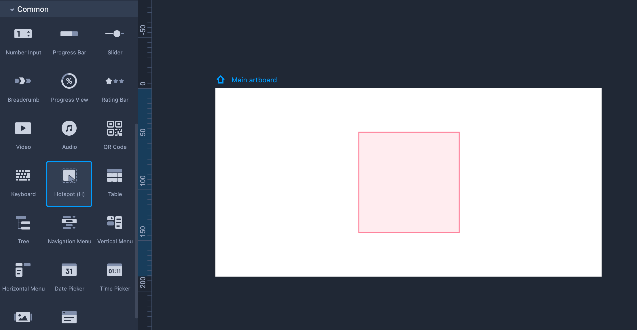
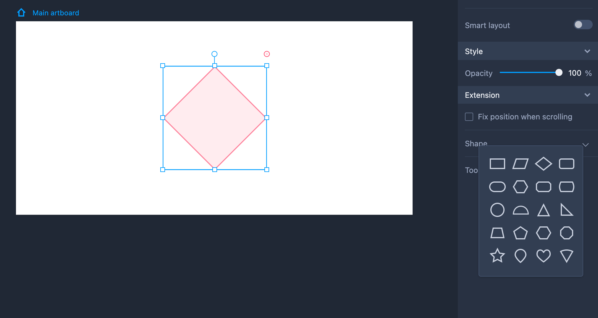
Hotspot
A Hotspot is a special component made of vector paths which is completely invisible during preview mode. Its primary function is to act as a trigger area for interactive settings.
- You can adjust the shape and size of a Hotspot. Hold Shift to zoom in/out the Hotspot while keeping its width/height ratio unchanged.
- Double click Hotspot to enter the path editing mode. Through path adjustment, you can change the Hotspot into any shape you want.
- The Hotspot component supports Boolean operations, cutting, and path opening/closing.
Hotspot Properties
Most Hotspot properties are not editable, but you can still adjust its transparency, angles, and other features on the properties panel.
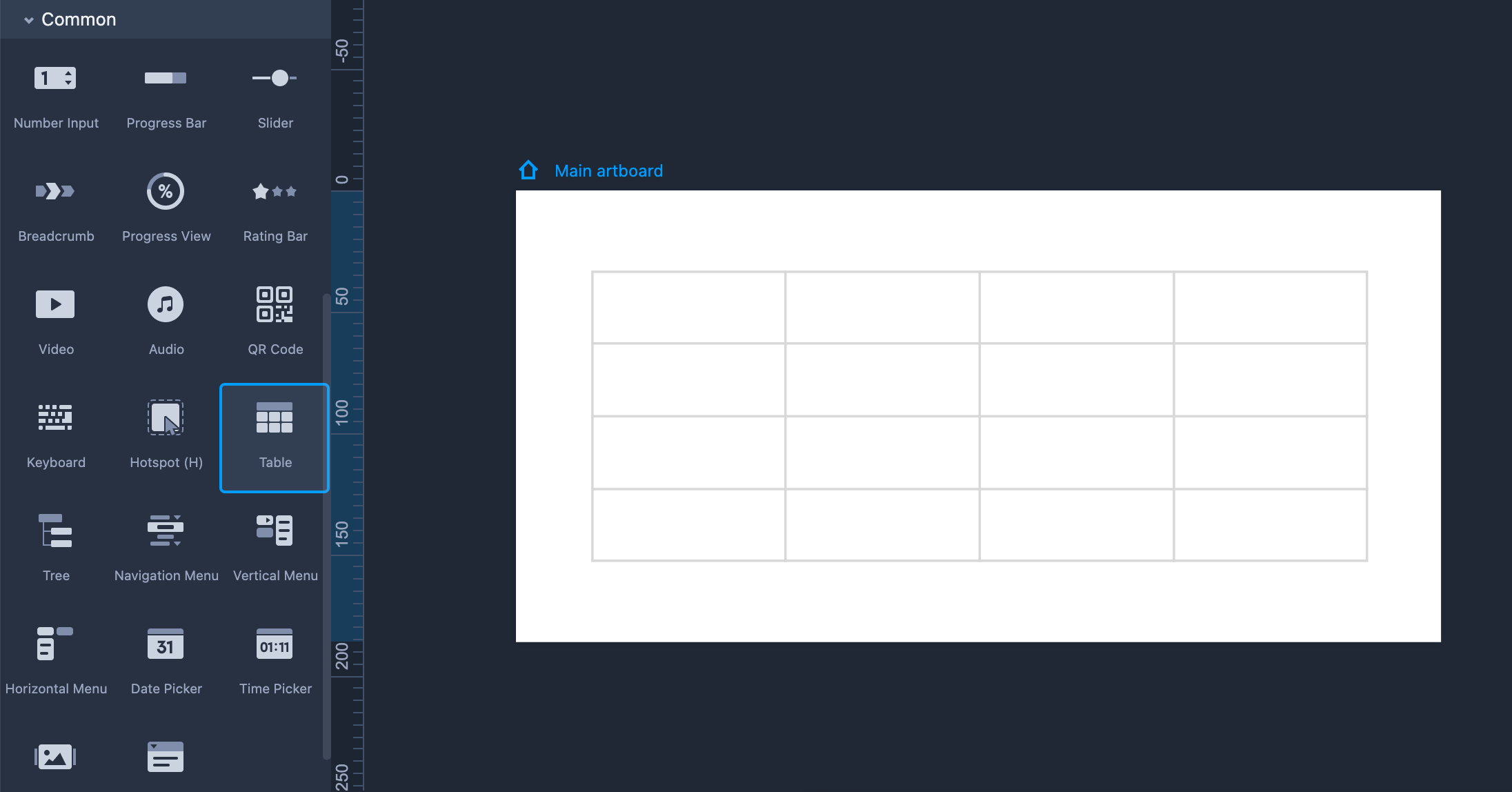
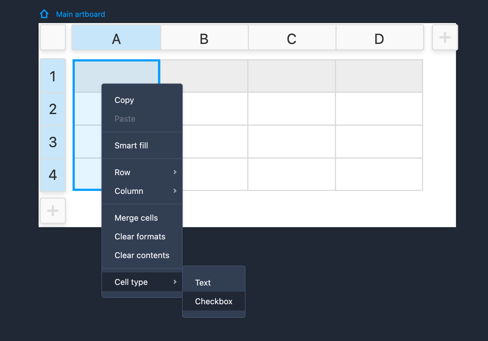
Table
The Table component gives you an easy way to create data tables quickly.
Properties Settings
● Select a Table to change its properties (like opacity, border and shadow, etc.);
● Select a cell of a Table to change its properties (like text alignment, fill color and border, etc.);
● Select a column/row of a Table to set its height and width.
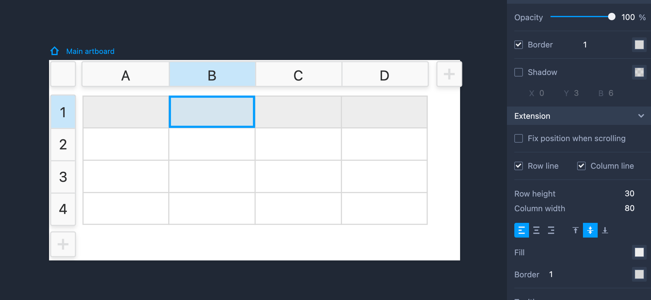
Edit Table
To resize Table, select the component and drag its four resize handles around.
To edit columns or rows, double click the component to enter its edit mode. You can then:
● Select a column/row and change the row's height or the column's width with drag-and-drop.
● Select a column/row and right click it to insert a column or row.
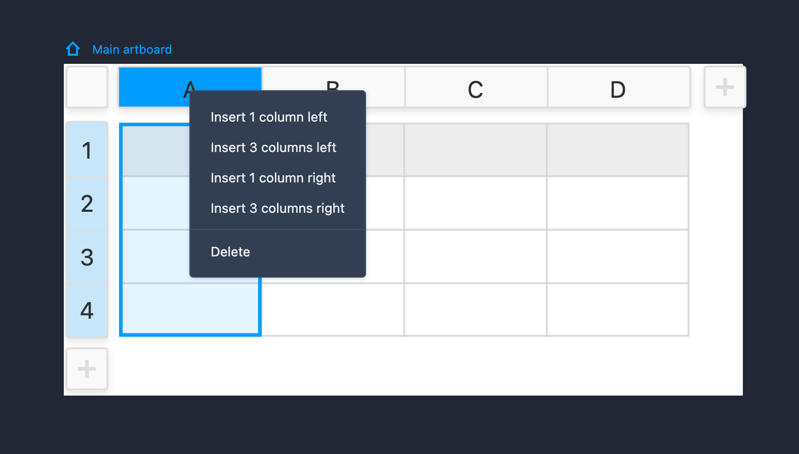
Right click any cell and you can freely insert columns or rows from the right-click menus.
From the same right-click menu, you can also add a checkbox to the selected cell by choosing "Cell type" > "Checkbox".
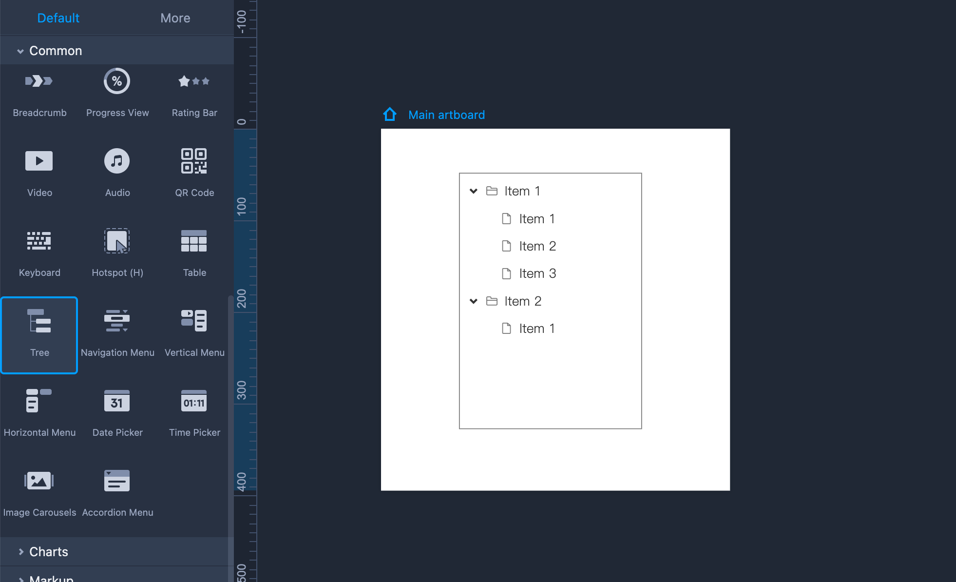
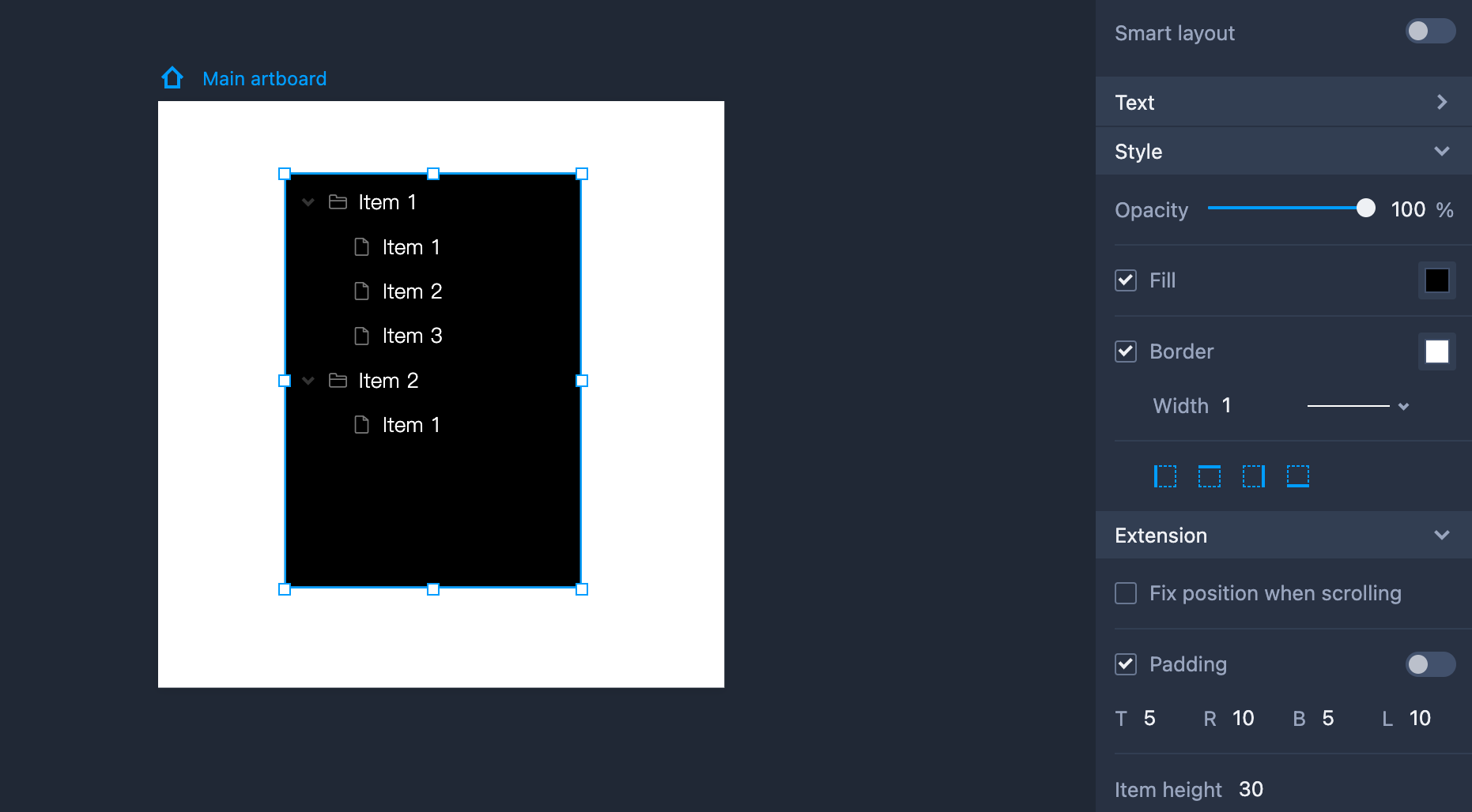
Tree
Tree components are most often used to quickly arrange your files, folders and other information into tree structures. The inner button, icon, checkbox and the other elements are fully customizable. You can freely edit its item texts and style them with simple clicks.
Properties Settings
Basic properties, like border and fill, can be changed in the Properties panel on the right.
Set the icon, checkbox and button in the "Extension" section.
Set the style of a selected item, like its background and text content, in the right Properties panel.
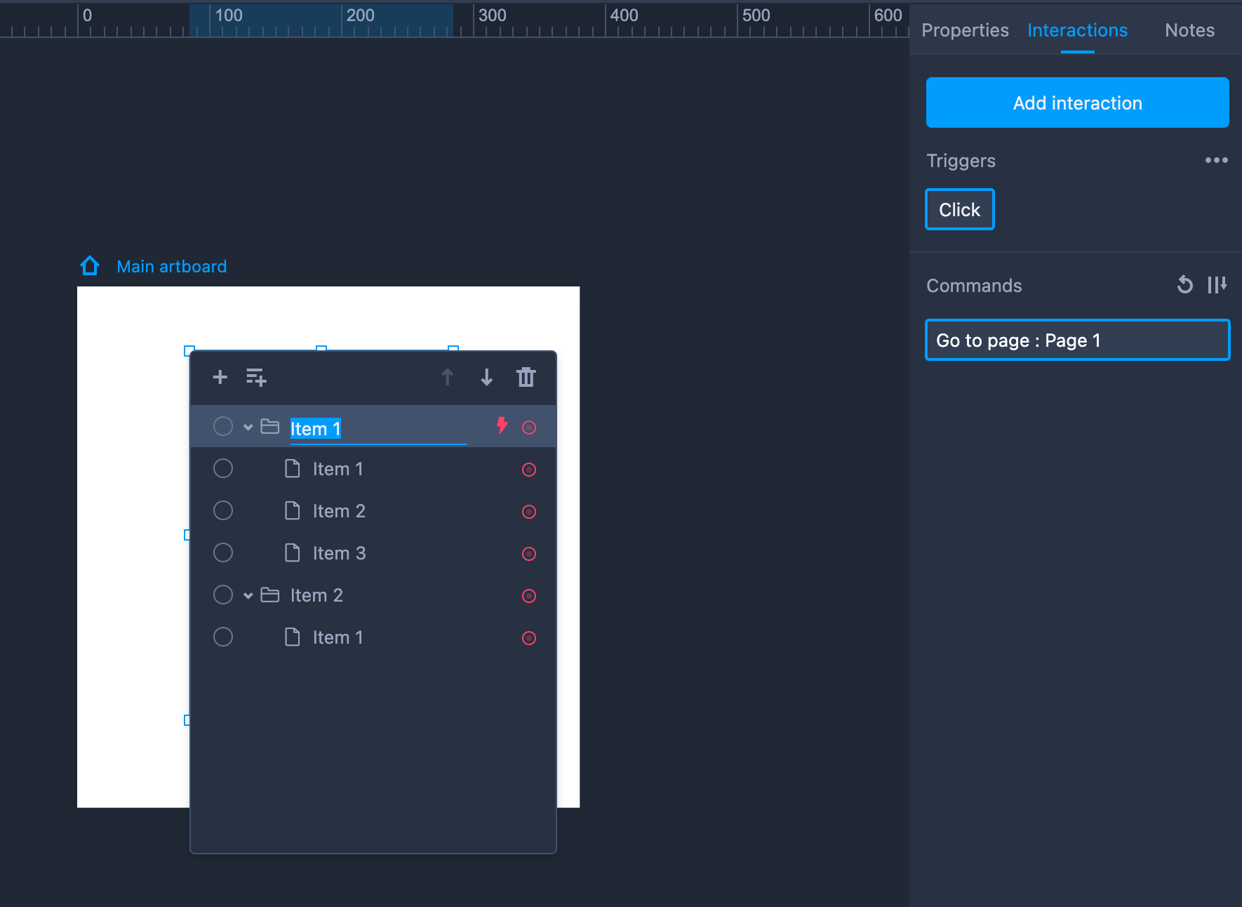
Edit Tree
To edit a Tree component, you need to select it and go into its edit mode by pressing "Enter" or double clicking on it. Here you can edit many properties, such as:
● Items and item text content.
● Add, delete or reorder sibling and child items.
● Adjust the order and hierarchy of items using drag-and-drop.
● Set default selection by clicking the radio button in front of the item.
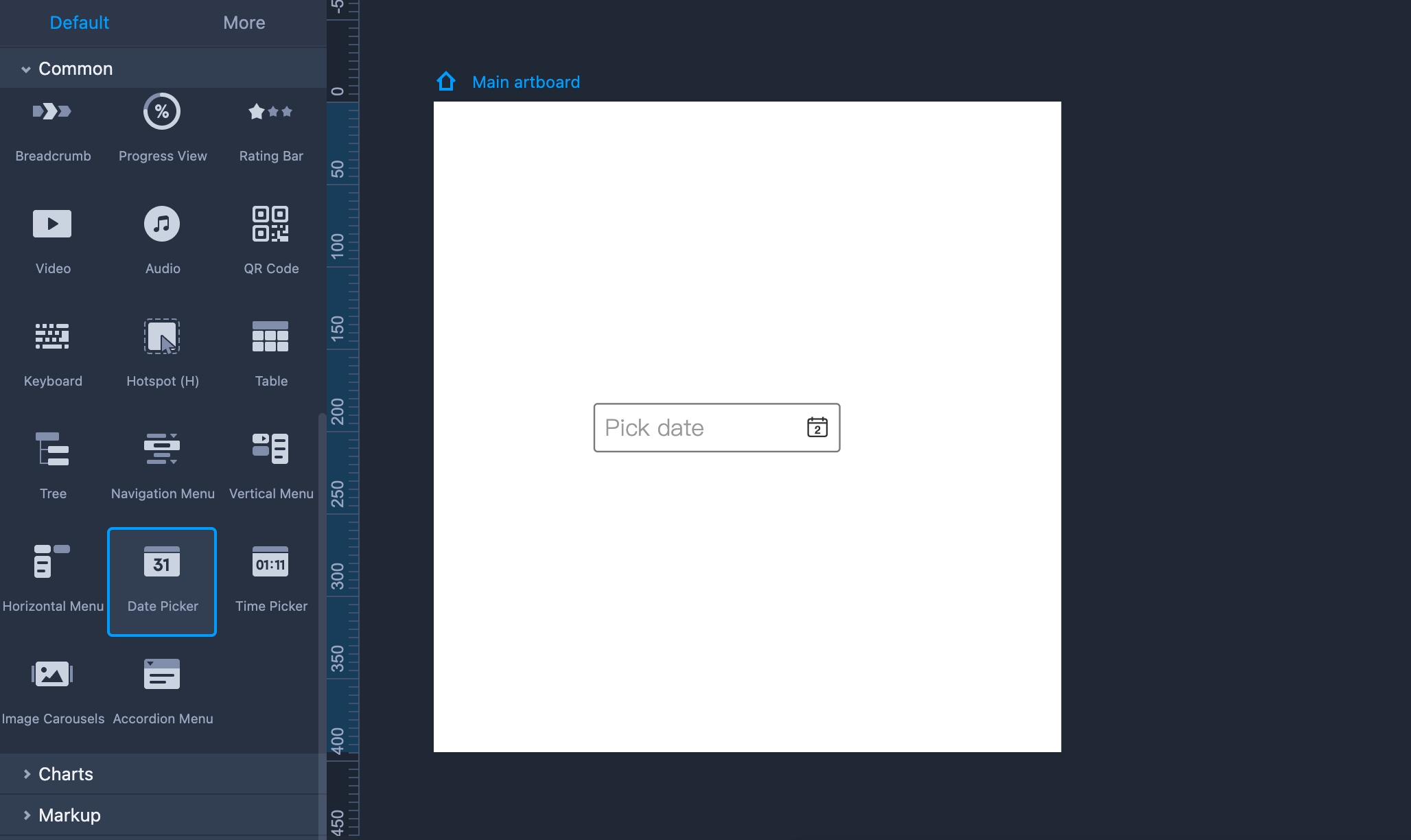
Date Picker
Date Picker is a ready-made interactive component that allows you to select a date or date range when previewing your web or mobile app prototype project.
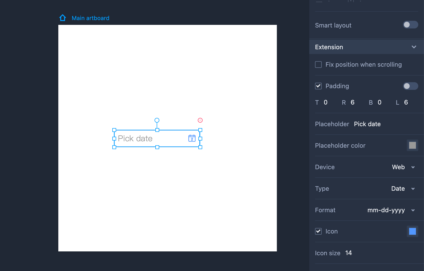
Property Settings
You can change the details of this date picker on the right-side property panel:
- Device - select a mobile or website device
- Type - select a date or date range
- Format - select a date format, like mm/dd/yyyy or mm-dd-yyyy
- Show year - choose to show the year or not
- Show mask- choose to show a mask to make it stand out from the main page content
You can also enter a custom placeholder and choose a placeholder color. The icon size and color also can be adjusted to match your design needs.
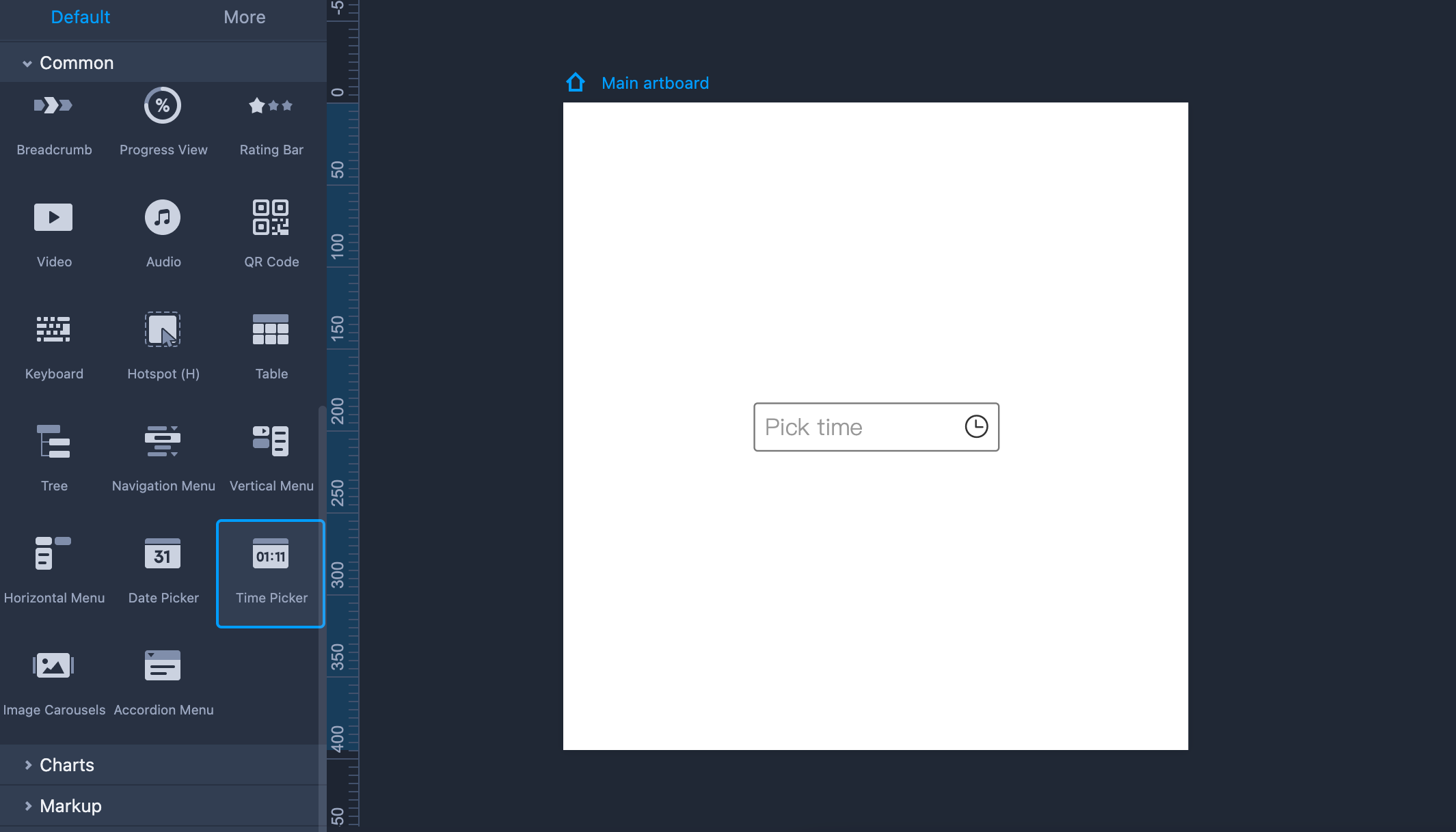
Time Picker
Time Pickers is also an interactive component that allows you to select a time or time range when previewing your web or mobile app prototype project.
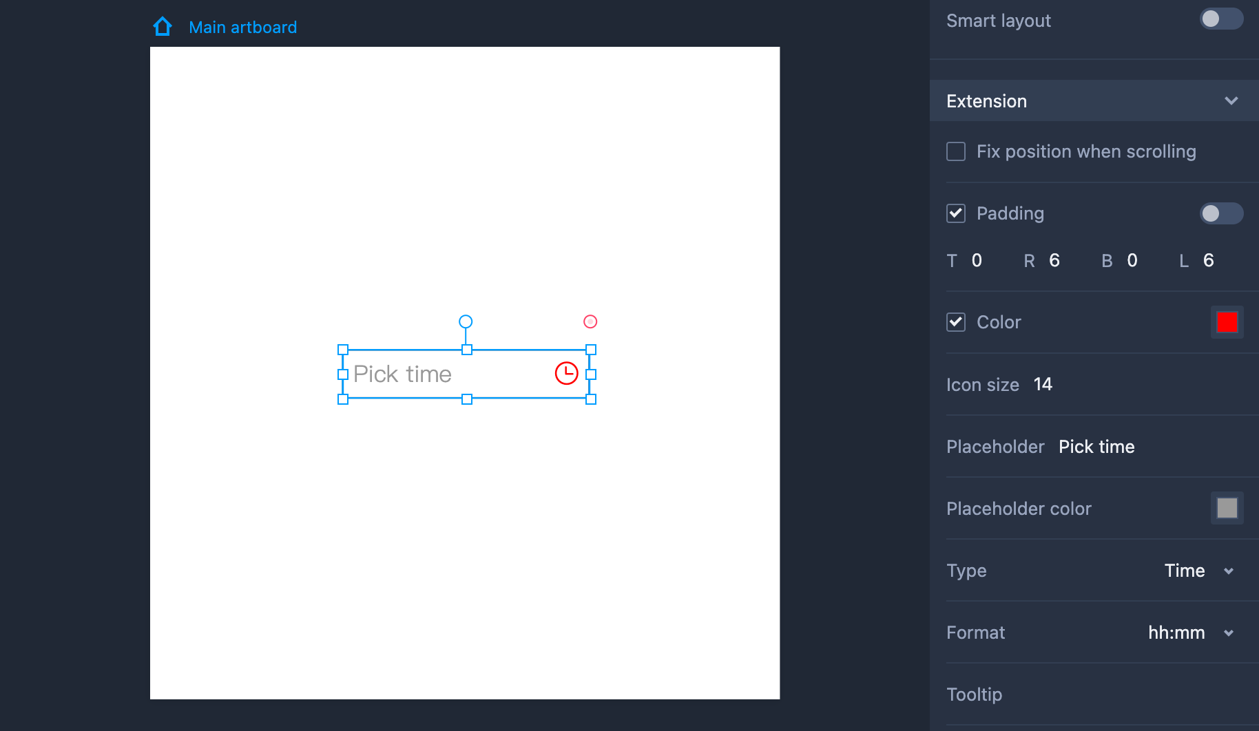
Property Settings
You can change the details of this time picker on the right-side property panel:
- Type - select a time or time range
- Format - select a time format, like hh:mm or hh:mm:ss
- Placeholder - enter a custom placeholder
- Icon size - change the icon size and color
Accordion Menu
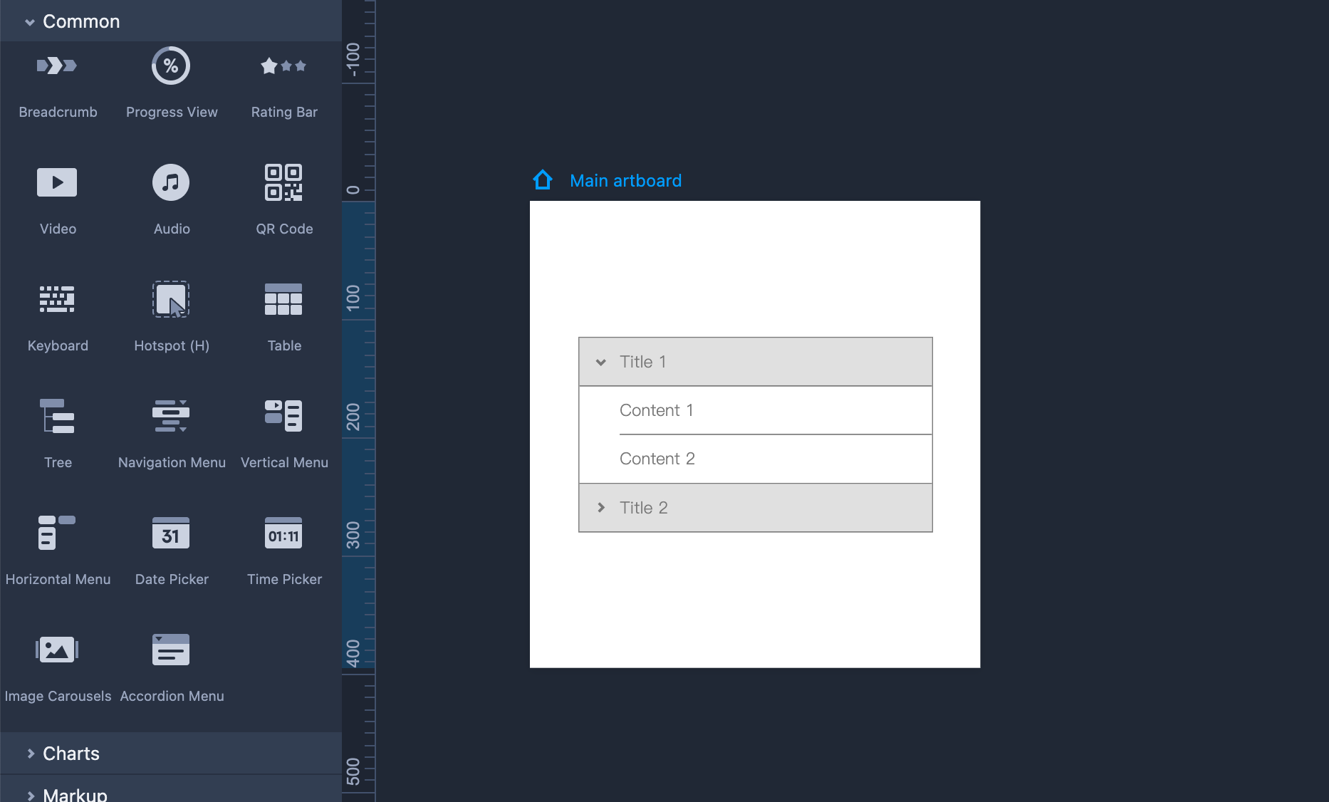
How to add an Accordion Menu to your prototype?
Drag and drop the Accordion Menu component to your artboard
Double click to edit the Titles and Contents separately.
Drag the link point of these Titles or Contents to set interactions for them.
Title - Only accommodates a single line of text. Text content that exceeds the max length of the component will be omitted with an ellipsis during the preview.
Content - Allows for multiple lines of text. Text content that exceeds the max length of the component will auto wrap to the next line.
How to edit an Accordion Menu?
Edit the background colors, text styles and more details
Enable or disable "Open one item at a time" to show one or several titles at a time during the preview.
Edit the Spacing to modify the overall height of the area containing the title and content of each heading.