


Creating a perfect design can consume a significant amount of time. Designers often need to pay meticulous attention to every detail to ensure the overall coherence and functionality of the design. This entails refining, repositioning, and iterating on various elements to achieve a polished result. Consequently, in most cases, the design process often involves a lot of repetitive tasks, which can even take up to 70% of designers' time to deal with.
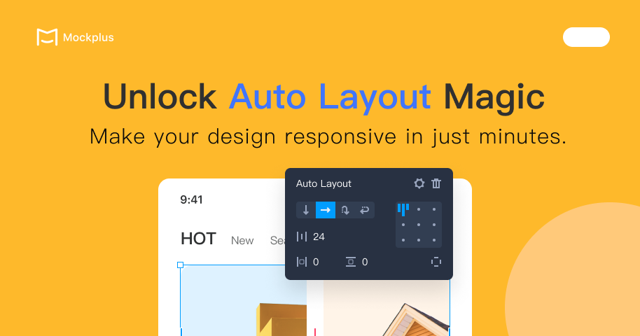
So, reducing those tedious and repetitive tasks is key to boosting design efficiency. This is where auto layout comes into play. The auto layout in Mockplus DT emerges as a potent tool to create fluid and responsive designs, significantly saving designers valuable time.
In this article, we will explore the magic of auto layout and show you how to use it to create a responsive card in minutes.
What is Auto Layout?
Auto layout is a property that can be added to any frame or a selection of elements to create dynamic and responsive designs. With auto layout, you can make elements that are responsive to factors like size changes and reordering of content, considerably reducing repetitive refining process.
Basically, the key pros of using auto layout can be summarized as:
A. Reducing repetitive work in spacing calculation and element alignment
B. Organizing UI design in a structured framework, allowing a more accurate representation of the design in the development phase.
Introduction to Auto Layout in Mockplus DT
In Mockplus DT, you can add auto layout to any selected element through the right-click menu, keyboard shortcuts, or the properties panel.
When a single frame is selected, the auto layout will be added directly to the frame.
When multiple layers or frames are selected, it will automatically create an outermost frame for all those selected elements and the auto layout will be added to this frame.
Once the auto layout is added to the frame, you can quickly adjust its layout direction, spacing, margins, alignment directly in the workspace or through the properties panel.
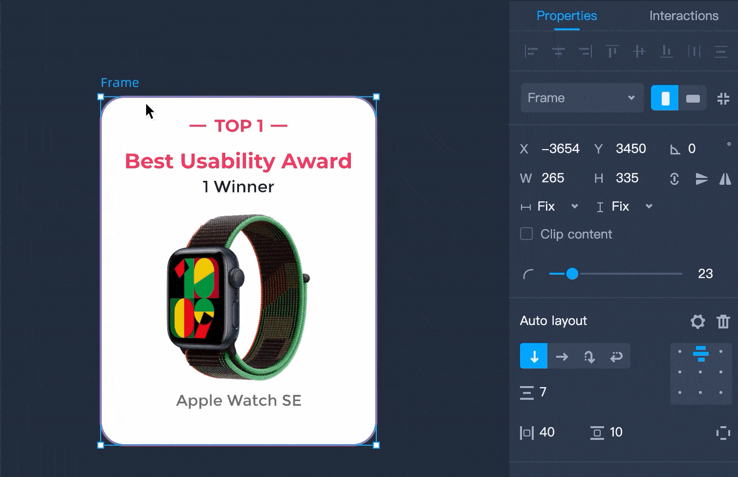
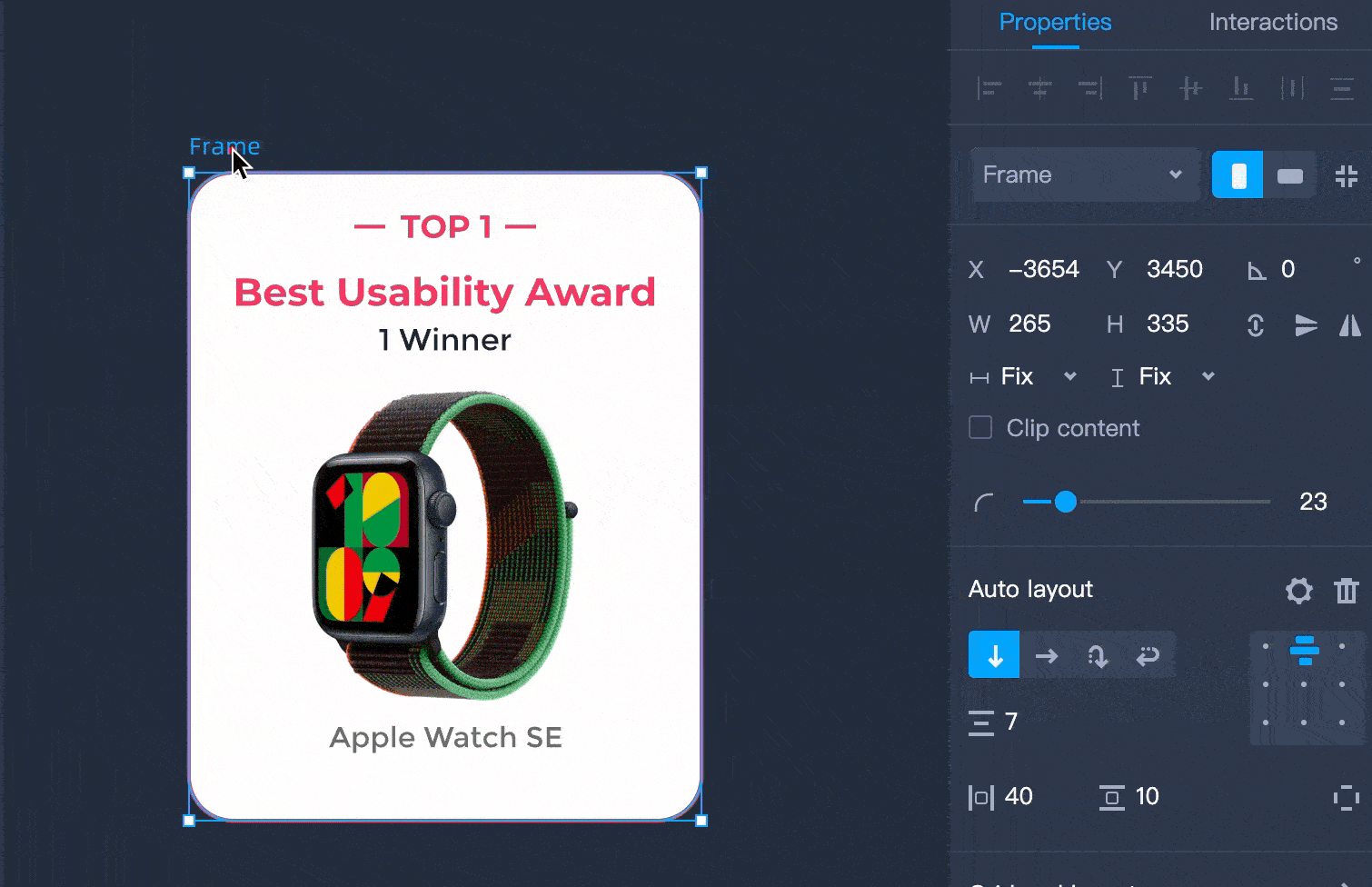
Moreover, to create a more responsive and adaptable design, you can select a frame or any element inside a frame and add auto horizontal and vertical resizing to it. There are three different resizing types that decides how elements or frames respond to changes of others:
Fixed width/heights: The values of a frame's or an element's dimensions don't respond to changes of other frames or elements and remain the same.
Hug content: A auto layout frame set to hug content can resize itself according to the changes of its child elements.
Fill container: Elements in an auto layout frame set to fill container stretch to the width and/or height of their parent frame.
Now you have a basic understanding of auto layout. Moving forward, let me use a simple graphic card with images and text as a use case to show you how to use auto layout in your design.
Create a Responsive Card with Auto Layout
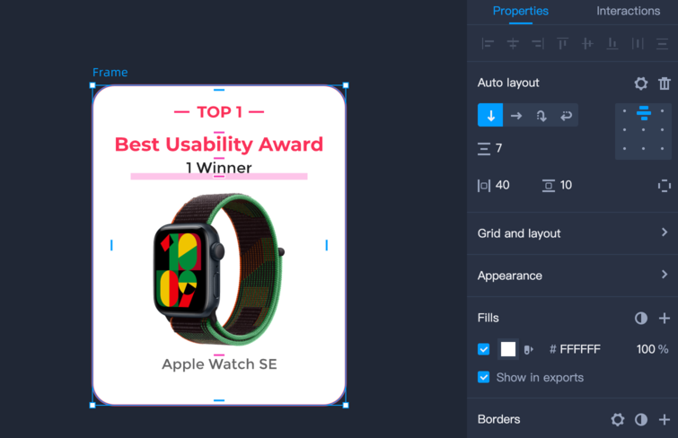
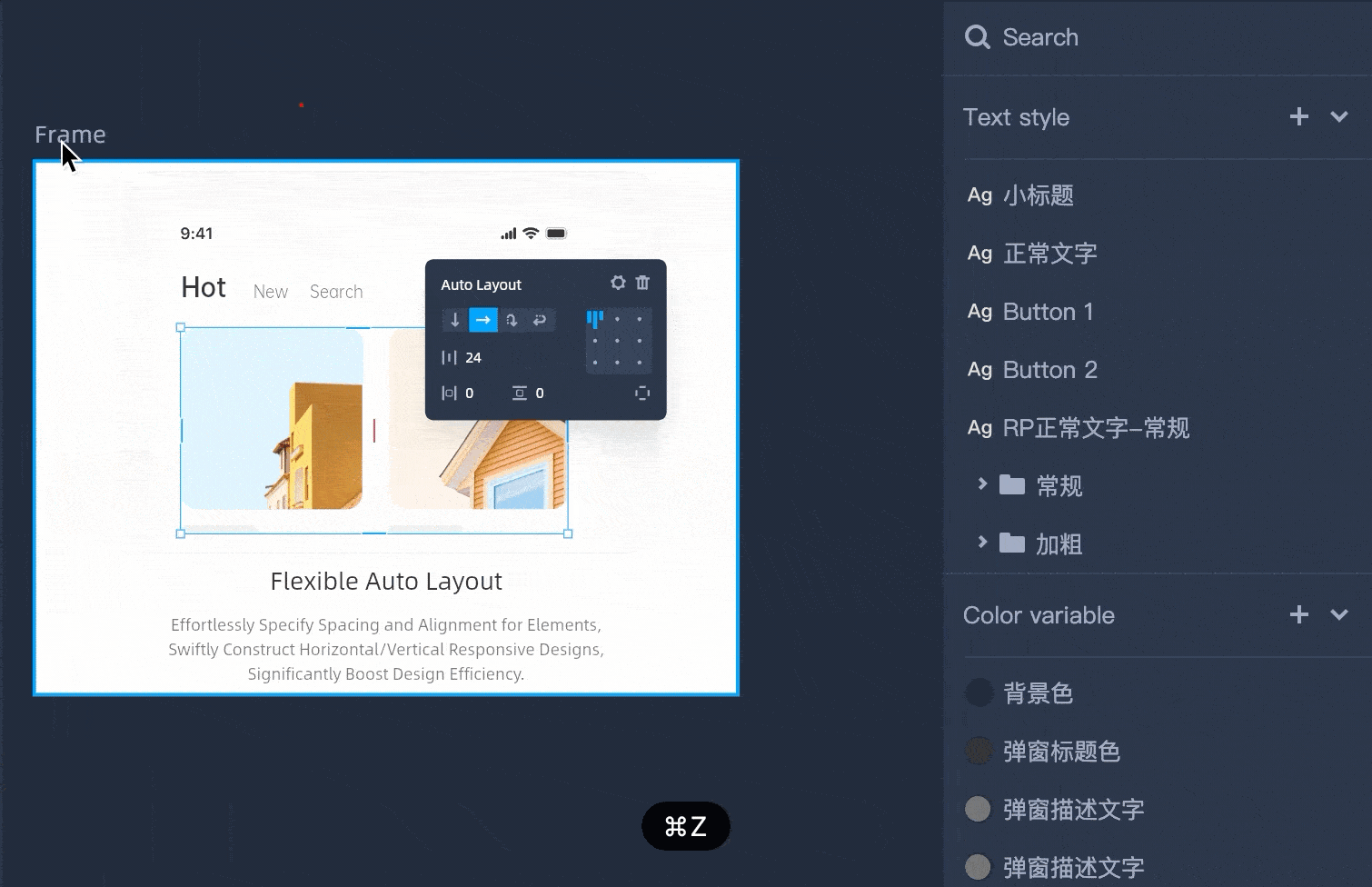
1.Basic Design
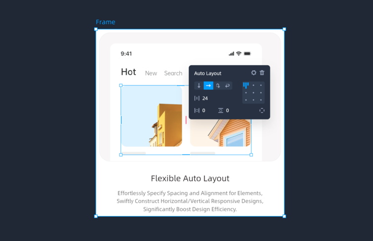
First, let's create the fundamental structure of the card with a frame and its internal image and texts.

Next, we need to add auto layout to the frame and set its layout direction, spacing, padding, alignments, etc. Here, we aim for all elements to maintain horizontal alignment at the center and vertical alignment at the top regardless of changes to the container.
Therefore, we set the alignments as 'Align Top Center.'
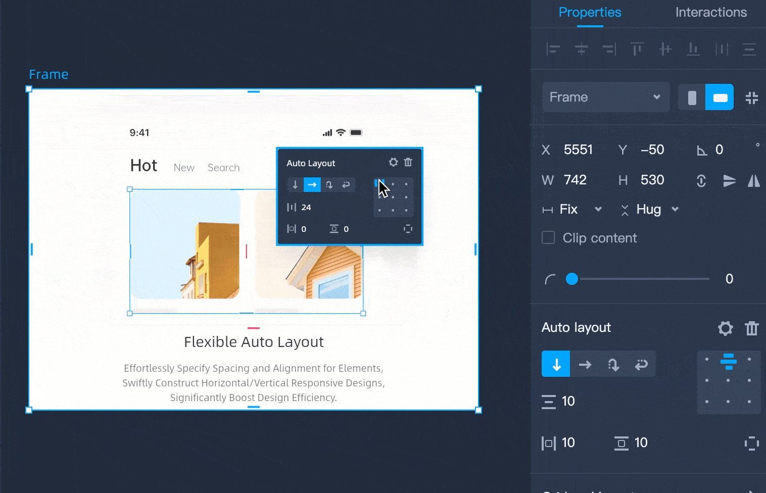
Next, we need to set horizontal/vertical resizing type for the internal elements based on how we want them to respond to changes of the container.
A. For elements intended to dynamically adjust to the container's size and consistently fill it, select 'Fill Container.'
B. For elements meant to maintain a fixed size irrespective of container's changes, opt for 'Fixed Width/Height.'
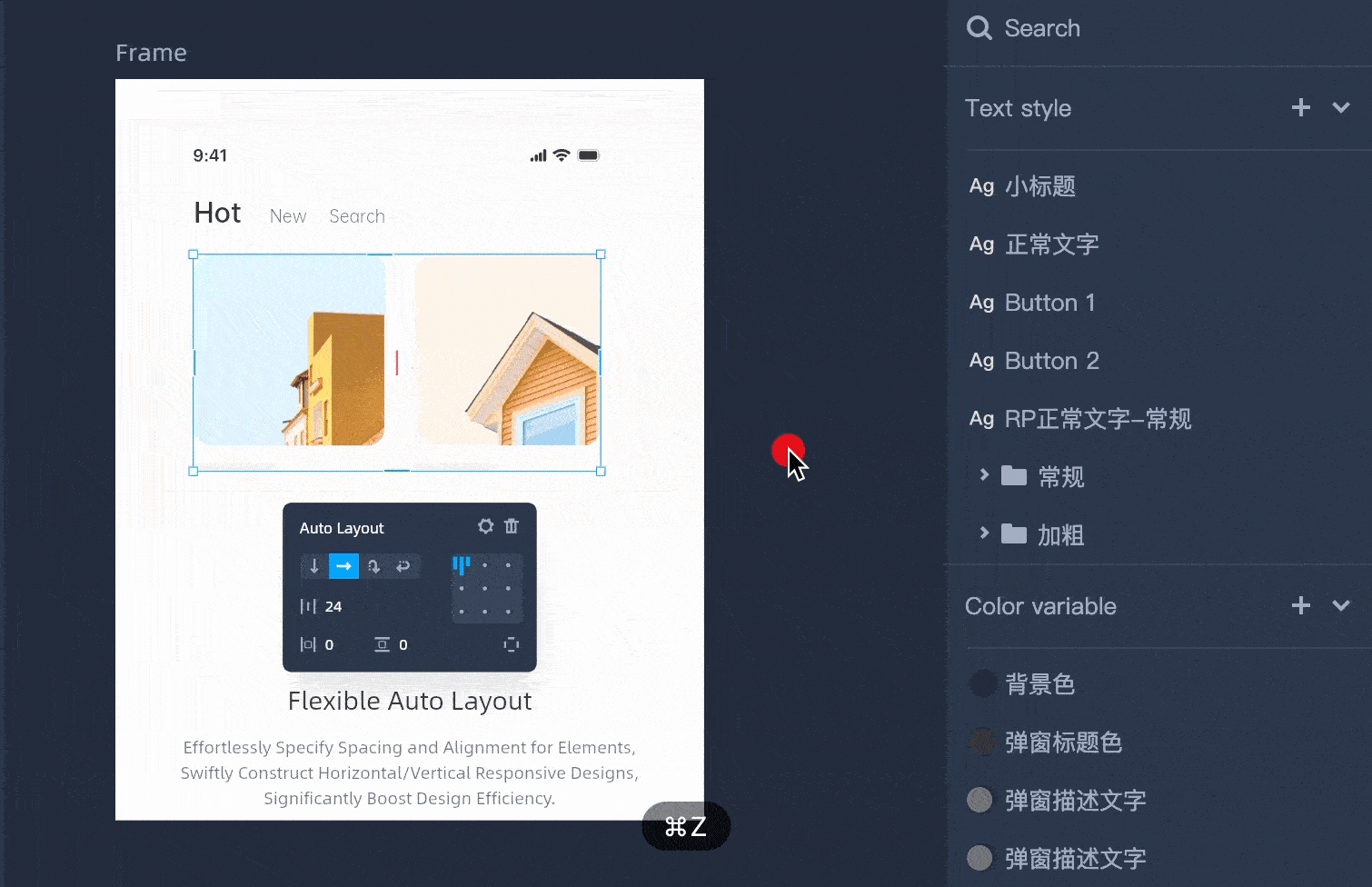
Once you finish all the settings for the auto layout, newly added elements within the container will automatically conform to these settings for seamless arrangement. Similarly, when removing elements from the container, the remaining elements will also automatically rearrange.
2.Advanced Design
Now we have created a simple responsive card. Moving forward, we can elevate the complexity of the design by combining two techniques: absolute position and constraints.
First, let's create the fundamental structure of the card with a frame and its internal images and texts. And then add auto layout to the frame.
Here we want the elements in the red area to respond to size changes of the container and elements in the green area can stay in the same size but automatically relocate according to changes of the container.
Once we add auto layout to the frame, you may notice that you can't place any element above others within the frame. This is because all the internal elements of an auto-layout frame have to conform to its auto-layout settings. To address this problem, we can enable 'Absolute position' for elements that need to float above others. This essentially detaches these elements from the auto layout rules we've set, allowing independent adjustments to their position, size, and constraints. It means we can place it wherever we want.
Next, we need to set the rule of how we want elements to respond to changes of the container. As we mentioned, we can set horizontal/vertical resizing types for the internal elements according to our needs. But for those elements that enable 'Absolute position', that's another story. We can only use 'constraints' to set the resizing rule for those elements.
Once all done, let's take a look at the final result.
More Advanced Use for Auto Layout
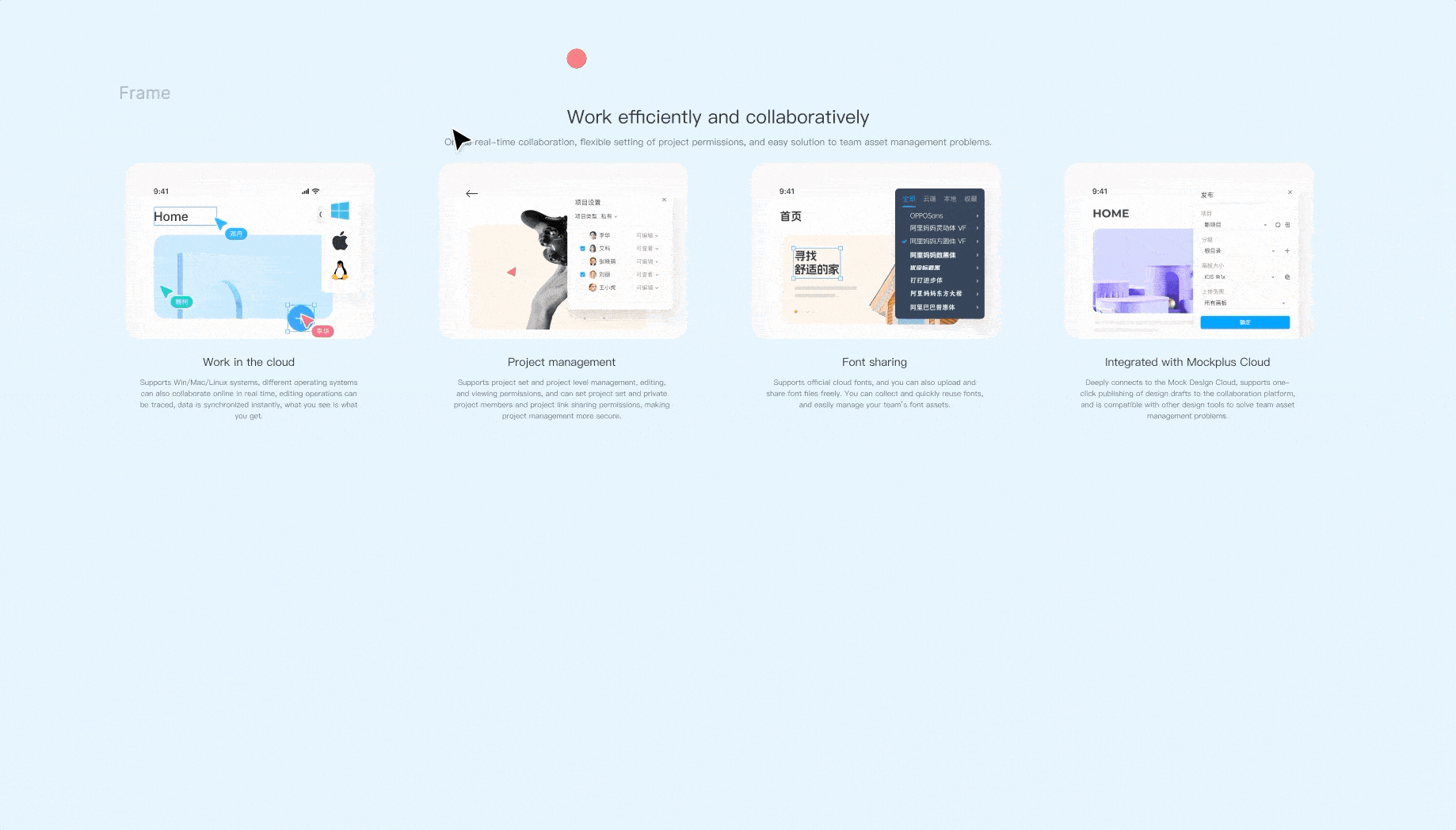
Once you can use auto layout skillfully to create responsive card. You can also expect more from it. For example, you can nest an auto layout frame within another auto layout frame to get more compete responsive web or app designs. Let's have a look at responsive web design with a nested auto layout structure.
Conclusion
By utilizing auto layout, designers can easily and quickly create designs adaptable to different platforms and devices, and also can save tons of time spent on adding, deleting, modifying content size, and positioning. Moreover, auto layout also serves to align designers' design thinking closely with development logic. By organizing UI design in a structured framework, it ensures a more accurate representation of the design in the development phase.
Overall, auto layout will not only open up ways for your creativity, but also drastically improve your workflow. Don't just take our word for it, give it a try for yourself in Mockplus DT. There's much more it can offer than you might expect!