


 Mockplus Classic

With Mockplus Classic, you can easily create realistic yet fully interactive web or app prototypes within minutes, no programming required. The highest skill you'll ever need is a mouse click and drag-and-drop.
By following this guide, you will learn how to create an interactive web or app prototype easily step by step.
Create your first prototype
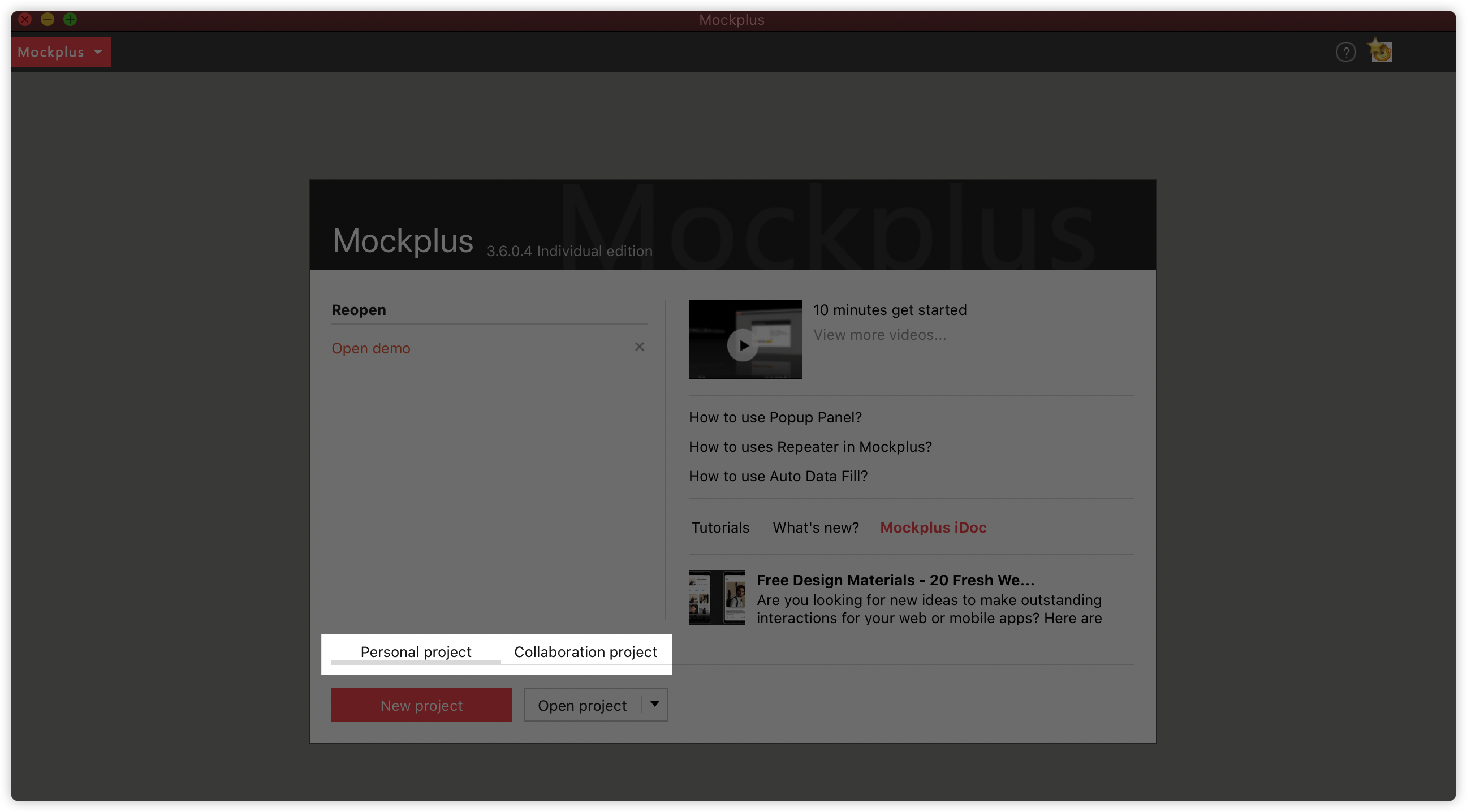
After logging into Mockplus desktop app with your account, you can create two types of projects: Personal projects and Collaboration projects:
- Choose Private project if you plan to do everything by yourself;
- Choose Collaboration project if you want your team to work on the same project simultaneously.
Next, you'll be taken to the project selection interface, you can choose Mobile, Tablet, Web and Desktop projects as you need. For custom sketching you can choose between Whiteboard and Custom:
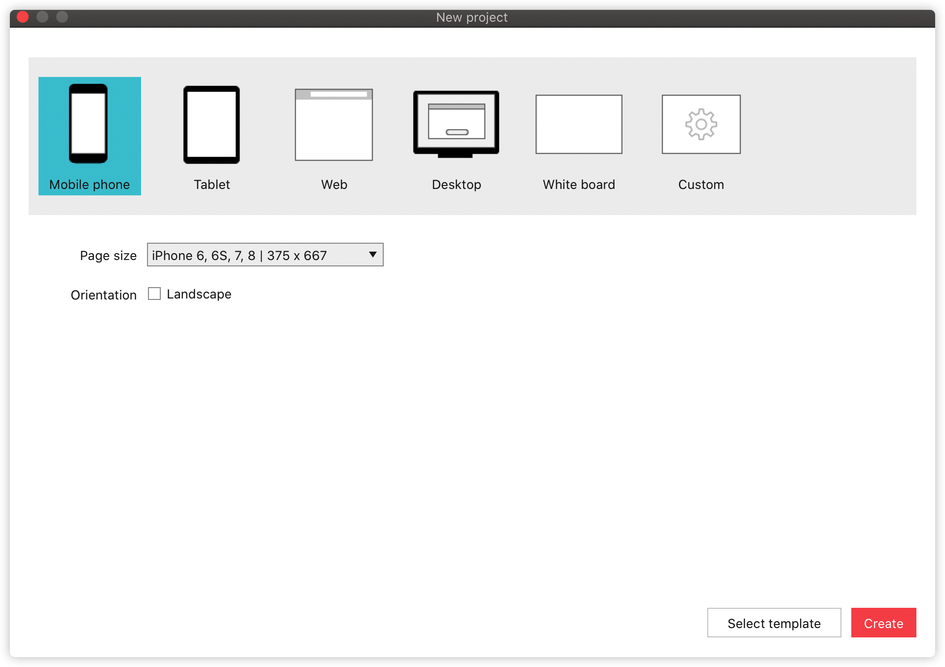
Then, choose the right page size, if you don't find a match with your device, you can always create a custom size.
Use a template
There are a set of templates you can access by clicking "Select template":
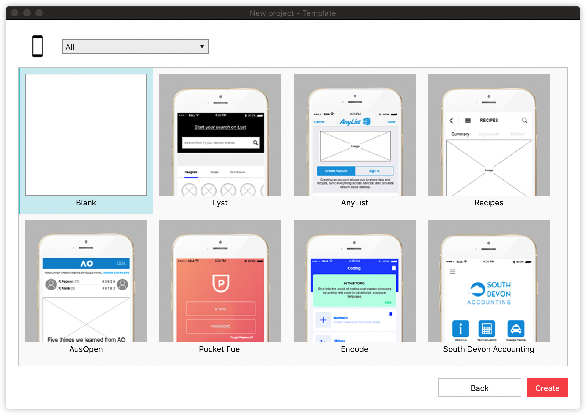
We have a large number of pre-installed templates for all kinds of scenarios. The template options will differ when you choose different project platforms and devices. With these templates, you can create your own layout or prototypes quickly.
Check more templates and samples: https://help.mockplus.com/p/309
Introduction to user interface
To get started with Mockplus Classic, you need to get yourself familiar with the interface:
Workspace
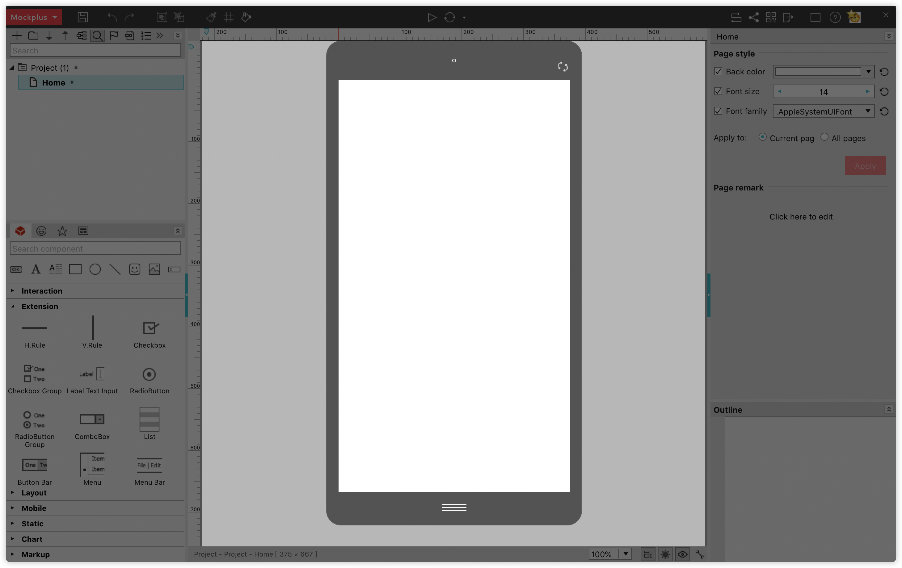
You can place components and design your prototypes onto the workspace.
Top Toolbar
You can access common options to facilitate your design process with the toolbar. You can see the following tools (left to right): Save, Redo, Undo, Group, Ungroup, Format Painter, Repeater, Auto Data Fill, Preview, Publish and share, UI Flow, Export and more.
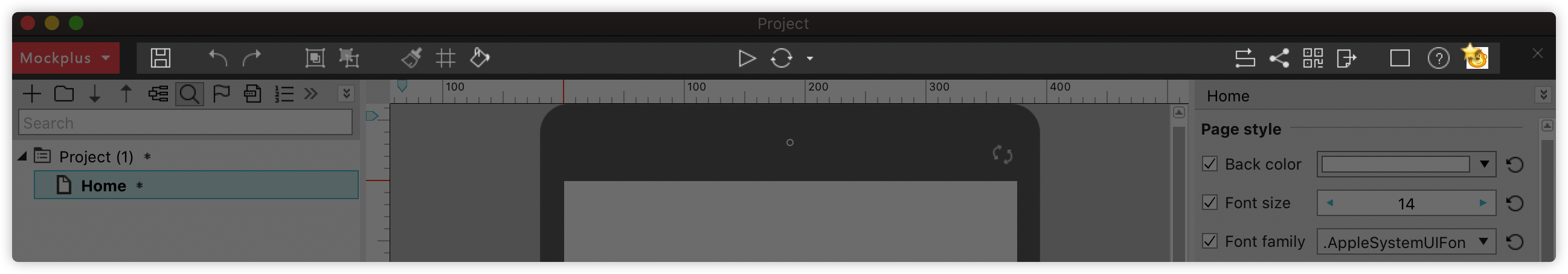
Project Tree Panel
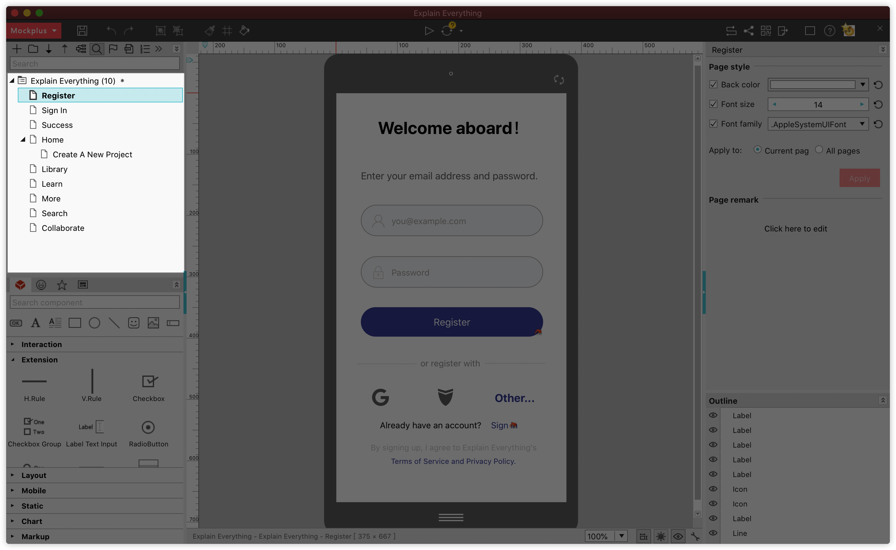
Project Tree panel allows you to manage your project pages with simple drag-and-drop. You also can create folders or sub-folders to better organize and manage your pages.
Tips: On the top toolbar of this panel, you have more functions to facilitate your work process: MindMap Design Mode, Page Tag, Page Template, Number Page, Hide Current Page and Show Recycle Bin. ·
Component Panel
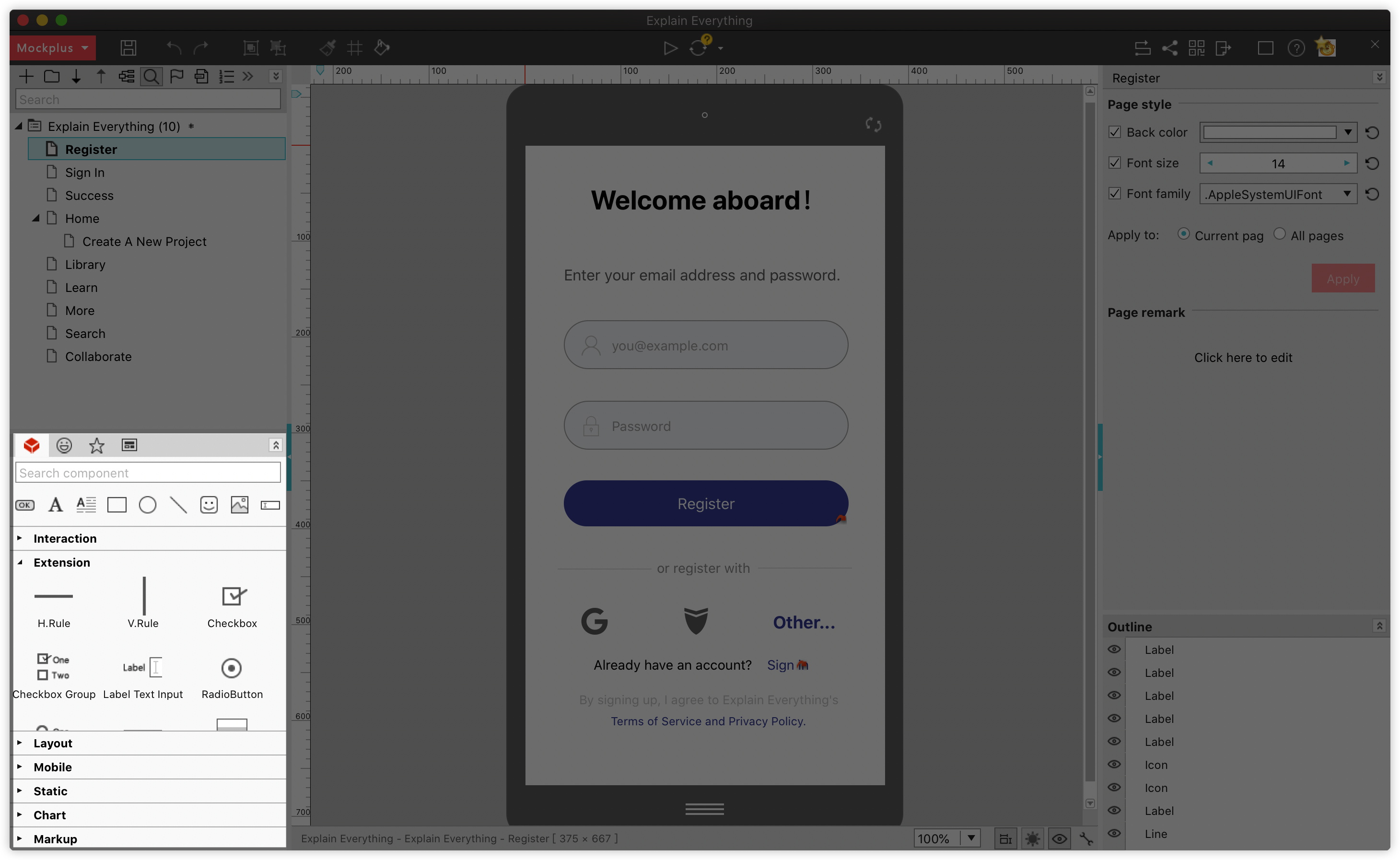
Component Panel contains all pre-built, ready-to-use component libraries (including over 200 components). All components are organized into smaller libraries, like Interaction, Extention, Layout, Mobile, Static, Chart and Markup.
You can expand and collapse these libraries or directly use the search bar to find your desired component.
Icon Panel
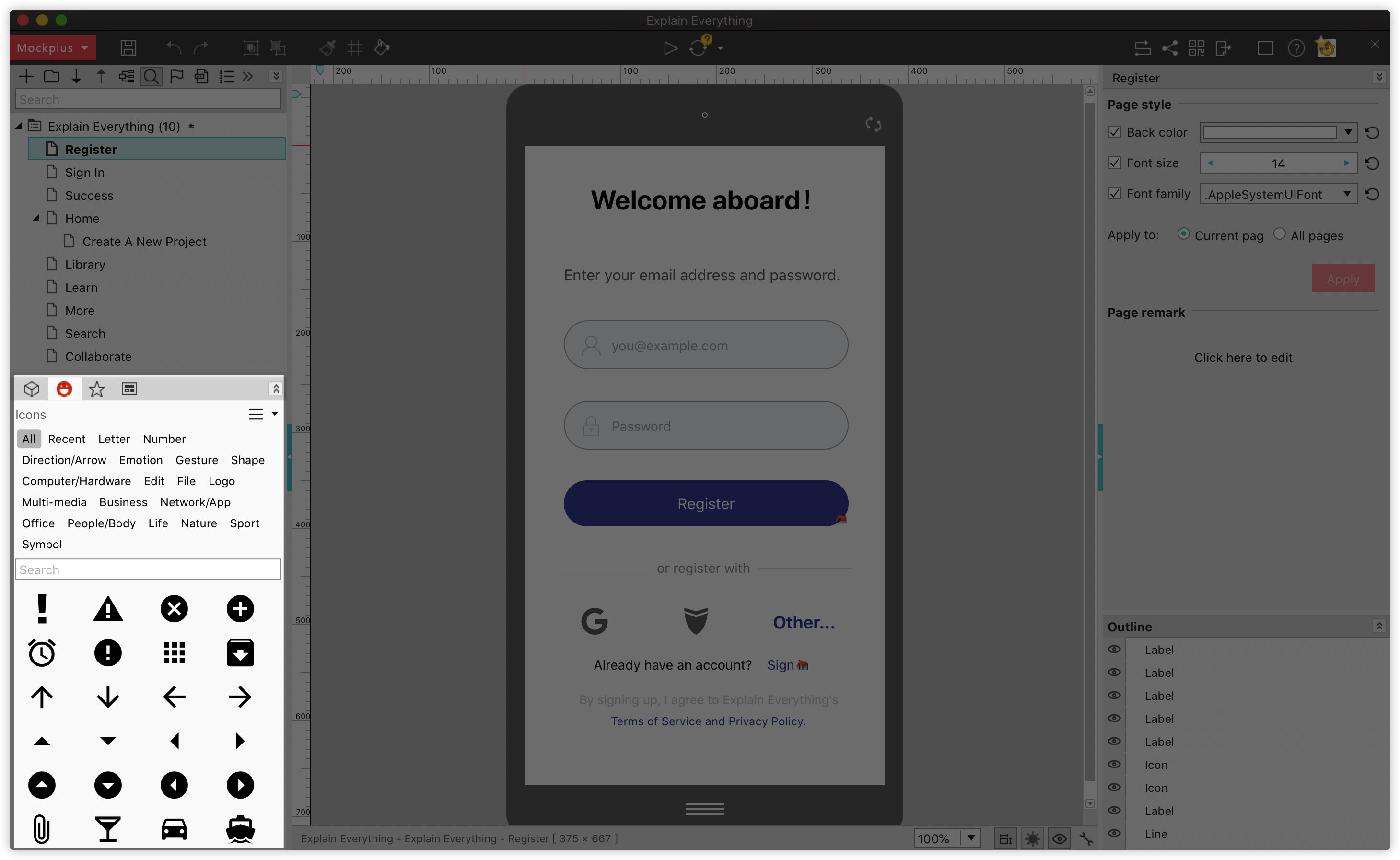
Icon Panel provides over 3000 icons from all walks of life. You can also use the search bar to look for a specific icon.
My Library Panel
My Library Panel collects or can help import all your favorite components, groups, UI libraries and other design resources, and reuse them freely across different projects or pages.
With this panel, you can still sync your libraries on different devices for fast reuse, subscribe to and download an online component library in a few clicks.
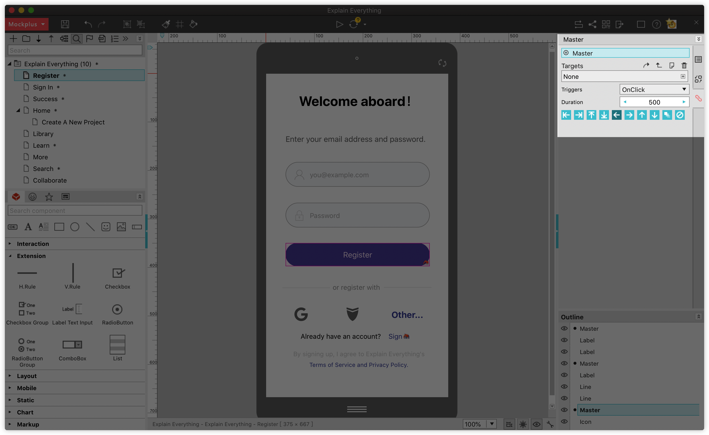
Master Panel
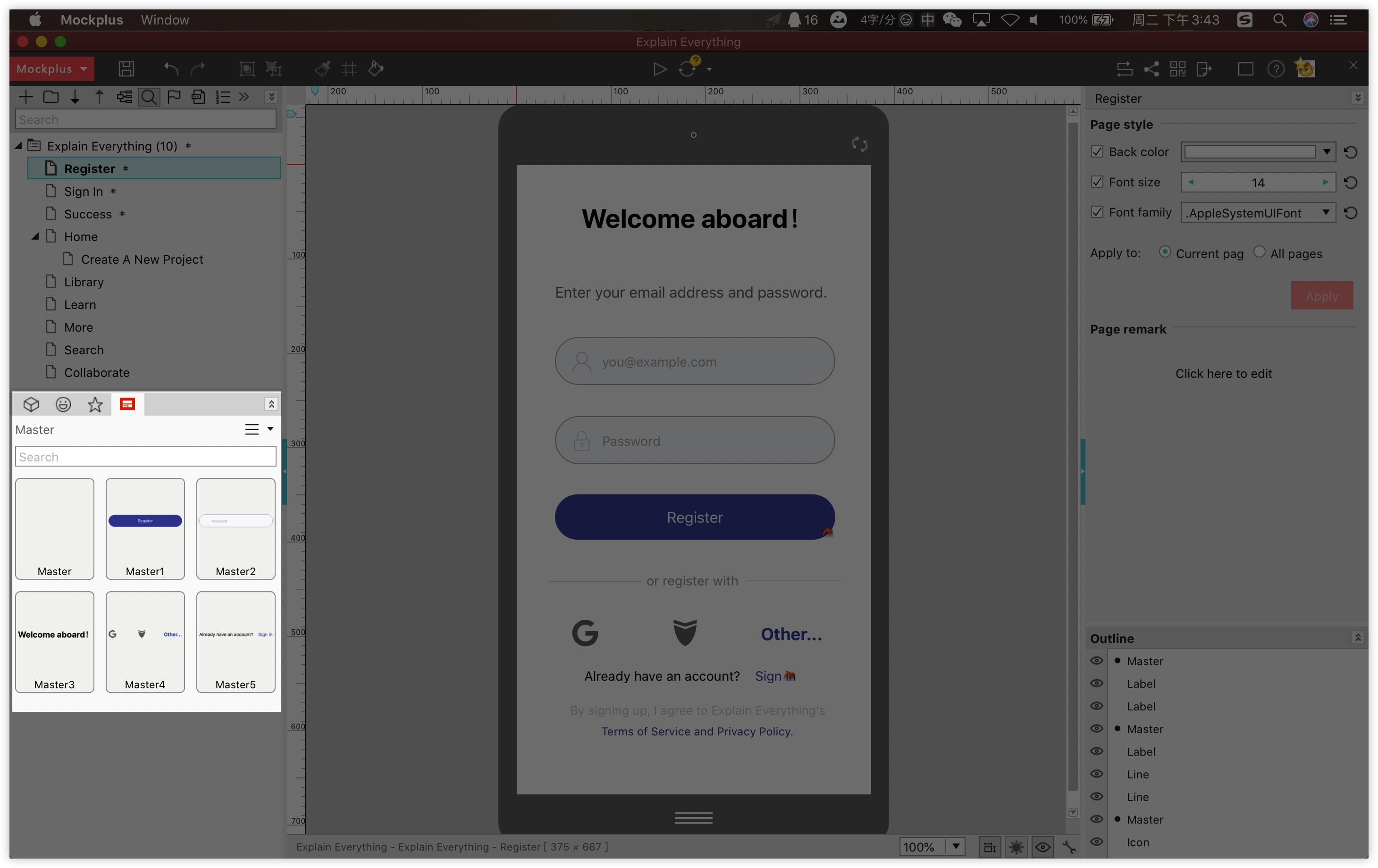
The Master gives you an effective way to save and reuse common elements, groups, interactions and even pages across your projects. It displays all your masters by groups and enables you to reuse them in different projects with simple drag-and-drop.
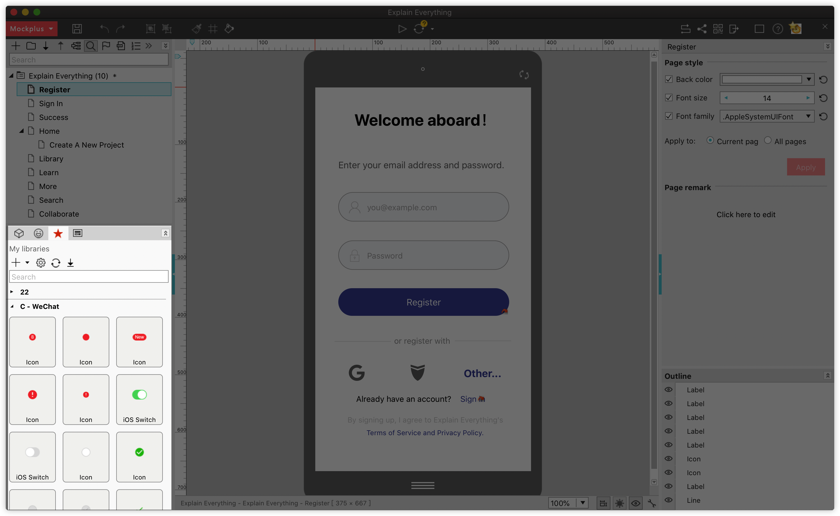
Property Panel
The property panel shows up on the right side of your screen when you select a component. A full set of properties, like colors, texts, borders, etc, can be set there with ease.
Component Style Library
Component Style Library helps you save and copy all styles of a button, text, or other components directly.
View a tutorial here: https://help.mockplus.com/p/35·
Interaction Panel
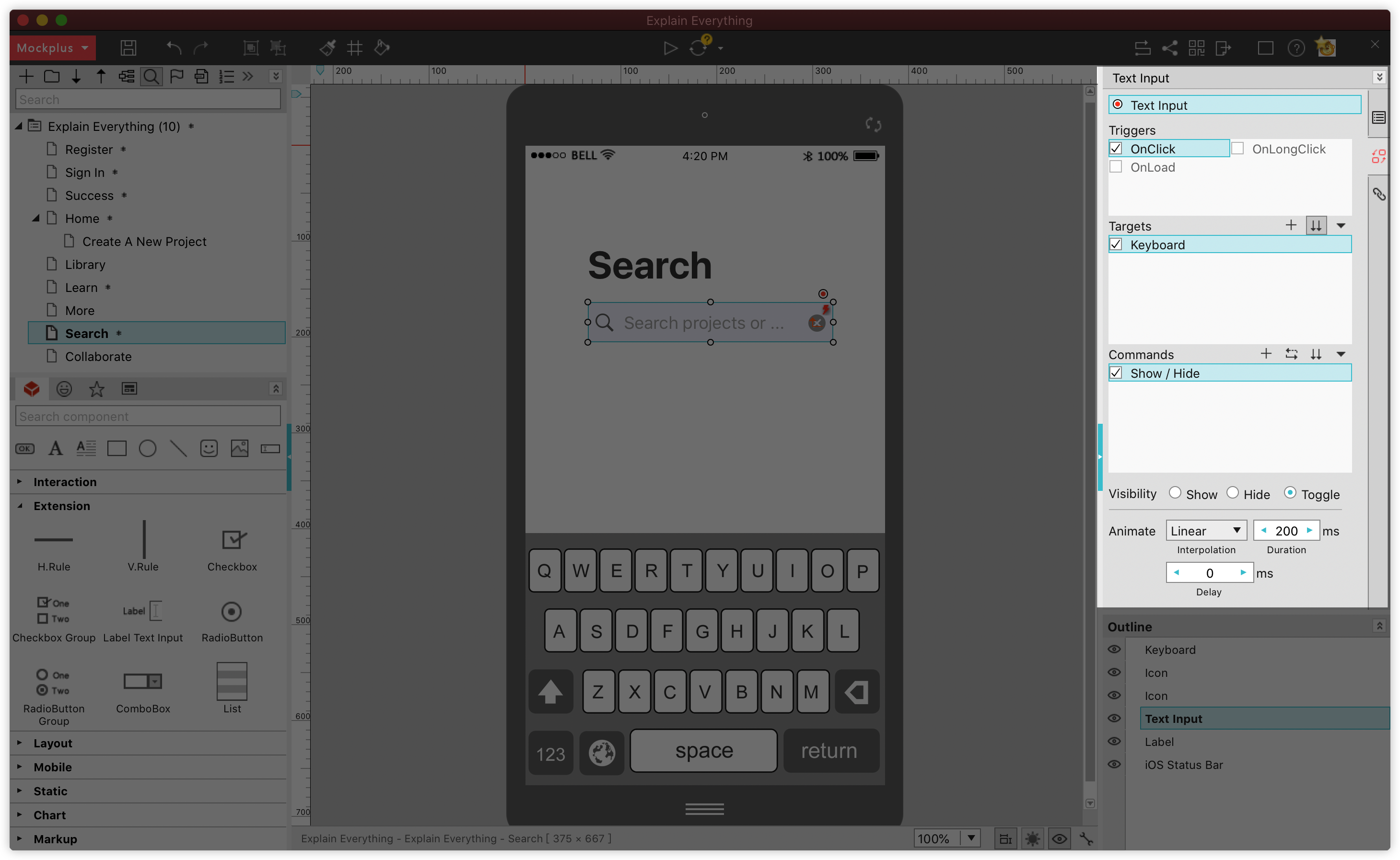
With Mockplus Classic, you can easily drag and drop the link point of a component to create interactions, animations and transitions with ease. You can examine and set the parameters of your interactions in the Interaction panel, including Triggers, Commands, Targets, Animations, Delay time, Duration, etc.
Page Link Panel
Page Link Panel is where you can view and set links between pages with simple clicks. Many transition animations can also be added there, including Swipe left/right/up/down, Slide left/right/up/down, and Fade, etc.
Also, show or hide the right and left panels to adjust your workspace by clicking these buttons:
Prototype with Drag and drop
If you decide not to use a template, you'll need to design everything from scratch:
- Drag and drop desired components to the workspace
- Customize their properties on the right Property panel
All common properties, such as its text styles, text alignments, position, size, opacity, colors, borders, items, visibility and more can be set there. You can also add a remark or external link to further explain the component.
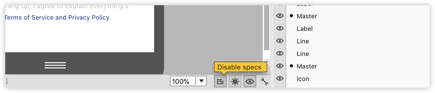
When you layout your page, also click "Disable specs" at the bottom. A series of redlines and auto-generated specs will appear to help you place components more accurately and quickly:
View a tutorial here: https://help.mockplus.com/p/103
Create interactions and transitions
In Mockplus Classic, you can easily translate static designs into fully interactive prototypes with simple drag-and-drop. Here you can learn how to create all three types of interactions:
Component interactions
Create an interaction between components as follows:
- Select a component or component group
- Drag the link point (a gray point in the upper right corner) onto the target component
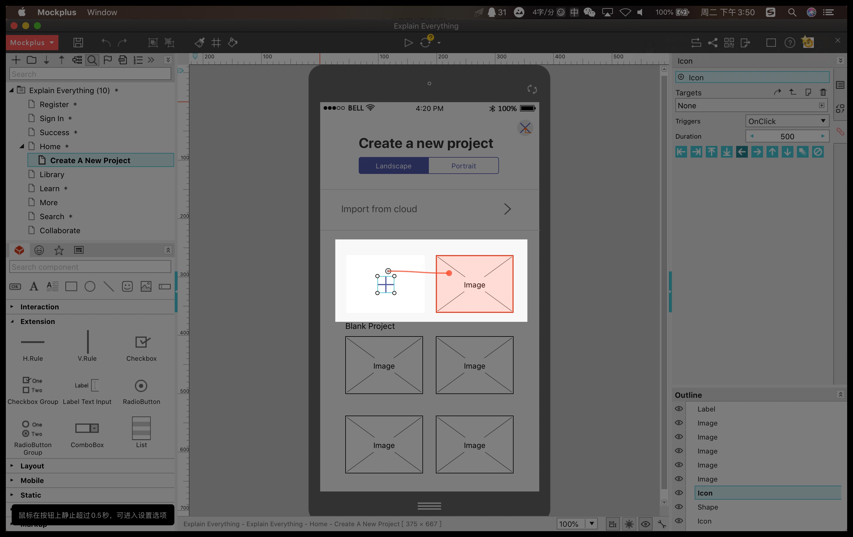
- Set a Trigger and Command
Customize the interaction details in the right panel.
Now, your component interaction is done
Page interactions
Follow the same steps above, but set a page as the target. You will have a page interaction.
State interactions
With Mockplus Classic, you can easily add "ClickOn" and "MouseHover" states to a component for creating a simple state interaction.
To create a state interaction, you only have to click the lightning icon in the Property panel.
For example, in order to create an auto color change on a button, you need to:
- Select a Button component and click the lightning icon
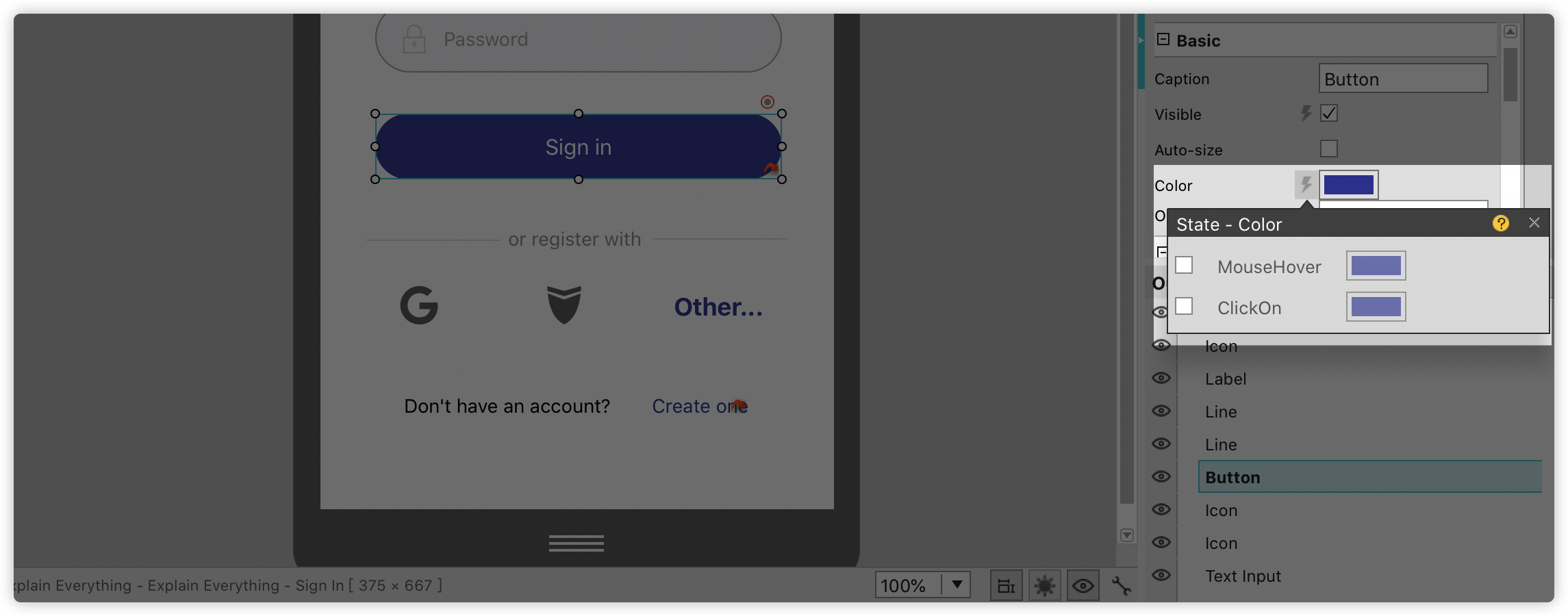
- Set colors for mouse hovering or clicking on the button.
You can view this interaction in action in the Preview mode.
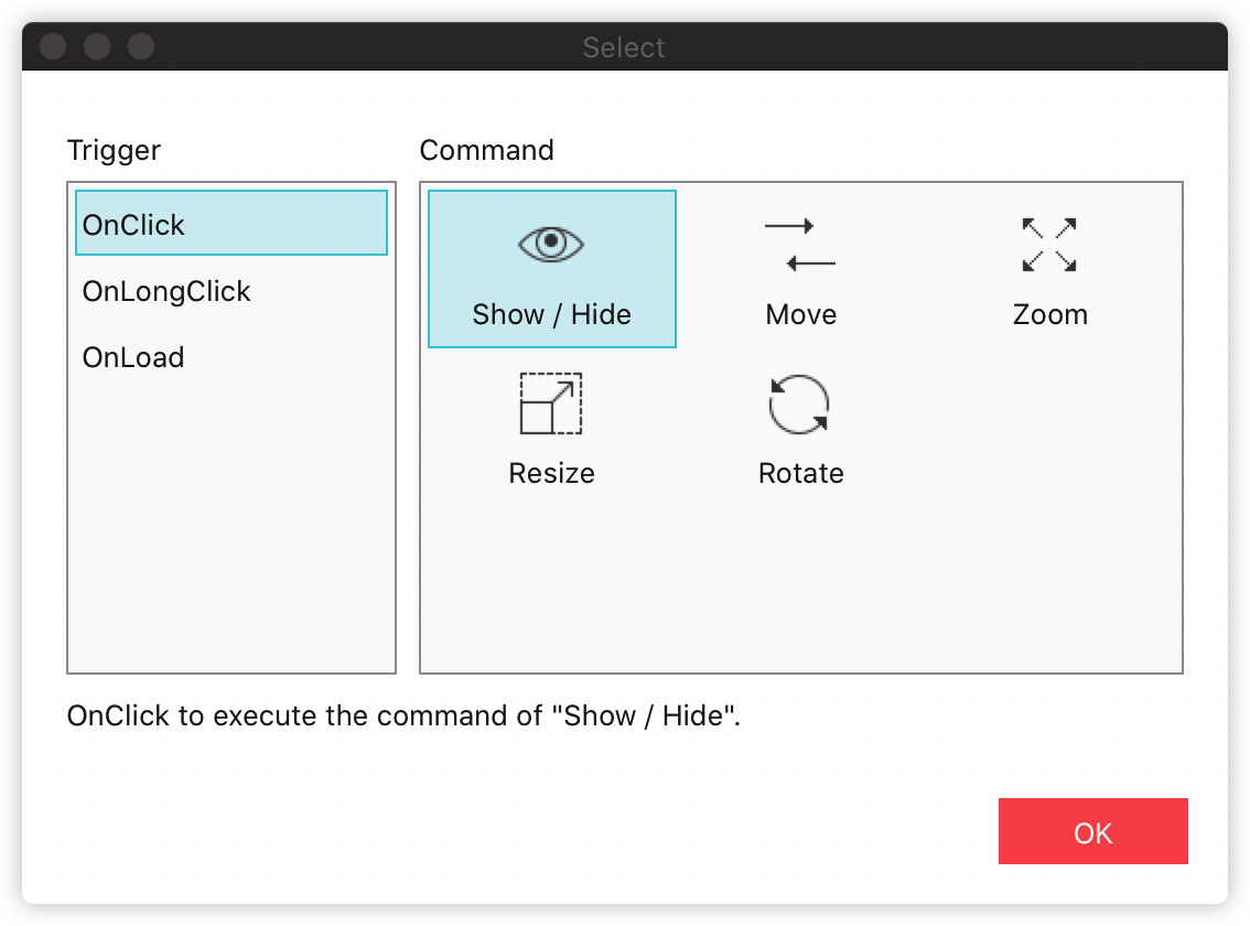
Triggers and commands
To create a vivid prototype that resembles an actual app with precision, We provide you with a set of triggers and commands.
Triggers:
- OnClick
- OnLongClick
- OnLoad
Commands:
- Show/Hide
- Move
- Zoom
- Resize
- Rotate
- Set color
- Switch content

You can also add more complex animations and transitions in the Interaction and Page Link panels on the right.
Share and test prototypes
After having completed your prototype, you can share it with your clients or colleagues, and collect their feedback.
For example, if you want to share it as a simple HTML link, you need:
- Click "Publish and share" on the top toolbar
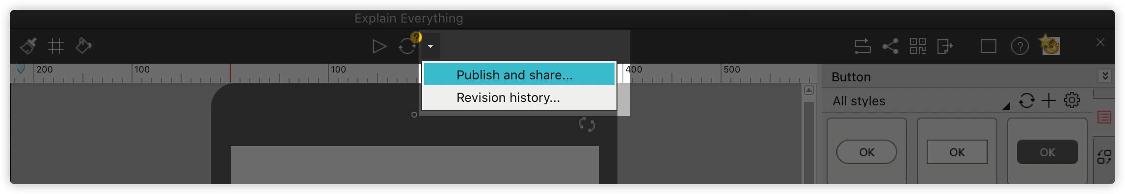
- Copy and share the link with your clients or colleagues
Your clients or colleagues can easily click the link to view and test it on a PC or mobile.
Check out 8 ways to share and test prototypes
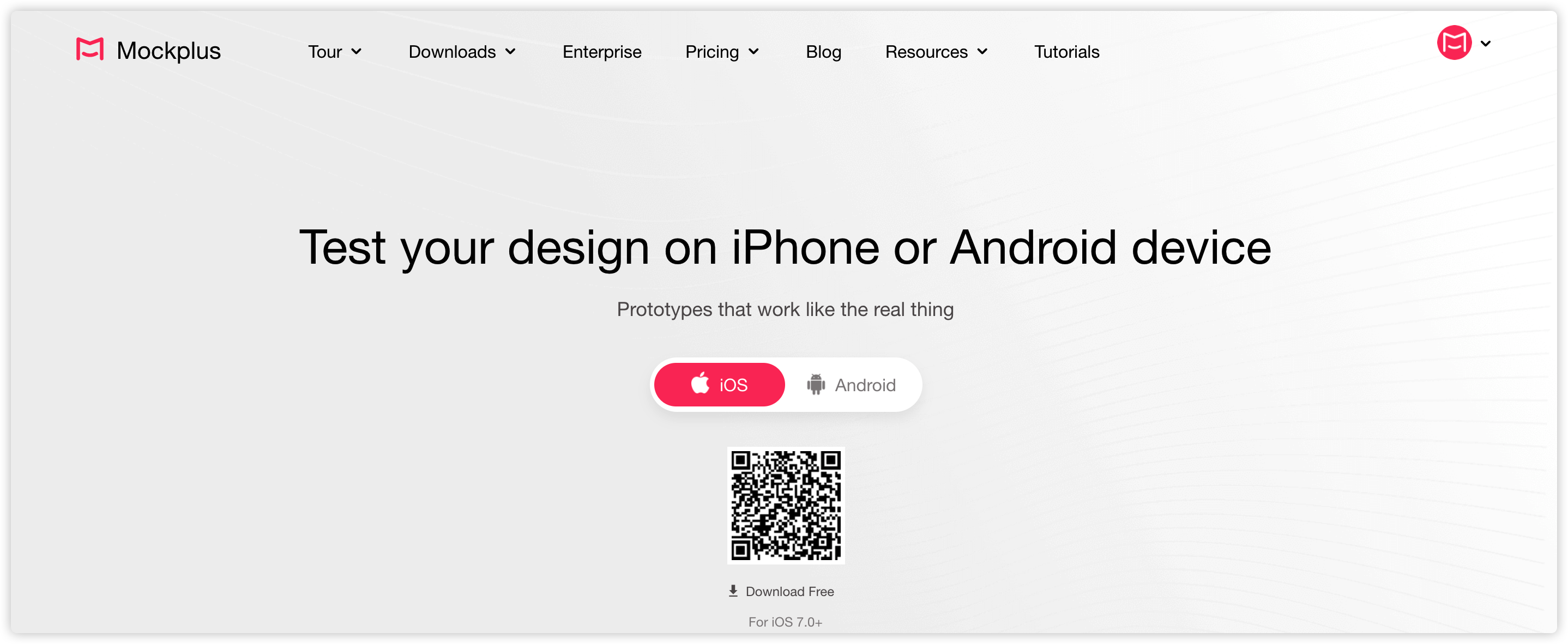
Preview prototypes on real devices
You can use Mockplus Classic Mobile Client App to view and test your prototypes on real devices.
Download and install Mockplus Classic Mobile Client App
First, you need to download and install the app on your mobile:
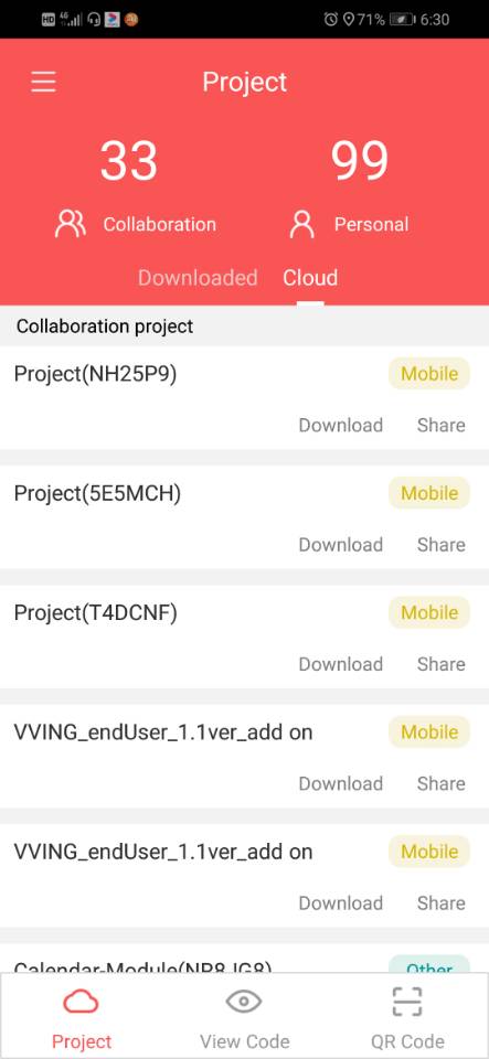
Log in and view prototypes
Log in to the app with your Mockplus account to see all your personal and collaboration projects listed there. Click the one that you want to preview:
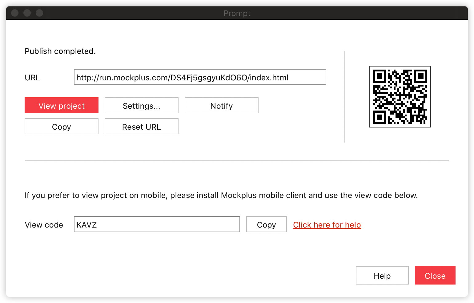
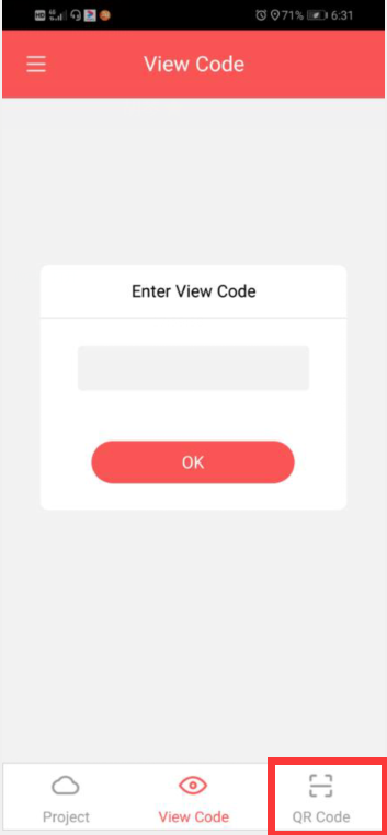
View projects with View Code
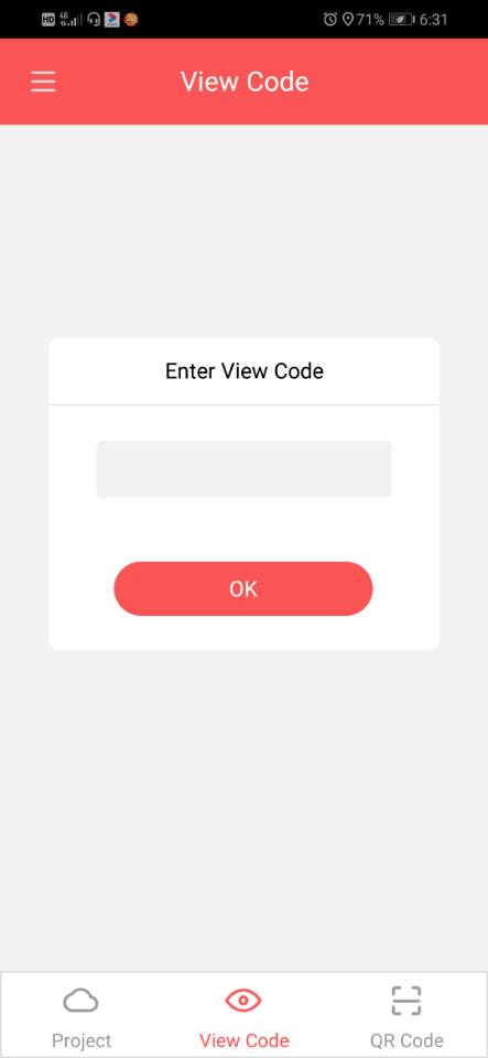
After publishing and sharing your project, apart from a shareable link, you will also get a View Code:
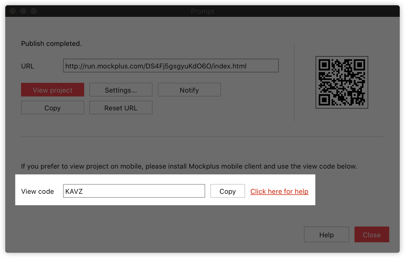
Enter this code to view the prototype on your mobile phone:
View projects by scanning a QR code
After publishing a project, you also get a QR code here:
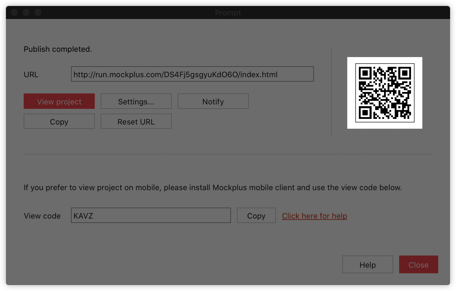
Or here:
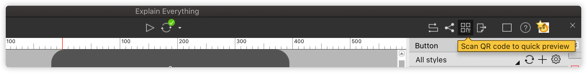
Also, scan it with your mobile app to view the prototype:
Please note:
In his way, you can only preview a mobile project.