Mockplus Classic

In the 3.3 release of Mockplus RP, there is a new feature of Component Style that allows for saving and reusing the styles of components quickly and effortlessly. Follow the below instructions to get your design faster and better.
Save the style
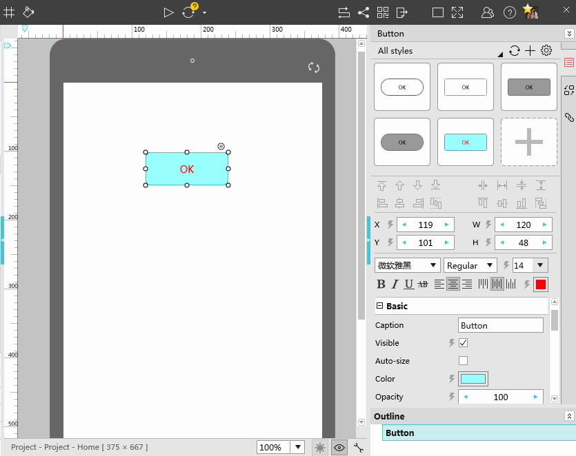
Select a component and then make settings to its properties, such as the color, font and text, etc. Click the + icon from the upper-right panel in order to save the property settings you’ve just made.
Apply the style
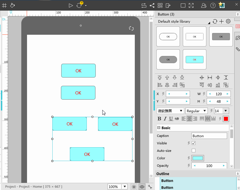
To do it, you need to select a certain component that you have set its style beforehand. Then, it will load the corresponding component style from the right-hand panel. Choose the needed style to apply it to the component directly.
You can select multiple components of the same type to set their styles at the same time. Note that, a few components cannot be set style, such as the Static components.

Delete the style
Select a component with certain style and there will be a red X button showing on the right-side panel. Click this button to delete its style. Please pay attention that, you can only delete the style added by you.
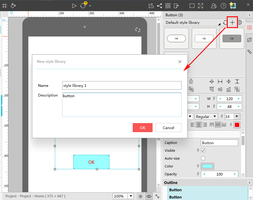
Add a style library
It’s required to input the name and description of the style library.
- Name, it will be displayed in the drop-down menu of your Style Library.
- Description, it gives a brief description of the library and can be seen when you manage the style library.
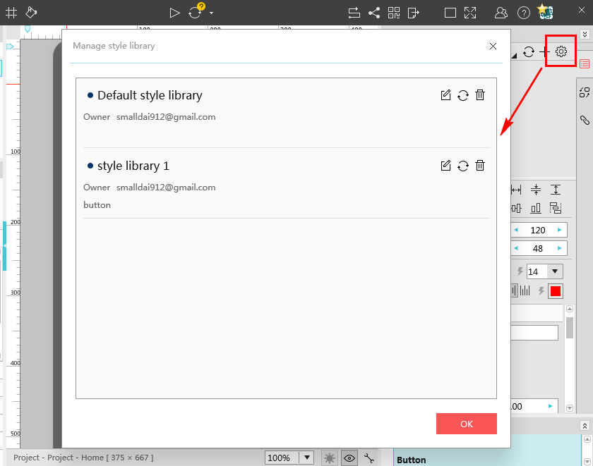
Manage the style library
Click the gear icon to manage your library. The dot next to the style name is an indicator of the synchronization status of the library. Meanwhile, you can use the other options in the first column to edit, sync, share and delete the style library. The options in the second column will show the creator, number of shares and notes.
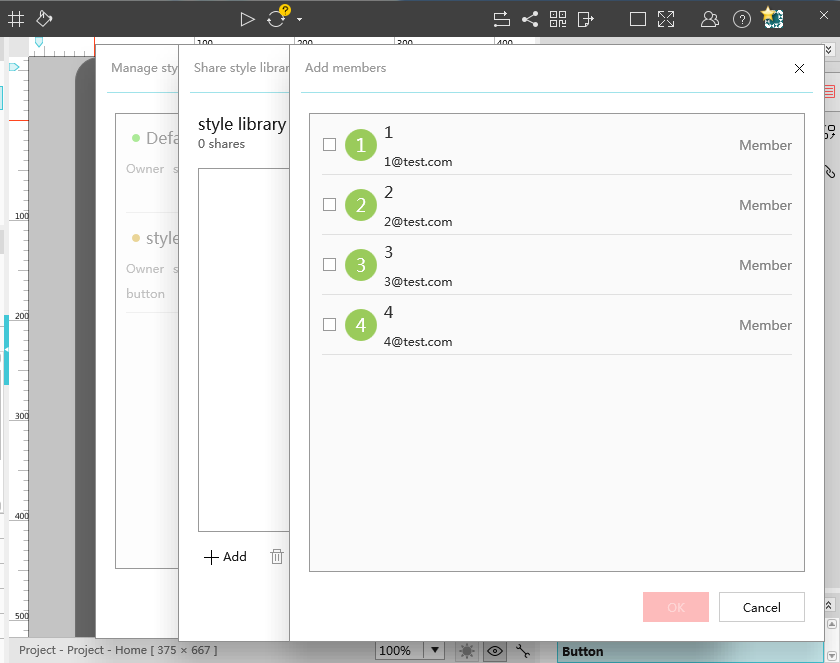
Share the style library
You can also add or delete the members to share, but those members should be in the same company or team. For the detailed steps, you can refer to the team collaboration tutorial. For users of the Enterprise Edition, they can also edit the styles of the shared components.