


 Mockplus Classic

About E-Marketing
With e-commerce growing faster than ever before, e-marketing has emerged, gradually becoming more popular than traditional marketing. More and more companies are choosing e-marketing to manage, monitor, and promote their products online. That's also why a handy, effective e-marketing website/app has become a must to grow any business quickly.
E-Marketing Web/App Prototyping
In order to build a well-designed e-marketing website/app, UX/UI designers need to prototype their designs (including the main structures, user interfaces, and interactions), as well as test their work to find potential problems early on. This hastens the design-to-development process.
Here are 3 tips to help you prototype your e-marketing website/app design quickly:
1. Create a clear structure in advance
Before getting started, you should first figure out the logical relationships between pages, and build a clear, hierarchical design structure between/within pages.
This structure will guide you in completing your prototypes step by step without encountering any fuss later on. At the design collaboration and handoff stage, it also serves as a useful design resource to establish mutual understandings between designers and developers quickly. So, never forget to create a clear, hierarchical design structure in advance.
2. Keep designs consistent
Inconsistent designs can affect the visual appeal of your e-marketing website/app, cause confusion, and sometimes even mislead developers. To avoid such problems, when prototyping your designs, you should keep design elements consistent all the time. Use uniform alignments, spacings, fonts, icon styles, etc, to create a more consistent prototype.
3. Never waste time showing everything
A website/app prototype is only created for better communication, collaboration, and handoff. It is not a real, functioning website/app. So, there is no need to waste time showing every product detail. Instead, devote your time to doing more valuable tasks.
On top of the above tips, to create an effective, life-like e-marketing web/app prototype, you will surely benefit from a professional and useful prototyping tool, like Mockplus. Why? Mockplus offers powerful features to visualize your user interfaces and allows you to add interactions and animations with drag-and-drop, as well as share and test your prototypes in 8 ways.
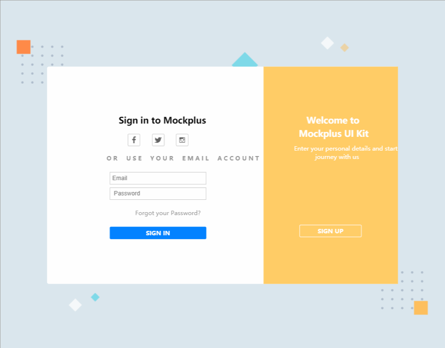
Do you want to know more about Mockplus? Let's take a Mockplus sample design, E-Market (an e-marketing website ), as an example to explain its features in detail.
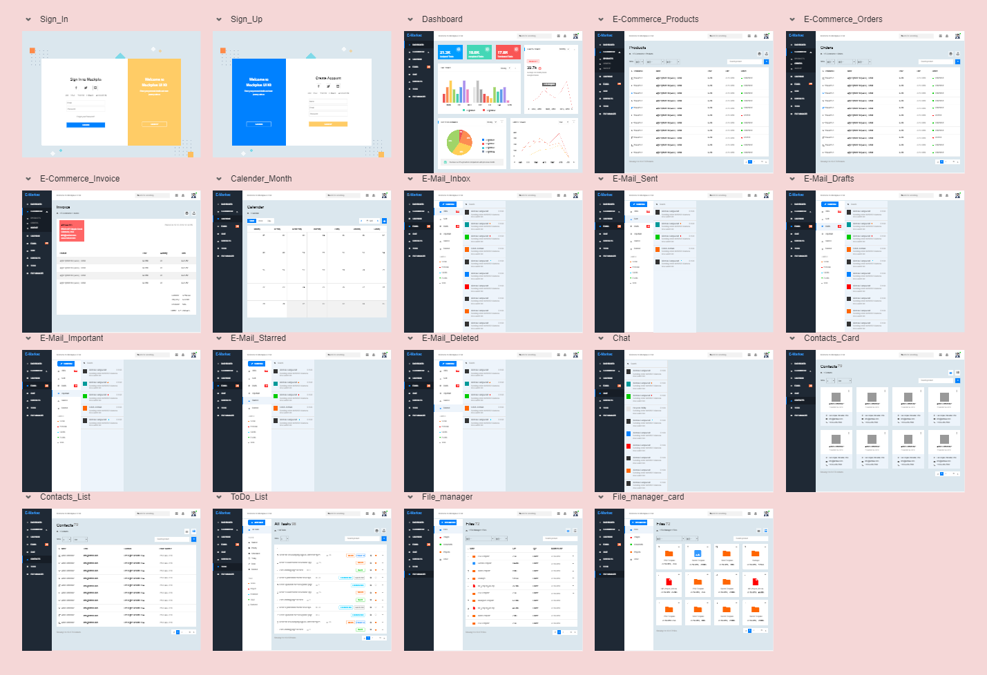
Mockplus Best Practices: E-Market (Web, E-commerce)
E-Market has 19 pages, including Sign in/up, Dashboard, Email, Chat, and ToDo List, etc. Each page has been designed with rich elements and interactions to effectively highlight its main functions.
Let's first have a quick view of its pages and interactions:
Click here to preview this prototype online: http://run.mockplus.com/tunYGlvPTeNRMWNX/index.html
And then, let's see how you can create this sample prototype faster and easier in Mockplus:
E-Market Prototyping Guide
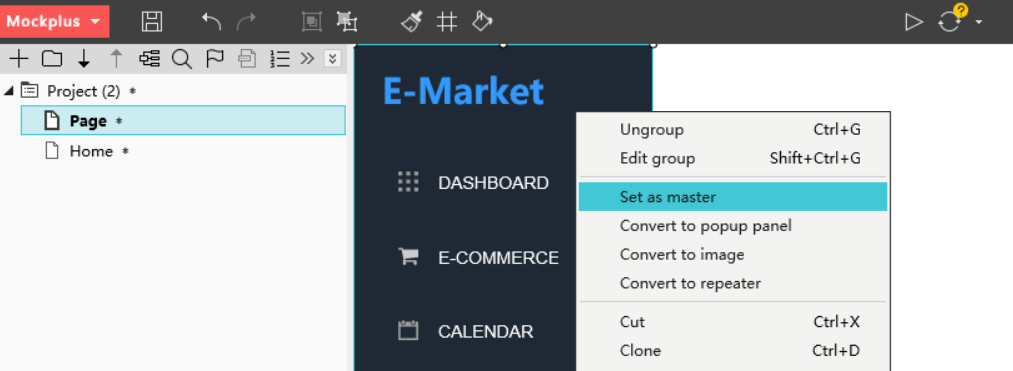
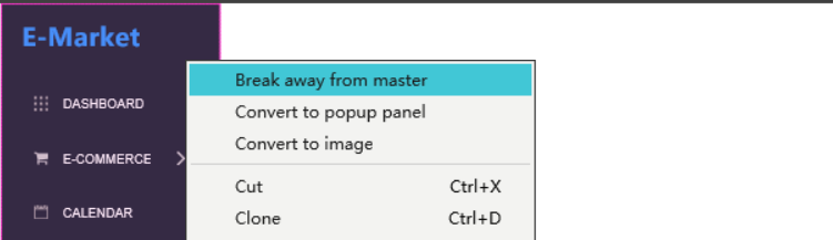
1. Reuse navigation bars with Masters
After previewing the sample prototype online, you must have noticed that it has a very intuitive, smart navigation bar, which is used in many pages and allows you to quickly switch between different functional sections.
How can you achieve this in your daily work? Just build the navigation bar and relevant interactions from scratch all over again whenever you open a new page. However, this can be tedious and time-consuming.
To help you avoid repetitive work, Mockplus offers Masters for you to edit, save, and reuse any components, groups, and layouts with one click.
Here are simple steps for you to reuse navigation bars with Masters:
Step 1. Build your navigation bar from scratch
In this sample, we've created an intuitive side navigation bar with "Shape +icon +Label" component groups.
On top of being packed with a powerful component library, Mockplus allows you to create similar navigation menus in many ways. For example, you can directly use "Icon and Label", "Menu", "Menu Bar", "Accordion", or "Tree" components instead.
Step 2. Set your navigation bar as Master
Select your navigation bar and right click to choose "Set as master". It will then be added to the Master library. A simple drag-and-drop enables you to reuse it in any pages.
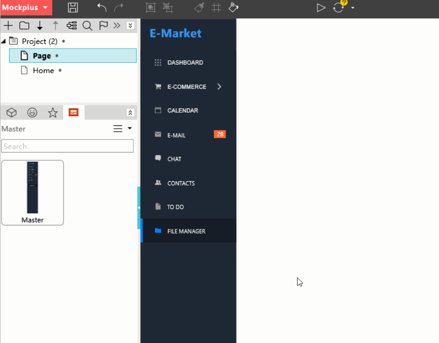
Step 3. Resuse the Master in other pages
Open the Master library on the left panel. You can drag and drop the Master to the workspace to reuse the navigation bar.
Step 4. Double click the Master to edit
If you need to change anything, simply double click the Master to edit it. Any changes will also be automatically applied to all pages using this Master.
Step 5. Right click to break away from Master
If you need to edit a component or item separately within the Master, just right click on it and choose "Break away from master". You can then edit it as you wish.
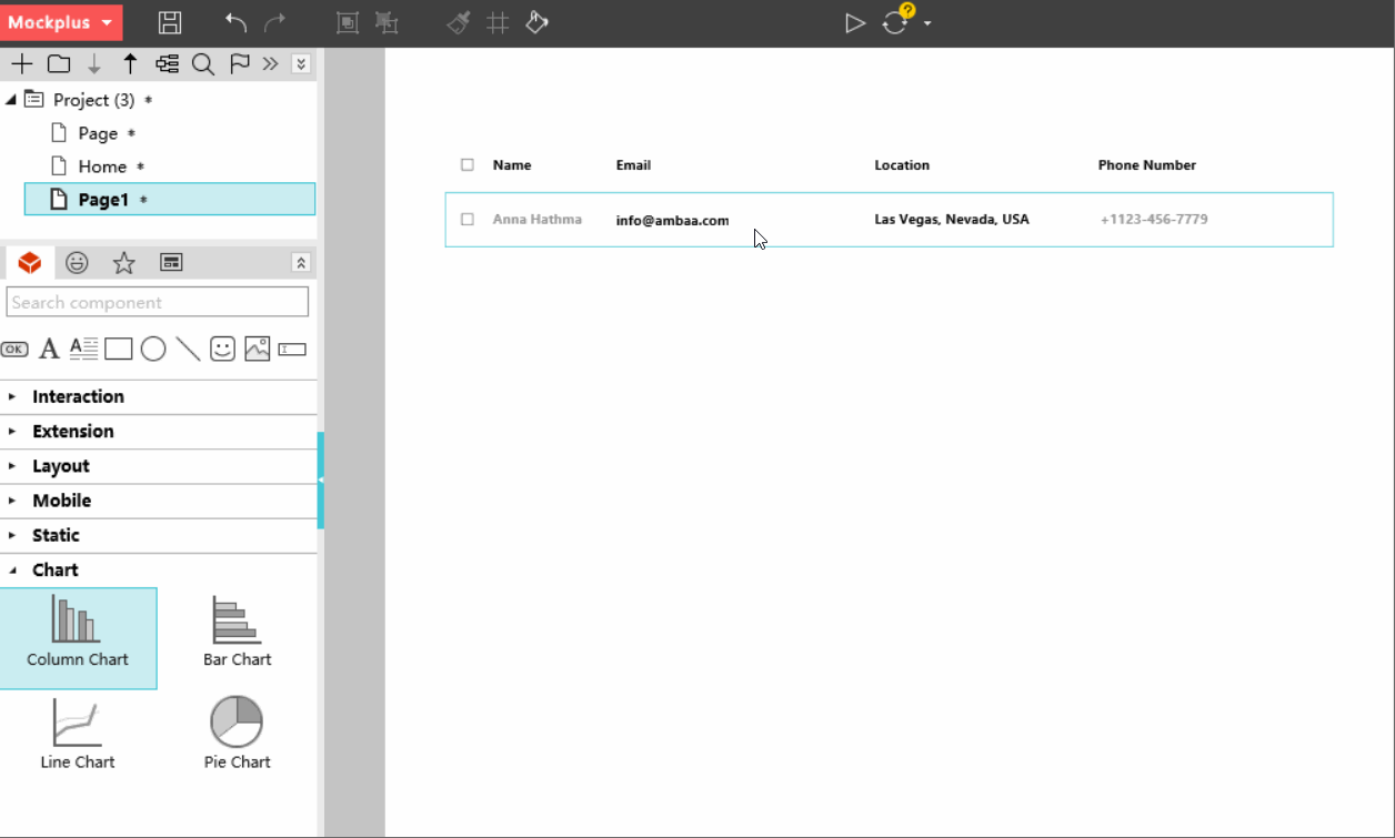
2. Visualize dashboard data with Charts.
Designers often use charts to visualize dashboard data. To help them, Mockplus provides four chart options: Column Chart, Bar Chart, Line Chart, and Pie Chart. This e-marketing website uses only three of them:
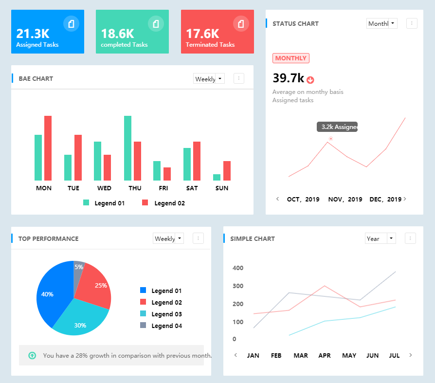
While using a chart component, you can easily double click to edit its colors and values.
Here are 3 tips for you to edit charts in Mockplus:
When using Column Chart, you can create a blank line by setting a certain column as white.
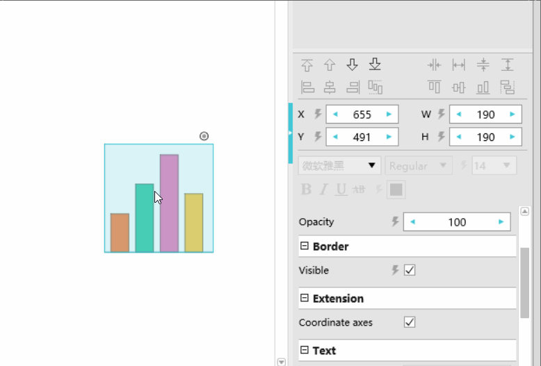
When using Line Chart, you can mark a line point by using “Circle + Label" components.
"Label” components can help you add numeric scales for your charts. Also add notes to further explain your charts by using "Shape" and "Label" components.
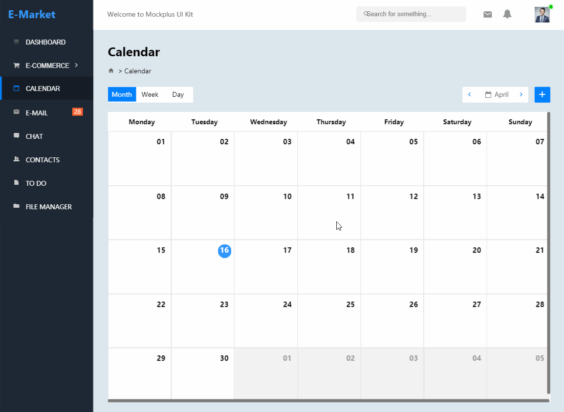
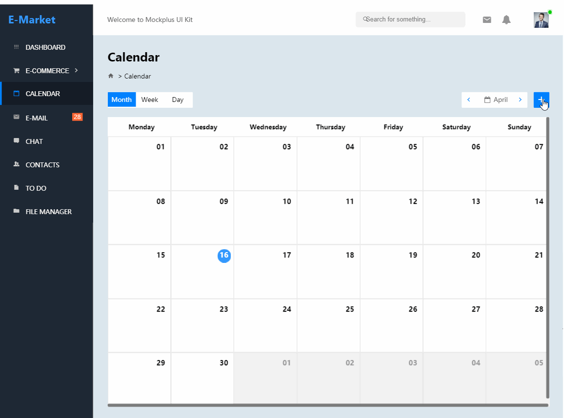
3. Create smart tab bar with "Button Bar + Stack Panel".
On the "Calendar" page, there is a smart tab bar to switch monthly, weekly, and daily backend data by using "Button Bar + Stack Panel" components:
Step 1. Create three backend data pages separately
Create three new pages to display the monthly, weekly, and daily backend data separately.
Step 2. Drag and drop Stack Panel to create three layers
Drag and drop a "Stack Panel" component, and create three new layers by clicking "+" on the top of this component.
Step 3. Link three layers to your data pages
Drag the link points of the three layers to the three backend data pages correspondingly.
Step 4. Link the Button Bar to your Stack Panel
Drag the link points of the three buttons to the relevant stack panel layers correspondingly. You can then freely click buttons to switch related backend data.
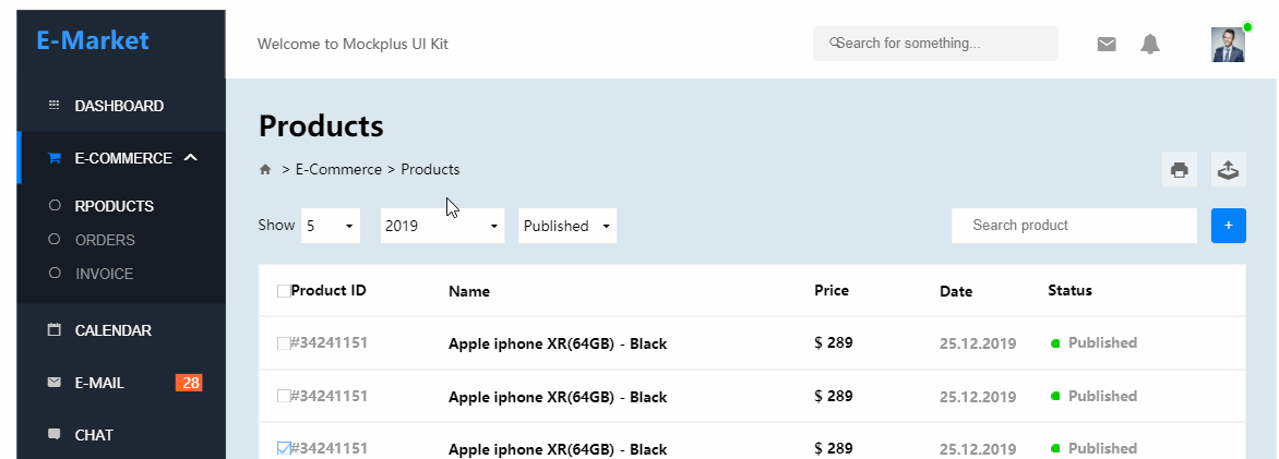
4. Add repetitive contents or layouts quickly with "Repeater"
On the "Email", "Chat", and "E-commerce products" pages, all emails, messages, or products are displayed with similar styles and layouts. To help you create them all without repetitive work, Mockplus offers a special "Repeater" feature for you.
Here’s how to use “Repeater”:
Step 1. Create a message with Shape, Label & Icon
You need to create at least one email, message, or product on your own with Shape, Label, Text Area, or Icon components.
Step 2. Convert your message into a repeater
Select your newly created email, message, or product, and click the "#" icon on the top bar to convert your message into a repeater.
Step 3. Drag repeater borders to create more messages
You can also click the "+" button to create more messages, emails, or products.
Step 4. Drag and drop red lines to resize your message
You can drag and drop red lines inside the repeater to resize the inner cells. Also directly enter values to set an accurate size for them on the right property panel.
Step 5. Separate a message cell to edit it independently
If you need to edit a message cell separately, you can easily click the "Separate” option on the upper-right corner of each cell.
5. Set selection status with "Set Color" interaction
On the "Email" and "Chat" page, we've set different selection statuses for these emails and messages. In other words, they all are displayed in the blue background by default. Once selected, they will be automatically changed into white and the right detail panel will also be changed correspondingly.
How can you achieve this in Mockplus? Here are simple steps for you to follow:
Step 1. Create an item with Shape, Label & Icon
You should also create an email or message item with Shape, Label, and Icon components. Group them if necessary.
Step 2. Add a "Set Color" interaction to this item
Drag the link point of this item to itself, and choose the "Set Color" Command. And then, when you click the item, its color will change as you wish.
Step 3. Use Repeater to create more items
You can still use Repeater or copy and paste the item to create more items with selection statuses.
6. Others
This prototype also uses many other components to present website functions.
1).ComboBox
It uses ComboBox components to switch different product data in combination with "Stack Panel" components. You can double click it to edit its items and interactions. Font colors, selection item colors, and item texts can also be set in the right property panel.
2).Popup Panel
On the "Calendar" and "ToDo List" page, Popup Panels are used to add a new event or task.
Just drag and drop a Popup Panel, add all your content, and link it to your desired button.
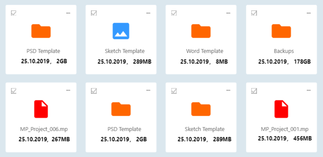
3).Card design
The clean and neat file card designs are another highlight of this sample design. You can easily create such card designs with Shape, Icon, and Label components as well. Also do not forget to use the above mentioned "Repeater" to create more design cards with simple clicks.
Aside from the repeater, you can also directly put all your card contents into a Panel component, copy and paste the Panel to get more card designs.
Moreover, to improve efficiency, you can easily right click any desired new components and add them to your libraries for reusing anytime and anywhere. Also share these libraries with others easily.
We hope the example and details above can help you create an e-marking website prototype easily in Mockplus.
All of the pages above can be downloaded here.
All pages of the album (19 pics in total) can be downloaded here.
Enjoy it!