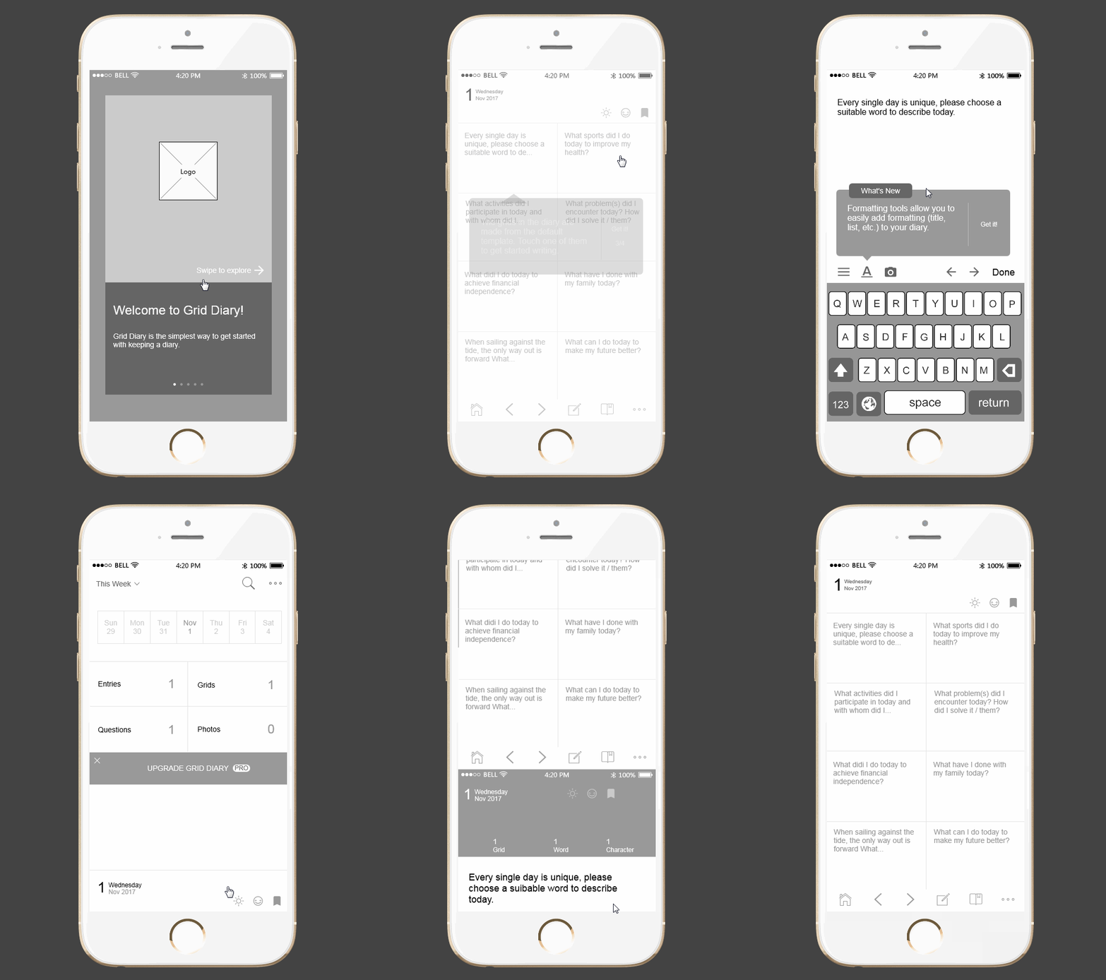
Grid Diary is a simple journal app with powerful functions and is very popular with young people who love writing diaries. And it is not only a tool that can help you record your life. Actually, its unique interface is made up of a number of grids. And each grid also includes a question. That’s really interesting. And as with grids, recently, Mockplus also introduces a brand-new Table component that really shows you WYSIWYG. It no longer uses a set of text codes to control and edit the data grid, you can directly insert a row or column, and enter a text with double clicks. So, it can be really easy and fast to set such interesting grids with this new Table component.
Since this new Table component has not been released yet while building this app prototype, the process of adding these grids by using line components is a little bit troublesome.Let’s try this new Table component.
Let’s see it in GIF at first:

Click here to preview it online: http://run.mockplus.com/JeWQcqLK5nOkDTGH/index.html
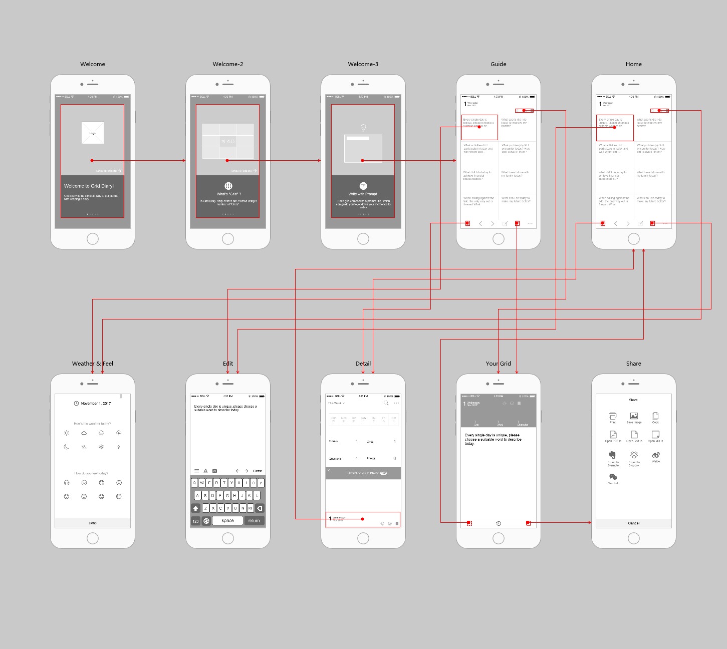
UI Flow in Large Size:
Pages of this prototype: Welcome, Guide, Home, Edit, Detail and Share, etc.
The project file can be downloaded here.
All pages of the album (10 pics in total) can be downloaded here.
Enjoy it!


 Mockplus Classic

