To create a perfect web/app design, designers and product teams discuss design details a lot and edit the design repeatedly. Each design version is important so that designers can view, compare, and improve on it easily at any time.
However, comparing and managing design versions efficientlyis not easy - especially for design/product teams with several members.
Is there any solution to help designers and product teams compare design versions quickly and manage them efficiently?
The answer is “Yes”! Mockplus Cloud recently introduced a new feature - Page Comparison - which allows users to quickly compare pages/page versions for detailed differences in various ways, as well as manage them effectively.
What Is the “Page Comparison” Feature in Mockplus Cloud?
Mockplus Cloud provides users with four effective comparison modes to compare their design pages or page versions:
1. Split - Compare pages/page versions in two separate columns
In this comparison mode, the two design pages or page versions selected are displayed and compared separately in two columns, eliminating the need to switch tools/windows frequently.
Moreover, when moving one page/version, the other will also be automatically moved correspondingly for better comparison.
So, whether you attempt to compare two hi-fi and lo-fi pages or two page versions, you’ll find this mode to be very useful.
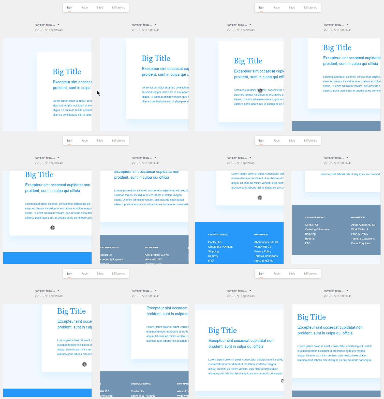
Alt: Compare Pages in Split Mode
2. Fade - Overlay pages and adjust the opacity for faster comparison
In this mode, the two design pages/page versions selected are overlaid automatically. Users can easily adjust the opacity to spot the differences quickly.
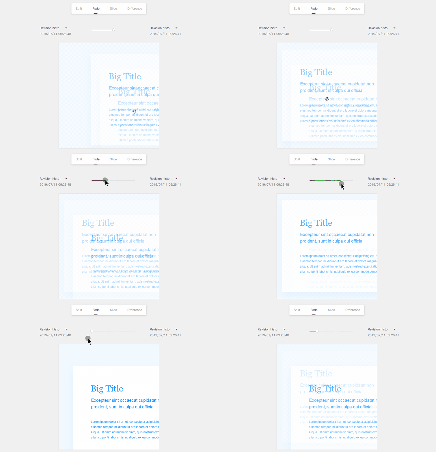
Alt: Compare Pages in Fade Mode
3. Slide - Overlay pages and adjust the visible area for better comparison
In this mode, the two design pages/page versions selected are also overlaid automatically. Users can movead the ruler to adjust the visible area for more intuitive comparison.
This mode is best used for color comparison of two pages/versions.
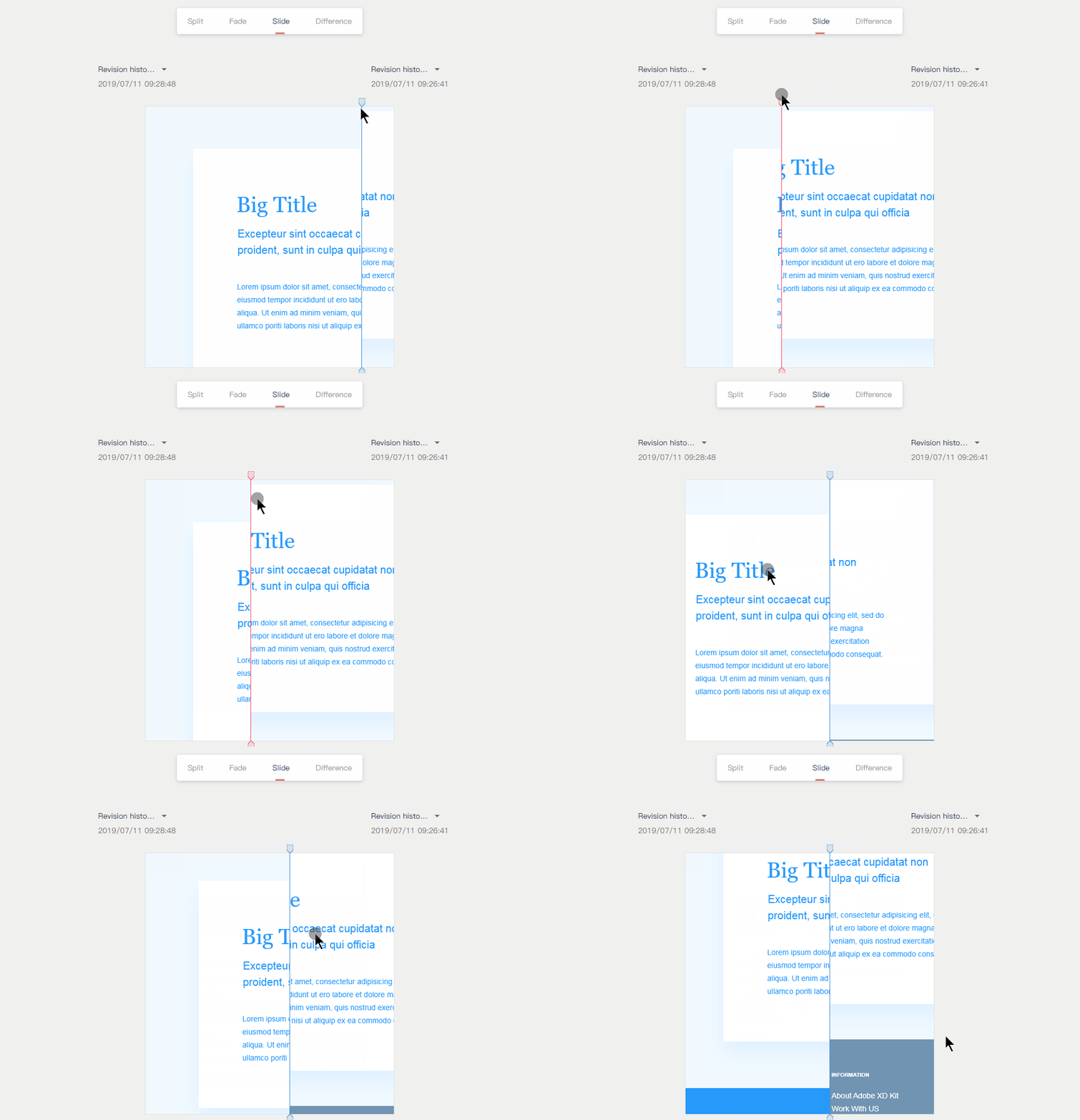
Alt: Compare Pages in Slide Mode
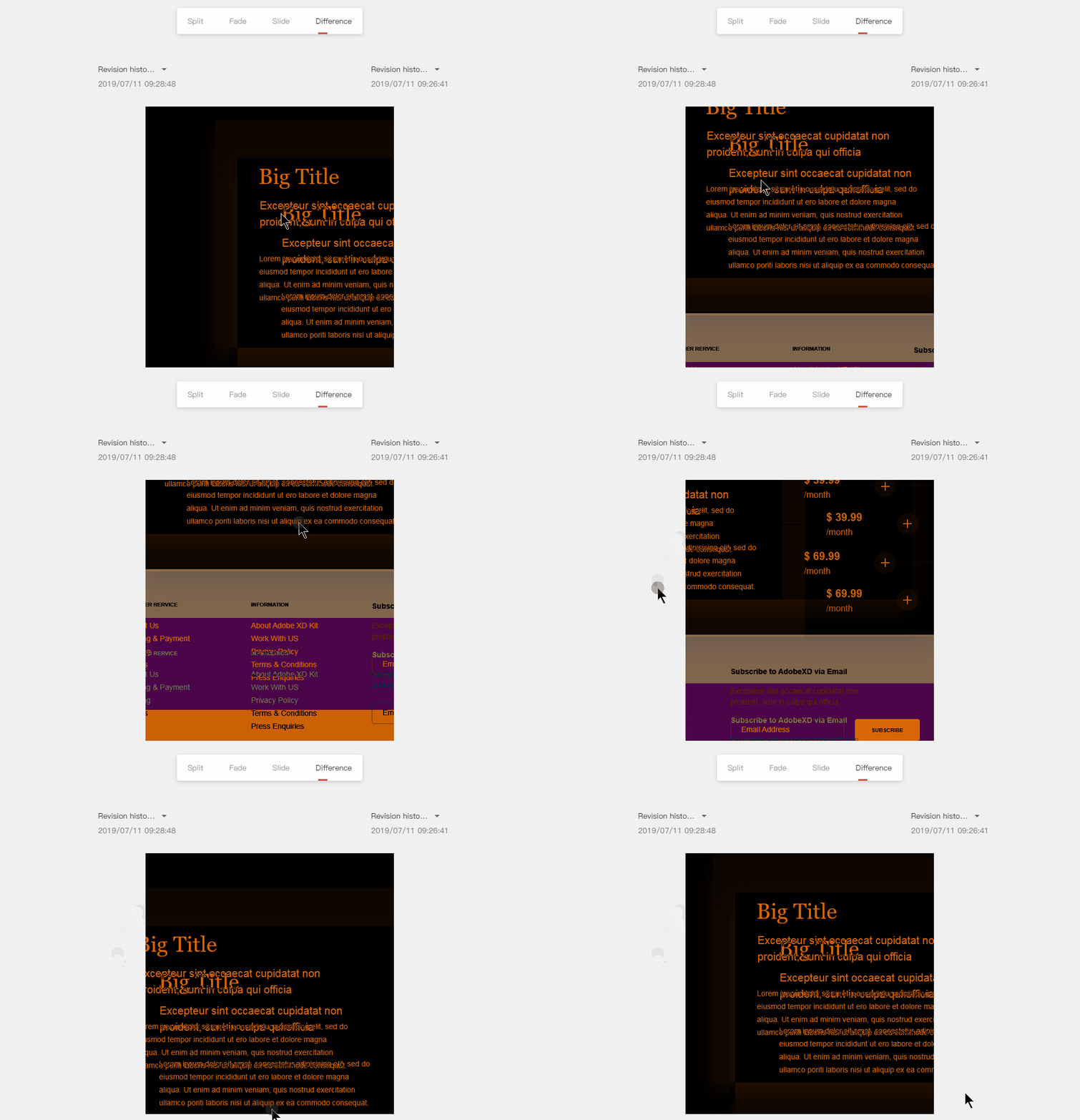
4. Difference - Overlay pages and show differences in diverse colors
In this mode, the two pages/versions selected are also overlaid automatically and the differences are directly in a black background (since the similar parts are shown as black).
So, this mode is perfect for designers to check whether a page or version has changed and spot the differences quickly.
In a nutshell, the “Page Comparison” feature enables you and your team to compare and manage pages/page versions effectively and efficiently.
Who Needs the “Page Comparison” Feature?
Obviously, designers are at the top of the list. However, designers are not the only ones who can benefit from the “Page Comparison” feature. To improve work efficiency, many roles/members of your product/design teams need the features to compare and manage their designs:
1. UI designers: Find version differences and similarities quickly
2. Product managers: Find similarities between hi-fi and lo-fi designs in a flash
3. Developers: Find the differences in diverse page versions quickly to complete designs effortlessly
4. Product teams: Find changes in different versions to check whether designers have modified the final design without authorization
In short, the “Page Comparison” feature can be used by you and your entire product team to improve work efficiency.

How to Use the “Page Comparison” to Simplify Your Design Process?
Don’t fully understand how to use this feature to simplify your design process yet? Follow these simple steps:
Step 1. Log in
Visit the official website to log in or register: https://idoc.mockplus.com
Step 2. Upload designs (from PS/Sketch/XD) and Mockplus/Axure prototypes
It doesn’t matter whether you upload designs directly from PS/Sketch/XD or Mockplus/Axure prototypes. Once they have been edited, updated, and even covered, the revision histories will be automatically generated and saved.
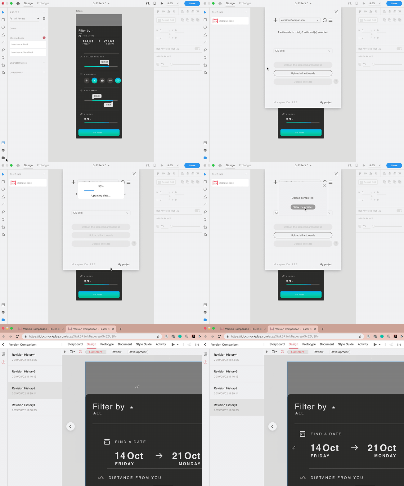
Step 3. Open the “Page Comparison” screen to compare pages
There are 3 ways for you to open the “Page Comparison” screen:
1. Select two revision histories in “Design” mode and right-click to pick “Page comparison”.
2. Hover on an edited page in “Activity” mode and click “Page version comparison”.
3. Select two pages on “Project Tree” and right-click to pick “Page comparison”.
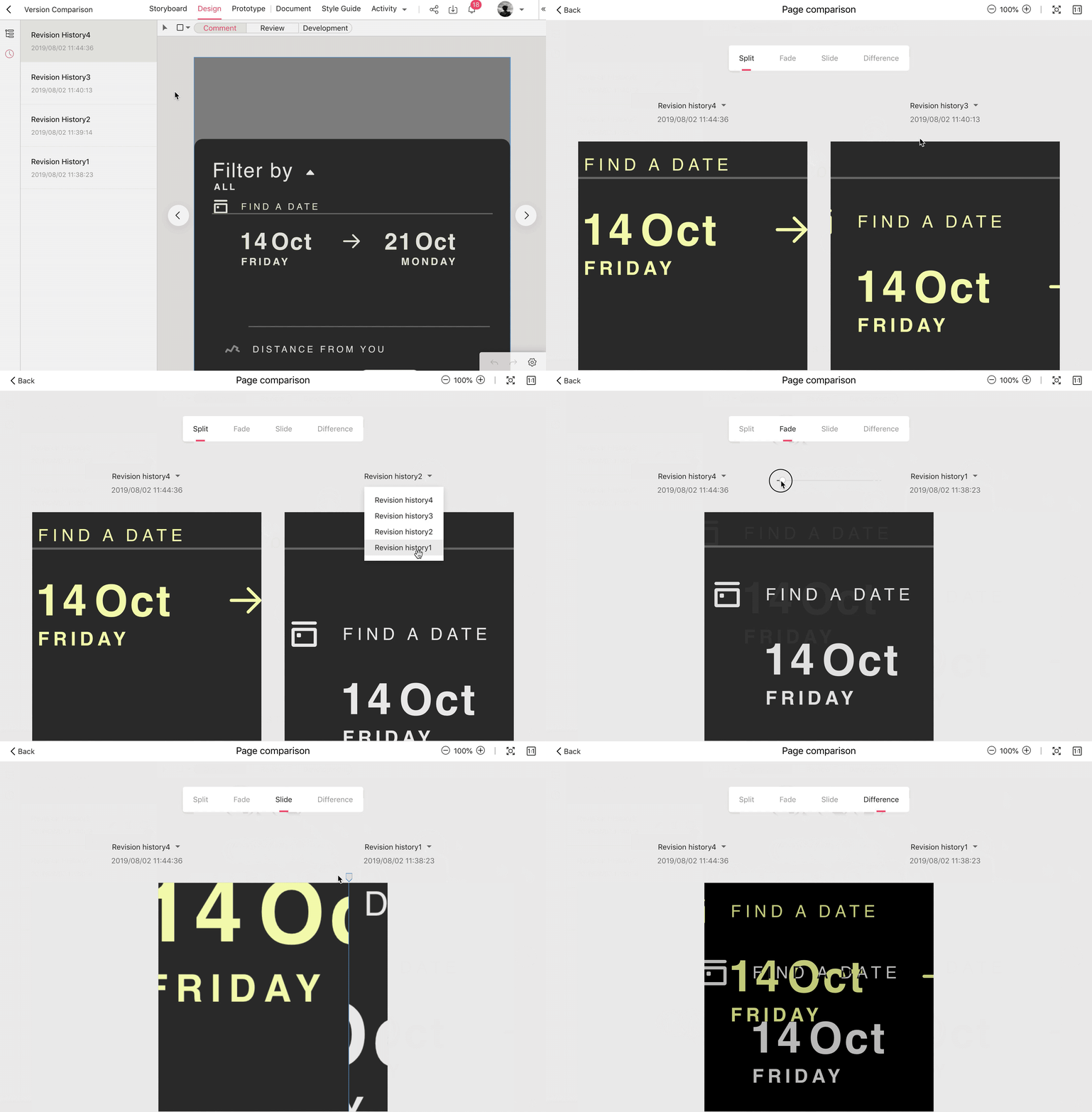
Click this tutorial to read more: https://help.mockplus.com/p/337
With this “Page Comparison” feature, you and your team can compare and manage pages/versions effortlessly in Mockplus Cloud.
Try it free here: https://idoc.mockplus.com/


