As a UI/UX designer, do you often manually mark up designs all night long?

Also, do have to explain almost everything orally to developers? Why not use a tool to generate auto design specs instead?

You will be able to use automatic and manual specs together to solve any problems!
Mockplus Cloud recently introduced the “Auto & Manual Specs” feature that satisfies all your needs!!!
Let’s check it together now:
Why Designers Need Automatic & Manual Specs for Better Design Handoff?
As everyone knows, for a quite long time, UI/UX designers have to manually create design specs, which was both time-consuming and error-prone.
Fortunately, there are some design tools available on the market today that can generate specs automatically. They save time and make design work more efficient.
However, does it mean that these auto spec generating tools can ultimately save designers from the extensive and repeated manual markup work? The answer is “No.”
In fact, it’s always recommended to use automatic and manual specs together to complement spec systems and achieve a better design handoff with developers. Below are the top 3 reasons for that:
Reason 1: Automatically generated specs may not be as comprehensive as you wish.
Honestly, the auto specs are generated according to the layer data of your web/app design. No matter what tool you use to create web/app designs, these tools will detect the layer data of your designs and generate the corresponding specs automatically.
However, once these tools aren’t able to detect any layer data in a design source, the related auto specs won’t be generated. As a result, you may lost some important data.
Reason 2: Automatically generated specs may not be as accurate as you wish.
The layer data of a web/app design can be very large and complicated. These spec generating tools sometimes cannot recognize every layer detail and show it in specs.
As a result, the generated specs cannot be as accurate as you wish. In some situations, the automatically shown spec can even be incorrect.
Reason 3: Automatically generated specs cannot deliver all design information as you wish.
Moreover, the design handoff between designers and developers does not include the spec data only. The related design information, such as the responsive design illustration, interaction description, design requirements and more, are also need to be delivered.
In other words, the auto specs cannot deliver all design data as you wish. That’s also why manual specs are needed to complement your spec system.
In short, it is the right thing to do for designers to use automatic and manual specs together to deliver designs smoothly and effectively.
However, is there any good tool that meets this need of users on the market?
Let’s check the following chart:
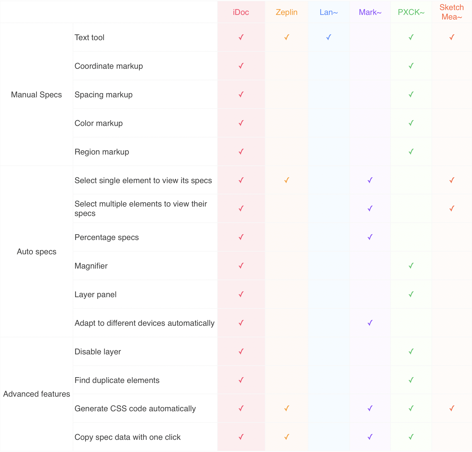
See it? Mockplus Cloud is the perfect tool that allows designers to generate auto specs with one click and also easily add manual specs for better design collaboration and handoff.
Handoff Designs with Auto & Manual Specs Effortlessly in Mockplus Cloud
To collaborate and handoff design more effectively online, Mockplus Cloud introduces “Flexible workflow” (which offers three independent and customizable design steps in its “Design” module: Comment, Review and Development).
And the “Auto & Manual specs” feature is integrated into this “Flexible workflow”.
Specifically speaking, it is directly connected with the “Review” and “Development” steps in the “Design” module.
Let’s learn how it works in details:
Review: Designers can manually add specs for better communication and handoff with developers
If the auto specs cannot explain everything, but designers can easily add manual specs to prepare simple PRD files for developers.
Moreover, to simplify the process, Mockplus Cloud offers many manual markup tools such as:
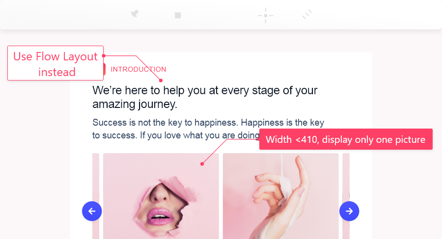
1. Text
Designers can use the text tool to add any design information, such as the mentioned above responsive design illustration, interaction description, design requirements and more.
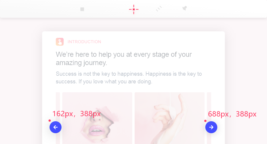
2. Coordinate markup
With this coordinate markup tool, designers can easily mark the coordinate information of any page location or element with one click.
It can be very useful when designers need to add coordinate information for a floating button/element.
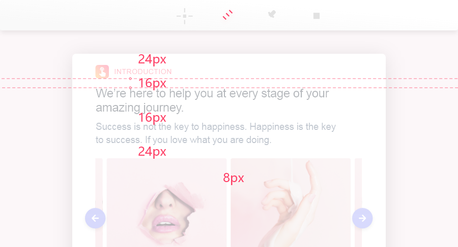
3. Spacing markup
With this spacing markup tool, designers can draw a line around/between page elements to add accurate spacing markups, such as the word-spacing markups.
As a result, developers can view these spacing markups for implementing a web/app design as accurate as possible.
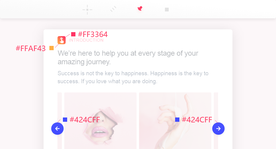
4. Color markup
With this color markup tool, designers can simply click any position on a page to get the color value.
It is also a piece of cake to mark up the color value of any element in a design asset.
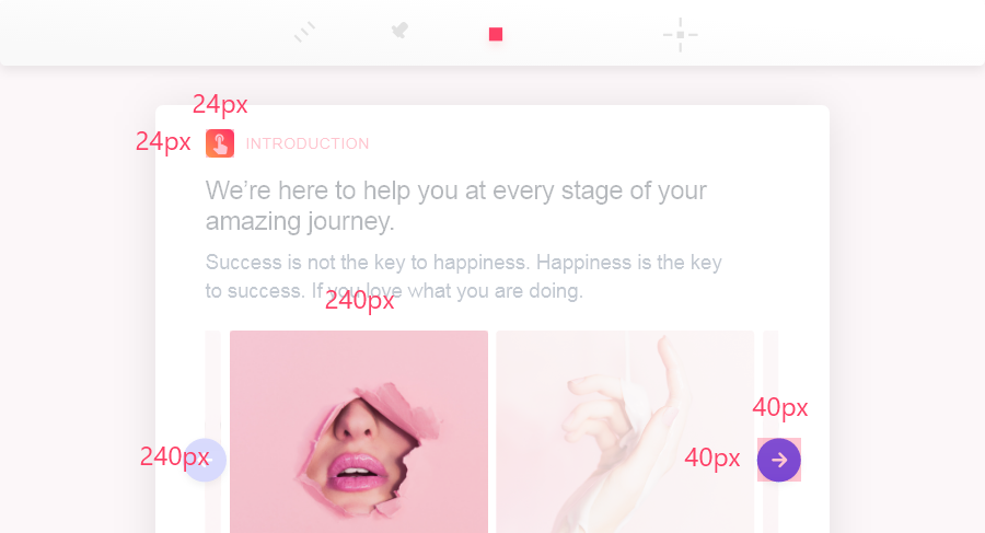
5. Region markup
Designers can use this tool to add the height and width markups of any page area so that developers can easily check them.
In addition, to add more distinguishable specs, designers can customize the text colors, background colors, line thickness/colors, opacity and other markup properties easily and quickly as well in this “Review” part.
Development: Developers can check Auto & Manual specs for better and faster design
In the “Development” part, developers can check the auto and manual specs both based on their own needs. If necessary, they can also show/hide the manual markups with one click.
Moreover, to improve work efficiency, Mockplus Cloud offers three spec viewing modes for developers in this part:
1. Not selecting any layer
Without selecting any layer, the specs will show the distance between the layers as you move between them.
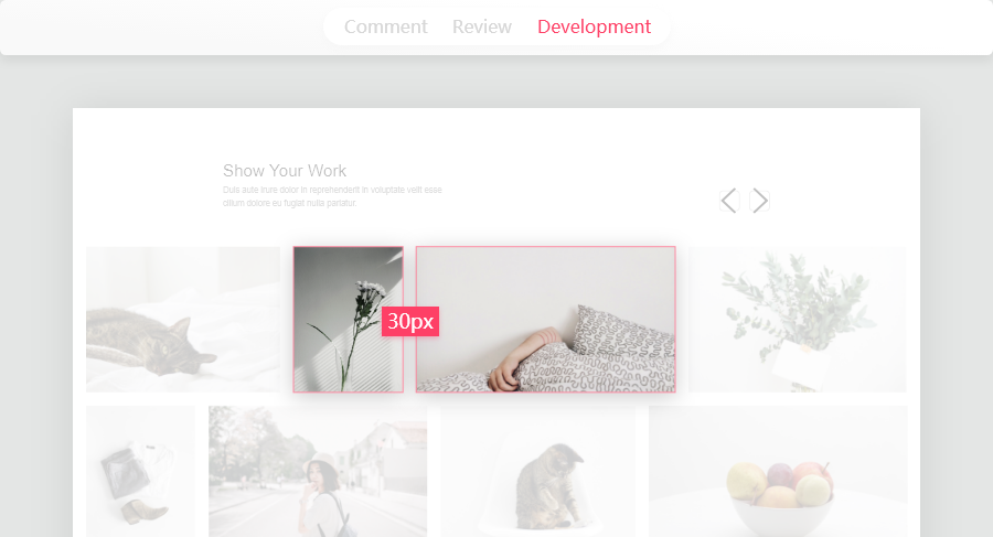
2. Move between the layers
Select a layer and hover over another layer to see the spacing specs between the two layers.
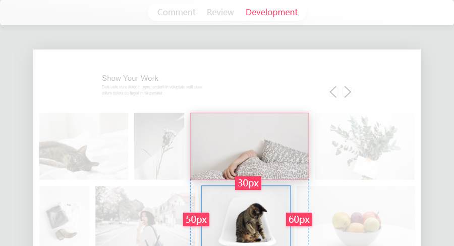
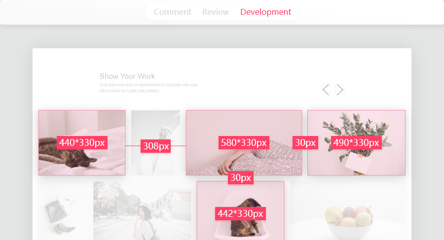
3. Select multiple layers
Hold the “Ctrl” key and select multiple layers to see the distance between multiple layers.
With these modes, developers can freely check their desired design specs for better and fast design.
More User-Friendly Features to Speed up Your Design Process:
Mockplus Cloud also offers more user-friendly features to fast your design process in the “Development” part:
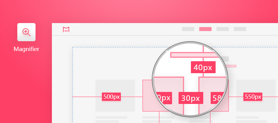
1. Magnifier
With this magnifier tool, users can view super spec details with one click.
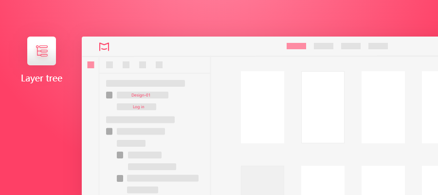
2. Layer tree
Though the intuitive layer tree in the left panel, users can easily view the hierarchical relationships between page layers to quickly get familiar with the page layouts.
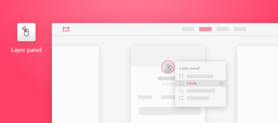
3. Layer panel
When there are multiple layers in the same location of a page, double-click the location to open the layer panel to display all the layers.
A particular layer can also be disabled in this layer panel, if necessary.
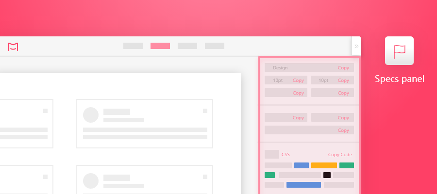
4. Spec panel
The top half of the spec property panel displays the detailed spec information.
The lower half of the spec property panel displays the spec codes.
Users can simply copy the spec details and codes with one click.
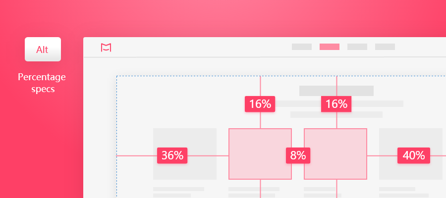
5. Percentage specs
By default, you see pixel specs. But you can hold the “Alt” key to display the percentage specs.
There is no need to set anything in advance since Mockplus Cloud will automatically detect the nearest parent layers of the selected element as references of the percentage specs.
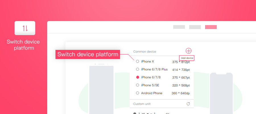
6. Switch device platform
Switch the measurement units for different device platforms (such as the pt in iOS, the dp in Android, and the rem for Web). Also, you can customize the measurement units if you wish.
How to Use “Auto & Manual Specs” in Mockplus Cloud Step by Step?
Here are simple steps for you to use auto and manual specs in Mockplus Cloud:
Step 1. Upload designs (including the Sketch/PS/Adobe XD files and images) to Mockplus
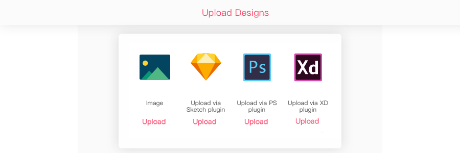
Free download Sketch/PS/Adobe XD plugin here:
Photoshop Plugin: https://idoc.mockplus.com/download/ps
Adobe XD Plugin: https://idoc.mockplus.com/download/xd
Sketch Plugin: https://idoc.mockplus.com/download/sketch
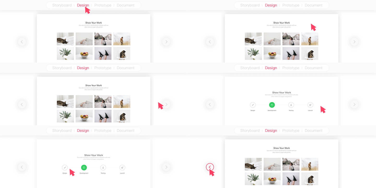
Step 2. Select a page and click the “Design” module on the top navigation bar
If you want to change the selected page, you can use the page turner or click the desired page on the left project tree (no need to go back to the “Storyboard” module and selecting another page again).

Step 3. Add desired specs manually in the “Review” step
So far, there are 5 markup tools for you to add manual specs: Text, Coordinate markup, Spacing markup, Color markup and Region markup.
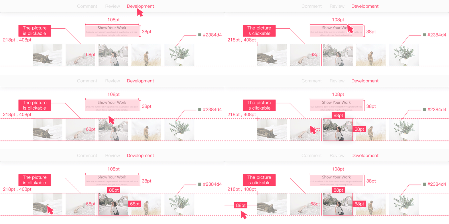
Step 4. View auto and manual specs in the “Development” step
The auto specs are automatically generated after you’ve uploaded your designs to Mockplus Cloud. The manual specs can be added in the “Review” step.
And the auto and manual specs both can be viewed in the “Development” step.
Moreover, developers can also download assets in different sizes, view spec details (including the text sizes, opacity, color and fonts) and export CSS codes with one click in this “Development” step.
Check the tutorial here: https://doc.mockplus.com/?p=2311
The constantly increasing complexity of design make design collaboration and handoff troublesome and time-consuming.
That’s exactly why you need an effective tool to generate auto specs for your web/app designs. Generate all required information in just a few clicks and also add manual specs for delivering every possible design detail to developers.
Mockplus Cloud is a perfect tool for you and your team to collaborate and handoff designs effortlessly with auto and manual specs online.
Free try the Team version of Mockplus Cloud here: https://idoc.mockplus.com/buy


